


CSS hasn't changed much since CSS 3 was released, but the relatively new Flexbox module provides some much needed relief when it comes to creating complex structured layouts in HTML. Flexbox can be considered a much more capable successor to HTML tables. In this article, I'll introduce the basic concepts of Flexbox and a few practical examples that demonstrate how to put Flexbox to use in your own HTML applications.
Let's face it. Most of us doing Web development have struggled with multi-column layouts at some time. Any developer new to HTML and coming from a desktop-based development environment is very likely to comment immediately on how difficult it is to properly create a structured layout in HTML. Although it's always been possible to make layouts behave using various tricks and specialized workarounds, the process has never been easy.
HTML has always been very good for document style layout; that is, creating flowing documents where content stacks on top of the previous content. HTML thrives on flowing content that takes up as much space as is available and reflowing content around embedded floating elements automatically.
On the other hand, creation of structured layouts that display content in confined areas that sit side-by-side or need to stack in an exact order and location have been much more elusive to achieve with HTML. Trying to create paneled layouts that can stay fixed and/or dynamically resize relative to each other are not trivial to create in HTML.
Technologies to deal with structured layouts have come and gone over the years: Developers have used HTML frames, HTML tables, float based layouts, and, more recently, various CSS tricks and grid systems popularized by a number of CSS frameworks like Bootstrap, Foundation, and Google's Material Design. Although there have always been solutions and hacks to beat HTML into submission, it has never been an easy road, as each of these technologies has limitations and requires compromises. Even today, for many Web developers, tables are the first and only tool they reach for when a structured layout is required. But that's finally changing.
It seems that we've been struggling long enough with various hacks to create complex, structured HTML layouts.
Flexbox to the Rescue
With the advent of the HTML Flexbox model, HTML finally gains a rich box formatting engine that addresses complex layouts. You can think of Flexbox as HTML tables on steroids, without the styling limitations of tables and the ability to use any HTML semantic tag to create a Flexbox container and child elements. You can apply Flexbox styling to any HTML element, which means that you can easily restyle and reflow elements independently of each other as there is no fixed container hierarchy like there is in tables.
Flexbox makes it much easier to lay out documents that require multiple columns or need to flow complex layouts around pages by providing many declarative attributes that describe exactly how each container and their children should size themselves, how content should align and wrap, how much and where spacing should be applied to fill space, and so on. For example, it's easy with Flexbox to create a full-page layout that stays fixed to the height of the browser window and adjusts all panels within the layout when the browser resizes. Likewise, it's pretty easy to specify that content should be centered either horizontally or vertically, or both. Content inside a container can be made to stack on top of the previous element or to flow side-by-side, and you can easily control the wrapping behavior, which makes it much easier to create responsive, mobile-friendly layouts that can adjust according to screen size.
Much of this was possible before from HTML without Flexbox, but it required a lot of disjointed CSS attributes to find the right invocations. Flexbox creates a new, comprehensive model using a few clearly defined attributes specific to layout tasks that can interact with each other more easily than the old HTML attributes.
Here are some of the cool things you can easily create with Flexbox without the help of a full HTML framework like Bootstrap:
- Full-page paneled and dynamically resizing layouts
- Seamless grid layout without any ‘grid-stops’
- Lining up multi-column form controls
- Input add-on controls
- Easy vertical centering of content
Flexbox History
As you build increasingly interactive applications inside the browser, it's increasingly important to more easily control layout that enables the complex interfaces you now build with HTML. User interface design is still one of the most time-intensive operations in Web application development, and anything that makes this process easier is a welcome change. Flexbox provides some much needed relief in this area as it facilitates creating complex layouts using standard semantic HTML element tags.
The HTML Flexbox model is not exactly new. The initial, now-outdated spec for Flexbox was released in 2009, followed by another now-outdated update, and was finally was replaced in 2012 by the current Flexbox specification that's available in most browsers today (see the Flexbox and Browser Support sidebar). It's still a working draft in the final recommendation stage, but the draft has been fairly stable for a few years now. All Evergreen browsers and recent mobile browsers now support Flexbox. The big glaring exception is Internet Explorer 9 and older, which has no support, and Internet Explorer 10, which has partial (but reasonably good and usable) support for Flexbox.
Although decent Flexbox browser support has been available since 2014, it seems that Flexbox really hasn't hit the developer mainstream yet. It still feels like bleeding-edge technology that hasn't garnered wide adoption yet. This is because it's relatively new and because Flexbox has a learning curve. The Flexbox CSS syntax uses new CSS attributes and uses new terminology and to use it, you have to understand the basics of how the model and its relationships work. It's not as simple as slapping a new attribute on a single HTML element and seeing behavior changes. Flexbox deals with layouts and acts on many elements simultaneously and therefore requires some Flexbox styling on each participating element. It's not rocket science, but there are quite a few CSS attributes to choose from. The terminology for some of these attributes and values is somewhat overlapping, so it can be a little overwhelming at first to figure out which attributes to use. But, as is often the case with new technology, you end up using a few features over and over again and the few attributes you need to master are easy to remember once you get the basic hang of how they relate to each other.
You'll be hearing a lot more about Flexbox in the near future. Many of the updated big CSS frameworks coming out soon, like Bootstrap 4.0 and Material Design from Google, rely heavily on Flexbox to provide their layout features. Now's a good time to get up to speed on how Flexbox works. Even if you're not using Flexbox directly, some of the frameworks you might use in the future will leverage Flexbox under the covers and understanding how it works will make it easier to interact with these frameworks.
You can think of Flexbox as HTML tables on steroids, without the limitations of table styling and the ability to use any semantic HTML tags.
Getting Started with Flexbox
Flexbox is a CSS-based container layout module. One of the big benefits of Flexbox over HTML tables is its ability to use any HTML element to define its containers and elements. You can use div, nav, article, or any other built-in or dynamic semantic HTML tag to define your containers and child items.
The key thing to understand about Flexbox is that it's a container manipulation tool. It defines the overall behavior on the container and then allows element functionality to override some behavior traits of the elements that are under control of the container. Using a handful of Flexbox-specific attributes, you get a ton of control in how the container alignment and flow is managed.
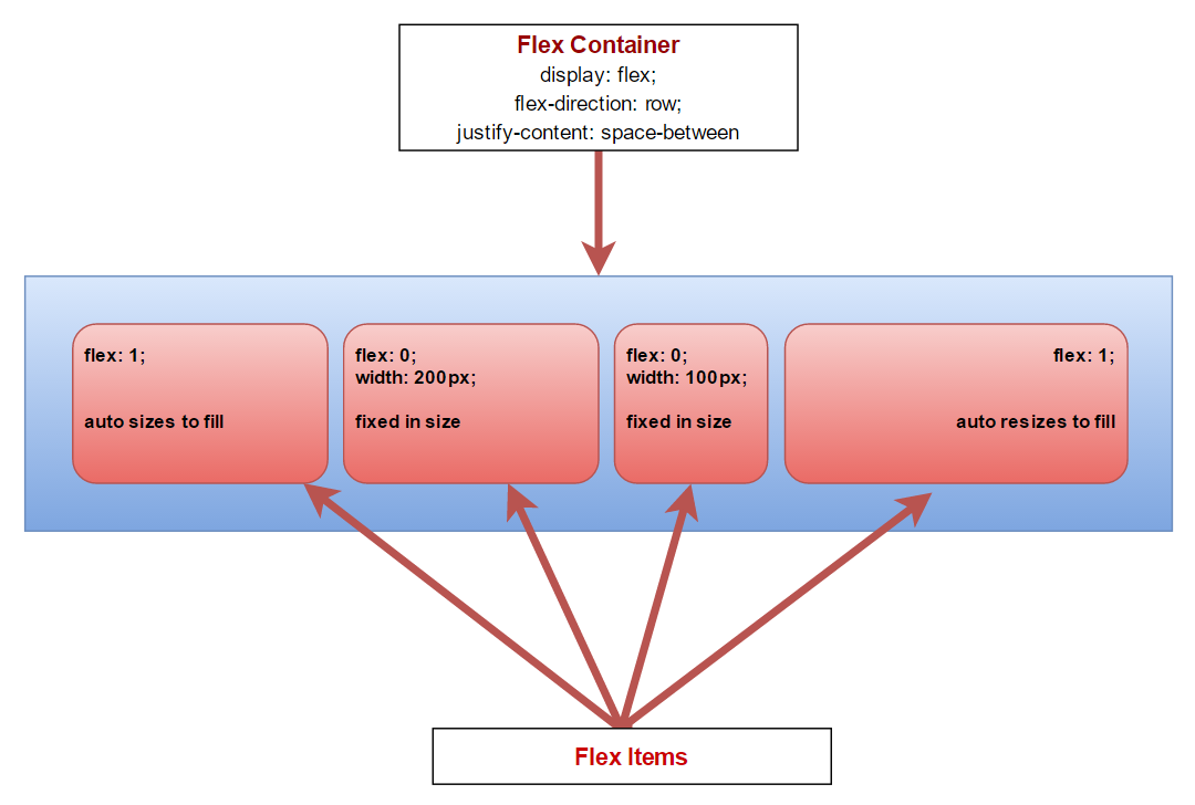
Figure 1 demonstrates the containership and some of the more common CSS attributes that you're going to see in a Flexbox layout. The container controls the overall flow of the layout and it all starts with display: flex, which indicates that the container should use Flexbox layout. The container can use attributes like flex-wrap, align-items, and justify-content to control how the elements in the container should render. The layout in Figure 1 is horizontal, using flex-direction: row, but Flexbox also supports flex-direction: column layouts that format a layout vertically. Using these attributes, you can control many aspects, including element sizing, spacing, wrapping, and fill mode with very little CSS styling and that clearly defines the container behavior.
Individual items can control how they fit into the layout and manage their own internal formatting using both new Flexbox-specific and standard CSS attributes. Child items primarily use the flex attribute to determine their Flexbox behavior. The flex attribute is a combination of the flex-grow, flex-shrink, and flex-basis attributes and can be written as a single value or a triple value. For example, flex: 1 is equivalent to flex: 1 1 0%, and flex: 0 0 auto is the same as flex: none. Single values is what you commonly see in Flexbox layouts, but it's merely a shortcut for the three attributes that determine whether the element can grow or shrink if the value is non-zero.
If the numeric value is non-zero, the element can grow or shrink and the value is used as a ratio in relation to the other elements in the container. This means that a flex: 1 element should render at half the size of a flex: 2 element. The flex-basis determines the initial size or uses auto for whatever the elements' current size is initially. Using Flexbox, it's easy to create relatively sized elements that are recalculated on resizing and as new elements are added to the container. Other item attributes include align-self, which overrides the parent's align-items setting and order, which lets you explicitly control the location of an element in the container's child collection. These are very useful if you programmatically insert and manage elements dynamically.
Flex containers can be nested so that you can create a top-level container that vertically manages elements, then use a child container to set up a horizontal flex container inside one of the child containers. A common example of this is a fixed window layout where you have a top-level container that manages the full height of the browser window with header, content, and footer. The content area can then have a horizontal Flexbox layout that contains multiple panes for a nav sidebar, content, and ad sidebar. I'll look at an example of this later in this article.
Unlike HTML tables, Flexbox can use any semantic HTML element for the container or child elements.
The Flex Container
The flex container starts off the Flexbox hierarchy using the display:flex attribute. This changes the display mode and tells the container and immediate child elements that they are using Flexbox layout formatting. The flex-direction attribute controls the horizontal (row) or vertical (column) flow of the child elements. The default is row and can be omitted for horizontal layouts. You can also specify the fill characteristics via the align-item and align-content attributes, which define the positioning via fill or spacing respectively, and the flex-wrap attribute that controls wrapping behavior or elements. In combination, these attributes give you a lot of control over how the container renders its child elements.
To demonstrate, here's a simple example of a full-width horizontal container using some very simple HTML:
<div class="panel-container">
    <nav class="panel-left">
        left
    </nav>

    <div class="splitter">
        splitter
    </div>

    <article class="panel-right">
        right
    </article>
</div>
To define a top-level container, you can do something like this (all but the first attribute are optional):
.panel-container {
    display: flex;
    flex-direction: row;

    justify-content: space-around;
    flex-wrap: nowrap;
    align-items: stretch;
}
Flex Elements
Once you have a container, you can customize how the contained elements behave inside it by primarily using the flex attribute.
To demonstrate, I'm using three horizontal panels that have two fixed-width panels and one auto-resizing panel:
.panel-left {
    flex: none;  /* manual resize */
    width: 300px;
}
.splitter {
    flex: none; /* manual resize */
    width: 18px;
}
.panel-right {
    flex: 1; /* resizable */
}
The most important attribute is the flex attribute, which is a shorthand for flex-grow, flex-shrink, and flex-basis. The first two are numeric values that represent the relative sizes of all the child elements. A value of 0 means that the size is fixed and shouldn't shrink or grow respectively. Any number greater than 0 means that the element can grow or shrink relative to the other elements' grow and shrink values. The most common values are 0 0 auto, which specifies to keep the size fixed, or 1 1 auto (which is also the default if not provided), which specifies that the element will auto-size itself to fill available space. If multiple elements exist with positive flex values, they will all resize relative to each others' flex values; the larger the number, the more space they take up.
If flex-shrink and flex-grow are the same value and flex-basis is auto, you can shortcut the three values to a single number, like flex: 0 and flex: 1 respectively, which is what you see most commonly in Flexbox layouts. The default is 0 so you can omit flex: 0. I'm only showing it above and in the samples to be explicit.
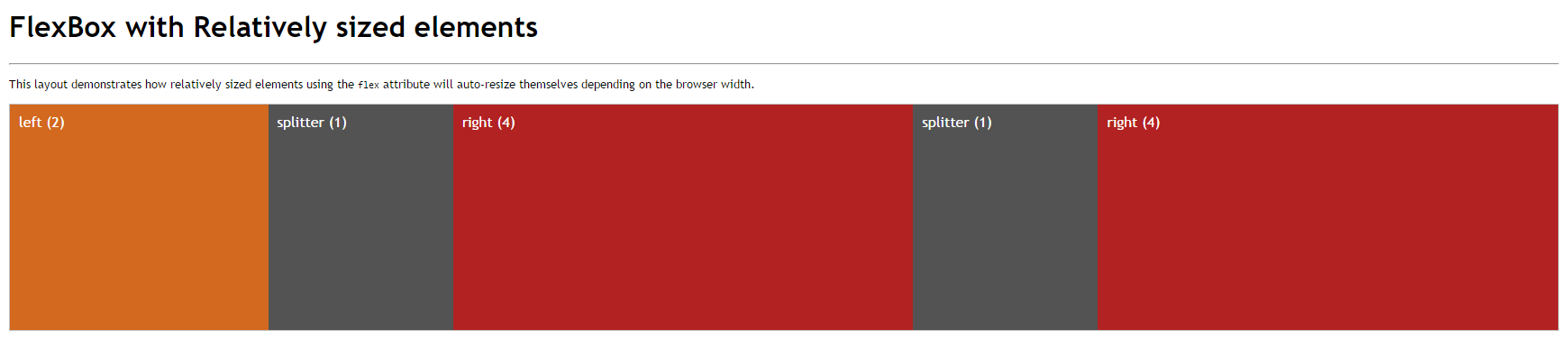
If you want to express a sizing relationship without explicit width (or height), you can also use relative numbers that establish a ratio relationship between the elements:
.panel-left {
    flex: 2;
}
.splitter {
    flex: 1;
}
.panel-right {
    flex: 4;
}
This makes the left panel (2) half the size of the right panel (4), and the splitter panel half the size of the left panel (1). As you resize the container, that relationship stays intact. This is similar to using percentages in table layouts except that Flexbox can recalculate the ratios even if new elements are added to the layout. Figure 2 shows how this relationship renders in the browser when multiple .splitter and .panel-right elements are added to the initial layout. You can check it out online at: http://codepen.io/rstrahl/pen/adJPeQ.
Although relative sizing like this is very powerful, you can also use specifically sized layouts where some elements stay fixed and others automatically stretch or shrink to accommodate the new size of the container. Using flex: 0 specifies that the element should stay fixed in size while flex: 1 resizes to fill. This is very common for layouts that have a single expanding container or that are using things like splitters to let a user resize panels.
Vertical Layouts
One of the most difficult layout issues to deal with in HTML consistently, even in modern browsers, is to build a UI that automatically stretches to fill the entire browser window and stays properly sized as you resize the document. The age-old problem with vertical sizing in the browser is that HTML has to know the actual size of the window from the top-level container (body/html) all the way down into the child elements. Flexbox makes this process much easier.
To create a vertical layout, you can use the flex-direction: column on the container, and then layer the elements to fill the height of the container. Using the exact same layout as in Figure 2 and simply switching the flex-direction:column results in a stacked layout, as displayed in Figure 3. You can also check out the Codepen at: http://codepen.io/rstrahl/pen/NxjxRW.
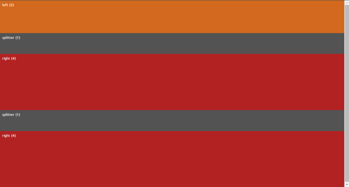
As in the horizontal layout, the vertical panels now fill the height of the container to its maximum size using the ratios specified by in the flex attribute.
To create full window height layouts that fill the entire browser window and resize to fill the entire content area, you have to ensure that the html,body elements as well as the top-level flex container that wraps the entire page have a height:100% set in their CSS:
html,body {
    height: 100%;
    overflow: hidden;
}
.flex-container {
    display: flex;
    flex-direction: column;
    height: 100%;
    overflow: auto;
}
This ensures that the content of the items fills the entire window. Note the overflow:auto in the .flex-container, which works around an odd gotcha I ran into with FireFox. FireFox requires overflow:auto in order to keep the panels constrained to the panel height, even though overflow:auto should be the default based on container inheritance. All other browsers seem to work without this. I've found a few instances where explicit overflow settings are required, so I've taken to being very explicit with my overflow settings in flex containers.
Vertical and Horizontal Content Centering
Another common difficulty in HTML is vertical centering of elements in a container. Although there's a vertical-align property in CSS, this property applies only to table-cells and inline elements. It has no effect on any other container elements.
Flexbox provides a simple solution using justify-content and align-items. justify-content justifies items in the current flex direction or the main axis of the container, while align-items justifies items along the perpendicular flex direction or cross-axis.
There are several ways to center elements vertically:
.panel-right {
    display: flex;
    align-items: center;
}
This implies flex-direction:row, which is the default and can be omitted. If all you're after is vertical centering, this is the least CSS code you can use. The align-items centers vertically because it's the cross-axis to horizontal flex-direction: row.
Another slightly more verbose but maybe more obvious way to express this same vertical centering is to use justify-content, which aligns content on the active flex-direction:
.panel-right {
    display: flex;
    flex-direction: column;
    justify-content: center;
}
Here justify-content centers vertically because the main axis is vertical, based on flex-direction: column. Both approaches have the same effect but it's easier to see that centering is occurring on the column axis.
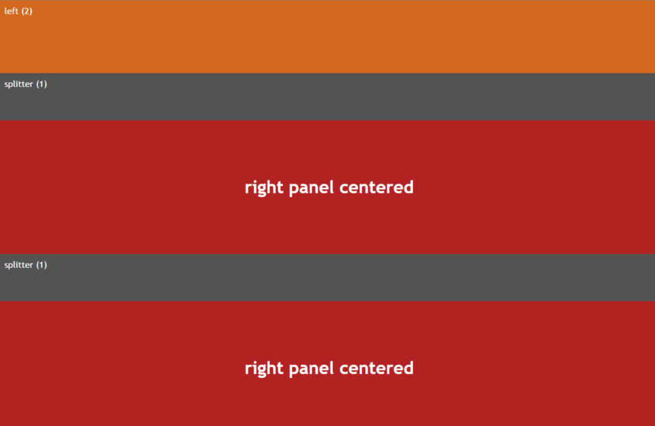
The reason both of these exist is so that you can combine them to center both vertically and horizontally. The following does just that:
.panel-right {
    display: flex;
    flex-direction: column;
    justify-content: center;
    align-items: center;
}
Applied to the .panel-right style in the previous example, Figure 4 shows what the horizontally and vertically centered content looks like.
At this point, you've seen most of the Flexbox attributes used, but keep in mind that there are many more combinations of these attributes that you can apply. You can control wrapping behavior, fill behavior between elements, whether elements stretch and fill or simply leave space at the beginning or end - the combinations are endless.
As a summary and for a better idea of all the options available using Flexbox syntax, Table 1 and Table 2 show the Flexbox-related attributes grouped by container and child elements.
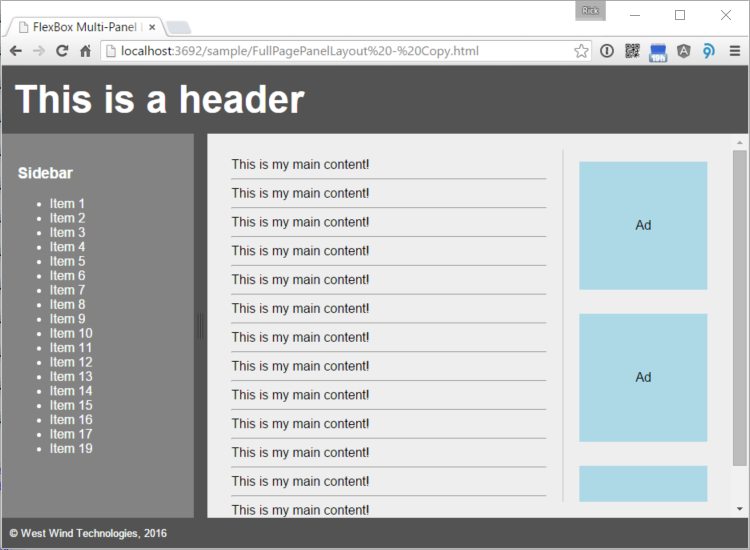
A Practical Example: Full-Page Panel Layout
To provide a comprehensive and practical example, let's create a full-page layout that includes a number of nested Flexbox containers. Figure 5 shows a five-panel layout that contains a header, a sidebar, a main content area, an ad bar, and a footer. You can also check out the HTML and CSS markup in Listing 1 or on CodePen: http://codepen.io/rstrahl/pen/YwZbYw.
Listing 1: A multi-pane Flexbox Layout
<!DOCTYPE html>
<html><head>
<meta name="viewport"
content="width=device-width, initial-scale=1">
<style>
html, body {
height: 100%;
padding: 0;
margin: 0;
}
.flex-master {
display: flex;
flex-direction: column;
flex-wrap: nowrap;
height: 100%;
overflow: auto;
}
.page-header {
flex: none; /* fixed size */
padding: 15px;
font-size: 3em;
font-weight: bold;
background: #535353;
color: white;
}
.page-content {
flex: 1;/* resize in container */
overflow: auto; /* IMPORTANT for FireFox */
/* new flex container for content */
display: flex;
flex-direction: row;
}
.sidebar-left {
flex: none;
background: #838383;
padding: 20px;
width: 200px;
overflow: auto;
color: white;
}
.splitter {
flex: none;
width: 17px;
cursor: col-resize;
background: #535353;
}
.content-container {
flex: 1 1 auto;
background: #eee;
padding: 20px;
width: 100%;
overflow-y: auto;
display: flex; /* new flex for content/ads*/
flex-direction: row;
}
.main-content {
flex: 1 1 auto;
width: 100%;
padding: 10px;
}
.page-ads {
flex: 0 0 auto;
width: 180px;
overflow: hidden;
display: flex; /* new flex for ads */
flex-direction: column;
}
.ad {
flex: none;
align-self: center;
padding: 5px;
margin: 15px;
width: 150px;
height: 150px;
background: lightblue;
overflow: hidden;
/* center ad text */
display: flex;
justify-content: center;
align-items: center;
}
footer {
flex: 0 0 auto;
background: #535353;
color: white;
padding: 10px;
}
</style>
</head>
<body>
<div class="flex-master">
<header class="page-header">
This is a header
</header>
<div class="page-content">
<nav class="sidebar-left">
<h3>Sidebar</h3>
<ul>
<li>Item 1</li>
<li>Item 2</li>
</ul>
</nav>
<div class="splitter">
</div>
<div class="content-container">
<article class="main-content">
This is my main content!
<hr />
This is my main content!
<hr /> ...
</article>
<aside class="page-ads">
<div class="ad">
Ad
</div>
<div class="ad">
Ad
</div> ...
</aside>
</div>
</div>
<footer>
<small>© West Wind Technologies, 2016</small>
</footer>
</div>
</body></html>
Full-page layouts like this that maintain their full size in the browser are becoming more common as we build more complex applications in the browser. Applications, rather than content pages, often require a fixed layout so that you can find and navigate content more easily.
The layout contains a number of nested containers:
- Top level page container (.flex-master)
- Contains header, .page-content and footer
- A new horizontal container (.page-content)
- Contains .sidebar-left, .content-container
- The .content-container contains .main-content and .page-ads
- The .page-ads contains individual ads
That's quite a bit of container nesting that breaks down each page section into smaller and smaller containers. Flexbox makes this relatively easy because any child element can also act as a new Flexbox container to its contained elements. If you've used WPF in .NET and the various panel containers, this approach should look very familiar.
One of the key features of this layout is that it remains fixed to the full window size, so as you resize the window, the footer stays at the bottom and the content in the middle grows or shrinks to match the height of the browser. As mentioned earlier, the html,body styles are marked height:100% to ensure that the various containers can calculate the total page size. The top level .flex-master also sets its height:100% to fill out the entire height of the window. From there on, Flexbox's relative or stretch sizing can fill out the window height.
It's important to think about the overflow characteristics for each container and due to the funky FireFox I mentioned earlier, it's a good idea to explicitly specify how you'd like to have the overflow handled in each container. For the top-level container, overflow should be hidden because you don't want to ever see a scrollbar on the document and content really shouldn't be overflowing anyway. The main content container also shouldn't have any overflow, as it should fill the width of the browser and the height between footer and header, but each of the contained panels with the sidebar and main content should have overflow to scroll the container for height and width.
The CSS for all of this is a bit verbose, but the HTML for the containers and elements remains very compact and readable. Although it will never be really simple to create multiple nested containers to create full page layouts, Flexbox makes this a lot easier than it would be using traditional CSS styling and without any required JavaScript code.
Bonus: Adding Panel Resizing
Although this has nothing to do with Flexbox, wouldn't it be nice if you could easily resize the sidebar and main panels using splitter-like behavior in the example above? It turns out that there's an easy way to add this functionality using the jQuery-resizable plug-in that I created recently (see sidebar Resizing Panels with jQuery-resizable). This very small jQuery plug-in allows resizing of containers and makes it trivial to create a resizable panel:
<script src="src/jquery.min.js"></script>
<script src="src/jquery-resizable.js"></script>
<script>
    $(".sidebar-left").resizable({
        handleSelector: ".splitter",
        resizeHeight: false
    });
</script>
And voila! You can now drag the black separator in Figure 5 to resize the left and right panels, which makes a nice addition to a paneled layout.
Form Layouts
Another pain point in HTML is form layout. One of the big draws of the Bootstrap framework is its grid system, which provides responsive form formatting and a semblance of multi-column form layouts. Flexbox can replace much of what the grid system does with a small amount of CSS just by using a Flexbox container around the individual form items. The result looks similar to the HTML that you would write with Bootstrap, but you get a lot more control over the elements because you're not constrained by specific grid sizes. You can get automatic resizing of elements, but if you choose to, you can also give specific sizing hints to size each grid column to a specific relative value that is automatically recalculated by Flexbox when the page or container is resized.
Figure 6 shows an example of a very simple input form that uses Flexbox. You can check out the code in Listing 2 or on CodePen at http://codepen.io/rstrahl/pen/rxmjgL.
Listing 2: FlexBox responsive styling for an Input Form
<style>
.form-group {
display: flex;
flex-direction: row;
}
.form-group label {
flex: none;
display: block;
width: 125px;
font-weight: bold;
font-size: 1em;
}
.form-group label.right-inline {
text-align: right;
padding-right: 8px;
padding-left: 10px;
width: auto;
}
.form-group .input-control {
flex: 1 1 auto;
display: block;
margin-bottom: 10px;
margin-right: 8px;
padding: 4px;
margin-top: -4px;
}
button {
padding: 5px 15px;
margin: 5px;
min-width: 100px
}
@media (max-width: 768px) {
.form-group {
flex-direction: column;
}
.form-group .input-control {
margin-top: 2px;
}
.form-group label.right-inline {
text-align: left;
padding-right: 0;
padding-left: 0;
}
}
</style>
<div class="form-group">
<label>First Name</label>
<input value="Rick" class="input-control" />
<label class="right-inline">Last Name</label>
<input value="Strahl" class="input-control" />
</div>
<div class="form-group">
    <label>Company</label>
    <input value="West Wind"
           class="input-control" />
</div>
<div class="form-group">
<label>Address</label>
<textarea class="input-control">32 North End</textarea>
</div>
<div class="form-group">
<label>City,State,Zip</label>
<input value="Walnut Creek"
class="input-control"
placeholder="City"
style="flex: 6" />
<input value="CA"
class="input-control"
placeholder="State"
style="flex:1" />
<input value="94152"
class="input-control"
placeholder="Postal Code"
style="flex:2" />
</div>
<div class="form-group">
<label> </label>
<button>Save</button>
<button>Cancel</button>
</div>
The key feature in this layout is that each row is wrapped in a container item very much like you would do in Bootstrap:
<div class="form-group">
<label>Company</label>
<input value="West Wind"
class="input-control" />
</div>
You can then use some relatively simple styling to get the elements to line up in each row:
.form-group {
    display: flex;
    flex-direction: row;
}
.form-group label {
    flex: 0;
    display: block;
    width: 125px;
}
.form-group .input-control {
    flex: 1;
    display: block;
    margin-bottom: 10px;
}
This simple CSS allows for the full row styling that you see on the left. What's nice about this is that this existing layout works even when additional elements are added to the input group. For example, the city/state/zip row automatically sizes multiple input boxes using relative sizing and it still fills out the whole width of the container:
<div class="form-group">
    <label>City/State/Zip</label>
    <input value="Clayton"
           class="input-control"
           style="flex: 6" />
    <input value="CA" class="input-control"
           style="flex: 1" />
    <input value="94152"class="input-control"
           style="flex: 2" />
</div>
The textboxes automatically stay relatively sized in the flex container as you resize the container.
Flexbox and Responsive Design
One big advantage that Flexbox has over HTML tables is that you can apply Flexbox styling to any HTML element so you aren't limited to the strict structure that HTML tables must adhere to. Because of this, it's much easier to restyle Flexbox containers and elements using media queries and other responsive techniques.
Flexbox is just a styling mechanism, which means that you can add and remove it at will, and because you change the flow direction easily, it's almost trivial to go from a horizontal layout of a large display to a vertical layout just by switching the flex-direction. Often, you can just switch from flex-direction:row for wide screens to flex-direction:column for small screens.
For example, in the form example in the previous section, you can add a media query and simply flip the direction like this:
@media (max-width: 768px) {
    .form-group {
        flex-direction: column;
    }
}
This has the affect that the form jumps to the display on the right that you see in Figure 6, which is a single-column layout.
Although it's not always going to be quite so easy to rearrange content for different sizes, Flexbox gives you a lot of control via CSS to restyle content and automatically reflow content for responsive layouts.
Flexbox lets you easily create responsive layouts because you can easily redefine how elements flow in a flex container.
Summary
Now that you've seen some of the features that Flexbox brings to the table for HTML layout, I think you'll agree that it's pretty exciting to see these enhancements come to HTML and CSS design. Flexbox is a very welcome addition to HTML, providing a sorely missing structured layout engine for composing complex HTML layouts more easily than ever before. HTML has suffered long enough from hacks and workarounds to build multi-column layouts that are adaptable and can take advantage of responsive design when the browser resizes.
Although Flexbox technology is still relatively new and hasn't been adopted widely yet, all major browsers have Flexbox support with the exception of IE 9 and older. Flexbox is in the Last Call stage of ratification as a W3C standard, so it's unlikely that there will be any major changes to this spec. A number of big frameworks are betting big on Flexbox, including the forthcoming BootStrap 4.0 and Google's Material Design.
If you haven't checked out Flexbox before, or you have and initially dismissed it as too different or because it wasn't yet widely adopted, it's time to give it another good look. You won't regret it for the time you save in your HTML layout.
Table 1: Flexbox Container Attributes
| Attribute | Function |
| display: flex | Top-level attribute that enables Flexbox formatting on the container it is applied to. display:flex |
| flex-direction | Determines horizontal (row) or vertical (column) flow direction elements in the container. row,column |
| flex-wrap | Determines how content wraps when the content overflows the container. wrap, nowrap, wrap-reverse |
| flex-flow | Combination of flex-direction and flex-wrap rolled into a single attribute. flex-flow: row nowrap |
| justify-content | Aligns content along the flex flow direction (main axis). flex-start, flex-end, center, space-between, space-around |
| align-items | Like align-content but aligns content along the perpendicular axis (cross axis). flex-start, flex-end, center, stretch, baseline |
| align-content | Aligns multi-line content so that multiple lines of content line up when wrapping. flex-start, flex-end, center, space-between, space-around, stretch |
Table 2: Flexbox Child Element Attributes
| Attribute | Function |
| flex | Combination of flex-grow, flex-shrink, and flex-basis rolled into a single attribute. 1 1 auto, 0 0 auto, 0 0 200px , flex: 0, flex: 1, flex: 10 |
| flex-shrink flex-grow | Numeric value that determines how a child element should grow or shrink. A 0 means fixed size, a numeric value is used in relation to other numeric values on other sibling elements in the container. 0 -- fixed size, number -- relative sizing to other flex items in container |
| flex-basis | The initial size of the element and the basis on which sizing is based auto -- uses size of element from width, pixel size -- fixed size to apply |
| align-self | Sets the alignment for the element explicitly overriding the value set by align-items on the container. auto, flex-start, flex-end, center, baseline, stretch |
| order | Sets the rendering order of the element inside of the container in ascending order numeric value |