


ASP.NET represents a significant leap forward from traditional Active Server Pages (ASP) development.
In this article, I'll show you what it takes to begin building ASP.NET Websites with Visual Studio .NET. This article will provide you with the knowledge you need to jumpstart your foray into the world of ASP.NET development.
.NET Overview
Before we can dive in and begin building Web pages with ASP.NET, I want to introduce a few topics and new terminology.
.NET Framework
Microsoft designed classes in the .NET Framework to accommodate your current programming needs and beyond. It contains classes for many activities including manipulating text, working with database data, and working with the file system. The .NET Framework also contains classes that represent the basic data types including integers, bytes, strings, and arrays. You should learn one of the .NET languages, but it is vital that you learn about the .NET Framework. Do you have to know how to use every class in the Framework before you can become an effective .NET developer? No, but there are quite a few classes you need to learn about before you will make any substantial headway. When it comes to developing in .NET, the Framework is everything.
Namespaces
As you can probably imagine, the entire .NET Framework is huge?it is comprised of thousands of classes, or as astronomer Carl Sagan might say, “billions and billions!” Management and classification of this enormous list of classes requires an organizational mechanism. The organizational mechanism that manages the .NET Framework is called a namespace. Simply put, a namespace is a logical grouping of classes. For example, the System.Web namespace stores all of the classes that relate to working with browser-server communication.
The .NET Framework organizes namespaces into a hierarchical tree structure. The System namespace resides at the root of this tree. It contains all of the classes for working with the base data types, random numbers, dates, directories. and other system resources.
To uniquely identify a class in the .NET Framework, you reference the class by its full namespace and class name. For example, to refer to the File class contained in the System.IO namespace you would use:
System.IO.File
Table 1 shows a partial list of standard namespaces.
.NET Languages
.NET supports a number of languages. By default, Visual Studio. NET installs Visual C# .NET (usually abbreviated as C# and pronounced c-sharp), Visual Basic .NET, and Visual C++ .NET. The two languages most commonly used in .NET are Visual Basic .NET and C#. Other languages that that have been ported over to .NET include COBOL, Eiffel, and PERL. I'll use Visual Basic .NET throughout this article.
File Extensions
As is the case with just about every new development environment, you're going to need to be aware of a few new file extensions in Visual Studio .NET.
Table 2 lists common file extensions that ASP.NET uses.
Set Up and Installation
In order to run ASP.NET Web Forms you need to have Internet Information Server (IIS) and the .NET Framework Software Development Kit (SDK) installed on your machine (installing IIS is beyond the scope of this article).
Notice I didn't say you need Visual Studio .NET installed on your machine to build and run ASP.NET Web Forms. Just like standard HTML, you can create your ASP.NET Web Forms in any text editor. However, we'll use Visual Studio .NET as the development environment.
Your First ASP.NET Project
Now you're ready to get your feet wet. Launch Visual Studio .NET and let's get started.
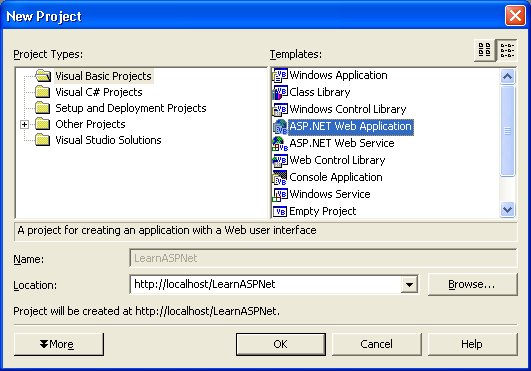
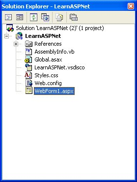
To create a new ASP.NET project in the Visual Studio .NET IDE, select File | New | Project, and then select ASP.NET Web Application from the Templates. Name the project LearnASPNet (see Figure 1), click OK, and Visual Studio will build the project files. The Solution Explorer will contain your newly created project and a Web Form named Webform1.aspx (see Figure 2).
The first thing to do is rename Webform1.aspx to MyFirstWebForm.aspx. Right-click on Webform1.aspx and select Rename. Then, right-click on MyFirstWebForm.aspx again and select Set As Start Page. This ensures that MyFirstWebForm.aspx will be the Web Form initially displayed when you run the project.
Let's launch this Web Form just to make sure you configured your machine correctly. Click the blue triangle in the toolbar (see Figure 3), select Debug | Start, or press F5 to launch the form.

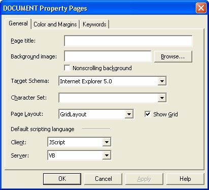
If you set up your machine correctly you should see a blank Web page (see Figure 4). Congratulations, you've just created and run your first ASP.NET Web Form! Close the browser and return it to the Visual Studio .NET IDE.
One of the first things to note about your newly-created Web page is the text in the middle regarding the layout mode of the page. There are two options for layout mode: GridLayout and FlowLayout. You specify the layout mode used by the page on the General tab of the DOCUMENT Property Pages dialog box. Right-click on the page and select Properties to display the DOCUMENT Property Pages dialog box (see Figure 5).
You're probably wondering, what's the difference between the two layout modes? GridLayout provides absolute positioning for controls placed on the page. Developers that have their roots in rich-client development environments like Visual Basic will find it easier to develop their pages using absolute positioning, because they can place items exactly where they want them. On the other hand, FlowLayout positions items down the page like traditional HTML. Experienced Web developers favor this approach because it results in pages that are compatible with a wider range of browsers.
Which layout should you use? Flowlayout is the safer route, however, absolute positioning is appropriate for an intranet application when you are sure all of your users will have a compatible browser.
While you still have the Property Pages dialog box open, go ahead and change the Page Title to My First Web Form. Click OK to close the dialog box.
Adding Controls
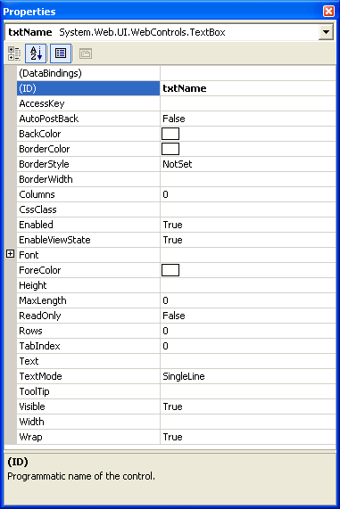
We will examine a few controls shortly, but first you need to learn how to add a control to a form. The Toolbox is located on the left side of the screen. Select the Web Forms controls section and double-click the TextBox control. You should now see a text box on your Web Form. Right-click the text box and select Properties from the shortcut menu. Change the ID property to txtName (see Figure 6). Next, add a button control. Name the button cmdSubmit and set its Text property to Away I Go!
Separating Code from Content
One of the primary differences between ASP and ASP.NET is that ASP.NET can store program code in a separate file from the HTML. While ASP.NET still supports combining the program logic and HTML into a single file, I won't present that approach in this article. Instead we will let the Visual Studio .NET IDE automatically create the file that will store any program code for handling page and control events. The name of the file automatically created by Visual Studio .NET is the name of the page concatenated with “.vb” for Visual Basic .NET or “.cs” for C#. For example, MyFirstWebForm.aspx.vb is the Visual Basic .NET code file created for MyFirstWebForm.aspx.
Double-click the MyFirstWebForm page to display the event code for the form.
Handling Events
ASP.NET has two types of ASP.NET events to manage: Page events and Control events. Requesting an ASP.NET page raises Page events; user interaction with a control raises Control events. To handle a Page or Control event you need to code the subroutine associated with the event. Table 3 lists Page events and when they occur.
The Load event is the most useful of the Page events. You can use the Load event to initialize the properties of the controls on a page.
The following code shows a Page_Load, a subroutine for the Load event. When the page loads, the subroutine initializes the Text property of the txtName text box to “Clark Gable:”
Private Sub Page_Load _
  Me.txtName.Text = "Clark Gable"
End Sub
You code Control events the same way as Page events. Double-click the cmdSubmit button and create the following subroutine, called cmdSubmit_Click, which accepts a parameter of type Object and a parameter of type EventArgs:
Private Sub cmdSubmit_Click _
  (ByVal sender As System.Object, _
  ByVal e As System.EventArgs) _
  Handles cmdSubmit.Click
    Me.cmdSubmit.Text = "Now you don't!"
End Sub
You'll notice that the name of the Control event subroutine is the name of the control, “cmdSubmit,” with the name of the event, “_Click,” appended to the end. While this is not a naming requirement, it does make connecting subroutines to events much easier.
The Handles keyword specifies exactly what event or events the subroutine responds to. If you're thinking that means multiple objects can share the same event handler, you are correct. How does the subroutine know which object raised the event? That's where the sender argument comes in. Sender is a reference to the object that raised the event. You can interrogate sender to determine which object raised the event and act accordingly. What about that “e” argument passed in? The properties of e, an EventArgs object, contain information relating to the specific event raised.
We'll use the Click event of the ImageButon control to demonstrate a good example of an EventArgs implementation. The following code assigns the lblXPosition and lblYPosition variables to the x and y coordinates of the mouse when the user clicks the ImageButton control:
Private Sub ibtnMyPicture_Click(_
  ByVal sender As System.Object, _
  ByVal e As <a href="http://System.Web.UI">System.Web.UI</a>.ImageClickEventArgs) _
  Handles ibtnMyPicture.Click
    Dim lblXPosition As String
    Dim lblYPosition As String

    lblXPosition.Text = e.X
    lblYPosition.Text = e.Y
End Sub
ASP.NET Controls
When you create an ASP.NET page, you have the option of using four different types of controls. You can use the HTML Controls, which are server-side versions of the standard HTML tags; you can use the Web Controls, which are a more flexible and object-oriented set of controls; you can use the Validation Controls, which provide automatic data validation; and you can use User Controls, which are developer-created controls.
Although you can use a combination of standard HTML tags and Web Controls, HTML gets sent back to the client's browser. Microsoft designed the ASP.NET controls to help make creating Web pages less complicated than using traditional ASP, but in the end, the page sends standard HTML to the client's browser.
HTML Controls
HTML controls are contained in the System.Web.UI.HTMLControls namespace, and provide a convenient path for migrating existing code to ASP.NET. See Figure 7 for the list of HTML Controls found in the HTML section of the Toolbox in Visual Studio .NET. The HTML controls provide a simple way to convert an existing ASP page to an ASP.NET page. One key property setting is runat=“server”. This article focuses on the more flexible and powerful Web Controls.
Web Controls
The System.Web.UI.WebControls namespace contains the Web controls.
Property Basics
Much like the controls used in other development environments, Web controls have properties to which you can assign values. You can assign property values in one of two ways: declaratively or programmatically.
To assign properties declaratively you set the value via the Properties window or via the HTML code used to create the control.
All Web controls share an ID property which uniquely identifies or names the control. Earlier you assigned txtName to the ID property of the text box you added to MyFirstWebForm.aspx. Here is the equivalent HTML code:
<asp:textbox id="txtName" runat="server"
   MaxLength="20" Columns="20">
</asp:textbox>
Table 4 lists common Web control properties, methods, and events.
You can assign values to properties programmatically much the same way you would in other development environments. You'll see more examples of this shortly.
Label Control <asp:Label>
You use the Label control to place text on a Web Form page. If you want to add static text to a page, use traditional HTML. However, if you want to be able to programmatically modify the text displayed on a page, use the Label control. Table 5 lists properties of the Label control.
You can assign the Text property declaratively via the Properties window or in the HTML code of the page. Here is how the Label control looks in the HTML of the form:
<asp:Label id="Mylabel" runat="server">
   Is it a good day or bad day?
</asp:label>
You can also assign a value to the Text property in the code on a page. For example, the following code assigns a value to the text property of a label based on the month and day:
Private Sub Page_Load( _
   ByVal sender As System.Object, _
   ByVal e As System.EventArgs) _   Handles MyBase.Load

   'Put user code to initialize the page here
   If Month(Now()) = "01" _
      And Day(Now()) = "01" Then
      Me.Mylabel.Text = "Happy New Year!!"
   Else
      Me.Mylabel.Text = "Just another day."
   End If
End Sub
TextBox Control <asp:textbox>
You will use the TextBox control to create Web pages that accept user entries. Table 6 lists TextBox control properties, methods, and events.
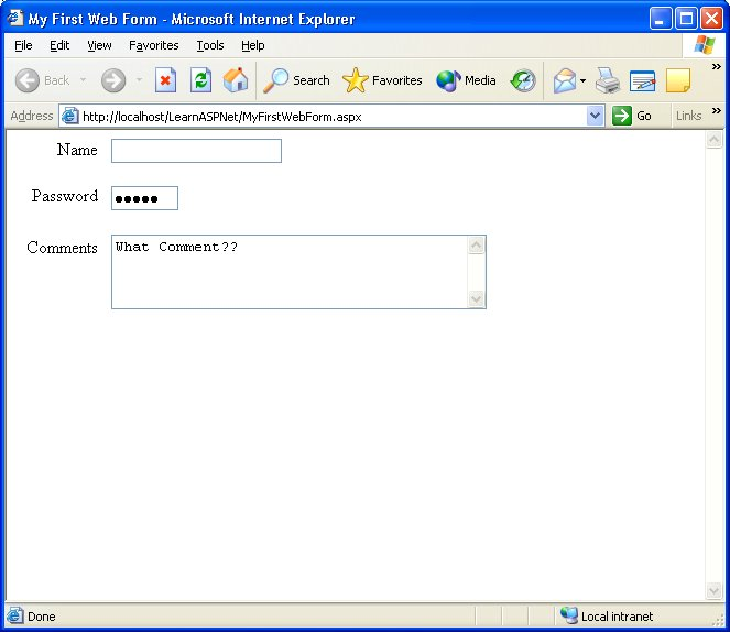
The TextBox control can render any one of three HTML fields: a standard HTML text input field, an HTML text area, or an HTML password input field. The TextMode property determines how the text box will look and behave. Table 7 lists the TextMode property options. Figure 8 shows the three different user interface elements you can create using the TextBox control.
As with all Web controls, you can assign TextBox control properties declaratively via the Properties window or in the HTML code of the page. Figure 9 shows the property settings for the txtName text box. Here is how the txtName text box looks in the HTML of the form:
<asp:textbox id="txtName" runat="server"
   MaxLength="20" Columns="20">
</asp:textbox>
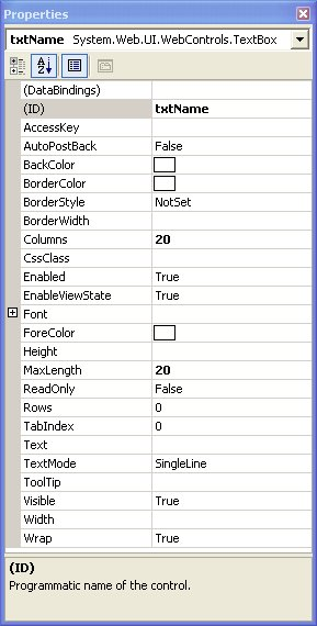
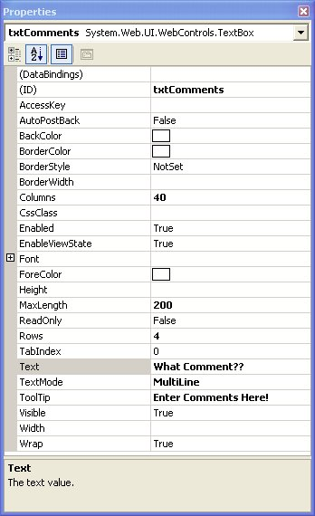
Figure 10 displays the properties for the txtComments text box. Here is how the txtComments control looks in the HTML of the form:
<asp:textbox id="txtComments"
   runat="server" MaxLength="200"
   TextMode="MultiLine"
   Columns="40" Rows="4"
   ToolTip="Enter Comments Here!">
     What Comment??
</asp:textbox>
Optionally, you can also assign default text to the Text property:
<asp:textbox id="txtComments"
   runat="server" MaxLength="200"
   TextMode="MultiLine"
   Columns="40" Rows="4"
   Text="What Comment??"
   ToolTip="Enter Comments Here!">
</asp:textbox>
Button <asp:Button> and ImageButton Controls <asp:ImageButton>
When clicked, both Button and ImageButton controls submit the form that contains them to the Web server. What's the difference between these two types of button controls?
The Button control renders the same HTML as the <input type="Submit"> tag and displays on a page as a gray button. Table 8 lists Button control properties, methods, and events.
Clicking a button submits the form containing the button to the Web server and raises both the Click and Command events. The only difference between these events is that the Command event is passed two additional properties: CommandName and CommandArgument.
To handle the Click event of a button you could code a subroutine like the following:
Private Sub cmdSubmit_Click( _
   ByVal sender As System.Object, _
   ByVal e As System.EventArgs) _
   Handles cmdSubmit.Click
      Me.cmdSubmit.Text = "Now you don't!"
End Sub
The following code displays a text box, txtDisplay, and three buttons, cmdMultiple, cmdAdd, and cmdSubtract. Notice that each of the buttons has values specified for the CommandName and CommandArgument properties:
<asp:TextBox id="txtDisplay"
   runat="server" Text = 0
</asp:TextBox>
<asp:Button id="cmdMultiply"
   runat="server" Text="Multiply"
   CommandName="Multiply"
   CommandArgument="1.5">
</asp:Button>
<asp:Button id="cmdAdd"
   runat="server" Text="Add"
   CommandName="Add"
   CommandArgument="25">
</asp:Button>
<asp:Button id="cmdSubtract"
   runat="server" Text="Subtract"
   CommandName="Subtract"
   CommandArgument="3">
</asp:Button>
The following code handles the Command event raised by clicking the cmdAdd, cmdSubtract, or cmdMultiply command buttons:
Private Sub PerformCalculation( _
   ByVal sender As Object, _
   ByVal e As _
   <a href="http://System.Web.UI">System.Web.UI</a>.WebControls.CommandEventArgs) _
   Handles cmdAdd.Command, _
      cmdSubtract.Command, _
      cmdMultiply.Command

   Dim intNumber As Integer = _
      e.CommandArgument
   If e.CommandName = "Add" Then
      Me.txtDisplay.Text += intNumber
   ElseIf e.CommandName = "Subtract" Then
      Me.txtDisplay.Text -= intNumber
   ElseIf e.CommandName = "Multiply" Then
      Me.txtDisplay.Text *= intNumber
   End If
End Sub
Passing the “e” parameter in as the type CommandEventArgs makes the CommandName and CommandArgument properties for the clicked button available to the subroutine. The PerformCalculation example demonstrates how easy it is to build a single routine to handle events for related controls.
The ImageButton control is very similar to the Button control. The main difference between the controls is that you can use the ImageButton control to display an image instead of a plain button. Table 9 lists ImageButton control properties, methods, and events.
The following HTML code segment creates an ImageButton named ibtnCool that displays the button.gif image:
<asp:ImageButton id="ibtnCool"
   runat="server" ImageUrl="button.gif"
   AlternateText="Cool Blue Button"
   ToolTip="Click here for a surprise!">
</asp:ImageButton>
What are some uses for an ImageButton control? One thing you can use an ImageButton control for is to make a toolbar. You can use a single image for a toolbar containing all the button images you need. In the Click event you can check the value of the X coordinate of the control to determine which button was pressed.
 Private Sub ibtnCool_Click( _
   ByVal sender As Object, _
   ByVal e As ImageClickEventArgs) _
   Handles ibtnCool.Click

   Select Case e.X
      Case Is < 40
         'Corresponds to the position
         'of the Add button
      Case Is < 150
         'Corresponds to the position
         'of the Save button
      Case Is < 300
         'Corresponds to the position
         'of the Delete button
   End Select
In this article I'm just covering a few of the available Web controls. Additional Web controls you can use include Checkbox, CheckboxList, DataGrid, DataList, DropDownList, HyperLink, ListBox, Panel, PlaceHolder, RadioButton, and RadioButtonList.
Form Field Validation
While it's not one of the most glamorous programming tasks, validating user entries certainly is one of the most important. Unfortunately, it can also be quite time consuming. Microsoft recognized this and created an entire series of Web controls dedicated to making validation quicker and easier.
The Validation Server controls provide a number of validation capabilities. These capabilities include checking for required entries, ensuring entries match a specified input expression (a telephone number for example), ensuring an entry is within a specified range of values, and ensuring an entry is valid compared to a constant, another control's value, or a database value. Table 10 lists type of validation controls.
A validation control acts as a virtual big brother for another server control. Each validation control has a specific job to do for the control it's assigned to watch over. You can assign multiple validation controls to watch a single data entry control. For example, you can assign both a RequiredFieldValidator and a RegularExpressionValidator to watch over the same telephone number TextBox control.
There are three properties that are common to all validation controls: ControlToValidate, ErrorMessage, and Display. The ControlToValidate property specifies which control to watch over. The ErrorMessage property specifies the text to display if the validation fails. The Display property determines where to display the error message.
A validation control is invisible to the user unless it is displaying its error message text. The three settings for the Display property?Static, Dynamic, and None?specify how and where to display the error message text. The default value, Static, causes the validation control to take up space even when the error message text is not displayed. This allows you to define a fixed layout for a page. Using the Dynamic setting, validation controls do not take up any space until the error message is displayed. This causes the layout of the page to change when the controls display their message text. The last value, None, is used in conjunction with the ValidationSummary control and suppresses the display of the error message in the validation control. You'll learn more about this setting when we cover the ValidationSummary control.
The Page.Validate method causes the validation controls to work their magic. You can call this method in one of two ways. You can manually call the method or you can set a button's CausesValidation property to True. If the validation fails, your application will display the text specified in the ErrorMessage for the validation controls that failed. With either method, checking the Page.IsValid property in the submitting button tells you if the entries passed the rules set by their validation controls.
The following code shows a button that has its CauseValidation set to True:
Private Sub btnExample_Click( _
   ByVal sender As System.Object, _
   ByVal e As System.EventArgs) _
   Handles btnExample.Click

   'Page.Validate() ? Call if
   ' CausesValidation property is set to False
   If Page.IsValid Then
      'Code here if validation passes
   End If
End Sub
Checking the Page.IsValid property allows you to determine if the page validation succeeded or failed. If all entries are valid, the Page.IsValid returns True, otherwise it returns False.
Now we'll take a look at how to use each of the validation controls.
RequiredFieldValidator
You can use the RequiredFieldValidator control to guarantee that a user doesn't leave an empty control. As with all of the validation controls, you must specify which control the RequiredFieldValidator watches over.
The following HTML code shows a text box named txtPhone with reqPhone, a RequiredFieldValidator control watching over it:
<asp:TextBox id="txtPhone" runat="server">
</asp:TextBox>
<asp:RequiredFieldValidator
   id="reqPhone" runat="server"
   ErrorMessage="You must enter a phone number!"
   ControlToValidate="txtPhone">
</asp:RequiredFieldValidator>
Figure 11 shows the same RequiredFieldValidator control set up in the Property window.
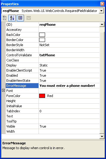
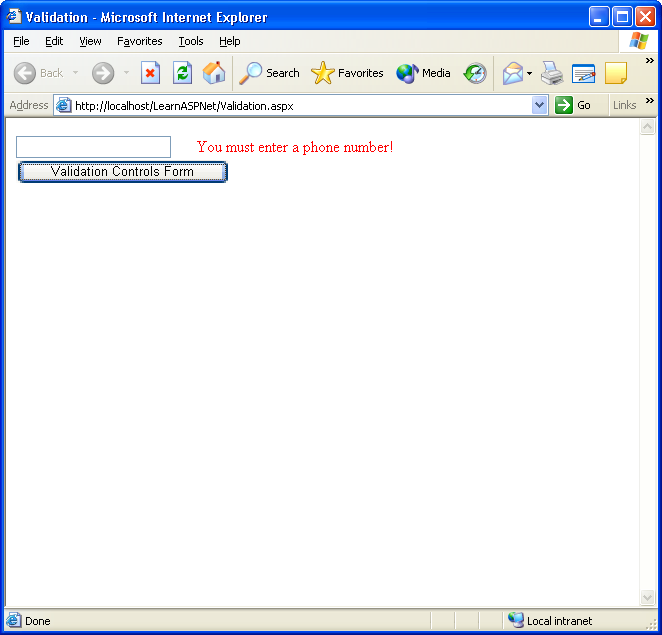
Figure 12 shows that when a user clicks the Validation Controls Form button without entering anything in the txtPhone text box, the RequiredFieldValidator control's error message text displays.
Since a control can have more than one validation control watching over it, we will next look at a control you can use to ensure the user enters data in the correct format.
RegularExpressionValidator
You can use the RegularExpressionValidator control to verify that the entry in a control conforms to a specified Regular Expression. This allows you to check an entry against a pattern such as a U.S. Social Security number, telephone number, email address, etc.
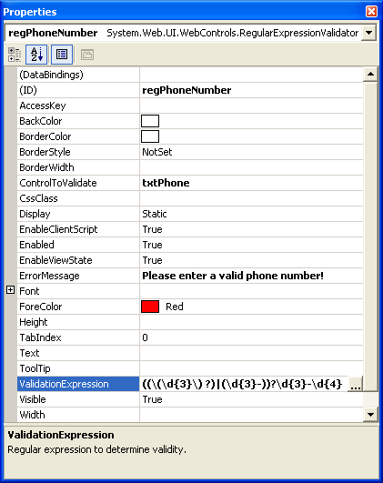
The following HTML code adds a RegularExpressionValidator named regPhoneNumber to watch over the txtPhone text box, which is also watched over by reqPhone, the RequiredFieldValidator:
<asp:RegularExpressionValidator
   id="regPhoneNumber" runat="server"
   ErrorMessage="Please enter a phone number!"
   ControlToValidate="txtPhone"
   ValidationExpression=
      "((\(\d{3}\) ?)|(\d{3}-))?\d{3}-\d{4}">
</asp:RegularExpressionValidator></P>
Figure 13 shows the Property window for the regPhoneNumber RegularExpressionValidator control.
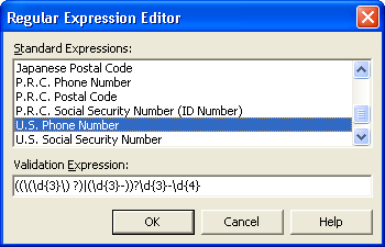
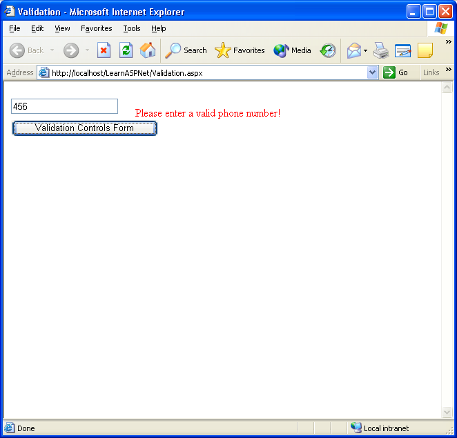
I know you're wondering how I came up with that ValidationExpression. Did it take me hours to figure out the exact expression for a U.S. phone number? No. I used the Regular Expression Editor (see Figure 14). The Regular Expression Editor has a number of pre-built Regular Expressions available for you to select from including email addresses, Internet URLs, U.S. Social Security number, U.S. Zip code, and international phone and postal code formats. You can develop you own custom expressions as well. When a user enters an incorrectly formatted telephone number, the RegularExpressionValidator control displays an error message (see Figure 15).
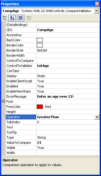
CompareValidator
The CompareValidator control compares the value in a control against a constant value or against the value contained in another control.
The properties you need to pay attention to with this control are: ControlToCompare, ValueToCompare, and Operator. The ControlToCompare property contains the name of the control against which to compare the watched control. The ValueToCompare property contains a fixed value to compare against. The Operator property determines the type of comparison to perform (equal to, less than, greater than, etc.).
Here you can see the HTML code for a CompareOperator watching over a text box named txtAge:
<asp:TextBox id="txtAge" runat="server">
</asp:TextBox>
<asp:CompareValidator
   id="compAge" runat="server"
   ErrorMessage="Enter an age over 21!"
   ControlToValidate="txtAge"
   ValueToCompare="21"
   Operator="GreaterThan">
</asp:CompareValidator>
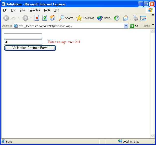
Figure 16 shows the Property window for the compAge CompareValidator control. If the value entered in the txtAge control is not greater than 21, the compAge control displays an error message (see Figure 17).
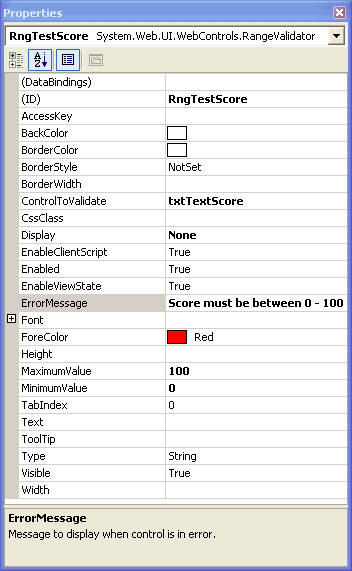
RangeValidator
The RangeValidator control ensures that the entry in a watched control is within a range of values. You can choose to validate ranges within a pair of numbers, alphabetic characters, or dates. The properties you need to pay attention to for this control are the MinimumValue and MaximumValue properties.
The following HTML code is for a RangeValidator control watching over a text box named txtTestScore.
<asp:RangeValidator
   id="rngTestScore" runat="server"
   ControlToValidate="txtTestScore"
   ErrorMessage="Score must be between 0 - 100"
   MaximumValue="100" MinimumValue="0">
</asp:RangeValidator>
Figure 18 shows the Property window for the rngTestScore RangeValidator control.
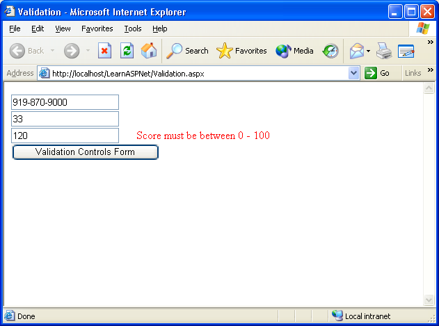
If the value entered in the txtTestScore control is not between 0 and 100 then the rngTestScore validation control displays an error message (see Figure 19).
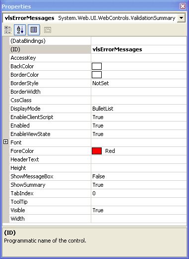
ValidationSummary
The ValidationSummary control does not provide any data validation capabilities. Instead, it automatically acts as a display container for validation error messages. If you have ever submitted information to a Web page only to get a list of validation errors at the top of the page, then you have seen what the ValidationSummary control does.
You need to pay attention to the ShowMessageBox and ShowSummary properties for the ValidationSummary control. The ShowMessageBox property, when set to true, displays the error text in a popup message box. The ShowSummary property, when set to true, displays the error text on the Web page itself. Typically you will only want one of these properties set to True.
When page validation fails, does it make sense to display the error text for each validation control next to the control it watches over as well as display the error message in the ValidationSummary control? I didn't think so. To keep this from happening, set the Display property for the validation controls to None.
Here is HTML code to add a Validation control named vlsErrorMessages to the page you've been working on:
<asp:ValidationSummary
   id="vlsErrorMessages" runat="server">
</asp:ValidationSummary>
Figure 20 shows the Property window for the vlsErrorMessages ValidationSummary control.
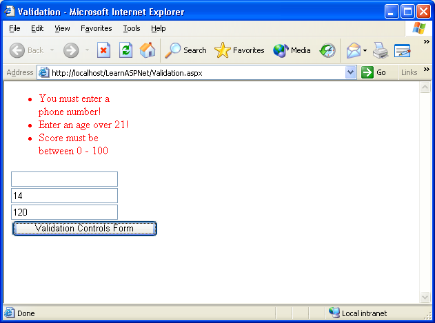
If the Display property for all the validation controls is set to None and you intentionally enter invalid data for each text box, the error messages appear in the vlsErrorMessages ValidationSummary control located at the top of the page (see Figure 21).
User Controls
User controls, a wonderful feature in ASP.NET, let you bundle multiple UI elements into a single control and place it on a Web Form. If you are familiar with server-side include files, you already have an idea of what I'm talking about. Typical uses of a user control might include a page header or page footer used on multiple pages.
Working with Style Sheets
You can use style sheets to apply formatting characteristics to your Web page content. Style sheets let you make site-wide formatting changes quickly and easily. The concept is simple; you create a file named styles.css, for example, which contains HTML formatting tags and specifies how you want to display your Web page content. For example, suppose you want to make all H3 commands Arial font. Or, suppose you want to make all paragraph commands indent a half-inch. You can even specify the distance you want between lines. You get the idea.
When you create a new ASP Web Project, ASP.NET automatically creates a Styles.css to use in the project. You can use this style sheet, copy an existing Styles.css file over the one automatically created, or you can use a style sheet of a different name altogether. If you decide to go with a style sheet with a name other than Styles.css, you need to add it to the project by right-clicking the project, selecting Add, and then selecting Add Existing Item.
This example shows a new characteristic named mainheading that I added to the styles.css stylesheet:
.mainheading
{
    font-family: Verdana, Helvetica, sans-serif;
    font-size: 14pt;
    font-weight: bold
}
In order for a page to adhere to the formatting options in a style sheet, you need to reference the style sheet in the page containing the controls that you want to format. You can do this by dragging and dropping the style sheet from the project onto the page, or by adding the following LINK code to the <HEAD> section of the HTML page:
<LINK href=“Styles.css” type=“text/css”
rel="stylesheet">
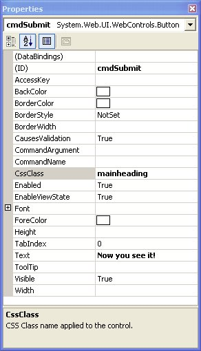
Once you've linked your style sheet to the page you can begin applying the formatting styles to controls on the page by setting the CssClass property (see Figure 22).
Conclusion
This article just scratched the surface of designing and building Web pages with ASP.NET. The goal of this article was to give you enough fundamental knowledge about building Websites with ASP.NET to get you started. Now that you have a basic understanding of ASP.NET, you'll be able to research additional topics including maintaining state, session and application variables, creating custom controls, site deployment, security, and more.
Table 1: Partial list of standard namespaces.
| Namespace | Description |
|---|---|
| System | The root namespace for the entire .NET Framework. Contains the base types and other useful classes. |
| System.Collections | Contains classes for working with the standard collection types. |
| System.Configuration | Contains classes for working with Web configuration files (web.config). |
| System.Data | Contains classes for interaction with data sources (ADO.NET). |
| System.DirectoryServices | Contains classes for accessing Active Directory Services. |
| System.IO | Contains classes for reading and writing files. |
| System.Text | Contains classes for working with strings. |
| System.Xml | Contains classes that process XML data. |
Table 2: Common ASP.NET file extensions.
| Extension | Description |
|---|---|
| .aspx | ASP.NET page file |
| .ascx | ASP.NET User Control file |
| .asmx | Web Service file |
| .aspx.vb | Visual Basic .NET code file for an ASP.NET page |
| .aspx.cs | C# code file for an ASP.NET page |
| .sln | Visual Studio .NET Solution file |
Table 3: Page events.
| Event | Description |
|---|---|
| Init | Occurs when the page is initialized. |
| Load | Occurs when the page is loaded on the server. |
| UnLoad | Occurs when the page is removed from memory. |
Table 4: Common control properties, methods, and events.
| Property | Description |
|---|---|
| AutoPostBack | Specifies if the form posts automatically whenever a change is made to the contents of the control. Applies to controls that allow user interaction, such as the TextBox control. |
| ID | Uniquely identifies or names the control. |
| Enabled | Determines if control is enabled. |
| Font | Determines the typeface of the control. |
| Visible | Specifies if the control is visible. |
| ReadOnly | Specifies if the data within a control can be updated. |
| Methods | Description |
| OnTextChanged | Raises the TextChanged event. |
| Events | Description |
| TextChanged | Raised when the contents of a text box have been changed. |
Table 5: Label control properties.
| Property | Description |
|---|---|
| Text | Specifies the text displayed by the label. You can assign any text or HTML content to the Text property. |
Table 6: TextBox control properties, methods, and events.
| Property | Description |
|---|---|
| AutoPostBack | Specifies if the form posts automatically whenever a change is made to the contents of the text box. |
| Columns | Specifies, in characters, the width of the text box. |
| MaxLength | Specifies the maximum number of characters that can be entered into a text box; does not apply to multi-line text boxes. |
| ReadOnly | Determines if the contents of the control can be modified. |
| Rows | Specifies, in characters, the vertical size of a multi-line text box. |
| Text | The actual contents of the control. |
| TextMode | Specifies if the text box is a SingleLine, MultiLine, or Password text box. |
| Wrap | Determines how text in a multi-line text box wraps. Word wrap is enabled if set to True. |
| Methods | Description |
| OnTextChanged | Raises the TextChanged event. |
| Events | Description |
| TextChanged | Raised when the contents of a text box have been changed. |
Table 7: TextMode property options.
| Setting | Description |
|---|---|
| SingleLine | Specifies a normal single-line text box is displayed. SingleLine is the default setting. |
| MultiLine | Specifies an HTML text area is to be displayed. |
| Password | Specifies that an HTML password input field is displayed and the contents are obscured. |
Table 8: Button control properties, methods, and events.
| Property | Description |
|---|---|
| CommandName | Passes this value to the Command event when the button is clicked. |
| CommandArgument | Passes this value to the Command event when the button is clicked. |
| CausesValidation | Specifies if the button causes the form validation controls to validate the entries on the form. |
| Text | Specifies the text displayed on the button. |
| Methods | Description |
| OnClick | Raises the Click event. |
| OnCommand | Raises the Command Event. |
| Events | Description |
| Click | Raised when the button is clicked. The form containing the button is submitted to the Web server. |
| Command | Raised when the button is clicked. The values in the CommandName and CommandArgument properties are passed. |
Table 9: ImageButton control properties, methods, and events.
| Property | Description |
|---|---|
| AlternateText | Text displayed when the browser does not support images. |
| CommandName | Passes this value to the Command event when the button is clicked. |
| CommandArgument | Passes this value to the Command event when the button is clicked. |
| CausesValidation | Specifies if the button causes the form validation controls to validate the entries on the form. |
| ImageAlign | Specifies the positioning of the image. Options include AbsBottom, AbsMiddle, Baseline, Bottom, Left, Middle, NotSet, Right, TextTop, and Top. |
| ImageURL | Specifies the URL of the image to display for the button. |
| Methods | Description |
| OnClick | Raises the Click event. |
| OnCommand | Raises the Command Event. |
| Events | Description |
| Click | Raised when the button is clicked. The form containing the button is submitted to the Web server. |
| Command | Raised when the button is clicked. The values in the CommandName and CommandArgument properties are passed. |
Table 10: Validation control types.
| Control | Description |
|---|---|
| RequiredFieldValidator | Used to make sure a control is not left blank. |
| CompareValidator | Used to compare a user entry to a constant value, another control's property, or a value retrieved from a database. |
| RangeValidator | Used to make sure a user entry is within a specified upper and lower boundary. |
| RegularExpressionValidator | Used to make sure an entry matches a pattern defined by an expression. |
| ValidationSummary | Used to display any error messages generated by the validation controls on a page. |