


Data-bound controls play a key role in the development of ASP.NET applications.
Data-driven controls allow you to associate their whole interface, or individual properties, with one or more columns of a .NET-compliant data source. In this article, I'll delve into the depths of an extremely versatile data-bound control that is a fixed presence in any real-world ASP.NET application?the DataGrid control. I'll focus on the key programming aspects of the control, including data binding, column mapping, paging, and sorting.
The DataGrid server control renders a multi-column, fully templated, data-bound grid and provides a highly customizable, Excel-like user interface. Bound to a DataGrid, the data source renders through an HTML table interspersed with HTML elements and hyperlinks. You can customize the contents of the cells in each column to some extent using system-provided, as well as, user-defined templates. The DataGrid supports various types of data-bound columns, including text, templated, and command columns. The data binding mechanism is nearly identical to that of other ASP.NET controls. You bind the data source using the DataSource property, but no data will actually load until you call the DataBind method.
You can set most of the DataGrid features declaratively in the page layout; the same set of attributes, though, are also available programmatically through the properties and methods of the DataGrid class.
Simple Data Binding
The following line of code is enough to enable grid functionality in a Web page. It declares a server-side instance of the DataGrid control and assigns it the name of grid. All of the code associated with the page, refers to the DataGrid using the specified ID. The ASP.NET runtime takes care of creating and initializing such an instance for each request.
<asp:DataGrid runat="server" id="grid" />
Once you've placed the control onto the page, you bind it to the data source and display the resulting HTML code. The following code binds a DataTable to the grid.
void Page_Load(object sender, EventArgs e)
{
   // Run the query and get
// some data to display
   DataTable data = ExecuteQuery(cmdText,
      connString);

   // Bind the data to the grid
   grid.DataSource = data;
   grid.DataBind();
}
DataTable ExecuteQuery(string cmdText,
   string connString)
{
   SqlDataAdapter adapter;
   adapter = new SqlDataAdapter(cmdText,
      connString);
   DataTable data = new DataTable();
   adapter.Fill(data);
   return data;
}
Although effective in terms of retrieval and display, you probably would not use this code in real applications because as Figure 1 shows, the resulting DataGrid control doesn't implement necessary features and the interface is too plain.
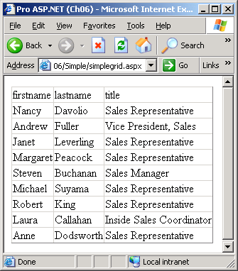
Consider the user interface. You want to create a pleasing and graceful combination of colors, styles, and fonts to make the application as seamless as possible to the end user. Furthermore, this application runs the query whenever a user invokes the page. Getting data over and over again from the database is a necessity when the data changes frequently, but is relevantly ineffective in other, more common, situations. In this case, server-side caching techniques can make the difference. In Figure 1, I've mapped all the columns in the result set to the grid with the same settings. A real-world grid, would instead bind each column independently using different settings and an individual user interface pattern. Finally, I've included all the rows in the result set in the view, regardless of the total number. In a more realistic scenario you might choose to retrieve or display only a relatively small number of rows. You want to devise an effective support for data paging in real-world grids. Let's see how to enhance a basic grid to implement all these features.
The Programming Interface
The DataGrid control has no method specific of the class. It inherits all the methods it provides (for example, DataBind) from the various base classes. The DataGrid inherits from the BaseDataList class and implements the INamingContainer interface. The BaseDataList abstract class inherits from WebControl and provides a common set of functionality for all data listing controls, including the DataList and the DataGrid. The INamingContainer interface is a marker interface that doesn't require the implementation of any methods but only indicates that the class has some features. In particular, the interface marks the class as a naming container. A naming container is a class that provides an ID namespace for their child controls. Controls that act as naming containers guarantee that the ID attributes of their child controls are unique within the entire application?a key point for all controls that contain a subtree of controls.
Table 1 details the list of properties supported by the DataGrid control, but doesn't include the properties inherited by the BaseDataList and WebControl classes.
Many of the properties allow you to improve the grid's look and feel. When setting attributes, you can either set the property individually at the <asp:datagrid> level, or group related properties together on a per-item basis. For example, if you want to set the background color of the column headers to a particular color, you can do that through the headerstyle-backcolor attribute at the root level, as shown in the following code.
<asp:DataGrid runat="server" id="grid"
  headerstyle-backcolor="brown">
However, you can also define the <HeaderStyle> child node within the <asp:DataGrid> declaration and set its BackColor attribute.
<asp:DataGrid runat="server" id="grid" ...>
<HeaderStyle BackColor="brown">
:
</asp:DataGrid>
The effect is the same, but the second option looks more elegant and is easier to maintain. Visual Studio .NET generates this type of code when you drop a DataGrid control on a Web form. The following schema illustrates the overall ASP.NET layout of the control.
<asp:DataGrid runat="server" ... >
   <AlternatingItemStyle ... />
   <EditItemStyle ... />
   <FooterStyle ... />
   <HeaderStyle ... />
   <ItemStyle ... />
   <PagerStyle ... />
   <SelectedItemStyle ... />
   <Columns>
:
   </Columns>
</asp:DataGrid>
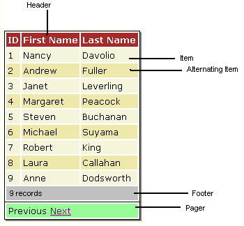
The output of a DataGrid control consists of several constituent elements grouped in the ListItemType enumeration. (See Table 2 for more information.) Each element plays a clear role and has a precise location in the control's user interface as Figure 2 shows.
All constituent elements are table rows and inherit from the DataGridItem class. Each time your application creates one of the constituent elements, the grid fires an ItemCreated event. This event allows you to perform some application-specific tasks. ItemCreated fires immediately after the DataGridItem object is created and before being added to the resulting HTML table. The following delegate illustrates the prototype of the event handlers.
public delegate void DataGridItemEventHandler(
   object sender,
   DataGridItemEventArgs e);
The event handler receives an argument of type DataGridItemEventArgs that contains data related to the involved item. The DataGridItemEventArgs class features an extra Item property initialized with the freshly created DataGridItem object. When you raise the ItemCreated event, you haven't yet set the binding between the underlying data row and the grid's row. The data binding takes place only when the ItemDataBound event reaches the application. The initialization step occurs in the following order.
- You create and initialize a new grid item object. At this point, it is a standalone object not yet bound to the grid or to the data.
- The ItemCreated event fires to let applications know that a new item has been created. The event data includes information about the new item. Once the event handler terminates, the item is added to the HTML table being generated.
- If the DataGrid item supports data binding, the underlying row is associated with the table row. The DataItem property on the new grid item object is set correctly.
- The ItemDataBound event fires and applications can read the actual values bound to normal and alternating rows.
Notice that if you define a handler for the ItemDataBound event, it will also be called for the creation of nonbindable items, such as the header or footer. In this case, the DataItem property on the DataGridItem object is null, as expected.
Binding Data to the Grid
A DataGrid control is composed of a number of data-bindable columns. By default, the control includes all the data source columns in the view. You can change this behavior by setting the AutoGenerateColumns property to false. In this case, the grid displays only the columns explicitly listed in the Columns collection. The DataGrid control supports a variety of column types, which mostly differ from one another in how each represents the data. You must indicate the type of column if you add it to the Columns collection; otherwise, automatic generation will create only columns of the simplest type?the BoundColumn column type. Table 3 lists all of the column types available.
You normally bind columns using the <columns> tag in the body of the <asp:datagrid> server control, as the following code demonstrates.
<asp:datagrid runat="server" id="grid" ... >
  :
  <columns>
    <asp:boundcolumn runat="server"
      DataField="quantityperunit"
      HeaderText="Packaging" />
    <asp:boundcolumn runat="server"
      DataField="unitprice"
      HeaderText="Price"
      DataFormatString="{0:c}">
      <itemstyle width="80px"
        horizontalalign="right" />
    </asp:boundcolumn>
  /columns>
</asp:datagrid>
Alternatively, you can create a new column of the desired class, fill its member properly, and then add the class instance to the Columns collection. Here is the code to add a BoundColumn object to a grid.
BoundColumn bc = new BoundColumn();
bc.DataField = "firstname";
bc.HeaderText = "First Name";
grid.Columns.Add(bc);
The order of the columns in the collection determines the order of the columns in the DataGrid control. A BoundColumn object key properties include a DataField, which represents the name of the column to bind, and a DataFormatString, which allows you to format the displayed text. The previous code snippet adds two columns and specifies the header text and the source column for each. In addition, the second column is right aligned and given a format string to make it look like a currency value. The text of a bound column is always rendered using literal text.
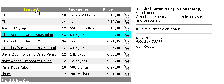
The HyperLinkColumn class is a column type that contains a hyperlink for each cell. The programmer controls the text of the hyperlink (property DataTextField) and the URL (property DataNavigateUrlField). You can bind both fields to a column in the data source.
<asp:hyperlinkcolumn runat="server"
  DataTextField="productname"
  HeaderText="Product"
  DataNavigateUrlField="productid"
  DataNavigateUrlFormatString=
    "moreinfo.aspx?id={0}"
  Target="ProductView">
  <itemstyle width="200px" />
</asp:hyperlinkcolumn>
When you click the cell of a hyperlink column, the browser jumps to the specified URL and displays the linked contents in the window specified by the Target property. Feasible values for the Target property include a few special names like _self, _blank, _top, plus any name that individuates a frame window. If you have not set a target then the current page will refresh.
You can set most of the DataGrid features declaratively in the page layout.
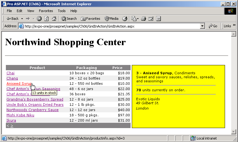
In Figure 3, the yellow box to the right of the grid is an inline frame with a modified border. The frame refreshes whenever the user clicks a column hyperlink. You can use column names to format the URL. In the DataNavigateUrlFormatString property you define the URL with a one column placeholder identified by the {0} expression. The macro will expand at runtime using the value read from the column specified by the DataNavigateUrlField property.
The ButtonColumn class represents a command column and contains a user-defined button for each cell in the column. Functionally similar to hyperlink columns, button columns generate a postback event on the same URL. To handle the Click event on a button you write the ItemCommand event handler and check the CommandName property of the clicked button. Although you can bind the caption of each button to a data source column, more often than not a button column has a static text displayed through all the cells. The static text can be any HTML expression, including an expression that defines a small image, as shown in the following code snippet.
<asp:buttoncolumn runat="server" headertext=""
  buttontype="linkbutton"
  commandname="AddToCart"
  Text
    ="<img title='Add to cart' src='cart.gif' />">
  <itemstyle width="30px"
    horizontalalign="right" />
</asp:buttoncolumn>
When the user clicks a button, the page posts back and raises the ItemCommand event. The following code illustrates the typical structure of the handler.
void ItemCommand(object s,
  DataGridCommandEventArgs e)
{
   switch(e.CommandName)
   {
      case "AddToCart":
         AddToCart(e.Item.ItemIndex);
         break;
      :
   }
}
The CommandName property of the event data class contains the value of the commandname attribute of the column. In the previous code, you pass the ordinal position of a clicked item to the AddToCart method. In other cases, you might want to use that information to retrieve the key associated with a clicked row. You can do that pretty easily using the DataKeys collection of the DataGrid, which contains the values of the data source key column for the displayed items. You use the DataKeyField property to specify the data source key column.
The select column is a very special type of button column. It is a normal ButtonColumn with a command name of select. When you click on such a column, the DataGrid automatically redraws the selected row using a different class of settings?those defined under the <selecteditemstyle> node. You don't need to write an ItemCommand handler for this; the described behavior is built in. Of course, you'll write a handler if you need to accomplish more tasks when the user click the row.
<asp:ButtonColumn runat="server" text="Select"
  CommandName="Select" />
You set the style of the selected row?at most one at a time?using the SelectedItemStyle property. It can be as easy as using the following code:
<selecteditemstyle backcolor="cyan" />
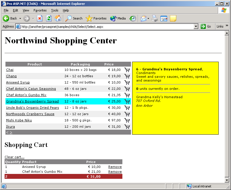
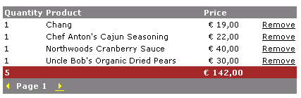
The SelectedIndexChanged event (which follows the ItemCommand event) signals that the selection has changed. Note that the value of the DataGrid's SelectedIndex property?the property that indicates the currently selected item?has not been changed when ItemCommand arrives. The application sets the SelectedIndex property only when SelectedIndexChanged reaches the application. You can programmatically set the selected item by setting the SelectedIndex property to the appropriate 0-based index. Note, though, that if you select a new item through code, then the SelectedIndexChanged code does not automatically execute. As long as that code is important, you should add an explicit call in the code. Figure 4 shows a shopping cart application using button columns to select rows and add items to the in-memory cart.
Paging the Grid's Contents
In real-world scenarios, the size of the data source easily exceeds the real estate of the page. Many applications use data paging to gain scalability and present a more helpful page to the user. Especially on the Web, displaying only a few rows at a time is a more effective approach than downloading hundreds of records that stay hidden most of the time. The DataGrid control provides some built-in facilities that let the programmer easily switch to a new page according to the user's clicks. The control needs to know how many items to display per page, what type of functionality you require for the pager, and the data source to page through. In return, the control tracks the current page index, extracts the rows that fit into the particular page, and refreshes the user interface. Whenever the page index changes, the control files the PageIndexChanged event to the application.
The DataGrid supports two types of paging?built-in paging and custom paging. Built-in paging assumes that all the records that you scroll through are memory resident. The DataGrid is bound to the source all the time and automatically extracts and displays only the rows that fit on a particular page. Notice that the page's view state does not save the data source; henceforth you must rebind the data source at each postback.
Just because the data source gets lost at each response, caching is vital for effective paging. You download all the data the first time your user access the page, store the data set into the application's Cache object or session memory, and rebind that data to the control until the application or session is over.
In real-world applications, data caching is a double-edged sword. On one hand, it significantly speeds up data retrieval; on the other hand it taxes the Web server's memory and potentially affects the overall scalability of the application. You also need to carefully consider the scope of the data?If all sessions share the data and that data doesn't get stale often, then you can store it once in a global object. If you need to store a distinct copy of the data for each session, then the default built-in paging is probably not the smartest approach you can take. It requires a lot of memory and, even worse, pushes an application architecture that doesn't scale well.
Custom paging is designed to work around the data cashing risks. When you enable custom paging, the DataGrid assumes that you want to display all the records in the data source on the page. In this case, the DataGrid doesn't even attempt to extract a page from the bound data. The application is therefore responsible for ensuring that, at any time, the data source contains only the records for the current page. With custom paging your application downloads a small subset of data from the database at each request. If you opt for built-in paging, the following code snippet summarizes the layout of the page data access layer.
void Page_Load(object sender, EventArgs e) {
   if (!IsPostBack)
   {
      LoadDataFromDatabase();
      BindData();
      :
   }
   :
}
void LoadDataFromDatabase() {
   DataTable data = ExecuteQuery(cmdText,
connString);
   Cache["AppData"] = data;
}
void BindData() {
DataTable data = (DataTable)
Cache["AppData"];
   :
   grid.DataSource = data;
   grid.DataBind();
}
The data loads only once and it gets cached in memory. Whenever the page posts back, the application retrieves data from the cache and binds it to the DataGrid control.
To enable paging in a DataGrid control you must set the AllowPaging property to true. When you turn the property on, the control user interface automatically acquires an extra component?the grid pager. The pager is a built-in toolbar with links to move from one page to the next or to previous pages. You normally configure the pager declaratively by specifying the working mode and a few visual settings. The PageSize property lets you control the maximum number of rows that each page should contain. By default, this value is set to 10.
After you turn the pager on, you're only half way there. The pager is displayed and updated, but is not functional until you write and register a handler for the DataGrid's PageIndexChanged event.
<asp:datagrid runat="server" id="grid"
      :
   allowpaging="true"
   onpageindexchanged="PageIndexChanged">
The delegate for the PageIndexChanged event is shown below. It passes down to the handler a data structure of type DataGridPageChangedEventArgs.
public delegate void
   DataGridPageChangedEventHandler(
   object source,
   DataGridPageChangedEventArgs e);
The class inherits from EventArgs and features two extra properties?CommandSource and NewPageIndex. The former represents the source of the event. Since the event only fires when a user clicks a button in the pager, the event source is nothing more than the pager itself?that is, a DataGridItem object. The NewPageIndex property contains the updated index of the page. The DataGrid's internal engine calculates the correct index of the new page based on the button that the user actually clicked. The following code shows the typical (and minimal) page changed handler for a DataGrid control. It sets the grid's CurrentPageIndex property with the new page index and rebinds to the data.
void PageIndexChanged(object sender,
DataGridPageChangedEventArgs e)
{
   grid.CurrentPageIndex = e.NewPageIndex;
   BindData();
}
When the DataGrid's DataBind method executes, the control extracts the subset of rows from the data source that fits onto the current page. The rest of the code in the DataBind method loads those records into the Items collection and uses the records in the collection to generate the HTML output for the control.
The pager component is a table row made of a single cell that spans the whole width of the grid. The DataGrid provides some built-in properties to let you customize the pager bar both declaratively and programmatically. In particular, you can choose between two display modes?numeric pages and next-prev mode.
By default, the pager is made of two link buttons pointing to the previous and the next page respectively. The default text associated with these links is < for the previous button and > for the next button. You can change the text for each link using the PrevPageText and NextPageText properties. The following code demonstrates how to configure the pager using the <pagerstyle> element.
<pagerstyle backcolor="gray" forecolor="white"
  font-name="webdings"
  font-size="12pt" prevpagetext="3"
  nextpagetext="4"
/>
The font of the pager is set to Webdings. According to this font, the strings 3 and 4 are equivalent to the characters ? and ?.
The DataGrid supports various types of data-bound columns, including text, templated, and command columns.
The display mode of the pager is controlled by the Mode property whose feasible values are NumericPages and NextPrev. The Mode property takes its values from the PagerMode enumeration. The default setting is NextPrev and results in two buttons, one to move to the previous page and one to jump to the next page. The DataGrid control automatically enables and disables the links according to the index of the current page.
When working in numeric pages mode, the pager displays as many links as there are pages in the data source. The PageCount read-only property provides the total number of available pages. Figure 5 provides a side-by-side view of the two interfaces (NumericPages on the left and NextPrev on the right).
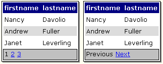
In numeric pages mode, the pager shows the index of the current page as plain, non-clickable text. There's no explicit information about the current page index in the default mode. You add this information manually by using the advanced customization mechanism supplied by the ItemCreated event. The code snippet inserts a new label control with page information between the page links.
if (e.Item.ItemType == ListItemType.Pager)
{
  if (cartGrid.PagerStyle.Mode ==
     PagerMode.NextPrev)
  {
    TableCell pager = e.Item.Cells[0];
    Label ctl = new Label();
    ctl.Font.Name = "verdana";
    ctl.Font.Size = FontUnit.Point(8);
    ctl.Text = String.Format("Page {0}",
        1 + cartGrid.CurrentPageIndex);
    pager.Controls.AddAt(1, ctl);
  }
 }
Figure 6 shows the final result.
The second to last row in Figure 6 is the footer and displays some summary information. You must calculate that information and you must format its display. By default, the footer is rendered through an empty row and maintains the same column structure as the other rows. If this suits you, use the column's FooterText property to assign it HTML content. If you want a footer with a different number of columns, then write a handler for ItemCreated and hook it up the moment in which the footer is created. The following code snippet shows how to make the footer display a single cell that spans over the entire grid width.
void ItemCreated(Object sender,
  DataGridItemEventArgs e)
{
  ListItemType elemType = e.Item.ItemType;
  if (elemType == ListItemType.Footer)
  {
    // Remove all the cells but one
    TableCellCollection tcc =
      e.Item.Cells;
    int nTotalCols = tcc.Count;
    for (int i=0; i<nTotalCols-1; i++)
      e.Item.Cells.RemoveAt(0);

    // Only 1 cell left at this time ...
    TableCell c = e.Item.Cells[0];
    c.ColumnSpan = nTotalCols;

    // Set any text to be displayed
    c.Text = "...";
  }
}
The footer is a DataGridItem object and, as such, a special type of table row. The Cells collection provides access to all the row cells that you can modify at will as a TableCell object. To compute aggregate functions on the data source, you can use the methods of the ADO.NET objects?for example, the DataTable's Compute method.
Sorting the Data
To enable the DataGrid's sorting capabilities, set the AllowSorting property to true. When you enable sorting, the DataGrid renders column header text as links. You can associate each column with a sorting expression using the SortExpression property. A sorting expression is any comma-separated sequence of column names. You can enrich each column name with an order qualifier such as DESC or ASC. DESC indicates a descending order, while ASC (the default) denotes the ascending order. If omitted, the column will sort ascendingly. The following code sets up the DataGrid column for sorting on the productname data source column.
<columns>
   <asp:buttoncolumn runat="server"
      DataTextField="productname"
      HeaderText="Product"
      SortExpression="productname" />
   :
</columns>
As Figure 7 shows, the header of the column is rendered as a link. When you click on the link, the page posts back and runs the code associated with the SortCommand event.
The sort command event handler must accomplish two tasks?sort the source and bind the data back to the grid. The sorting can take place in any way that is suitable to your application. Typically, if you're working with cached data (as I'm doing now) use the sorting capabilities of the ADO.NET objects?in particular, the DataView object. Otherwise, you can run another query against the DBMS and obtain a properly sorted record set.
The following code shows how to handle the SortCommand event and rebind a sorted data source.
void SortCommand(object sender,
  DataGridSortCommandEventArgs e)
{
   ViewState["DataSortExpression"] =
        e.SortExpression;
   BindData();
}
void BindData()
{
   DataTable data = (DataTable)
        Cache["AppData"];
   DataView dv = data.DefaultView;
   dv.Sort = (string)
        ViewState["DataSortExpression"];
   grid.DataSource = dv;
   grid.DataBind();
}
You need to pass the sort expression from the SortCommand method down to the BindData method, which will actually prepare and bind the sorted view of data to the grid. Judging from the previous code, there is no need to use the view state. You could actually pass the sort expression as an argument to the BindData method, but that would only sort data after a user click. If you don't save the sort expression in some kind of persistent location (Session or ViewState is fine as well), that information will get lost with the next postback. In particular, you'll lose the sort as soon as you move to the next page.
Summary
As long as you can display your data in rows and columns, the DataGrid control is the ideal way to render it. The control provides facilities to select single rows, page through a bound data source, and sort and filter views. In addition, you can customize all the cells in a column using any data-bound template made of any combination of HTML and ASP.NET text. In user applications, a fair number of events signal the key events in the control's life cycle. ItemCreated and ItemDataBound events allow the most customization. Other events such as SelectedIndexChanged, ItemCommand, and PageIndexChanged are more specific, but equally useful.
This article covered the key features of the Web DataGrid control and the main tasks you can accomplish by using it. You can hardly cover the whole list of features in this robust control in the space allowed by a magazine article. I haven't mentioned two other DataGrid features, in-place editing and templated columns, but you may want to read more about them on your own. To gain a real-world perspective, you should dig deeper into sorting and paging. All in all, this DataGrid tour has provided you with enough information to get you started with the most versatile control in the ASP.NET namespace.