


Chapter 2
The Diverse Visual Class Structure
In the first chapter, we talked about how the construction of a framework like WPF is much like the construction of a house. If you don’t know why certain things are built the way they are, you are likely to use them improperly and break something.
This chapter is all about the tools you use when building your house. Every craftsman (including programmers!) knows that picking the right tool for the job is essential to the success of the project. If you use a tool that has too much power, you’re likely to break something or punch a hole through a wall. Go with something that doesn’t have enough power and you won’t be able to get the job done either.
WPF provides a rich and diverse set of classes that allow you to create everything from simple visuals to complex layered visuals and components. This is possible because of the precision with which the class structure of WPF was built. There are dozens of tools, but it is up to you to pick the right one for the job. Each class has a specific purpose and unique strengths that separate it from other classes. This allows us to mix and match classes to fit our particular needs.
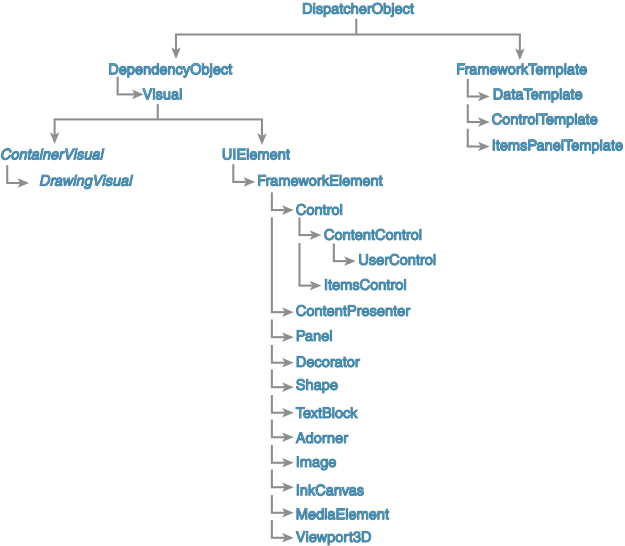
Figure 2.1 shows the visual hierarchy of classes that we examine in detail in this chapter.
Introducing the Visual Classes
WPF has a rich, diverse set of building blocks and tools that you can use to create amazing interfaces. Knowing which tool to use and when to use it is absolutely invaluable to creating next-generation applications. What follows is a brief overview of the most important classes in WPF. These are the classes that you will use most often as you progress through this book and as you create your own applications.
The DispatcherObject Class
The DispatcherObject class can be found in the System.Windows.Threading namespace. It provides the basic messaging and threading capabilities for all WPF objects. The main property you will be concerned with on the DispatcherObject class is the Dispatcher property, which gives you access to the dispatcher the object is associated with. Just like its name implies, the dispatching system is responsible for listening to various kinds of messages and making sure that any object that needs to be notified of that message is notified on the UI thread. This class does not have any graphic representation but serves as a foundation for rest of the framework.
The DependencyObject Class
The DependencyObject class provides support for WPF’s dependency property system. The main purpose behind the dependency property system is to compute property values. Additionally, it also provides notifications about changes in property values. The thing that separates the WPF dependency property system from standard properties is the ability for dependency properties to be data bound to other properties and automatically recompute themselves when dependent properties change. This is done by maintaining a variety of metadata information and logic with the DependencyProperty.
DependencyObject also supports attached properties, which are covered in Chapter 6, “The Power of Attached Properties,” and property inheritance.
The DependencyObject class is part of the System.Windows namespace and has no graphic representation. It is a subclass of DispatcherObject.
The Visual and DrawingVisual Classes
The System.Windows.Media.Visual abstract class is the hub of all drawing-related activity in WPF. All WPF classes that have a visual aspect to their nature are descendants in some way from the Visual class. It provides basic screen services such as rendering, caching of the drawing instructions, transformations, clipping, and of course bounding box and hit-testing operations.
While the Visual class contains a tremendous amount of useful functionality, it isn’t until we get down to the DrawingVisual class in the hierarchy that we start seeing concrete implementations that we can work with. DrawingVisual inherits from ContainerVisual, a class that is designed to contain a collection of visual objects. This collection of child visuals is exposed through the Drawing property (of type DrawingGroup).
DrawingVisual is a lightweight class specifically designed to do raw rendering and doesn’t contain other high-level concepts such as layout, events, data binding, and so on. Keep in mind the golden rule of this chapter: Pick the right tool for the job. If you need to simply draw graphics and the extent of user interaction with that object is simple hit testing, you can save a lot on overhead by using DrawingVisual.
A great example of where DrawingVisuals would be an excellent choice is in a charting application. You can build a variety of charts by using the drawing primitives such as lines, beziers, arcs, and text and fill them with colors using a solid brush or even more advanced fills such as linear and radial gradients.
You might be wondering what to do for your charting application if you need the charts to be data bound. You see more about how to do this later, but remember that the output of processing a data template can be simple drawing visuals, allowing you to create data-bound charts that produce only the functionality you need.
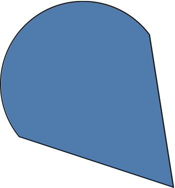
Listing 2.1 shows an example of drawing a sector in a chart. In charting terms, a sector is a closed region that looks like a pizza slice. It has two straight lines that form the two sides of a triangle, but the last piece of the shape is closed by an arc rather than another straight line.
When rendered, the preceding class creates a visual that looks like the one shown in Figure 2.2.
Retained Mode Graphics
Remember that WPF is a retained-mode graphics system, which means all of the drawing instructions are cached and you do not need to call any kind of update graphics API to force a visual refresh, as in an immediate mode graphics system. Although the API around DrawingVisual and DrawingContext resembles something you find in an immediate mode graphics system, beware of using it like one. You should never have to call any kind of update-my-graphics API to force a visual to redraw.
If you have done any graphics programming for other platforms before, the concept behind the DrawingContext class should be pretty familiar to you. It is essentially an entry point into the conduit between your code and the actual rendered pixels on the user’s monitor. As WPF is a retained graphics system, it caches all the drawing instructions and renders them whenever a refresh is required. The DrawingContext is used as the cache from which these instructions are picked up. In the preceding code, we start by building the geometry of the sector using the StreamGeometryContext. We then use the DrawingVisual’s RenderOpen method to obtain a reference to the current DrawingContext instance and draw the geometry. The DrawingContext class contains methods for drawing lines, rectangles, geometry, text, video, and much more. Using these methods, you can build up a shape like the sector in Listing 2.1.
While the DrawingVisual class is ideally suited to scenarios in which you just need to do basic drawing and hit testing, it still needs a container that is responsible for placing those graphics on the screen. One such container is the FrameworkElement class.
The FrameworkElement Class
System.Windows.FrameworkElement derives from UIElement, which actually provides the core services such as layout, eventing, and user input that are used by rest of the framework. Although UIElement is a public class you would typically not derive from it. Instead, the FrameworkElement makes a better choice since it exposes the previous services (that is, layout, styles, triggers, data binding) in a user-customizable way.
FrameworkElement is also a lightweight container host for a set of visuals. Because it is a descendant of UIElement it is free to participate in the logical tree and can provide container support for more primitive visual elements (such as the DrawingVisual from the preceding example). The FrameworkElement class can be used in the following ways:
For the pie slice control to be displayed onscreen, we need to build a container in which the SectorVisual class (refer to Listing 2.1) is the lone visual child, as shown in Listing 2.2.
The Spine
Inside the WPF team, a specific term is used for the set of classes comprised of DispatcherObject, DependencyObject, Visual, UIElement, and FrameworkElement. They call it the Spine and rightfully so. It is the backbone of WPF and provides the solid foundation to build more advanced functionality.
It is worth pointing out that the preceding VisualContainer class could also have been a subclass of UIElement instead of FrameworkElement, since it is not doing any custom layout. A FrameworkElement is best suited when you also want to provide custom sizing and positioning of elements, data binding, and styles.
The Shape Class
The Shape class provides yet another mechanism to enable primitive drawing in WPF applications. If we already have the DrawingVisual, which we have seen can be used to draw lines, arcs, and “pie slice” wedges, what do we need the Shape class for?
The Shape class actually provides a level of abstraction slightly above that of the DrawingVisual. Rather than using the primitives of the DrawingContext as we have already seen, instead we can use the concept of geometry to determine what is going to be drawn.
As a developer creating a custom shape, you use the DefiningGeometry property on your custom shape class. This geometry defines the raw shape of the class, and other properties such as the stroke, stroke thickness, and fill determine the rest of the information needed to render the shape. If you have ever used shapes, strokes, and fills in Adobe Photoshop or Illustrator, these concepts should already be familiar to you. Whatever you create using DefiningGeometry can also be done using the more primitive DrawingVisual class, but using the geometry allows your custom shape class to be inserted more easily into a logical tree, making it more flexible and more amenable to reuse and packaging.
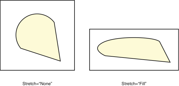
Shape is a subclass of FrameworkElement, a base class used by most container-type classes such as Panel to render child elements. This lets Shape instances participate in the layout pass and allows for easier event handling. Shape also defines the Stretch property, which allows you to control how a shape’s geometry is transformed when the dimensions of the Shape object change.
Figure 2.3 illustrates a sector shape and how it can be transformed automatically using the Stretch property.
Taking the previous example of the sector and upgrading it this time to inherit from the Shape class, we end up with the code in Listing 2.3.
As you can see from the preceding code, the construction of the shape is exactly the same as constructing a visual-based sector. The difference here is that for a Shape we stop after creating the geometry and setting that to the DefiningGeometry property. With the SectorVisual, we must both construct the geometry and render it. The core difference is basically a difference in responsibilities. The Shape knows how to render itself in its container using the geometry defined in DefiningGeometry.
When creating a shape’s defining geometry, the most commonly used geometry classes are PathGeometry, StreamGeometry, GeometryGroup, or CombinedGeometry. You learn more about these types of geometry in more detailed examples later in the book.
The Text Classes
Developers often overlook fonts when they are digging in their toolbox for something to get the job done. WPF actually has robust support for drawing text, laying out text, and working with documents. Text can be displayed onscreen in multiple ways and ranges from simple text to text with complex layout and formatting support.
At the most primitive level, we have GlyphRuns and FormattedText. These can’t be used declaratively; rather, you need to use the DrawingContext to display them onscreen. This can be done using the DrawingContext.DrawGlyphRun and DrawingContext.DrawText APIs.
In today’s modern age of globalized applications, you need more than just the ability to blindly throw text onto the user interface. You need to be able to do things like display text that runs from right to left, display Unicode characters, and much more. For example, when you draw text into a drawing context, not only do you supply font information, but you also supply the text, text culture, flow direction, and the origin of the text:
drawingContext.DrawText(
          new FormattedText(“Hello WPF!”,
          CultureInfo.GetCultureInfo(“en-us”),
          FlowDirection.LeftToRight,
          new Typeface(“Segoe UI”),
          36, Brushes.Black),
          new Point(10, 10));
Text can also be displayed declaratively and easily using the TextBlock and Label classes. TextBlocks (and Labels) are generally useful for a single line of text with fairly rich formatting and simple alignment support. For more complex text display, you can use the FlowDocument and FixedDocument classes that have more elaborate features to handle dynamic layouts, paragraphs, and mixing of rich media.
FlowDocument handles automatic layout and sizing of text and graphics as you resize the document. They are most useful for viewing newspaper-style text that can flow into columns and multiple pages. FixedDocuments are useful for programmatically generating a document with precise control over sizes of the textual elements, hence the name. These documents use two kinds of elements: blocks and inlines. Blocks are container elements that contain the more granular inline elements. Typical block-related classes include Paragraph, Section, List, and Table. Some of the common inline classes are Run, Span, Hyperlink, Bold, Italic, and Figure.
Although TextBlock, Label, FixedDocument, and FlowDocument are useful for displaying static text, WPF also provides interactive controls for editing text. These include the classic TextBox, which has limited formatting capabilities, and the RichTextBox, which as the name suggests has richer editing capabilities.
Most of these text-related classes expose properties to control alignment, fonts, font styles, and weights. Additionally, there is a class called Typography under the System.Windows.Documents namespace that has a rich set of properties to specifically control the various stylistic characteristics of OpenType fonts. They are available as attached properties, which can be set on text-related classes that use OpenType fonts. A sampling of the properties include Capitals, CapitalSpacing, Fraction, Kerning, and NumeralAlignment.
The Control Class
The Control class is pretty close to the top of the food chain of visual classes. It provides a powerful Template property (of type ControlTemplate) that can be used to change the entire look and feel of a control. Knowing that control templates can be changed during design time and at runtime can make for some amazingly powerful applications and compelling UIs. Designing with a Control allows developers and designers to quickly and easily define visual elements.
A rich set of classes that derive from the Control class provide specialized functionality and increasing complexity and level of abstraction. Choosing the right subclass of Control goes back to the analogy of choosing the right tool for the job. You need to make sure that you don’t take something overly complex as well as not picking something that is too simplistic and doesn’t offer the functionality you need. Choosing the wrong subclass can dramatically increase the amount of work you need to do.
For example, if you are building a control that needs to display a list of child items, you should start with ItemsControl or ListBox instead of starting with the comparatively low-level functionality of the Control class.
Unlike the earlier UI frameworks, the Control-related classes in WPF can be used directly without subclassing. Because of the powerful features such as Styles and Templates, you can customize the look and feel of a control declaratively. The subclasses of Control deal with the shape of the data rather than the appearance. A Button deals with singular data. ScrollBars, Sliders, and so on work with range data. ListBox and ListView work with collections. TreeView works with hierarchical data. It is up to the development team to decide how best to visually represent the data using these controls. In most cases, you do not have to subclass a control, rather you only have to change its Style and Template.
The ContentControl Class
The ContentControl class is ideal for displaying singular content, specified via the Content property. The content’s look and feel can be customized using its ContentTemplate property, which is of type DataTemplate. Remember back in Chapter 1, “The WPF Design Philosophy,” how plain data gets transformed into a visual representation through data templates.
The container that hosts the content can also be customized using the Template property of type ControlTemplate. This way you actually have two levels of customization available to you: You can customize the outer containing frame (via the Template property), and you can customize how the content within the frame is rendered (via the ContentTemplate property).
Controls derived from ContentControl are used to represent individual items that are displayed within list-based controls such as a ListBox, ItemsControl, ListView, and so on. The Template property is used for user interaction features such as showing selections, rollovers, highlights, and more. The ContentTemplate property is used for visually representing the data item associated with the individual element.
For example, if you have a list of business model objects of type Customer that you are displaying inside a ListBox, you can use its ItemTemplate property (of type DataTemplate) to define a visual tree that contains the customer’s picture, home address, telephone number, and other information. Optionally you can also customize the item container holding each Customer object. As mentioned, a ContentControl derived class is used for wrapping each item of a ListBox. We can customize this ContentControl derived container using its Template property, which is of type ControlTemplate.
Some of the most powerful tricks in WPF revolve around control templates, content controls, and content presenters, so it is well worth the effort of learning them in detail.
The ContentPresenter Class
The ContentPresenter class is the catalyst that brings a data template to life. It is the container that holds the visual tree of the data template. ContentPresenters are used inside the ControlTemplates of Control, ContentControl, or any other custom control that exposes a property of type DataTemplate. It may help to think of the role of the ContentPresenter as the class that is responsible for presenting the visual tree of a data template within its container.
Within the ControlTemplate, you associate the DataTemplate property of the template control with the ContentTemplate property of the ContentPresenter. You might do this in XAML (eXtensible Application Markup Language) this way:
<ContentPresenter ContentTemplate={TemplateBinding ContentTemplate} />
In the preceding snippet, we are template binding the ContentTemplate property of the ContentPresenter to the ContentControl’s ContentTemplate property.
In general, you can think of a presenter element as a shell or container for the actual content. It instantiates the template tree and applies the content to it. As you may recall from Chapter 1, you can think of the content as being a piece of cookie dough, the template is the cookie cutter, and the presenter pushes down on the dough and presents the end result of a nicely shaped cookie.
The ItemsControl Class
As this class’s name suggests, the ItemsControl class is ideally suited to displaying a list of items. More specifically, those items are interactive controls.
Not so long ago, when the main framework for building Windows applications was Windows Forms using .NET, controls were almost always too specialized. A ComboBox would display a drop-down list of items, but those items were always text, unless you rolled up your sleeves and did some serious work. This same problem occurred in virtually every place where Windows Forms displayed a list of items-the type and display of each item in a list was fixed unless you practically rewrote the control.
With WPF, the ItemsControl allows you to present a list of items that can have any visual representation you choose and can be bound to any list-based data you want. Finally we have both the flexibility we have always wanted and the power we have always needed.
Frequently used derivations of the ItemsControl class include the ListBox, ListView, and TreeView. The ItemsControl class exposes a wide variety of properties for customizing the look of the control and also of its contained items. Because these properties are exposed as DependencyProperties, they can be data-bound to other properties. These properties include the following:
- ItemsPanel-The ItemsControl needs a panel to lay out its children. We specify the panel using an ItemsPanelTemplate. The ItemsPanelTemplate is then applied to an ItemsPresenter.
- ItemTemplate-The ItemTemplate is the DataTemplate for the items being displayed. This template may be applied to a ContentPresenter or a ContentControl.
- ItemContainerStyle-This property indicates the style for the UI container for each individual item. Note that an ItemControl wraps each data item within a UI container such as a ContentPresenter or a ContentControl-derived class.
- Template-This defines the ControlTemplate for the ItemsControl itself.
If this seems like a lot to take in, don’t worry. The concepts behind content controls, presenters, and data templates can seem daunting at first, but we use them so extensively throughout this book that their use will quickly become second nature to you. We cover the ItemsControl in greater detail in Chapter 5, “Using Existing Controls,” and Chapter 8, “Virtualization.”
The UserControl Class
The UserControl class is a container class that acts as a “black box” container for a collection of related controls. If you need a set of three controls to always appear together and be allowed to easily talk to each other, then a likely candidate for making that happen is the UserControl class.
Creating your own UserControl is an easy first start at creating your own custom controls. It provides the familiar XAML + Code-Behind paradigm that you can use to define your control’s appearance and associated logic. The UserControl class derives from ContentControl and makes a few additions to ContentControl’s stock dependency properties.
The first thing you may notice about a user control is that the control itself cannot receive keyboard focus nor can it act as a Tab stop. This is because in the static constructor for UserControl, the UIElement.Focusable DependencyProperty and the KeyboardNavigation.IsTabStop property have been set to false.
This makes complete sense when you think about the idea that the primary function of a UserControl is to wrap a set of related controls and not act as an interactive control on its own.
To make things more clear, let’s take a look at an example. Suppose that you have to create a search bar for your application that looks something like the one in Figure 2.4.

The search bar in Figure 2.4 is comprised of a TextBox and a Button. When a user types a keyword or set of keywords and then presses the Enter key, the search functionality is invoked. The same functionality is invoked if the user types in a keyword and clicks the Search button.
While you can place these two controls individually in your window, their purpose and functionality are so interconnected that you would never really use them separately. This makes them ideal candidates for being placed inside a UserControl.
To further enhance the encapsulation, you could write your UserControl such that it doesn’t tell the hosting container when the user presses Enter or when the user clicks the Search button; it simply exposes a single event called SearchInvoked. Your window could listen for that event and, in an ideal Model-View-Controller world, pass the search request on to a search controller for processing.
Note
Customizing UserControls
A UserControl doesn’t allow customization of its look and feel because it does not expose properties for templates, styles, or triggers. You will have the best luck with UserControls if you think of them as faceless containers for logically and functionally related controls.
Within the UserControl, you have the ability to improve the look and feel of that single element without affecting the UI definition of the window and enabling your control for reuse in multiple locations throughout your application. Additionally, wrapping a set of related controls and giving them a purpose-driven name such as SearchBar makes your XAML and your code easier to read, maintain, and debug.
Similar to the way refactoring allows you to incrementally improve your C# code to make it more understandable, maintainable, and testable, refactoring the UI provides the same benefits and is much easier to do within the bounds of a UserControl. This is often called view refactoring.
The Panel Class
The Panel class is an element that exists solely to provide the core layout functionality in WPF. Powerful, dynamic layout capability has always been something that was missing in Windows Forms, and now that WPF has dynamic layout features, the world is a much happier place.
Think of the Panel as a “layout brain” rather than something that actually produces its own UI. Its job is to size the child elements and arrange them in the allocated space, but it has no UI of its own. WPF ships with a powerful set of panels that handle many of the common layout scenarios that developers run into on a daily basis. These include the Grid, StackPanel, DockPanel, and the WrapPanel. The following is a brief description of each layout pattern (don’t worry, you see plenty more of these classes in the code samples throughout the book):
- Grid-Provides a row/column paradigm for laying out child controls.
- StackPanel-Child controls are laid out in horizontal or vertical stacks.
- DockPanel-Child controls are docked within the container according to the preferences specified by each child control.
- WrapPanel-Child controls in this panel wrap according to the specified wrapping preferences.
Another panel called the Canvas provides static, absolute coordinate-based layout. Panels can be nested within each other to create more complex layouts. Layout in WPF is handled using the two-phased approach of measure and arrange.
During the measure phase, the parent requests that each of its children supply their minimum-required dimensions. The parent then applies additional requirements such as margins, alignment, and padding.
Once each child has been measured, the parent panel then performs the arrange phase. During this phase, the parent panel places each child control in its actual position in the final dimensions. The final position and size of the child element may not be what the child element requested. In these scenarios, the parent panel is the final authority on where the child controls are and how much space they take up.
Panels also have some extra functionality that you might not want to supersede, such as built-in ability to work with ItemsControls and the ability to dynamically change the z-order of a child element with the Panel.SetZIndex method.
The Decorator Class
A Decorator class is responsible for wrapping a UI element to support additional behavior. It has a single Child property of type UIElement, which contains the content to be wrapped. A Decorator can be used to add simple visual decoration, such as a Border, or more complex behavior such as a ViewBox, AdornerDecorator, or the InkPresenter.
When you subclass a Decorator, you can expose some useful DependencyProperties to customize it. For example, the Border class exposes properties like BorderBrush, BorderThickness, and CornerRadius that all affect how the border is drawn around its child content.
The Adorner Class
If we already have an additive decoration class in the form of the Decorator, why do we need an Adorner class? As mentioned earlier, every single class in the class hierarchy that makes up WPF has a specific purpose. While a Decorator is responsible for drawing decoration around the outside of a piece of child content, the Adorner class allows you to overlay visuals on top of existing visual elements. An easy way to think of adorners is that they are secondary interactive visuals that provide additional means to interact with the primary visual. That might seem complex, but think about widgets such as resizing grips that appear on elements in a typical diagramming program. Those are a secondary visual that sit on top of the elements that they are adorning and provide additional functionality and interaction. By clicking and dragging the resizing-handles, the user can resize the underlying control.
Adorner classes work in conjunction with the AdornerDecorator, which is an invisible surface on which the adorners rest. To be part of the visual tree, adorners have to have a container. The AdornerDecorator acts as this container.
AdornerDecorators are generally defined at the top of the visual tree (such as the ControlTemplate for the Window control). This makes all adorners sit on top of all of the Window content. We explore the use of adorners throughout the book, but you see them specifically in Chapter 6, “The Power of Attached Properties,” and Chapter 9, “Creating Advanced Controls and Visual Effects.”
The Image Class
You might be a little surprised to see the Image class mentioned here among all of the other highly interactive visual controls. In most frameworks, images contain just enough functionality to display rasterized (nonvector) images and maybe support reading and writing streams of image data, but that’s about it.
Image classes can actually provide control-like capabilities for some specific scenarios. Image derives from FrameworkElement, so it can be composed in logical trees and has rich support for event handling and layout. It encapsulates the functionality to render an instance of an ImageSource, specified via the Source property. The ImageSource class can represent a vector image like DrawingImage or a raster/bitmap image like the BitmapSource.
Images can be useful when you want to visualize a large amount of data for which you have limited interaction. Some situations where this might come in handy are when you are visualizing high-volume graphs or network monitoring tools that are visualizing thousands of network nodes. In cases like this, even DrawingVisuals become extremely expensive because each data item is a separate visual and consumes CPU and memory resources. Using an image, and knowing that each data point doesn’t need to be interactive, you can visualize what you need without bringing the host computer to its knees.
Since the Image class also has event handling support, we can attach handlers for mouse events that can query the pixel at the mouse’s current coordinates and report information about that data item. With a little bit of creativity and forethought, the class can be a powerful tool in any developer’s toolbox.
The Brushes
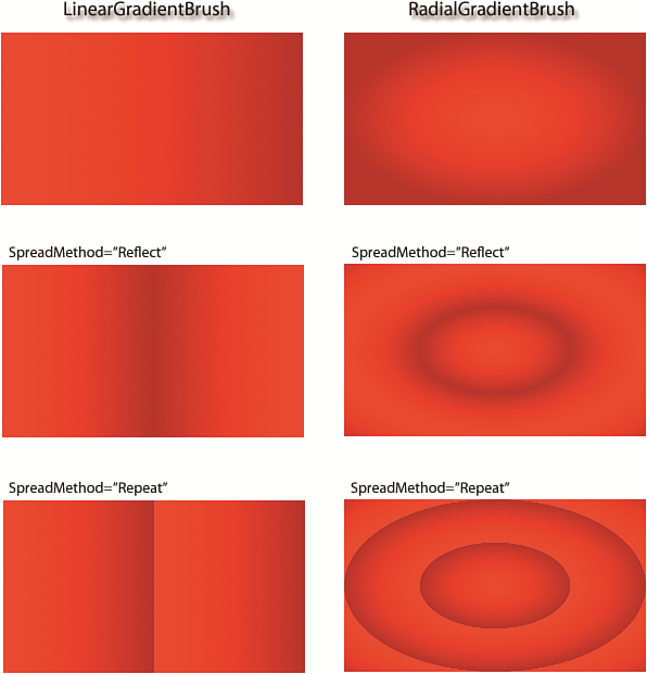
The Brush-related classes in WPF represent a powerful way of drawing simple to complex graphics with extreme ease of use. A brush represents static noninteractive graphics that serve mostly as backgrounds on visual elements. You can use a basic brush like SolidColorBrush, which only draws solid colors like Red, Blue, LightGray, and so on, and also gradient brushes like a LinearGradientBrush and RadialGradientBrush. The gradient brushes have additional properties to control the style of drawing the gradient. Figure 2.5 shows you various kinds of gradient brushes.
Although solid and gradient brushes are available in previous UI technologies, the real power comes with the TileBrush classes such as ImageBrush, DrawingBrush, and VisualBrush. An ImageBrush as the name suggests allows you to create a Brush out of an image. This is useful since it allows you to use an image without using the Image class. Since it is a brush, you can use it wherever a Brush type property is expected.
DrawingBrush gives you the power of defining complex graphics as a simple brush. Using DrawingGroups and GeometryDrawings, you can define nested graphics that can provide elegant backgrounds to your visuals. In Figure 2.6, you can see a nested set of graphic elements to create the final DrawingBrush. With clever use of DrawingBrushes, you can simplify the way you define some ControlTemplates.

A VisualBrush gives you a live snapshot of a rendered element from the visual tree. We see many uses of VisualBrushes in later chapters, such as using VisualBrush as a texture on a 3D model or creating reflections.
The TileBrush can also be stretched and tiled to fill the bounds of the visual. You can also cut out a rectangular section of the brush using the Viewport and ViewBox properties. Just like regular visuals, you can also apply transforms. Brushes have two kinds of transform properties: RelativeTransform and Transform. The RelativeTransform property scales the brush using the relative coordinates of the visual ([0,0] to [1,1]). It is useful if you want to transform the brush without knowing the absolute bounds of the visual on which it is applied. The Transform property works after brush output has been mapped to the bounds of the visual-in other words, after the RelativeTransform is applied.
The DataTemplate, ControlTemplate, and ItemsPanelTemplate Classes
WPF has a set of template classes that are used to represent visual trees. Templates are never actually rendered directly; rather, they are applied to other container classes like a ContentPresenter, ItemsPresenter, or a Control.
Each template class derives from the FrameworkTemplate class. These include the DataTemplate, ControlTemplate, and ItemsPanelTemplate classes. There is also a HierarchicalDataTemplate that is used for representing hierarchical data. It takes a little getting used to, but once you are, it is an invaluable tool for representing multilevel or tiered data. HierarchicalDataTemplates are used for controls such as the TreeView.
Each of these three templates contains a visual tree that can be greater than one level. The exception here is that the ItemsPanelTemplate can only contain a Panel-derived class as the root (there is a hint to this exception in the name of the template class itself).
The Viewport3D Class
So far every class that we have discussed so far has been a flat, two-dimensional control. WPF also gives developers unprecedented power and accessibility into the world of 3D programming. The Viewport3D class (see Figure 2.7) gives developers the ability to work in three dimensions without having to deal with complex game-oriented frameworks such as Direct3D or OpenGL.
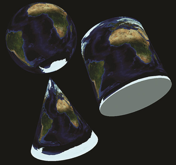
The Viewport3D class is a container for a 3D world that is comprised of 3D models, textures, cameras, and lights. Viewport3D derives from the FrameworkElement class instead of Control. This makes a good deal of sense because FrameworkElement works great as a visual container, and the Viewport3D class is a visual container for an interactive 3D scene.
The Viewport3D class also has no background. As a result, you can place a 3D viewport on top of 2D elements and create stunning effects by mixing and matching 2D and 3D visual elements. Just keep in mind that the 3D world must reside in a completely different container. For example, you can use a VisualBrush to take a 2D visual and apply it to the surface of a 3D model as a material. The .NET Framework 3.5 introduced additional classes that allow you to have live, interactive 2D visuals on a 3D surface. For example, you can place a Button visual as a material for a Sphere and interact with it like a regular button, even if the Sphere is spinning and being dynamically lit by a light source.
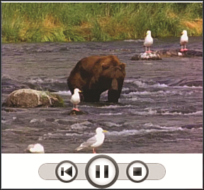
The MediaElement Class
Many of today’s modern applications are more than just static controls and grids and buttons. Many of them contain multimedia such as sounds, music, and video. WPF not only lets you play audio and video, but gives you programmatic control of the playback.
WPF gives you this multimedia programming experience with the MediaElement class. You indicate the source of the media using the Source property. You can control the media playback using the Play, Pause, and Stop methods. You can even control the volume and skip to a specific time in the playback using the Position property.
Figure 2.8 shows a simple WPF application that contains a media element and some controls for manipulating the video.
The InkCanvas
The Tablet PC introduced a more widespread use of the stylus as a means to interact with the applications. The strokes created using the stylus were treated as ink, which could also be mapped to application-specific gestures. Although the stylus is treated as the default device, a mouse makes a good substitute.
WPF has the InkCanvas class that provides most of the features available on the Tablet PC. In fact the InkCanvas becomes the slate on which we can scribble either with the mouse or with the stylus. InkCanvas can be created declaratively and exposes a variety of events related to strokes. It also has built-in gesture recognition for some standard gestures. By overlaying an InkCanvas on some UI elements, you can add some interesting features to an application. For example, for a photo-viewing application, you can overlay an InkCanvas on a photo to annotate parts of the picture, as shown in Figure 2.9.
Summary
With the diverse range of classes available to use within WPF, we can see that WPF is a great toolset for creating interesting, compelling, and visually stunning interfaces and controls.
Understanding and respecting this diversity and knowing which is the best tool for any given situation will make your development experience more rewarding and enjoyable and will ultimately improve the quality of your applications.
Table 2.1 presents a summary of the classes discussed in this chapter.
In the next chapter, we discuss creating controls and some best practices for approaching control creation. We build on the foundations from this chapter and the previous chapter as we venture into the world of creating exciting, modern interfaces with WPF.
Listing 2.1 A “Pizza Slice” Sector Visual Class
    public class SectorVisual : DrawingVisual
    {
        public SectorVisual
        {
            StreamGeometry geometry = new StreamGeometry;
            using (StreamGeometryContext c = geometry.Open)
            {
                c.BeginFigure(new Point(200, 200),
                        true /* isFilled */, true /* isClosed */);

                // First line
                c.LineTo(new Point(175, 50), true /* isFilled */, true /* isClosed    Â*/);

                // Bottom arc
                c.ArcTo(new Point(50, 150), new Size(1, 1), 0, true,
                    SweepDirection.Counterclockwise, true /* isFilled */, true /*     ÂisClosed */);

                // Second line
                c.LineTo(new Point(200, 200),
                    true /* isFilled */, true /* isClosed */);
            }

            // Draw the geometry
            using (DrawingContext context = RenderOpen)
            {
                Pen pen = new Pen(Brushes.Black, 1);
                context.DrawGeometry(Brushes.CornflowerBlue, pen, geometry);
            }
            }
    }
Listing 2.2 Creating a Container for the SectorVisual Class
public class VisualContainer : FrameworkElement
{
    private SectorVisual _visual = new SectorVisual();

    protected override Visual GetVisualChild(int index)
    {
        return _visual;
    }

    protected override int VisualChildrenCount
    {
       Get
       {
            return 1;
       }
    }
}
Listing 2.3 Making the SectorVisual into a Shape
public class SectorShape : Shape
{
    protected override Geometry DefiningGeometry
    {
        get { return GetSectorGeometry(); }
    }

    private Geometry GetSectorGeometry()
    {
        StreamGeometry geometry = new StreamGeometry();
        using (StreamGeometryContext c = geometry.Open())
        {
            c.BeginFigure(new Point(200, 200), true, true);
            c.LineTo(new Point(175, 50), true, true);
            c.ArcTo(new Point(50, 150), new Size(1, 1), 0, true,
             SweepDirection.Counterclockwise, true, true);
            c.LineTo(new Point(200, 200), true, true);
        }
        return geometry;
    }
}
Table 2.1: Summary of WPF Classes
| Class | Description |
|---|---|
| DispatcherObject | Provides threading and messaging control |
| DependencyObject | Provides hosting for dependenc properties, a core building block for many of WPF's advanced features, such as data binding |
| Visual, Drawing Visual | Provide functionality for drawing simple graphics |
| Shape | Provides funtionality for drawing geometry-based graphics |
| Decorator | Draws decorations around a contained UIElement |
| Adorner | Provides a decorative overlay on top of other controls |
| FrameworkElement | A container for other visual elements |
| GlyphRuns, TextBlock, FlowDocument | provide text support with increasingly complex set of features for formatting and layout |
| Panel | the "layout brain" container for other elements |
| Control | A UI component that supports templating |
| ContentPresenter | Container for holding a DataTemplate |
| ItemsPresenter | Container for holding an ItemTemplate |
| ContentControl | A control that contains a single child |
| ItemsControl | A control that displays a list of items |
| UserControl | A "black box" container for multiple logically and visually related controls |
| DataTemplate, ControlTemplate, ItemsPanelTemplate | Reusable visual tree templates |
| Image | A high-performance graphics control for high-volume data visualization or display of raster and vector images |
| Brush | Provides static graphics for backgrounds, ranging from the simple SolidColorBrush to the complex TileBrushes |
| Viewport3D | A container for an interactive 3D world |
| MediaEement | Plays audio and/or video within a container |
| InkCanvas | For creating Tablet PC-like strokes and gestures |