


When one writes a post mortem column for a major software developer magazine, one usually doesn’t want to look silly. One wants to write an article that shows off all the cool things done and utilized to achieve a great result. One generally wants to write about something that went well. This time around I’ll break that mold a little bit by writing about a project that although ultimately turned out well, the path to success was a rocky one. The interesting aspect here is that we managed to turn it around! I hope you will find it useful to read about our mistakes and how we salvaged the project.
This project was handled by our consulting arm - CODE Consulting - which is owned by the same parent company as CODE Magazine (EPS Software Corp.). The customer is Harms Software (www.HarmsSoftware.com), the company behind the Millennium product line and a leader in spa, wellness, and fitness software. Harms approached us at CODE Consulting to solicit our help in creating an extension to their current Millennium product line: MedSpa.
Harms wanted a Tablet PC application to use in spas and wellness centers by staff together with the customer/patient. Harms wanted the application to have a slate-experience where the wellness-expert can sit down together with the customer and review certain treatments on the tablet, use inking to draw on images and documents to illustrate and discuss planned treatments, and also to sign documents required before a certain treatment can be undertaken.
We decided to use WPF and Windows Vista to implement this scenario. When the project started, WPF was a very new product (Windows 7 wasn’t available yet), and we realized that WPF had great potential for creating a consumer-grade application and a professional experience, which is particularly important in this project, since users of this application are not just internal staff, but the app is used together with the customer. Furthermore, Harms wanted to use the software to help the spa or wellness center project a professional and polished image.
What Went Right
Using WPF
In hindsight, the choice to use WPF was right. When we started this project, using WPF wasn’t nearly as clear cut a decision as it is today. When we made the decision, WPF was available as version 3.0 (although later in the project we upgraded to 3.5 and we will probably upgrade to 4.0 soon). As an early adopter of WPF (we started using it during the early betas), we had quite a bit of experience with it, but naturally, nobody had a long history of running and maintaining WPF business applications. Also, many new patterns had not emerged yet (such as advanced styling of business applications) or were just being used for the first time (MVVM).
Using WPF allowed us to do a lot of things as the project progressed. First and foremost, WPF allowed us to build a user experience at the level we wanted it to be. It simply would not have been feasible to build the same user experience in any other UI technology. In fact, at one point we decided that we weren’t happy with the experience we had and we were able to change a lot of the UI without having to redo other parts of the application, or suffer any quality penalties.
Especially during the later parts of the project (the project went on for a long time, as very few resources were on the project at any given point… see below), we were able to use many modern WPF techniques, which allowed us to be much more productive than we would have been with WinForms or any other comparative technology. Data binding and styled layout, for instance, make for very productive and maintainable environments. (Unfortunately for us, many of these techniques just emerged, or were even developed by us, as time went on, and those techniques were not available at the outset of the project.)
Looking back, the road may have been a little bumpier than we had anticipated (see below), but the result is an application that should serve Harms Software well into the future. As the CSA (Chief Software Architect) of CODE Consulting, I am glad I gave our customer an application that will continue to be a worthwhile investment into their future.
WPF Styling
When the project started, nobody did much with WPF styles in business applications. The conventional wisdom was that if you were out of the teenage years, you didn’t care about styles in your apps. Nothing could be further from the truth, and at CODE, we have been an early champion of styling for business applications. In the MedSpa application, we started using sophisticated styles relatively late in the project, and once that was in full swing, it really paid off.
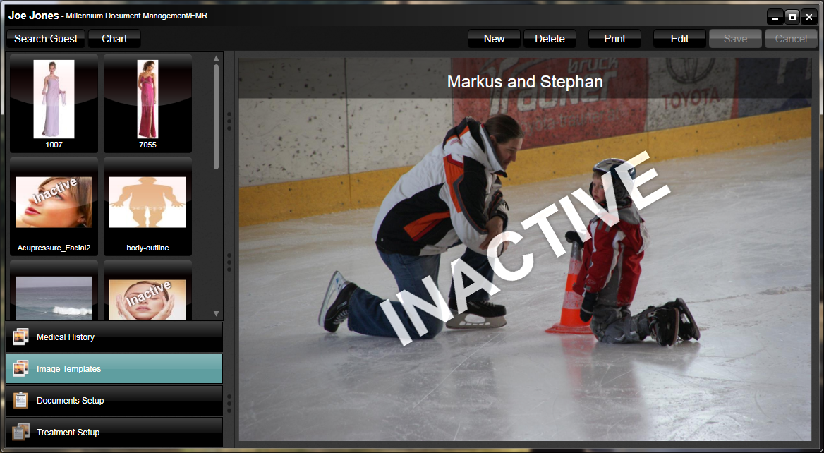
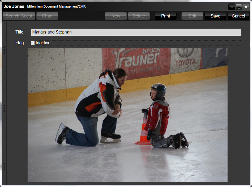
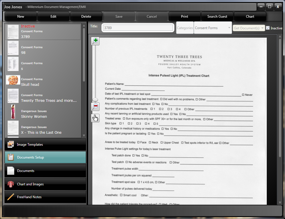
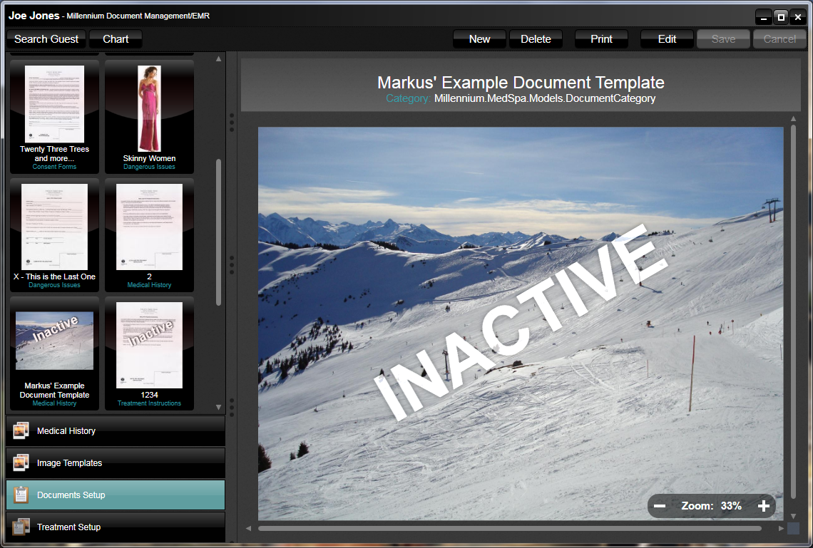
For example, the application had many lists of data. We implemented these lists using a View-Model to provide some data sources that included a few simple fields of information as well as a thumbnail view of the item. We then simply bound that data to a listbox in the UI. Developers do not really need to know how that listbox works exactly. They need to apply a style to it and the listbox completely changes its layout behavior from a top-to-bottom list, to a list with document thumbnails that flow across in a flow-layout fashion. Furthermore, some lists animate when resized and show the document preview in a graphically polished and professional fashion. We used this approach in dozens of places and having a single style that creates this entire setup has been priceless.
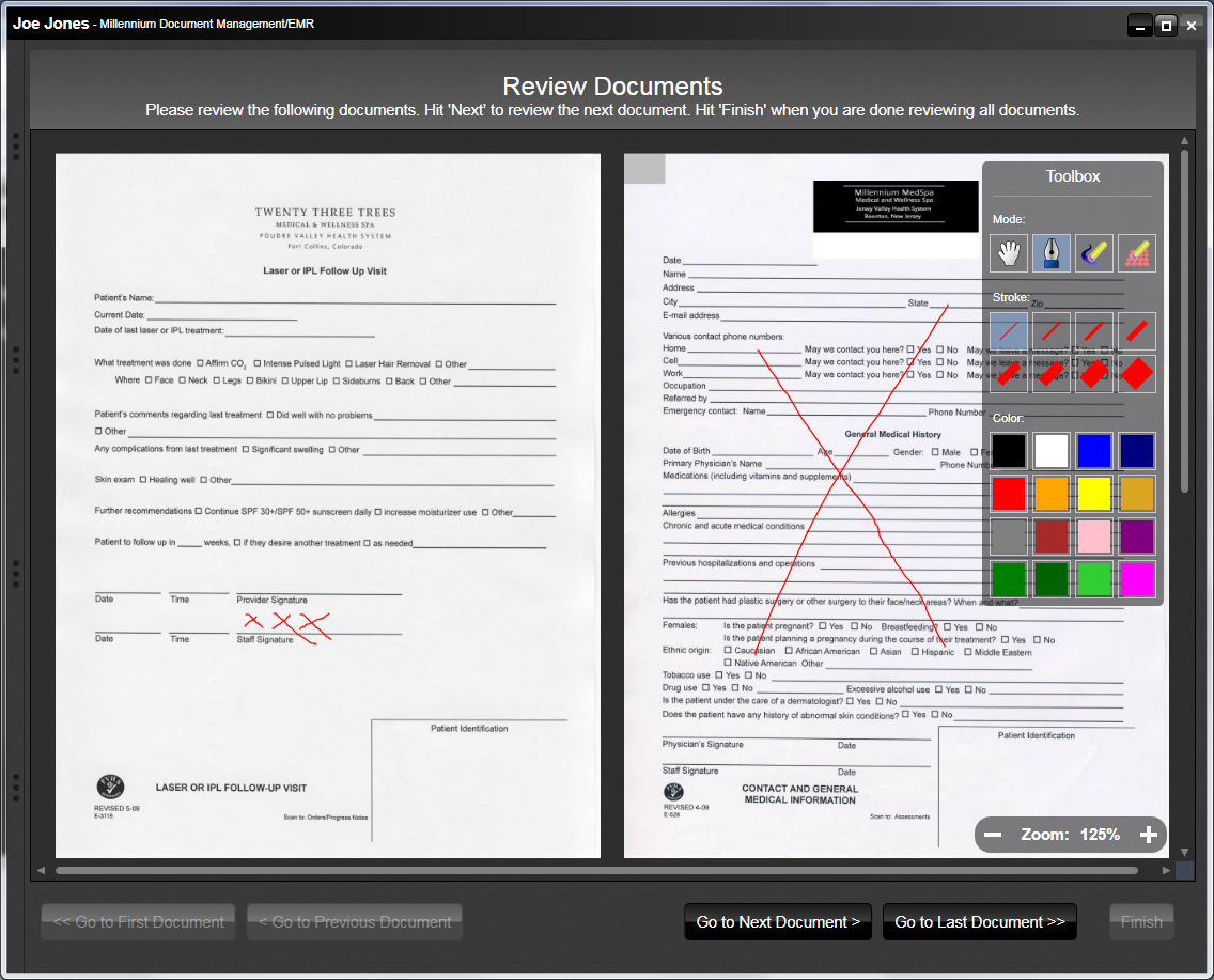
We also used styles in the document preview, so user can see documents and interact with them. Once again, the actual document pages are part of the data that is bound to a listbox. The visual appearance, however, is defined as a style that shows documents in a flow-layout at flexible zoom levels. The user can switch the documents into edit mode, which is done in-place in the list. The style simply picks up on an edit flag and automatically enables an ink element that is part of the style to allow for active handwriting and touch-up. The style also includes an ink toolbox that allows for rich interaction with the digital ink. Editable or not, the view is also automatically zoomable to the user’s preference. And once again, the developer does not have to worry about any of these details. Any of the many document lists in MedSpa automatically provide ink, edit, and zooming features on those documents.
Styles also allowed us to make the application have a consistent look without having to worry about such details on every one of the many forms. Fonts are set automatically. Header visuals are brought in automatically. And even a lot of the actual layout is handled by styles. This means that when creating UIs (Views), developers do not have to worry much about positioning of controls and other stylistic aspects. This is one of the biggest productivity gains in WPF: There is no faster way to lay out a form than to not have to worry about layout.
We implemented all styles used in this application as a skin. This means that the application can easily switch to another skin if the customer ever wants that. So far, the application only has a single skin. However, we anticipate that the target audience may want new skins in the future, or perhaps large customers of the application may want their own branding. It also helps to future-proof the application. This should help alleviate one of the most expensive aspects of software development: Having to re-write applications (or at least large parts of apps) due to new UI considerations, form factors, or trends.
Ink Support
We based the MedSpa application on Vista’s Tablet PC features (which of course also work beautifully on Windows 7 today). WPF supports an “Ink Canvas” element, which automatically ink-enables everything inside that canvas. It is also fully bindable, which really is what allowed us to use an MVVM approach without having to do anything special. Since our application is heavily based on ink and pen interaction, having this feature set available out of the box was a huge time saver for us and made it feasible to build this application.
Using ink, users of the application can annotate documents, take handwritten notes, draw over images to illustrate treatments, and patients can even digitally sign documents. We are not doing anything special for ink recognition (to turn handwriting into text), but if that need ever arises, we are in a very good position.
Using WPF’s Ink Canvas also allowed us to integrate ink into print output, which is a very important feature of this application. Printing ink would have been much harder without WPF.
Ink works especially well with Tablet PCs that utilize electromagnetic digitizers. These digitizers have extremely high collection rates and resolutions, making for the best possible ink quality. Even when zooming into ink, the drawings and writings remain high quality. Multi-touch tablets are not quite as good when it comes to inking. The experience is slightly lacking, since putting one’s palm on the tablet causes touch recognition and the overall ink experience and quality is not as good. However, on the upside, multi-touch tablets allow drawing with the fingers. This is good to annotate images that illustrate treatment options. It is not as good for signing documents.
In the future, I can foresee a number of additional scenarios and platforms for this application. It would certainly be slick to have an iPad version of this application. Especially given high-class spa scenarios, iPads would fit the bill very well and go along great with the overall desired image. It may be well worth to implement such scenarios, but the lack of WPF-style ink support will be one of the biggest hurdles to overcome. In our project, this simply was never a big area of concern.
MVVM
Early on in this project, we made the decision to use an MVVM (Model-View-ViewModel) approach to developing this application. In many ways, this hurt us, since the approach was so new then. We used the first version of Microsoft’s Prism framework, and it wasn’t nearly as refined and flexible as it is today. So there were some hardships around this.
In the end, however, the MVVM setup allowed us to be flexible in the later parts of the project and turn around the user interface after we weren’t happy with the initial version. It also allowed us to relatively easily swap out various views as requirements changed.
I am confident that moving forward, the customer (Harms) is going to be in a better position with MVVM than any other approach. The application features proper abstraction and separation of concerns, allowing for it to be moved into whatever direction the business needs take it.
UI Re-Envisioning
Our initial user interface was bad. This was especially troublesome considering the target audience of this app. As the CSA and thus the person who is ultimately in charge of this project, I had decided that I wanted to spend a few hours or days on the application to make it look a bit more professional before it went out the door. Once I started to dig into the details, I noticed that the user interface was assembled exactly like you’d expect it in an early WPF application. But we could do better than that!
For this reason I decided that CODE Consulting (that’s us… or in this case mostly me) had to bite into the sour apple and redo the user interface. This wasn’t something we could charge the customer for, but I felt strongly that it needed to be done. By the time it was all said and done, we spent close to another 400 hours to re-envision just about everything in the UI layer.
This included some of the overall approaches. We originally designed the application as a GUI application for Tablet PCs. In the meantime, however, NUIs (Natural User Interfaces) and multi-touch tablets have emerged. I wanted to re-envision the UI with a NUI mindset to make sure the app was as usable as possible in multi-touch as well as pen scenarios. Note that the application is still a WPF 3.5 application, which means that we do not get the benefit of WPF 4’s native NUI capabilities. We are planning to upgrade the application in the near future for exactly that reason. (We haven’t done it yet due to some 3rd-party components that need to be thoroughly tested for those cases.)
Another theme of the re-envisioning was “read vs. write”. The application features many UIs that are used to set up templates and documents. Once they are configured, users spend a lot of time looking at that data. Therefore, it really made sense to have different views of the same data, one for write mode, and another highly optimized for reading and consumption. Having the read-versions of the UI was the biggest step forward in making the application appear more professional.
The re-envisioning also included a new setup for all our styles and skins. Moving as much of the visual information out of the actual UIs (Views) and into styles means that all our UI definitions are now much smaller and easier to create and maintain. This was a huge productivity boost (although many people involved in the project probably never got the benefit of it since it happened too late… future development will benefit greatly from this, however) and also introduced some consistency across the application.
The Challenges
Lack of Management
This was not a large project. In fact, this project was much smaller than our usual projects. You would think that worked in our favor, but exactly the opposite is true. The project was too small to really warrant a lot of management (or so we thought) and as a result, none of our standard project managers were involved in the project in a permanent fashion. This really turned the project into a nightmare for some people and was the root source of just about all problems on this project.
One of the never changing facts about software projects is that they never ever go smoothly. Whenever someone tells me that their software projects sail along smoothly, I simply do not believe it. Software projects are hard and are always a struggle, and one needs to actively acknowledge all challenges and react accordingly. We pride ourselves in being able to do exactly that. We manage projects actively rather than pretending it is all smooth sailing.
Since we didn’t have our standard project management in place, we didn’t discover and address problems properly. We didn’t manage changing requirements properly and thus didn’t assign good quality control. Nobody was in charge of assigning UI design and interaction sessions early on, so we didn’t do good early UI design, making the app look nothing like we wanted it to, and the overall flow of the app - although changed repeatedly - was not as sophisticated as I wanted it to be.
Also, lack of management meant that the resources assigned on the project weren’t ideal. For a long time, we had very high level resources on the project, but at times they weren’t really needed. Later we had lower level resources on the project, but they were overwhelmed without access to the higher level guys. When communication happened, it worked very well, but it happened way too infrequently. There were no daily scrums for this project where roadblocks could be made apparent, and so forth.
Lack of management also meant lack of quality control. We invested a lot of time in things like unit testing, but as the team changed, the standards were not upheld and tests weren’t maintained properly. Nobody created a structured test plan. We didn’t do early performance testing. All of that caused us hardship.
I was not involved as much in this project as others (as I stepped in relatively late with the UI re-envisioning), but I was greatly frustrated by this situation. After all, we pride ourselves in being able to handle this very situation. Ironically, the project being comparatively small is what caused this issue.
Early Adopter of WPF and Prism
Ultimately, using MVVM and Prism in particular worked out well. Initially however, it caused us to be much less productive than we needed to be. People were learning Prism and a lot of the associated paradigms. We also tried to make a lot of our existing infrastructure work with Prism, such as using our Milos framework’s data access layer in ways that suited Prism best. In hindsight, we should have not done that and stuck with our own paradigm and only used Prism paradigms where needed. This may have resulted in a slightly worse code base, but we would have been much more productive in getting there.
As we started using Prism, a lot of the approaches were new and the best usage patterns still had to emerge. We initially constructed our views with a lot of XAML in each user control. Once we were through with the project, a lot of that had moved into styles, keeping views extremely compact and easy to create and maintain. Back then, nobody had even thought about some of those approaches, but from today’s point of view, it sure is a lot better now and I wish we didn’t have to go through those pain points.
Also, having used patterns such as “Inversion of Control” and composite, loosely coupled applications made it a lot harder for us to move new developers onto the project. I still see this issue to this day in all MVVM frameworks I am aware of. Decoupling and inversion of normal program flow simply introduces discoverability problems. Those issues need to be addressed with tools, documentation, and the introduction of “discovery points” to allow people to find their way around and work productively.
All these things combined resulted in a project that was technically successful in the end, but unsuccessful economically for CODE Consulting. Simply put: We lost a lot of money on this project due to these issues.
Changing Requirements and Lack of Flexibility
Requirements change. That is why we use an Agile software development process. However, change needs to be managed and controlled. After all, that is what Agile is all about. Due to the lack of management (see above) we didn’t do this well. Changes caused us too much chaos. Plus, changes caused a lot of re-work. Looking at the application today, one wonders where all the time went. After all, there aren’t really all that many pieces to it. But when you re-work the same piece several times (or even remove other pieces one worked on), then it adds up too.
Also, the way the application was originally set up, it lacked flexibility. The way a view interacts with the application toolbar, for instance, is not adequate for the amount of changes we encountered. Better planning (based on better management) would have helped us there. Plus, newer versions of Prism (or other MVVM frameworks) simply would have done a better job. Being a v1.0 adopter was not helpful here.
Clearly this problem went back to management again. Using our standard approach, we would have had better analysis in place, which would have gotten us to a better starting point initially. Having a more structured approach would have also helped us manage change more actively. Reducing change and managing the change that was required would have gone a long way here.
Not Considering the UI Early Enough
Nobody put any UI analysts and/or designers on the project early on. Partially this was due to management, and partially it was something one just didn’t do at the time. Windows UIs just didn’t seem to require that. Now we know better, of course. We use tools like SketchFlow to analyze the UI needs better and to make better suggestions to stakeholders who are not aware of new UI concepts such as NUI yet.
We have learned from this project as well as in general terms. These days, we do early UI brainstorming sessions with project stakeholders. We explain new concepts. Some of these things would have been available to us at the start of this project (we normally create UI style guides for most projects relatively early on) and other things have been introduced into our process since then (like SketchFlow to sketch business processes and UI flow).
Whatever the reasons were, some early UI brainstorming for overall interaction flow would have helped this project. Would we have arrived at a NUI before that term had really become mainstream? Probably not. But we would have discovered certain scenarios earlier, and we would have found the need for more flexibility earlier on. Changing UIs is usually expensive due to the far reaching consequences. Some of the positives mentioned above softened this blow, but this aspect was expensive for everyone involved.
Changing Team
The project started out with one of our best people at the helm. But great people get dragged in all kinds of directions, especially if lack of management is already one of your problems. Plus, we lost a developer early on (he took an offer at another company which we simply couldn’t counter). Initially, the team was two people plus some part-time management. The team then shrunk to one person. After a while, other things piled on to that person’s workload. We tried to counter that issue by putting other resources on the project. This was probably the right move but it should have been done earlier.
The project setup was too difficult and really only allowed high level people to work on it. And even for those developers, the going was tough and slow at times. As time went on and the project didn’t progress as quickly as we wanted, we tried to move various people with different levels and areas of expertise on and off the project with little success. It simply was too difficult to communicate aspects of the project to different team members. I am sure this caused a lot of frustration on our customer’s end. Plus, it made us “eat” a lot of overhead expense which simply was our fault and one couldn’t have argued for it to be billable work.
In hindsight, it might have been better to have more people on the project part-time than just one or two people full-time. This would have spread the knowledge across the team earlier. It probably would have forced us earlier to put better management in place. A team with multiple people is not bad, even for a small project. A team with multiple people working on the project but never at the same time on the other hand, is not good.
What’s Next?
In the end, the Harms MedSpa application ended up being a pretty cool application. I can envision a lot of cool additions and scenarios. This application would be great on other slate devices such as the iPad. I can also imagine integrating patients and customers more directly. Smart phone applications come to mind, whether they are Windows phones, iPhones, Android, or others. I can also imagine spas would like to have this software integrated with social networks, in particular Facebook. After all, why not share with your friends that you just had this awesome massage? There should be real business benefit in this. And we should be in a good position to cover all those scenarios.
In the end, I enjoyed working on the technical aspect on this app, which for me personally mainly meant UI and styles. I would almost go as far as saying I had fun. Unfortunately, as the owner of EPS Software Corp. and CODE Consulting, I also have to look at the business side, and clearly, there was no fun to be had there in this project. Luckily, all the issues and challenges encountered in this project are very easily addressable as long as we assign the task of addressing it to someone. And you can rest assured that we will be very conscious of the need for management from now on, even on the smallest of projects.