


ASP.NET MVC 4 Mobile Websites Succinctly by Lyle Luppes is a concise guide to creating a website aimed at mobile but also serving desktops-from just one code base. Luppes extols the virtues of .NET’s ASP.NET MVC framework, offering it up as the perfect solution for cross-platform website development. The following excerpt from his book discusses design. This book is part the Succinctly series and can be downloaded for free from Syncfusion’s Technology Portal.
Designing mobile websites is a big topic these days. Every conference you go to has several sessions on this topic, and there is an abundance of books on the topic. With all that noise, it’s hard to know who to listen to.
Some folks are saying that you need to use a dedicated site for mobile and a separate site for desktop. This is sometimes referred to as the “mdot” strategy, because many sites put an “m.” on the front of their mobile URL. However, this strategy causes a problem because you end up with two (or three!) different sites that you must maintain, each with duplicate content and web configurations.
Other sites rely on what is commonly known as Responsive Web Design. The theory is that if you design your site right with style sheets that adapt, you will be able to have one site with one URL, and it will adapt to many screen sizes, scaling the size up or down, shifting columns around, and making it look nice on all sorts of different sizes. One place this strategy fails miserably is page bloat. Even though you have a small screen with less visible content, you typically don’t have less content. Less visible content does NOT equal fewer bytes downloaded. Phones have data caps and lower download speeds, so using that strategy is not the most optimal design for mobile devices.
If you design a website using the responsive design strategy, you need to decide if you are going to start with a mobile design as your bias and then do progressive enhancement as the screen gets larger, or if you want to start with the desktop design, and then do graceful degradation. Both approaches suffer from some serious issues.
What if you could create a site that took good parts from both of these strategies? Rather than relying on the Responsive Web Design strategy, I prefer to use a pattern that I refer to as “Adaptive View Design.” By using the Adaptive View Design patterns in this book, you can have parts of the best of both of these strategies in your project.
Desktop Layout versus Mobile Layout
Before we get into the actual code, there are several design concepts that need to be understood when you are designing a mobile layout. There are some obvious differences when you compare a desktop screen to a small phone screen, and there are some that are not as obvious when you are designing for a medium-sized screen like a tablet.
Multicolumn versus Single-Column Design
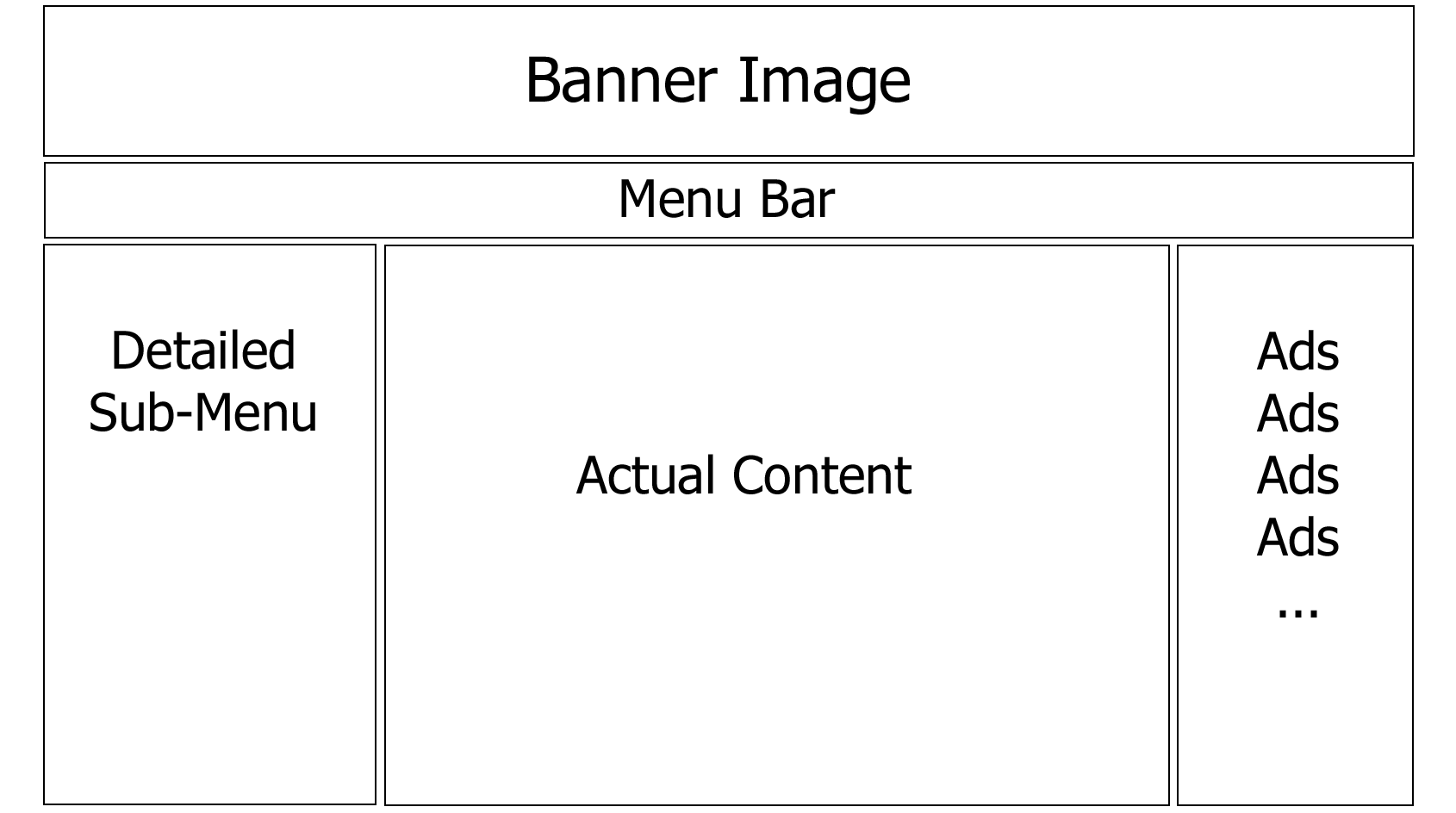
When you design a typical desktop website, you tend to work with a multicolumn layout with the three-column layout being the most common approach. Such a layout utilizes banner images, menu bars, ads to grab your attention, etc., like this:
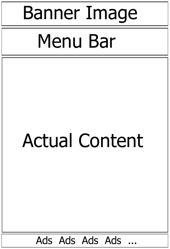
When laying out a mobile website, a better approach is to design for a single-column layout. Using just one column makes it easy to scale between differently sized devices and makes it simple to switch between portrait and landscape mode. Consider the layout of most phone applications:
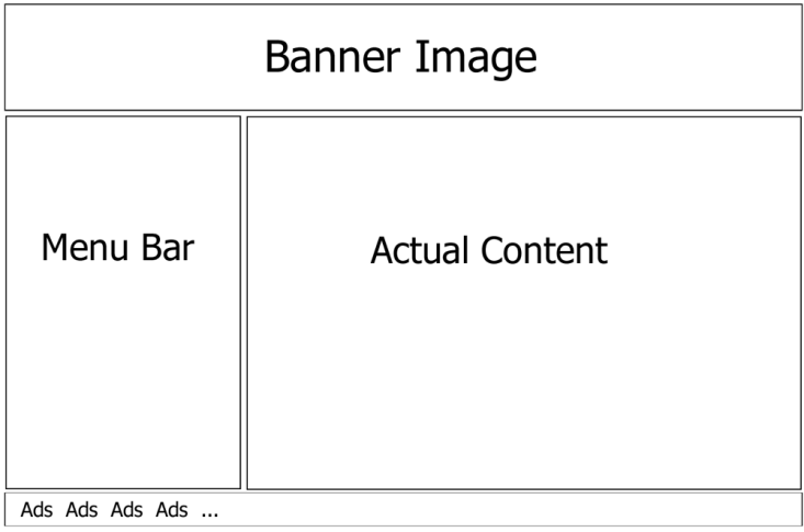
On the other hand, tablets tend to have a little bit of both approaches. A tablet tends to favor the one-column approach common to phones, but then it will switch to a two-column layout when rotated to landscape mode, and only occasionally will it use a three-column layout.
Each of the designs has a different approach, and it would be a mistake to assume that we could create one page that will work well in all three of these form factors. It’s not just the layout that changes, either; there are other considerations.
Tapping versus Hovering and Clicking
Another issue to consider is that on a desktop people are used to clicking on little text links that take them to the next page, and a mouse is a very precise tool for doing that. On a mobile device, people are tapping with their fingers and thumbs, and a small text link doesn’t really work when you are trying to do that. Your mobile-friendly design needs to incorporate larger buttons and icons wherever possible, and use links that let you tap anywhere on the whole line to activate a choice, not just on the actual word that contains the link.
In addition, on many desktop applications and websites, developers tend to use information that is hidden until the pointer hovers over an object. That concept simply doesn’t exist on a touch-based input device like a phone or tablet.
Large Screens and Collapsible Containers
In addition to scaling back the number of columns in your design, you need to think about the content containers themselves. On a desktop there is plenty of real estate, so it makes sense to expand and show as much data as you can inside many visually distinct containers. On the small screen of a mobile device, you want to show the least amount of data that makes sense, and then have the user decide what to show next, and on a tablet it’s somewhere between. One of the options that is most sensible for this paradigm is the collapsible container. The following three screenshots are the exact same URL with the exact same contents, but each of them is organized and optimized for the platform it is targeting.
In this example, the desktop shows all of the content, and it’s organized into nice containers with appropriate styling
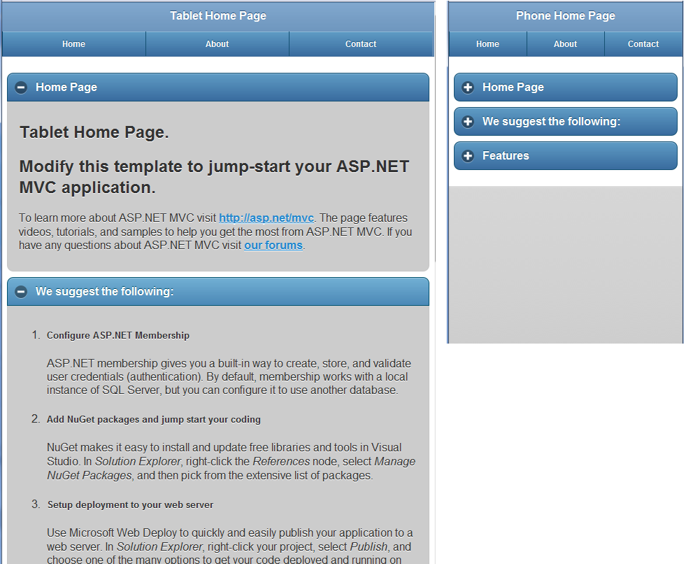
The tablet view shows the same content, but it is placed inside containers that have a minus sign in the header that allows you to collapse them if you want. The phone view uses those same containers, but starts with everything collapsed so you can easily scan the document for what interests you.
In Chapter 8, we’ll look at a pattern that we can use where you can have three distinct layouts, but reuse the same content in each of the layouts so that you don’t end up with duplicate content. We’ll also look at the collapsible containers in more detail in Chapters 8 and 9.
Desktop != Tablet != Phone
Hopefully this chapter has made you think just a little bit about the different design paradigms that need to be addressed when building mobile websites. Good desktop design is not the same as good tablet design, and that’s not the same thing as good phone design. The key here is to try to optimize the design to match the device requesting the content, and at the same time not have to maintain duplicate content in multiple sites and files.
When it comes to designing websites, Forrest Gump was right-we don’t really know what we’re going to get. We might think we know how we should design our site, but before we know it, a new device is going to come along and surprise us. As someone once said, “If you make something idiot proof, they’ll just make a better idiot.”
(Copyright © 2012 by Syncfusion, Inc. All rights reserved.)