


Mobile development is a white-hot area of software development. Everyone wants to target the mobile market and get their app into the hands of millions of customers. But the splintered landscape of mobile platforms quickly eliminates the enthusiasm for creating apps that span all mobile platforms. The reality is that cross-platform mobile app code is written in multiple programming languages and the app presentation layer is defined in distinctive and different ways. This repetition goes against the DRY (Don't Repeat Yourself) principle, so the developer community has created a variety of cross-platform tools that reduce the need to duplicate code for each platform.
Xamarin is a popular cross-platform toolkit aimed directly at the .NET developer. It provides a way to write project code in C# and produce an app that runs on Android, iOS, and Windows devices. In the early days of Xamarin, the focus was on building a shared code base that works across the various platforms. Instead of writing code in Java, Objective-C, and C#, a developer can write the majority of the app code in C#. That was a tremendous step forward, but it never addressed the UI dilemma; each platform has a different set of UI elements and a distinct markup language. Because of this fact, it was difficult to create a shared cross-platform UI in a Xamarin project; you were forced to create three separate presentation layers.
Xamarin.Forms offers a solution to this dilemma. Instead of defining a UI in a set of XAML, AndroidXML, and iOs Xib/Storyboard files, it uses XAML as the common markup language. Plus, it provides a set of UI controls that are simple to use within your XAML. When the app is compiled to native code, the Xamarin.Forms controls are turned into the native UI elements necessary for each mobile platform. The UI controls are .NET controls, so they will seem familiar to Windows Forms, WPF, or WebForms developers. Xamarin.Forms ships with a set of standard controls (button, text, lists, etc.) and is extensible for custom control development. Control vendors like Infragistics, DevExpress, ComponentOne, SyncFusion, Teema, and Telerik provide additional controls. Be aware that there's a cost to using Xamarin.Forms. Details about the price plans are at https://store.xamarin.com/. Editor's note: Xamrin is now part of Visual Studio, so this link redirects to Visual Studio pricing.
Developer Setup
For this article, I assume that you're using a Windows computer (or a Mac with Parallels) and have Visual Studio installed. I also assume that you're familiar with how Xamarin works for Android and iOs projects and how to compile iOS projects with a Mac. This article focuses on the UI features offered in Xamarin.Forms.
The first step is to head over to http://xamarin.com and get the platform installed on your computer. You need version 3.0 or later. The installation is straightforward; just follow the excellent installation guidelines on the Xamarin site. http://developer.xamarin.com/guides/cross-platform/getting_started/installation/
Once you have your computer ready, you have another decision to make. Which developer IDE should you choose: Xamarin Studio or Visual Studio? I'm a long-time Visual Studio customer - I'm very comfortable in its IDE and love my third-party extensions, so I'll be using it for my examples. The Xamarin integration is nearly seamless in Visual Studio, you feel like it's another part of the built-in project types.
Xamarin Studio is a well-designed alternative to Visual Studio. It's included in all Xamarin subscription levels and is targeted at people who don't have a Visual Studio license. The Mac version is very nice and the only choice for making Android and iOs Xamarin apps on Apple hardware.
Once you have your computer ready, you have another decision to make. Which developer IDE should you choose: Xamarin Studio or Visual Studio?
The Initial Project
Now, let's create the first project. Figure 1 shows the New Project dialog screen in Visual Studio.
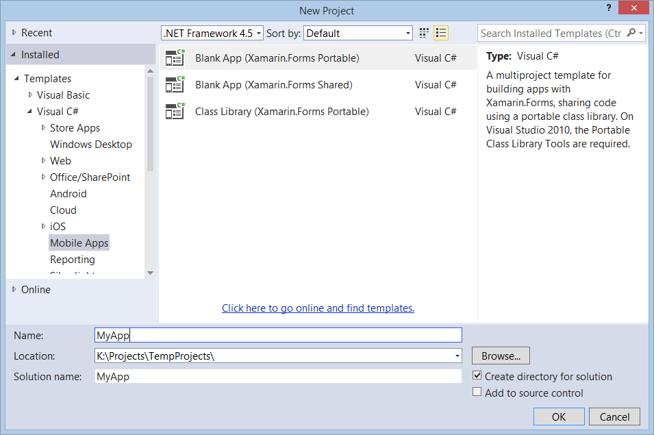
In the Visual C# node, select the Mobile Apps node and then choose Blank App (Xamarin.Forms.Portable). Click OK to create the project. If you're a Visual Basic programmer, grab a tissue and wipe that tear from your eye: Xamarin.Forms doesn't support VB yet.
Take a look at the four projects in Solution Explorer, as shown in Figure 2.
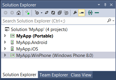
Table 1 provides general information about each project.
Take a few minutes to examine the Android and iOs project files. You'll see that there are a few C# files in each. What you won't find is any Java or Objective-C code in either project. For C# developers, this discovery is a satisfying moment.
If you've done Xamarin projects in the past, this layout will be familiar. Xamarin.Forms builds on top of the classic Xamarin project hierarchy. The enhancement in Xamarin.Forms is that the majority of your UI code is contained in the Portable library project. This library becomes the central source for the other project's presentation layer.
Writing global UI is a fantastic improvement over the alternative but in some situations, you might need to create platform-specific adaptations to the UI. For example: requesting wider page margins for one platform or choosing additional high resolution images for another. It's possible to accomplish this to some degree in the portable library. When that isn't sufficient, modify the individual iOs, Android, or Windows Phone projects with the platform-specific code or resource.
If you've done Xamarin projects in the past, this layout will be familiar. Xamarin.Forms builds on top of the classic Xamarin project hierarchy.
Building a UI
Obviously, my app needs a main screen. I'll put the main screen in the portable project and instruct each platform to fetch the screen in their prescribed manner. The details for how each project loads the start pages, layouts, and control tree is unimportant at this time; the details come later in the article. Suffice it to say that Xamarin handles the details and each project has the instructions to ensure that the page is loaded correctly.
Here is the convention used in the Xamarin portable library. It includes an App class that contains the static GetPage method. This method returns an instance of a Page class that represents the app's main page. The App.GetMainPage name and method name are the defaults suggested by Xamarin, but you can follow a different convention if you like.
Find the App.cs file in the MyApp (Portable) project and examine the code:
public static Page GetMainPage() {
    return new ContentPage
    {
        Content = new Label
        {
            Text = "Hello, Forms !",
            VerticalOptions = LayoutOptions.CenterAndExpand,
            HorizontalOptions = LayoutOptions.CenterAndExpand,
        },
    };
}
The page and its Views are created in code and returned from the GetMainPage method. Don't worry; you don't have to create the UI in code. If you prefer, you can create XAML text files and use XAML markup instead. The key takeaway from this snippet is that the method returns a page instance.
This example returns a ContentPage, which can contain a single child View. ContentPage is a good option for simple, one-page applications. Xamarin.Forms offers a diverse set of alternative page types (Carousel, MasterDetail. Navigation, Tabbed) for times when the ContentPage isn't suitable for your situation.
The Label View is the only child of this page. Labels are handy for showing read-only text on a page. Obviously, there's a multitude of other Views available for the UI. There is also a set of Layout Views, which can contain multiple children and are responsible for arranging those children on the screen.
How Each Platform Project Loads the Initial Page
Before looking at how to use XAML to build the UI, I'll take a side trip to examine how the Android, iOS, and Windows Phone projects load the initial page.
The Android App
Now let's see how to show the main page in an Android application. Find the MainActivity.cs file in the Android project and take a peek at the code:
[Activity(Label = "MyApp",
  MainLauncher = true,
  ConfigurationChanges = ConfigChanges.ScreenSize | ConfigChanges.Orientation)]
public class MainActivity : AndroidActivity {
  protected override void OnCreate(Bundle bundle) {
    base.OnCreate(bundle);

    Xamarin.Forms.Forms.Init(this, bundle);
    SetPage(App.GetMainPage());
  }
}
The class derives from AndroidActivity. This is a class provided by Xamarin. Note the [Activity] attribute decorating the class. Since there might be more than one Activity in the project, the MainLauncher=true assignment indicates which one is considered the start screen.
Android expects us to override the OnCreate method in the main activity and initialize the app window. Here you see a call to Forms.Init, which ensures that the Xamarin UI engine is ready to render the UI. Next, the code calls App.GetMainPage to get the shared page from the portable library and passes the result to the AndroidActivity SetPage method.
The iOS App
Now it's time to see how it's done in the iOs application. Open the AppDelegate.cs file in the iOS project. You'll see something like this:
 [Register("AppDelegate")]
 public partial class AppDelegate : UIApplicationDelegate {
    UIWindow window;
    public override bool FinishedLaunching(UIApplication app,
        NSDictionary options) {
            Forms.Init();
            window = new UIWindow(UIScreen.MainScreen.Bounds);
            window.RootViewController = App.GetMainPage().CreateViewController();
            window.MakeKeyAndVisible();
            return true; }
The AppDelegate class derives from the UIApplicationDelegate class (which is part of the Xamarin API). The FinishedLaunching method is where the magic happens. Here you'll find the call to Forms.Init, which ensures that the Xamarin UI engine is ready to render the UI. Next, it uses the CreateViewController extension method to take the page returned from App.GetMainPage and make it into an iOS controller. That controller is then assigned as the Root Controller for the app.
The Windows Phone App
In the Windows Phone project, the startup code lives in the MainPage.xaml.cs file, looking like this:
public partial class MainPage : PhoneApplicationPage {
    public MainPage() {
        InitializeComponent();

        Forms.Init();
        Content = MyApp.App.GetMainPage().ConvertPageToUIElement(this);
    }}
Here in the MainPage constructor, you can see the call the Forms.Init. Guess what? It invokes the same initialization process seen in the iOS and Android projects. Also, there's the call to App.GetMainPage.ConvertPageToUIElement. It ensures that the page returned from the portable library is converted to a child element and embedded within the MainPage.
Now that you know how the main page is used in each of the projects, let's examine how to use XAML to represent the UI.
Building More UI
Markup languages are the customary way to represent UI in Web applications and elsewhere. Xamarin.Forms use the time-honored XAML language as its markup language.
XAML Instead of Code
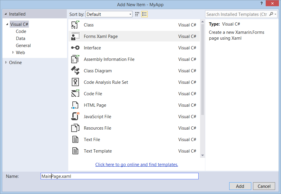
It's time to add a XAML file to the project and replace the default page instance in the GetMainPage method. Add a new item to the portable project, as shown in Figure 3.
The new XAML page contains XML markup that defines a ContentPage and a child Label control:
<?xml version="1.0" encoding="utf-8" ?>
<ContentPage   x:Class="App3.MainForm">
<!-- ContentPage xmlns attributes
     removed for clarity in code snippet-->
<Label Text="{Binding MainText}"
       VerticalOptions="Center"
       HorizontalOptions="Center" />
</ContentPage>
This is nearly identical XML equivalent to the UI that is returned from the current App.GetMainPage method. I'll change the XAML to include some additional labels and a button, as shown in Listing 1.
Listing 1: Replacement content for MainPage.xaml
<ContentPage.Content>
    <!-- The ContentPage can have a single child. -->
    <StackLayout Orientation="Vertical">
    <!-- Use a StackLayout or other layout elements to host
         many children controls  -->
    <Label Text="Nature Tracker (v1)"
           TextColor="Yellow"
           Font="Large"
           VerticalOptions="Start"
           HorizontalOptions="CenterAndExpand" />
    <Label Text="Yellowstone"
           TextColor="#EEEEEE"
           VerticalOptions="Start"
           HorizontalOptions="CenterAndExpand" />

    <Button Text="Add sighting..."
            Clicked="Button_Clicked"
            VerticalOptions="Start"
            HorizontalOptions="CenterAndExpand" />
    <Label Text=""
           x:Name="messageLabel"
           VerticalOptions="Start"
           HorizontalOptions="CenterAndExpand"
           Font="Large"/>
    </StackLayout>
</ContentPage.Content>
Next, modify the App.GetMainPage method to return the UI defined in the XAML file:
public static Page GetMainPage() {
    var page = new MainPage();
    return page;
}
Since the XAML file represents a .NET class (named MainPage), it's a simple matter to instantiate the MainPage and return it from the method.
Adding Code to the Page
Now it's time to add some code to the page. In XAML-based programs, there are two common locations for the page code: the page code-behind file or a ViewModel file. Xamarin supports both scenarios.
The example in Listing 1 assumes that the button click code is in the code-behind file, so I'll add the following code to the MainPage.xaml.cs file:
int _counter;
public void Button_Clicked(object sender, EventArgs e) {
    _counter += 1;
    messageLabel.Text = String.Format(
        "Wildlife sighted {0} times", _counter);
}
The Native Results
The project is ready for testing. Figure 4 shows the screenshots taken on several devices while running the app.
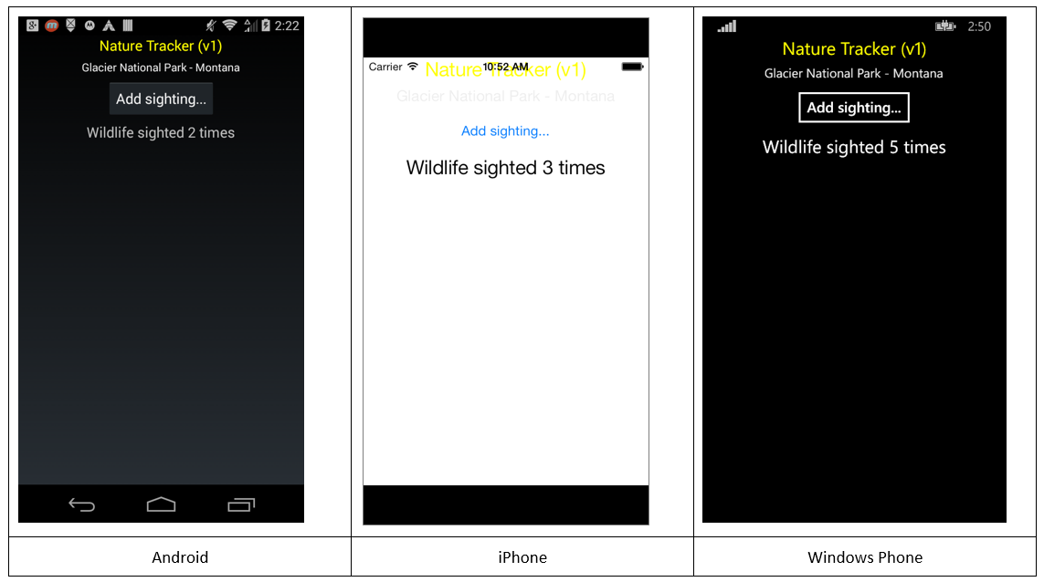
As you can see, the overall layout of the page is similar on each device. But there are some differences as well, e.g., the button appearance is distinct and fits with the users' expectations on each system. And what's up with the colors and layout on the iPhone? Didn't I say that Xamarin promises a write-once approach to UI?
It's true, Xamarin solves many cross-platform issues but you still need to be familiar with the conventions of each platform. The iPhone, for example, uses a white background as the default. It also has a top status bar (showing carrier, time, and battery life), which overlaps the content of the page. That might look nice on some apps but it's ruining this layout. There are two solutions available. The first choice is to apply a global setting that overrides each platform's default. I'll use this approach to change the background color of the page. The second choice is to indicate a platform-specific setting that influences a single platform. I'll use the second option to modify the top padding size on the ContentPage.
Xamarin solves many cross-platform issues but you still need to be familiar with the conventions of each platform.
Modifying the ContentPage
Color is specified in the XAML with a string value, the same as it's done in WPF and other XAML frameworks. I'm using a hex value to change the background to a muted green color:
<ContentPage.BackgroundColor >
  #334421
</ContentPage.BackgroundColor>
Of course, the color can also be set with an attribute on the ContentPage root element:
<ContentPage BackgroundColor="#334421" ... >
Use the OnPlatform element to specify each platform setting. Here, I'm changing the top padding for iOS only:
<ContentPage.Padding>
    <!-- set platform-specific padding iOS needs an additional
   20px top padding to account for iPhone status bar -->

 <OnPlatform x:TypeArguments="Thickness"
     iOS="0, 20, 0, 0"
     Android="0, 0, 0, 0"
     WinPhone="0, 0, 0, 0" />
</ContentPage.Padding>
The final result of these changes is shown in Figure 5. I didn't include the screenshots for Android or Windows Phone but they look similar.

Working with XAML Resources
Styles provide a way to designate a group of settings and apply them to one or more elements. They're common in XAML development and help reduce markup repetition. Take a look at Listing 1 again. Notice how the HorizontalOptions and VerticalOptions properties are duplicated on multiple elements. My first instinct is to add an implicit style to the XAML to remove the excess text in the control elements. But it's early days in the Xamarin.Forms world and styles aren't supported yet. The workaround is to use a resource and apply it with a markup extension. It won't reduce the redundant text in the control elements, but it will centralize the property values, which is helpful when refactoring the UI appearance. Here's the definition of the resource:
<ContentPage.Resources>
  <ResourceDictionary>
    <LayoutOptions x:Key="hOp"
                   Alignment="Center"
                   Expands="True" />
     <LayoutOptions x:Key="vOp"
                    Alignment="Start" />
  </ResourceDictionary>
</ContentPage.Resources>
And here, I'm using the StaticResource markup extension to apply the resource to the labels:
<Label Text="Nature Tracker (v1)"
       TextColor="Yellow"
       Font="Large"
       VerticalOptions="{StaticResource vOp}"
       HorizontalOptions="{StaticResource hOp}" />
<Label Text="Glacier National Park"
       TextColor="#EEEEEE"
       VerticalOptions="{StaticResource vOp}"
       HorizontalOptions="{StaticResource hOp}" />
Use the OnPlatform element in a resource to specify a platform-specific value:
<OnPlatform x:Key="messageColor"
            x:TypeArguments="Color"
            iOS="Orange"
            Android="Blue"
            WinPhone="#004444" />
Apply the OnPlatform resource in the same fashion as the HorizontalOptions:
<Label Text=""
       x:Name="messageLabel"
       Font="Large"
       VerticalOptions="{StaticResource vOp}"
       HorizontalOptions="{StaticResource hOp}"
       TextColor='{StaticResource messageColor}'/>
Data-binding
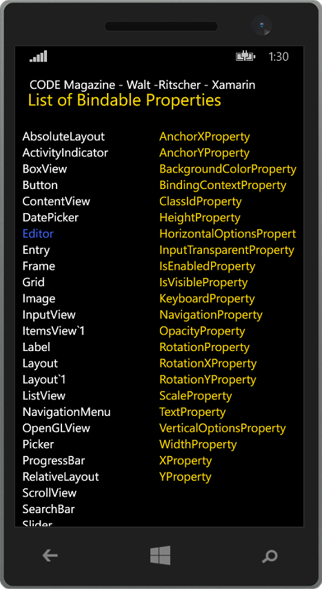
Now that you have a basic idea of how XAML and Xamarin.Forms work, it's time to discuss data-binding. This concept is a key part of other XAML frameworks and is at the heart of the MVVM presentation pattern. Essentially, data-binding takes the property of one object (the source) and transfers it to a property on another object (the target). The target property must be a BindableProperty on an object that derives from BindableObject. To find out which properties are eligible, here is a simple LINQ query that returns all the bindable properties in the Editor class:
var q2 = from member
         in typeof(Xamarin.Forms.Editor).GetFields
         (BindingFlags.Public | BindingFlags.Static | BindingFlags.FlattenHierarchy)
         where member.FieldType ==
         typeof(Xamarin.Forms.BindableProperty)
         orderby member.Name
         select member;
The left column in Figure 6 uses a similar LINQ query to show a list of the BindableObjects available in Xamarin.Forms. The right column in Figure 6 shows the BindableProperties for the Editor view.
View-to-View Binding
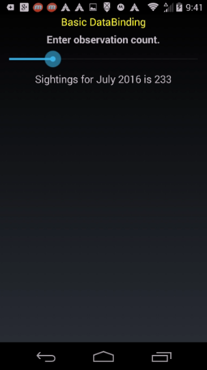
In some scenarios, it's convenient to create a binding between UI elements. Then, the property value of the source View is transferred to the target View's property. In XAML, a binding is defined on the target element. Use the BindingContext to specify the data-source. In this example, the target object is the Label view:
<Slider x:Name="slider"
        Maximum="1000"
        Value="21" />
<Label  BindingContext="{x:Reference slider}"
        Text="{Binding Value, StringFormat='Sightings for July 2016 is {0:F0}'}"
        Font="Large" />
Use the Label's BindingContext property to indicate the source. In this example, the source is another view on the page, so use the x:Reference markup extension to refer to the source view by name. Finally, use the Binding markup extension to bind the Label's Text property to the Slider's Value property.
Note the StringFormat parameter in the binding. This is useful for formatting the appearance of the bound value (e.g., currency, percent, longdate, etc.). It also provides a way to wrap the bound value in additional text. Figure 7 shows the page on an Android device.
Binding to a ViewModel
View-to-view binding is a nice feature but it's overshadowed by the more common view-to-data binding. In XAML-based frameworks, this is frequently done by creating a ViewModel class and using it as the data-source for the view. With this category of binding, the BindingContext is usually, but not always, set in the code-behind. Since there are no design-time tools in Expression Blend or Visual Studio for working with Xamarin XAML data sources, there's no reason to create the data-source in the page's XAML.
Before I show how to set the bindings, let's examine a few of the classes in the wildlife tracking application. First is the Creature class:
public class Creature {
  public int CreatureId { get; set; }
  public string DisplayName { get; set; }
  public int PointsAwarded { get; set; }
  public string ScientificName { get; set; }
  public string Description { get; set; }
}
This Creature class is exposed in the CreatureViewModel class shown in Listing 2.
Listing 2: CreatureViewModel class
class CreatureViewModel : INotifyPropertyChanged {

    private IRepository _repository;
    private int _creatureId = 1;

    public CreatureViewModel(IRepository repository, int creatureId){
        _repository = repository;
        _creatureId = creatureId;
    }

    public Creature Creature {
        get {
            return _repository.GetCreature(_creatureId);
        }
    }

    public virtual void RaisePropertyChanged(
        [CallerMemberName] string propertyName = null) {
        var handler = PropertyChanged;
        if (handler != null)
            handler(this, new PropertyChangedEventArgs(propertyName));
        }

    public event PropertyChangedEventHandler PropertyChanged;
}
To access the properties of the ViewModel, I'll instantiate it in the page and set the BindingContext in the page constructor:
public partial class CreaturePage {
  CreatureViewModel _vm =
     new CreatureViewModel(
 new LocalRepository(), 3);

  public CreaturePage() {
    InitializeComponent();
    this.BindingContext = _vm.Creature;
  }
}
When the CreatureViewModel is instantiated, I pass in the LocalRepository instance (see Listing 3) and the creatureID. Then I set the BindingContext to a Creature instance in the ViewModel:
this.BindingContext = _vm.Creature;
Then, it's simply a matter of using the Binding markup extension in the XAML:
<StackLayout>
  <Label Text="Creature Details" />
  <BoxView HeightRequest="2">
      <StackLayout Orientation='Horizontal' >
          <Label Text="{Binding DisplayName}"
                 TextColor="Yellow" />
          <Label Text=" - " />
          <Label TextColor="White"
                 Text="{Binding ScientificName}"/>
      </StackLayout>
</StackLayout>
<StackLayout Padding="20,0,0,20">
  <Label Text="{Binding Description}"
         TextColor="White" />
</StackLayout>
This is a familiar pattern for any XAML developer, and it's nice to see that binding works in a familiar way, albeit with some minor differences.
Listing 3: Repository classes
public interface IRepository {
    void AddSighting(int creatureId, double latitude,
                     double longitude, int userId);
    Creature GetCreature(int creatureId);
    List<Creature> GetCreatures();
    List<Sighting> GetSightings();
}

public class LocalRepository : IRepository {
    private List<Creature> _creatures = new List<Creature>();
    private List<Sighting> _sightings = new List<Sighting>();


    public LocalRepository() {
        _creatures.Add(new Creature
        {
            CreatureId = 1,
            DisplayName = "Brown Bear",
            ScientificName = " Ursus Arctos",
            PointsAwarded = 3,
            Description = " Brown bears are massively ..."
        });
    ...

}
public void AddSighting(int creatureId, double latitude,
                        double longitude, int userId) {
    var sighting = new Sighting();
    sighting.CreatureId = creatureId;
    sighting.Latitude = latitude;
    sighting.Longitude = longitude;
    sighting.TimeStamp = DateTime.Now;
    sighting.UserId = userId;

    _sightings.Add(sighting);
  }

  public List<Creature> GetCreatures() {

    return _creatures;

  }

  public List<Sighting> GetSightings() {

    return _sightings;

  }
  public Creature GetCreature(int creatureId) {
      return _creatures.SingleOrDefault(x => x.CreatureId == creatureId);
  }
}
List Binding
Showing a collection or list of data is common in many applications. In Xamarin.Forms, the primary View for showing a collection is the ListView. Don't look for a ComboBox, DataGrid, or similar views, as they're not available yet.
List binding works with IEnumerable types. For this example, I'm binding to the ObservableCollection<Creature> in my ViewModel:
public ObservableCollection<Creature>
    Creatures {
I'll set the BindingContext in my Page like this:
var vm = new SightingViewModel (new LocalRepository());
this.BindingContext = vm.Creatures;
And set the data-source for the ListView with the ItemsSource property. By default, each item in the collection is wrapped in a TextCell and rendered as a single row in the ListView:
<!-- Each item in underlying collection
     is wrapped in a Cell.
     The default is TextCell. -->
<ListView ItemsSource="{Binding}" />
Of course, I can explicitly set the TextCell as the data-template and indicate which bound properties to show:
<ListView ItemsSource="{Binding}">
  <ListView.ItemTemplate>
    <DataTemplate>
        <TextCell TextColor="#2B91AF"
                  DetailColor="#DDDDDD"
                  Detail="{Binding Description}"
                  Text="{Binding DisplayName}" />
    </DataTemplate>
  </ListView.ItemTemplate>
</ListView>
Figure 8 shows the results. The top ListView shows the TypeName (NatureTracker.Portable.Creature) due to the way the default implementation gets the bound data. The bottom ListView shows the Creature DisplayName and Description as defined by my bindings.
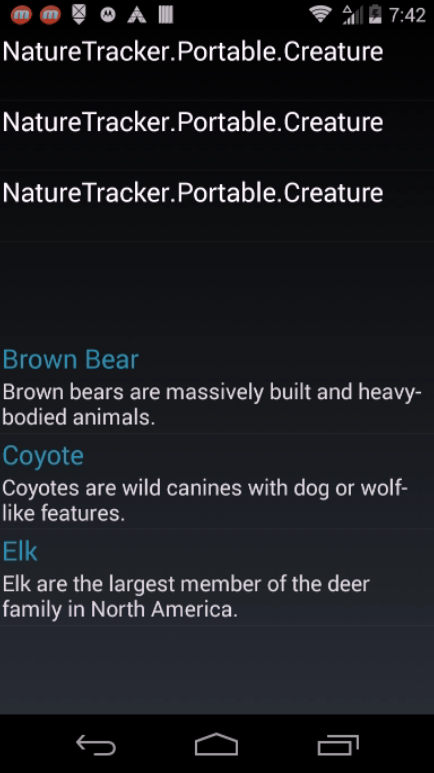
Notice how the data is automatically formatted by the TextCell in the bottom ListView. The default font size is smaller for the Detail text. Also notice that it uses my color choices as defined with the DetailColor and TextColor properties. The TextCell is convenient for showing simple bits of text. If you need more control over layout or representation of the data, there are additional Cell types available. Table 2 lists them.
Apply a DataTemplate to a ListView
Data templates provide a way to enhance the visual appearance of a bound item. They are especially powerful when combined with list controls. As you've seen, the TextCell provides a simple template within the ListView. For more influence over the data-template, use the ViewCell.
In this final example, I'll create a page that looks like Figure 9. The page BindingContext is bound to the SightingViewModel shown in Listing 4.

Listing 4 : SightingViewModel
public class SightingViewModel : INotifyPropertyChanged {
    private IRepository _repository;

    public SightingViewModel(
        IRepository repository) {
        _repository = repository;
        this._currentCreature = Creatures.FirstOrDefault();

        this.AddSightingCommand = new Xamarin.Forms.Command(() =>
        {

            AddSighting();
        });
    }
    public Xamarin.Forms.Command
        AddSightingCommand { set; get; }
    public ObservableCollection<Creature> Creatures {
        get {
            return new ObservableCollection<Creature>(
                _repository.GetCreatures());
        }
    }

    public List<Sighting> Sightings {
        get {
            return _repository.GetSightings();
        }
    }
    private Creature _currentCreature;
    public Creature CurrentCreature {
        get {
            return _currentCreature;
        }
        set {
           _currentCreature = value;
           OnPropertyChanged();
        }
    }

    public int GetCreatureCount(int creatureId) {
        return _repository.GetSightings().Where(
            x => x.CreatureId == creatureId).Count();
    }

    public int AllCreatureCount {
        get {
return _repository.GetSightings().Count();
        }
  }

  public void AddSighting() {
      AddSighting(creatureId: _currentCreature.CreatureId,
      latitude: 0.0, longitude: 0.0, userId: 742);
  }

  public void AddSighting(int creatureId,
      double latitude, double longitude, int userId) {
      _repository.AddSighting(creatureId,
      latitude, longitude, userId);

      MessageText =
         String.Format("Your sighting of the {1} was tallied at {2}." +
         "Volunteers have tagged {0} creatures in this region",
         AllCreatureCount, CurrentCreature.DisplayName, DateTime.Now);
  }


  private string _messageText;
  public string MessageText {
      get {

          return _messageText;
      }
      set {
          _messageText = value;
          OnPropertyChanged();
      }
  }

  public virtual void OnPropertyChanged(
      [CallerMemberName] string propertyName = null) {
          var handler = PropertyChanged;
          if (handler != null) handler(this,
              new PropertyChangedEventArgs(propertyName));
      }

      public event PropertyChangedEventHandler PropertyChanged;
}
At the top of the screen, there's a Button that the user taps to register an animal sighting. The text on the button is bound to the DisplayName property, as shown here:
<Button Text="{Binding CurrentCreature.DisplayName,
    StringFormat= ' Add your sighting of the {0}.'}" />
Below the button, there's a ListView, shown in Figure 10.
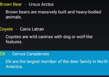
Here's a small section of the ListView data template:
<ListView.ItemTemplate>
  <DataTemplate>
    <ViewCell>
<ViewCell.View>
  <StackLayout>
    <StackLayout Orientation='Horizontal'>
<StackLayout>
  <Label Text="{Binding DisplayName}"
    TextColor="Yellow" />
  <Label Text=" - " />
  <Label Text="{Binding ScientificName}"
    TextColor="White" />
</StackLayout></StackLayout>
I've replaced the default TextCell with ViewCell, which allows me to create a custom data-template. Then it's easy to use the Binding class, where needed, to insert the ViewModel data.
Working with Commands
The Button on this page adds a Creature sighting to the data-store. To do that, it needs to invoke code in the ViewModel. While it's trivial to add a Clicked handler and call the SightingViewModel.AddSightng method, it's rare in MVVM to wire-up an event handler in the code-behind file. Instead, a command is placed in the ViewModel and bound to the Button Command property.
There are two types of Commands available in Xamarin.Forms. Which one you use depends on whether you need to pass arguments to the Command. The Command class is the simple one, without argument, and Command<T> is the one with argument (where T is the type of the argument).
Here's the ViewModel code that registers the AddSightingCommand:
public SightingViewModel(
    IRepository repository) {
        _repository = repository;

        this.AddSightingCommand =
            new Xamarin.Forms.Command(() =>
        {

            AddSighting();
        });
    }
    public Xamarin.Forms.Command AddSightingCommand { set; get; }
Modify the XAML as follows to bind the button command property to the AddSightingCommand:
<Button Text="{Binding CurrentCreature.DisplayName,
    StringFormat='Add your sighting of the {0}.'}"
        Command='{Binding AddSightingCommand}'/>
More to Explore
This article provides a starting point for learning Xamarin.Forms. Check out the complete code samples available in the companion project included with this article. There's still a lot to discover in Xamarin.Forms; I didn't have a room to discuss Navigation, Pages, Layout, Tables, and Custom Views in this article. I suggest that you head over to the Xamarin developer portal (http://developer.xamarin.com/guides/cross-platform/getting_started/) and read their excellent documentation to learn more.
For me, the appealing factor about this exciting technology is how it embraces the .NET mindset. I can write my code in C#, build my UI in XAML, and produce a cross-platform app that targets over two billion devices. That's a win in my book.
Table 1: The default project types
| Project Name | Description |
| MyApp (Portable) | This project contains the cross-platform code shared by the other projects. This is also the location for the shared UI markup and code. |
| MyApp.Android | This project contains the Android code and platform-specific assets. It's also the place to configure the app and contains the entry point for the Android app. |
| MyApp.iOS | This project contains iOS code and platform-specific assets. It's also the place to configure the iOs app and contains the entry point for the iOs app. |
| MyApp.WinPhone | This project contains the Windows Phone code and platform-specific assets. It's also the place to configure the app and contains the entry point for the Windows Phone app. |
Table 2: Cell types
| Cell Type | Description |
| EntryCell | A Cell with a label and a single line text entry field |
| ImageCell | A Cell that renders an image |
| SwitchCell | A Cell with a label and an on/off switch. |
| TextCell | A Cell with detail text and primary text |
| ViewCell | A Cell containing a developer-defined view. Useful for complex templates |