


When a browser displays a web page, it places each HTML block element in a box. That makes it easy to control the spacing, borders, and other formatting for elements like headers, sections, footers, headings, and paragraphs. Some inline elements like images are placed in a box as well. To work with boxes, you use the CSS box model.
How the box model works
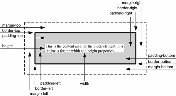
Figure 5-1 presents a diagram that shows how the box model works. By default, the box for a block element is as wide as the block that contains it and as tall as it needs to be based on its content. However, you can explicitly specify the size of the content area for a block element by using the height and width properties. You can also use other properties to set the borders, margins, and padding for a block element.
If you look at the diagram in this figure, you can see that padding is the space between the content area and a border. Similarly, a margin is the space between the border and the outside of the box.
If you need to calculate the overall height of a box, you can use the formula in this figure. Here, you start by adding the values for the margin, border width, and padding for the top of the box. Then, you add the height of the content area. Last, you add the values for the padding, border width, and margin for the bottom of the box. The formula for calculating the overall width of a box is similar.
When you set the height and width properties for a block element, you can use any of the units that you learned about in the last chapter. For now, though, we'll use pixels so the sizes are fixed. That way, the size of the page won’t change if the user changes the size of the browser window. This is referred to as a fixed layout.
When you use a fixed layout, you can use either absolute or relative units of measure for margins and padding. If you use a relative unit such as ems, the margins and padding will be adjusted if the font size changes. If you use an absolute unit, the margins and padding will stay the same.
The CSS box model
The formula for calculating the height of a box
top margin + top border + top padding +
height +
bottom padding + bottom border + bottom margin
The formula for calculating the width of a box
left margin + left border + left padding +
width +
right padding + right border + right margin
Description
- The CSS box model lets you work with the boxes that a browser places around each block element as well as some inline elements. This lets you add formatting such as margins, padding, and borders.
- By default, the box for a block element is as wide as the block that contains it and as tall as it needs to be based on its content.
- You can use the height and width properties to specify the size of the content area for a block element explicitly.
- You can use other properties to control the margins, padding, and borders for a block element. Then, these properties are added to the height and width of the content area to determine the height and width of the box.
A web page that illustrates the box model
To help you understand how the box model works, figure 5-2 presents the HTML for a simple web page. Then, the CSS adds borders to the four types of elements in the HTML: a dotted 3-pixel border to the body, a solid 2-pixel border to the main element, and dashed 1-pixel borders to the h1 and <p> elements. If you look at the web page in the browser, you can see how these four borders are rendered. You can also see how the margins and padding for these boxes work.
For the body, the margin on all four sides is set to 10 pixels. You can see that margin on the left, top, and right of the body border, but not on the bottom. That’s because the bottom margin for the body is determined by the size of the window.
For the main element, the width is set to 500 pixels, and the margins on all four sides of the box are set to 20 pixels. You can see these margins on the left, top, and bottom of the main box, but not on the right because the width of the section is set to 500 pixels.
The next rule set sets properties for both the h1 and <p> elements. In this case, the properties set the border and the padding for these elements. Then, the next two rule sets set additional properties for each of these elements.
The rule set for the h1 element sets the top margin to .5em, the right and left margins to 0, and the bottom margin to .25em. As a result, there is more space above the h1 element than below it. This rule set also sets the padding on the left side of the element to 15 pixels so space is added between the border of the box and the text.
The rule set for the <p> element starts by setting all the margins to 0. As a result, all of the space between the h1 and <p> elements is due to the bottom margin of the h1 element. In addition, the padding on the left side of the element is set to 15 pixels so the text for the h1 and <p> elements is aligned.
Please note that if I had used relative measures for the padding on the left of the h1 and <p> elements, they wouldn’t be aligned because the font sizes for these elements are different. One more thing to notice is that the padding-left properties in the rule sets for the h1 and <p> elements override the left padding specified by the rule set for both of these elements.
This should help you understand how the box model works. Now, it's on to the details for setting the properties for the box model.