


Most data analysts and scientists using Python are familiar with plotting libraries such as matplotlib, Seaborn, and Plotly. These libraries are very useful for doing data exploration, as well as visualizing and generating graphics for reports. However, what if you want to generate all these charts and graphics and let your users view them on Web browsers? Also, it would be useful if the users can interact with your charts dynamically and drill down into the details they want to see. For this, you can use Bokeh.
In this article, I'll walk you through the basics of Bokeh: how to install it, how to create basic charts, how to deploy them on Web servers, and more. So let the fun begin!
What Is Bokeh?
Bokeh is a Python library for creating interactive visualizations for Web browsers. Using Bokeh, you can create dashboards - a visual display of all your key data. What's more, Bokeh powers your dashboards on Web browsers using JavaScript, all without you needing to write any JavaScript code.
Dashboards provide all your important information in a single page and are usually used for presenting information such as KPIs and sales results.
Installing Bokeh
For this article, I'll be using Anaconda for my Python installation. You can download Anaconda from https://www.anaconda.com/products/individual. Once Anaconda is installed, the next step is to install the Bokeh library.
To install the Bokeh library, simply use the pip command at the Anaconda Prompt/Terminal:
$ pip install bokeh
Creating Basic Glyphs
In Bokeh, a plot is a container that holds all the various objects (such as renderers, glyphs, or annotations) of a visualization.
Glyphs are the basic visual building blocks of Bokeh plots. The simplest way to get started is to create a simple chart using the various glyphs methods.
In Bokeh, glyphs are the geometrical shapes (lines, circles, rectangles, etc.) in a chart.
In Jupyter Notebook, type the following code in a new cell:
from bokeh.plotting import figure, output_file, show
import random
count = 10
x = range(count)
y = random.sample(range(0, 101), count)
p = figure() # figure is a type of plot
# using various glyph methods to create scatter
# plots of different marker shapes
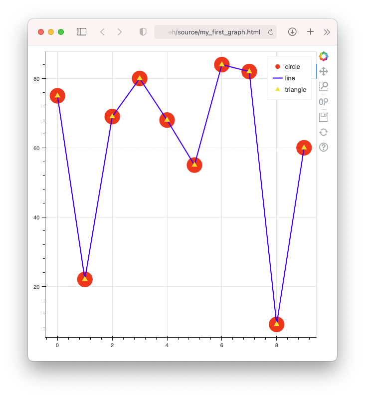
p.circle (x, y, size=30, color='red', legend_label='circle')
p.line (x, y, width=2, color='blue', legend_label='line')
p.triangle(x, y, size=10, color='gold', legend_label='triangle')
output_file('my_first_graph.html') # name the output file
show(p) #show the graph
The figure() function returns a plot object, which allows you to create various types of charts using the various glyphs methods. The circle(), line(), and triangle() glyph methods creates scatter plots with various marker shapes.
In the above, you also specified the filename of the page as my_first_graph.html, using the output_file() function; if you don't specify the output filename, a random file will be generated every time you run the code (and hence a new tab is created on your browser). When you run the cell containing the above code, you'll see the scatter plot containing the various markers as shown in Figure 1 in a new tab page on your Web browser.
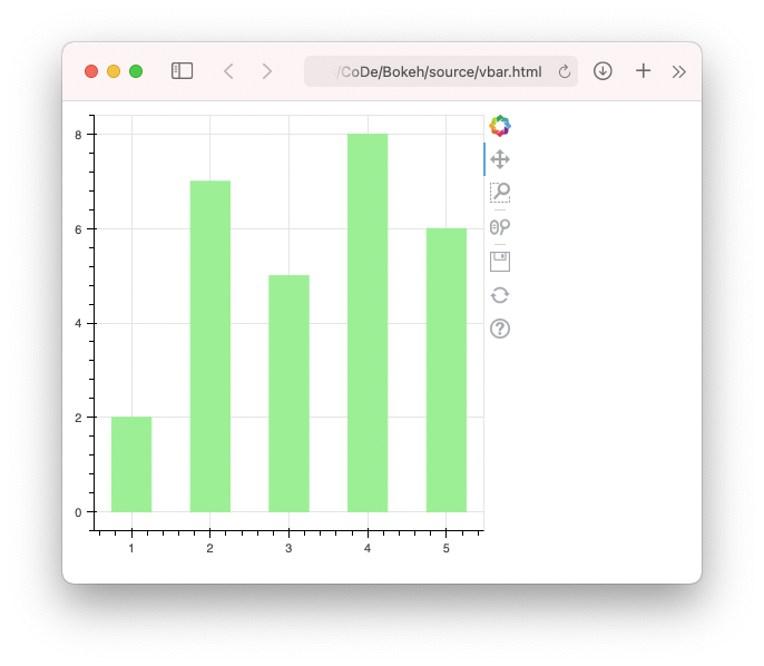
Observe the toolbar displayed on the right side of the plot (see Figure 2).
The toolbar contains the following tools:
- Bokeh: Link to the Bokeh page
- Pan: Drag the chart to move it around
- Box Zoom: Use your mouse to select part of the plot to zoom in
- Wheel Zoom: Use the wheel on your mouse to zoom in and out of the plot
- Save: Save and download a copy of your chart in PNG format
- Reset: Restore the plot to its original state
- Help: Link to the page on Bokeh plot tools
The toolbar is customizable and in a later section, I'll show you how to hide/add tools in the toolbar.
Vertical Bars
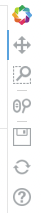
Bar charts can be drawn easily in Bokeh using the vbar() method. The following example shows how to display a bar chart by supplying data through a ColumnDataSource object:
from bokeh.plotting import figure, output_file, show
from bokeh.models import ColumnDataSource
import pandas as pd
import random

# create a Pandas dataframe
df = pd.DataFrame(dict(
    x = [1, 2, 3, 4, 5],
    y = random.sample(range(1,11), 5),
))

# create a ColumnDataSource obj using a dataframe
source = ColumnDataSource(data=df)

p = figure(plot_width=400, plot_height=400)

p.vbar(x = 'x',
    top = 'y',
    source = source,
    width = 0.5,
    bottom = 0,
    color = 'lightgreen')

output_file('vbar.html')
show(p)
In the previous example, you provided the data to be plotted using lists. Although this is perfectly fine, it's better to use a ColumnDataSource object as the supplier of data to your plots. In fact, when you pass data to your Bokeh plots using lists, Bokeh automatically creates a ColumnDataSource object behind the scenes. Using a ColumnDataSource, you can enable more advanced capabilities for your Bokeh plots, such as sharing data between plots, filtering data, etc.
The
ColumnDataSourceobject provides the data to the glyphs of your plot. It provides advanced capabilities for your Bokeh plots, such as sharing data between plots, filtering data, etc.
In the above example, the ColumnDataSource object is passed in through the source parameter of the vbar() method:
p.vbar(x = 'x',              # x-axis
       top = 'y',            # y-axis
       source = source,
       width = 0.5,          # width of bar
       bottom = 0,           # starts from bottom
       color = 'lightgreen')
Printing the source.data property shows the following (formatted for clarity):
print(source.data)
# {
#     'index': array([0, 1, 2, 3, 4]),
#     'x': array([1, 2, 3, 4, 5]),
#     'y': array([ 7, 10,  5,  9,  2])
#}
The value “x” in the vbar() method refers to the value of the “x” key in the value of source.data, and “y” refers to the value of the “y” key. Figure 3 shows the vertical bar chart generated by the vbar() method.
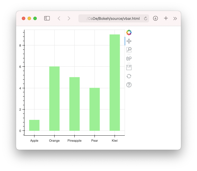
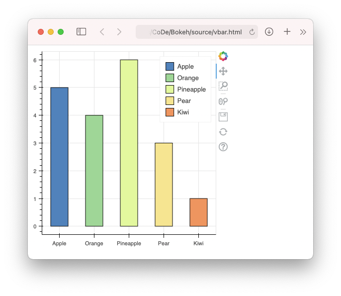
What happens if the values for the x-axis are categorical values, such as a list of fruits? Consider the following:
df = pd.DataFrame(dict(
    fruits = ['Apple','Orange','Pineapple', 'Pear','Kiwi'],
    sales = random.sample(range(1,11), 5),
))
In this case, in order to plot the chart correctly, you need to specify the x_range parameter in the figure() function and pass it the categorical values, like this:
from bokeh.plotting import figure, output_file, show
from bokeh.models import ColumnDataSource
import pandas as pd
import random

df = pd.DataFrame(dict(
    fruits = ['Apple','Orange','Pineapple', 'Pear','Kiwi'],
    sales = random.sample(range(1,11), 5),
))

source = ColumnDataSource(data=df)

p = figure(plot_width=400,
           plot_height=400,
           x_range=source.data['fruits'])

p.vbar(x = 'fruits',
       top = 'sales',
       source = source,
       width = 0.5,
       bottom = 0,
       color = 'lightgreen')

output_file('vbar.html')
show(p)
Figure 4 shows the updated vertical bar plot.
Displaying Legends and Colors
A chart needs a legend to be useful. Bokeh provides a collection of palettes for color mapping (https://docs.bokeh.org/en/latest/docs/reference/palettes.html). Consider the palette named Spectral (see Figure 5).
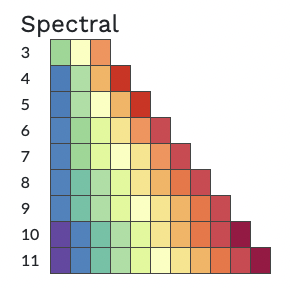
You can import the Spectral palette and examine its content:
from bokeh.palettes import Spectral
Spectral
# {3: ('#99d594', '#ffffbf', '#fc8d59'),
#  4: ('#2b83ba', '#abdda4', '#fdae61', '#d7191c'),
#  5: ('#2b83ba', '#abdda4', '#ffffbf', '#fdae61', '#d7191c'),
#  ...
Each row in the palette contains a collection (tuples) of colors. To use the colors in the palette, use the factor_cmap() function to create a dictionary of colors, like the following example:
from bokeh.plotting import figure, output_file, show
from bokeh.models import ColumnDataSource
import pandas as pd
import random

from bokeh.palettes import Spectral
from bokeh.transform import factor_cmap

df = pd.DataFrame(dict(
    fruits = ['Apple','Orange','Pineapple','Pear','Kiwi'],
    sales = random.sample(range(1,11), 5),
))

source = ColumnDataSource(data=df)

p = figure(plot_width=400,
           plot_height=400,
           x_range=source.data['fruits'])

p.vbar(source = source,
       x = 'fruits',
       top = 'sales',
       width = 0.5,
       bottom = 0,
       color = 'lightgreen',
       legend_field = 'fruits',
       line_color = 'black',
       fill_color = factor_cmap('fruits',
           palette=Spectral[6],
           factors=source.data['fruits'])
)

output_file('vbar.html')
show(p)
Figure 6 shows the vertical bar chart displayed in colors defined in the Spectral palette as well as with the legend.
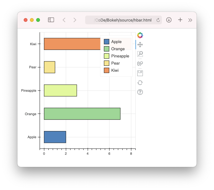
Horizontal Bars
In addition to vertical bar chart, horizontal bar chart is also sometimes useful. The following code snippet shows how to display a horizontal bar chart using the hbar() method:
from bokeh.plotting import figure, output_file,show
from bokeh.models import ColumnDataSource
import pandas as pd
import random

from bokeh.palettes import Spectral
from bokeh.transform import factor_cmap

df = pd.DataFrame(dict(
    fruits = ['Apple','Orange','Pineapple','Pear','Kiwi'],
    sales = random.sample(range(1,11), 5),
))

source = ColumnDataSource(data=df)

p = figure(plot_width=400,
           plot_height=400,
           y_range=source.data['fruits'])

p.hbar(source = source,
       y = 'fruits',
       height = 0.5,
       left = 0,
       right = 'sales',
       color = 'lightgreen',
       legend_field = 'fruits',
       line_color = 'black',
       fill_color = factor_cmap('fruits',
           palette=Spectral[6],
           factors=source.data['fruits'])
)

output_file('hbar.html')
show(p)
Figure 7 shows the output using the colors from the Spectral palette.
Stacked Bars
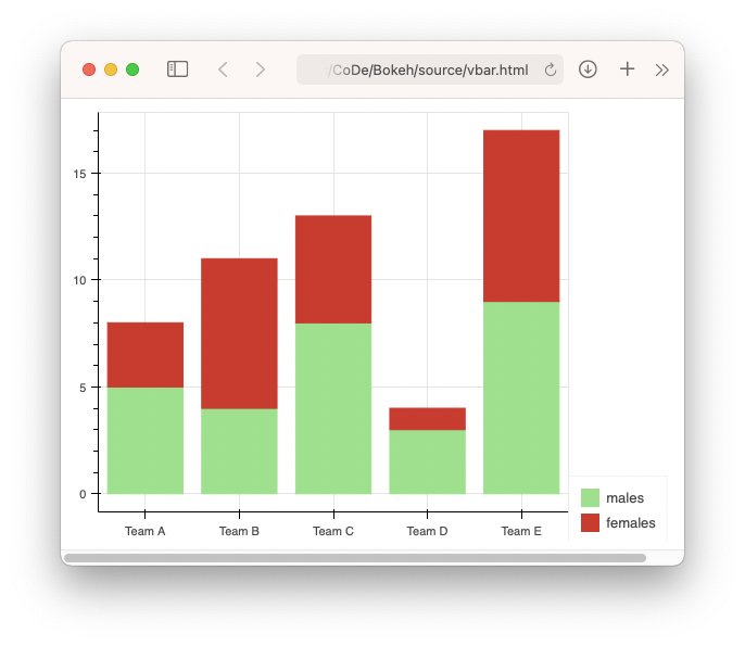
A Stacked bar chart is a variation of bar chart that allows you to compare numeric values between values of a categorical variable. Suppose you have a dataframe containing the following rows and columns:
    teams  males  females
0  Team A      9        8
1  Team B      3        4
2  Team C      4       10
3  Team D      1        3
4  Team E      6        1
It would be useful to use a stacked bar to show the number of males and females in each team. The following code snippet shows how to use the vbar_stack() method to display a stack bar showing the composition of genders in each team:
from bokeh.plotting import figure, output_file, show
from bokeh.models import ColumnDataSource
import pandas as pd
import random

from bokeh.palettes import Category20

df = pd.DataFrame(dict(
    teams = ['Team A','Team B','Team C','Team D','Team E'],
    males = random.sample(range(1,11), 5),
    females = random.sample(range(1,11), 5),
))

source = ColumnDataSource(data=df)

p = figure(plot_width=400,
           plot_height=400,
           x_range=source.data['teams'])

v = p.vbar_stack(['males', 'females'],
                 source = source,
                 x = 'teams',
                 width=0.8,
                 color=Category20[8][5:7],
)

output_file('vbar.html')
show(p)
Figure 8 shows the output for the stacked bars.
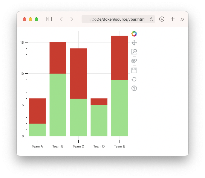
What the stacked bars lack is a legend to indicate what the red and green bars represent. So let's add a legend to the plot using the Legend class:
...
p = figure(plot_width=600,
          plot_height=400,
          x_range=source.data['teams'])

v = p.vbar_stack(['males', 'females'],
                 source = source,
                 x = 'teams',
                 width=0.8,
                 color=Category20[8][5:7],
)

from bokeh.models import Legend
legend = Legend(items=[
    ("males",   [v[0]]),
    ("females", [v[1]]),
], location=(0, -30))

p.add_layout(legend, 'right')

output_file('vbar.html')
show(p)
You can specify the position of the legend and where to add it to the plot. Figure 9 shows the stacked bars with the legend.
Pie Charts
A pie chart is another popular way to illustrate numerical proportion. In Bokeh, you can use the wedge() method of the plot object to display a pie chart. In the following code snippet, you have a dataframe containing a list of fruits and their sales:
      fruits  sales
0      Apple     10
1     Orange      8
2  Pineapple      5
3       Pear      4
4       Kiwi      7
5     Banana      2
6     Papaya      9
7     Durian      1
8      Guava      3
To display a pie chart showing the sales of the various fruits, you need to calculate the angle of each slice:
df['angles'] = \
    df['sales'] / df['sales'].sum() * \ 2*math.pi
In addition, you can also assign specific color to each slice:
df['colors'] = Category20c[len(df['fruits'])]
The following code snippet outputs the pie chart as shown in Figure 10:
from bokeh.plotting import figure, output_file, show
from bokeh.models import ColumnDataSource
from bokeh.palettes import Category20c
from bokeh.transform import cumsum
import pandas as pd
import random
import math

df = pd.DataFrame(dict(
    fruits =
        ['Apple','Orange','Pineapple',
         'Pear','Kiwi','Banana',
         'Papaya','Durian','Guava'],
    sales = random.sample(range(1,11), 9),
))

df['colors'] = Category20c[len(df['fruits'])]
df['angles'] = \
    df['sales'] / df['sales'].sum() * \ 2*math.pi

source = ColumnDataSource(data=df)

p = figure(plot_width=700,
           plot_height=500,
           x_range=source.data['fruits'])

p.wedge(x=len(df['fruits'])/2,
        y=0,
        radius=3.0,
        start_angle=cumsum('angles', include_zero=True),
        end_angle=cumsum('angles'),
        line_color="white",
        fill_color='colors',
        legend_field='fruits',
        source=source)

output_file('piechart.html')
show(p)
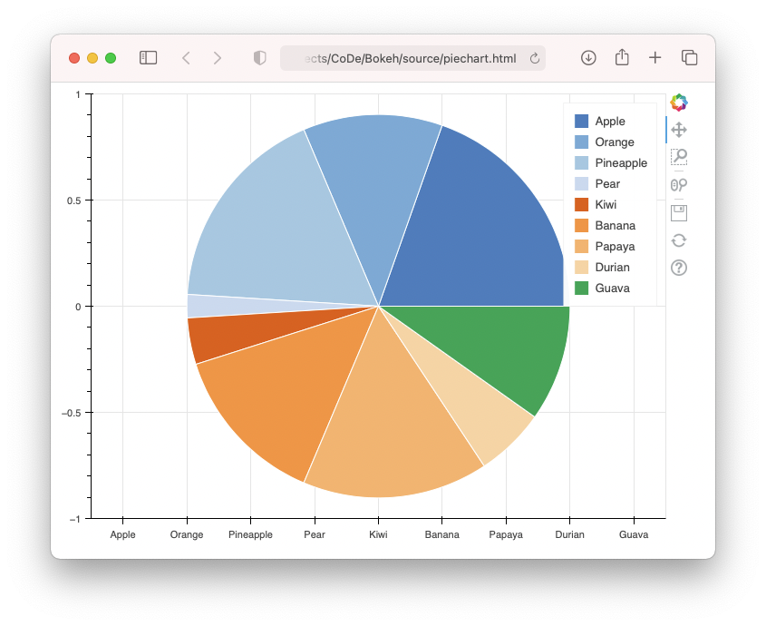
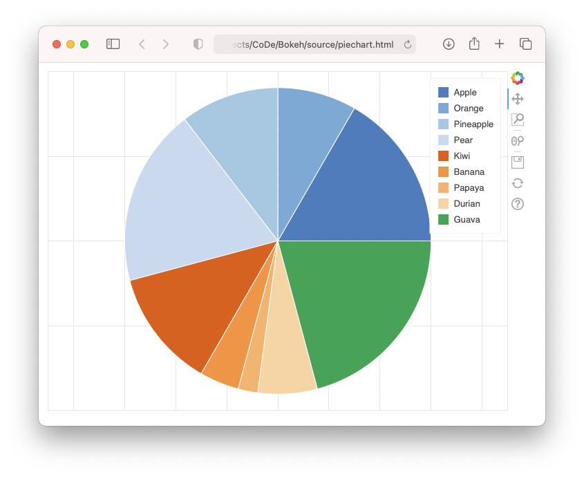
Notice that for the pie chart, it doesn't really make sense for the axes to be visible, and so you can turn them off using the axis.visible property:
p.wedge(x = len(df['fruits'])/2,
        ...)

p.axis.visible = False

output_file('piechart.html')
show(p)
Figure 11 shows the pie chart without the axes.
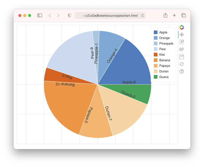
A pie chart without label on it may not be very useful, so let's now add text to each slice of the pie plot using the LabelSet class:
from bokeh.plotting import figure, output_file, show
from bokeh.models import ColumnDataSource, LabelSet
import pandas as pd
import random

from bokeh.palettes import Category20c

import math
from bokeh.transform import cumsum

df = pd.DataFrame(dict(
    fruits = ['Apple','Orange','Pineapple',
              'Pear','Kiwi','Banana',
              'Papaya','Durian','Guava'],
    sales = random.sample(range(1,11), 9),
))

df['colors'] = Category20c[len(df['fruits'])]
df['angles'] = \
    df['sales'] / df['sales'].sum() * \ 2*math.pi
df['label'] = (df['fruits'] + "-" +
               df['sales'].astype(
               str)).str.pad(30, side='left')

source = ColumnDataSource(data=df)

p = figure(plot_width=700,
           plot_height=500,
           x_range=source.data['fruits'])

p.wedge(x = len(df['fruits'])/2,
        y = 0,
        radius = 3.0,
        start_angle = cumsum('angles',
                      include_zero=True),
        end_angle = cumsum('angles'),
        line_color = 'white',
        fill_color = 'colors',
        legend_field = 'fruits',
        source = source)

p.axis.visible = False

labels = LabelSet(x = len(df['fruits'])/2,
                  y = 0,
                  text = 'label',
                  angle = cumsum('angles', include_zero=True),
                  source = source,
                  render_mode = 'canvas')

p.add_layout(labels)

output_file('piechart.html')
show(p)
Figure 12 shows the much-improved pie plot with each slice labeled with the name and the sales.
Dashboard Layouts
Now that you have learned the basics of Bokeh plots, let's not forget why you want to use Bokeh in the first place. If you just want to plot some simple charts, you could jolly well use matplotlib or Seaborn. Using Bokeh, you could layout multiple charts in a single page.
Bokeh provides several layout options:
- Row
- Column
- Gridplot
Listing 1 shows how you can use the row layout to display three charts.
Listing 1: Using the row layout
from bokeh.plotting import figure, output_file, show
from bokeh.models import ColumnDataSource
from bokeh.layouts import row, column, gridplot
import pandas as pd
import numpy as np
import math
x = np.arange(0, math.pi*2, 0.05)
df = pd.DataFrame(dict(
x = x,
sin = np.sin(x),
cos = np.cos(x),
tan = np.tan(x)
))
source = ColumnDataSource(data=df)
#-------------------------------
# Sine Wave
#-------------------------------
p1 = figure(title = "Sine wave",
x_axis_label = 'x',
y_axis_label = 'y',
plot_width=300,
plot_height=300)
p1.line('x', 'sin',
source=source,
legend_label = "sine",
line_width = 2)
#-------------------------------
# Cosine Wave
#-------------------------------
p2 = figure(title = "Cosine wave",
x_axis_label = 'x',
y_axis_label = 'y',
plot_width=300,
plot_height=300)
p2.line('x', 'cos',
source=source,
legend_label = "cos",
line_width = 2)
#-------------------------------
# Tangent Wave
#-------------------------------
p3 = figure(title = "Tangent wave",
x_axis_label = 'x',
y_axis_label = 'y',
plot_width=300,
plot_height=300)
p3.line('x', 'tan',
source=source,
legend_label = "tan",
line_width = 2)
#-------------------------------
# Laying out in row
#-------------------------------
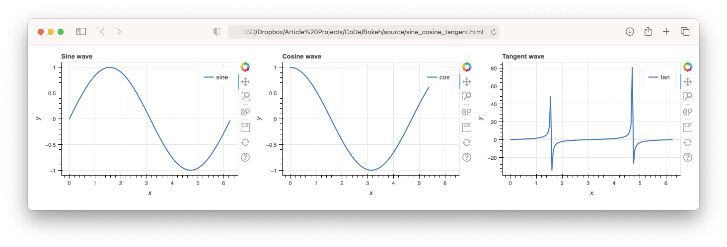
plot = row([p1, p2, p3], sizing_mode='stretch_both')
output_file("sine_cosine_tangent.html")
show(plot)
You make use of the sizing_mode parameter to configure how the charts are displayed when the display changes in size, as you can see in this snippet:
#-------------------------------
#       Laying out in row
#-------------------------------
plot = row([p1, p2, p3], sizing_mode='stretch_both')
Figure 13 shows the output of the three charts: Sine wave, Cosine wave, and Tangent wave.
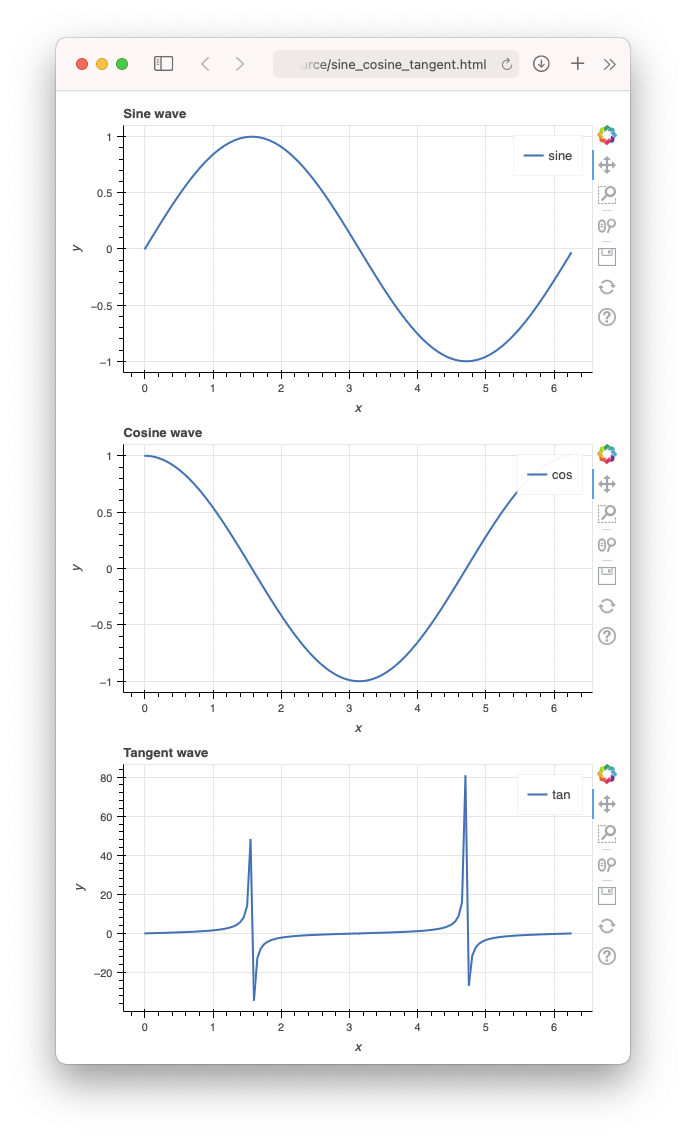
You can also use the column layout:
#-------------------------------
#      Laying out in column
#-------------------------------
plot = column([p1, p2, p3], sizing_mode='stretch_both')
Figure 14 shows the charts displayed vertically in a column layout.
Finally, you can also display the charts in a gridplot:
#-------------------------------
#     Laying out in gridplot
#-------------------------------
plot = gridplot([p1, p2, p3], ncols=2, sizing_mode='stretch_both')
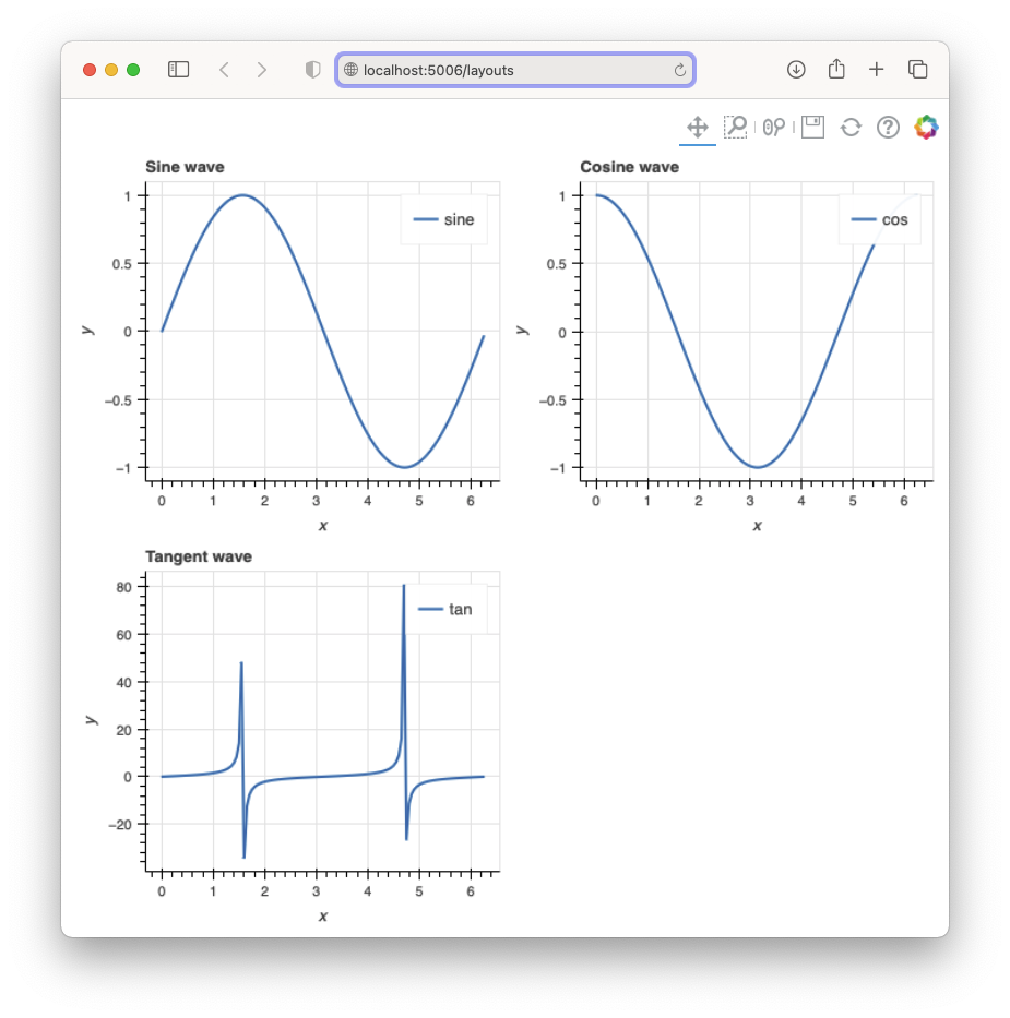
Based on the value of the ncols parameter, Bokeh automatically lays out your plot from left to right, top to bottom, as shown in Figure 15.
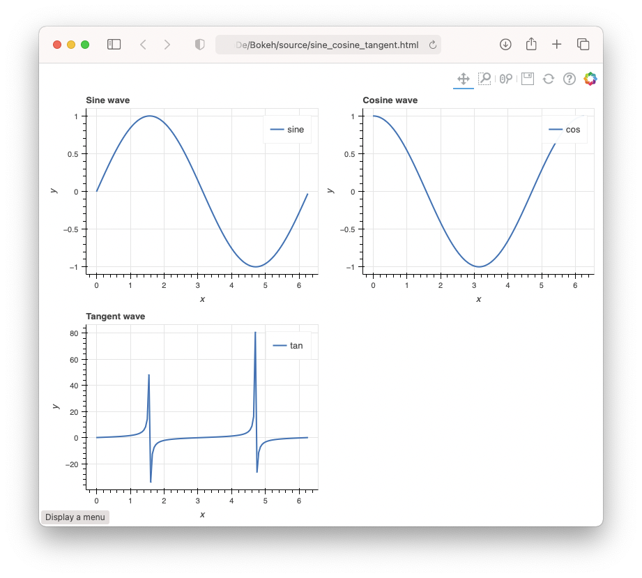
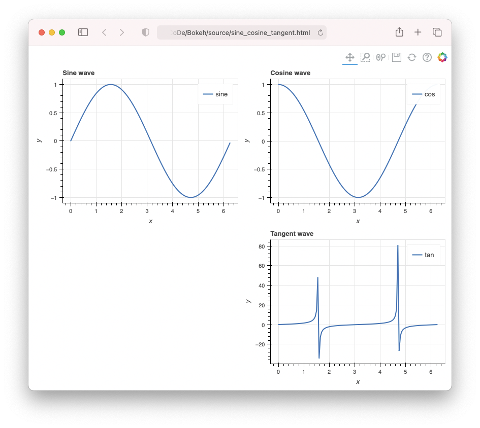
Observe that the Tangent chart is displayed on the left side on the second row. If you want to explicitly specify how the charts are displayed, you can leave out the ncols parameter and pass in your plots objects as lists:
plot = gridplot([[p1, p2], [None, p3]], sizing_mode='stretch_both')
Figure 16 shows the Tangent curve displayed on the right side of the second column.
Using the Bokeh Server
If you observe carefully, so far, all the charts generated by Bokeh run from the file system of your computer: file:///Volumes/SSD/Dropbox/Articles/CoDe/Bokeh/source/sine_cosine_tangent.html. Although this is useful if you're the only one viewing the charts, it's a problem if you need to publish the charts to a wider audience. This is where the Bokeh server comes in. The purpose of the Bokeh server is to make it easy for Python developers to create interactive Web applications that can connect front-end UI events to real, running Python code.
To convert an existing Bokeh to run using the Bokeh server, you just need to import the curdoc() function, and then add the plot object to the root of the current document:
from bokeh.io import curdoc

curdoc().add_root(plot)
curdoc().title = "Using the Bokeh Server"
The
curdoc()function returns the current document. Think of it as a collection of Bokeh plots.
Listing 2 shows the previous example being converted to run using the Bokeh server.
Listing 2: Saving the file as layouts.py to run it using the Bokeh server
from bokeh.plotting import figure, output_file, show
from bokeh.models import ColumnDataSource
from bokeh.layouts import row, column, gridplot

import pandas as pd
import numpy as np
import math

from bokeh.io import curdoc

x = np.arange(0, math.pi*2, 0.05)

df = pd.DataFrame(dict(
    x = x,
    sin = np.sin(x),
    cos = np.cos(x),
    tan = np.tan(x)
))

source = ColumnDataSource(data=df)

#-------------------------------
#   Sine Wave
#-------------------------------
p1 = figure(title = "Sine wave",
            x_axis_label = 'x',
            y_axis_label = 'y',
            plot_width=300,
            plot_height=300
)
p1.line('x', 'sin',
        source=source,
        legend_label = "sine",
        line_width = 2)

#-------------------------------
#   Cosine Wave
#-------------------------------
p2 = figure(title = "Cosine wave",
            x_axis_label = 'x',
            y_axis_label = 'y',
            plot_width=300,
            plot_height=300
)
p2.line('x', 'cos',
        source=source,
        legend_label = "cos",
        line_width = 2)

#-------------------------------
#   Tangent Wave
#-------------------------------
p3 = figure(title = "Tangent wave",
            x_axis_label = 'x',
            y_axis_label = 'y',
            plot_width=300,
            plot_height=300
)
p3.line('x', 'tan',
        source=source,
        legend_label = "tan",
        line_width = 2)

#-------------------------------
#   Laying out in gridplot
#-------------------------------
plot = gridplot([p1, p2, p3], ncols=2, sizing_mode='stretch_both')

# output_file("sine_cosine_tangent.html")
# show(plot)

curdoc().add_root(plot)
curdoc().title = "Using the Bokeh Server"
To run the program using the Bokeh server, you need to save it as a Python file (layouts.py) and run it on the Anaconda Prompt/Terminal:
$ bokeh serve --show layouts.py
Figure 17 shows that the Bokeh server publishes the page using a Web server listening at port 5006.
Bokeh Widgets
You've learned that you can publish your charts using the Bokeh server so that your users can now view your charts easily through a Web browser. To create a front-end user interface for your users to interact with the charts, Bokeh provides widgets - interactive controls that can be added to your Bokeh applications. Bokeh widgets include:
- Button
- CheckboxButtonGroup
- CheckboxGroup
- ColorPicker
- DataTable
- DatePicker
- DateRangeSlider
- Div
- Dropdown
- FileInput
- MultiChoice
- MultiSelect
- Paragraph
- PasswordInput
- PreText
- RadioButtonGroup
- RadioGroup
- RangeSlider
- Select
- Slider
- Spinner
- Tabs
- TextAreaInput
- TextInput
- Toggle
Bokeh widgets are interactive controls that can be added to your Bokeh applications.
Due to space constraints, I'll only illustrate a few of the above widgets.
Select Widget
The Select widget allows the user to make a single selection from a list of items. Listing 3 shows a complete example of the use of the Select widget. In particular:
- The
on_change()function allows you to set the event handler for the Select'svalueevent. - When the user selects an item from the Select widget, you make use of the event handler to update the
ColumnDataSourceobject so that the chart can be updated dynamically. - The event handler for the Select widget's
valueevent takes in three parameters:attr(the property that triggered the event handler),old(the old value of the property), andnew(the new value of the property).
Listing 3: Saving the file as SelectWidget.py to run it using the Bokeh server
import pandas as pd
from bokeh.plotting import figure
from bokeh.models import ColumnDataSource, Select
from bokeh.layouts import column
from bokeh.io import curdoc

# load the dataframe from a CSV file
df = pd.read_csv('AAPL.csv', parse_dates=['Date'])

# extract the columns
Date = df['Date']
Close = df['Close']
AdjClose = df['Adj Close']

# create the data source
source = ColumnDataSource(data=
{
    'x' : Date,
    'y' : Close
})

# called when the Select item changes in value
def update_plot(attr, old, new):
    if new == 'Close':
        # update the data source
        source.data['y'] = Close
        p.yaxis.axis_label = 'Close'
    else:
        source.data['y'] = AdjClose
        p.yaxis.axis_label = 'Adj Close'

# display a selection menu
menu = Select(options=[('Close','Close'), ('Adj Close','Adj Close')],
              value='Close',
              title = 'AAPL Stocks')

# callback when the Select menu changes its value
menu.on_change('value', update_plot)

p = figure(x_axis_type='datetime') # display the x-axis as dates

p.line('x',
       'y',
       source=source,
       color='green',
       width=3)

p.title.text = 'AAPL Stock Prices'
p.xaxis.axis_label = 'Date'
p.yaxis.axis_label = 'Close'

curdoc().theme = 'night_sky'
curdoc().add_root(column(menu, p))
curdoc().title = "First Graph"
Figure 18 shows the output when the file is run in Anaconda Prompt/Terminal:
$ bokeh serve --show SelectWidget.py
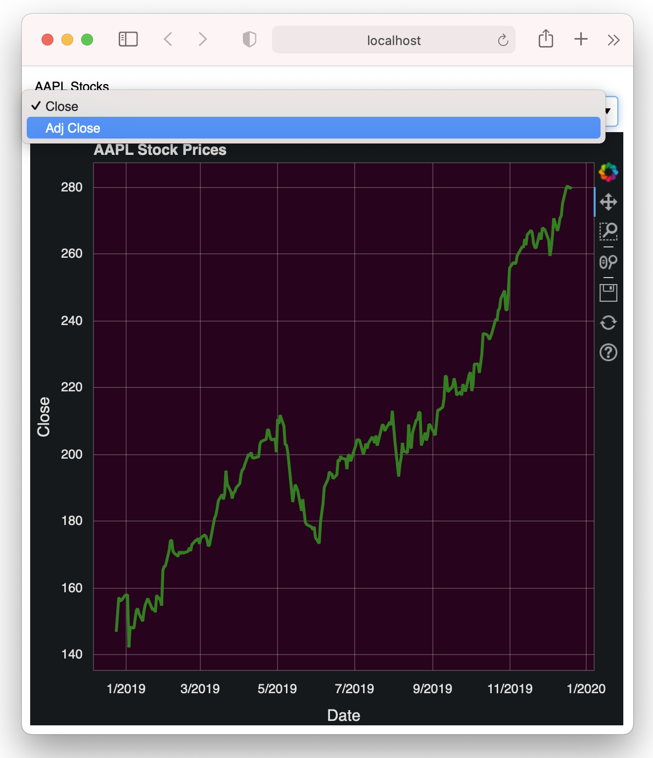
Selecting an item in the Select widget updates the chart to display either the closing or adjusted closing price of AAPL.
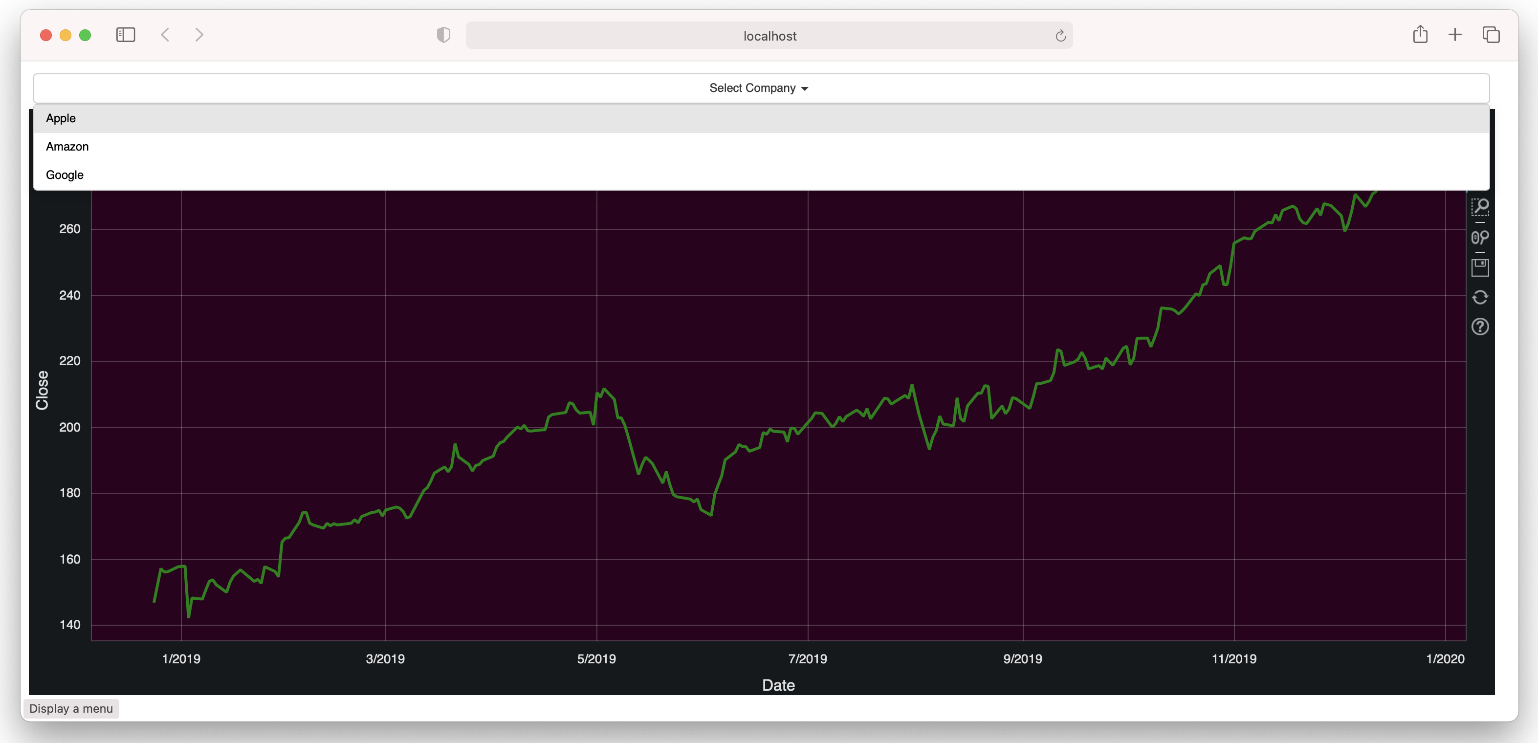
Dropdown Widget
Another Bokeh widget that's like the Select widget is the Dropdown widget, a button that displays a drop-down list of mutually exclusive items when clicked.
The following code snippet shows how to display a Dropdown widget and wire it up with a callback function when it's clicked:
# display a Dropdown menu
menu = Dropdown(label="Select Company", menu=[
    ('Apple','AAPL'),
    ('Amazon','AMZN'),
    ('Google','GOOG')])

# callback when the Dropdown menu is selected
menu.on_click(update_plot)
The callback function for the Dropdown function takes in a single argument:
# called when the Select item changes in value
def update_plot(event):
    print(event.item)   # the value of the item selected in the
                        # Dropdown widget
The item property allows you to know which item was selected in the Dropdown widget. Listing 4 shows how you can load the content of different CSV files depending on which item has been selected in the widget.
Listing 4: Saving the file as Dropdown.py to run it using the Bokeh server
import pandas as pd
from bokeh.plotting import figure, show
from bokeh.models import ColumnDataSource, Dropdown
from bokeh.layouts import column
from bokeh.io import curdoc

# load the dataframe
df = pd.read_csv('AAPL.csv', parse_dates=['Date'])

# create the data source
source = ColumnDataSource(df)

# called when the Select item changes in value
def update_plot(event):
    if event.item == 'AAPL':
        df = pd.read_csv('AAPL.csv', parse_dates=['Date'])
        p.title.text = 'Apple Stock Prices'
    elif event.item == 'AMZN':
        df = pd.read_csv('AMZN.csv', parse_dates=['Date'])
        p.title.text = 'Amazon Stock Prices'
    else:
        df = pd.read_csv('GOOG.csv', parse_dates=['Date'])
        p.title.text = 'Google Stock Prices'

# update the date source
source.data = df

# display a Dropdown menu
menu = Dropdown(label="Select Company",
                menu=[
                    ('Apple','AAPL'),
                    ('Amazon','AMZN'),
                    ('Google','GOOG')])

# callback when the Dropdown menu is selected
menu.on_click(update_plot)

p = figure(x_axis_type='datetime',
           plot_width=1500)
p.line("Date",
       "Close",
       source=source,
       color='green',
       width=3)

p.title.text = 'Apple Stock Prices'
p.xaxis.axis_label = 'Date'
p.yaxis.axis_label = 'Close'

curdoc().theme = 'night_sky'
curdoc().add_root(column(menu, p))
curdoc().title = "Stocks Chart"
Figure 19 shows the output when the file is run in Anaconda Prompt/Terminal:
$ bokeh serve --show Dropdown.py
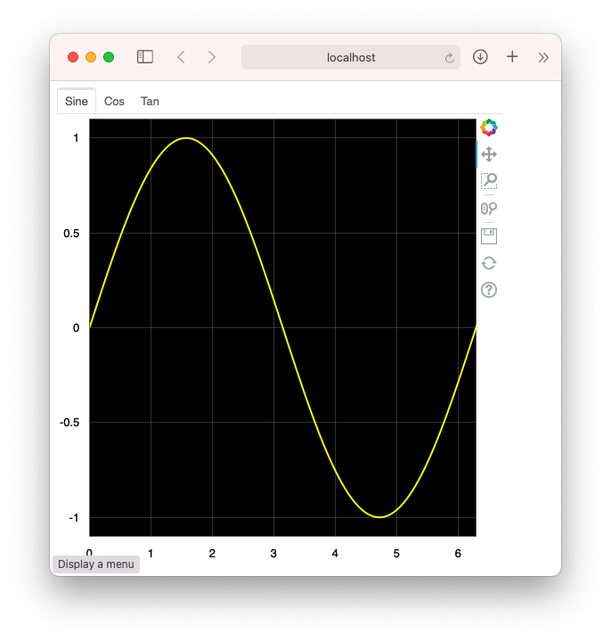
Tabs Widget
The Tabs widget allows you to display plots in different tabs, much like tabs in a Web browser. You first create Panel objects to act as the containers for your various plots. The Tabs widget then takes the various Panel objects and displays them in tabs.
Listing 5 shows an example of the Tabs widget containing three Panel objects, the first displaying the Sine wave, the second displaying the Cosine wave, and the third one displaying the Tangent wave.
Listing 5: Saving the file as Tabs.py to run it using the Bokeh server
from bokeh.plotting import figure, output_file, show
from bokeh.models import Panel, Tabs
from bokeh.io import curdoc
from bokeh.layouts import column
from bokeh.models import Range1d

import numpy as np
import math

width = 500
height = 500

x = np.arange(0, math.pi*12, 0.05)

#------------------------------------------------------
#      Sine tab
#------------------------------------------------------
p1 = figure(plot_width=width, plot_height=height)
p1.x_range = Range1d(0, math.pi*2)
p1.line(x, np.sin(x), line_width=2, line_color='yellow')
tab1 = Panel(child = p1, title = "Sine")

#------------------------------------------------------
#      Cosine tab
#------------------------------------------------------
p2 = figure(plot_width=width, plot_height=height)
p2.x_range = Range1d(0, math.pi*2)
p2.line(x,np.cos(x), line_width=2, line_color='orange')
tab2 = Panel(child=p2, title = "Cos")

#------------------------------------------------------
#      Tangent tab
#------------------------------------------------------
p3 = figure(plot_width=width, plot_height=height)
p3.x_range = Range1d(0, math.pi*2)
p3.y_range = Range1d(-5, 5)
p3.line(x,np.tan(x), line_width=2, line_color='green')
tab3 = Panel(child=p3, title = "Tan")

# Group all the panels into tabs
tabs = Tabs(tabs=[tab1,tab2,tab3])

curdoc().theme = 'contrast'
curdoc().add_root(column(tabs))
curdoc().title = "Trigonometry"
Figure 20 shows the output when the file is run in Anaconda Prompt/Terminal:
$ bokeh serve --show Tabs.py
Slider Widget
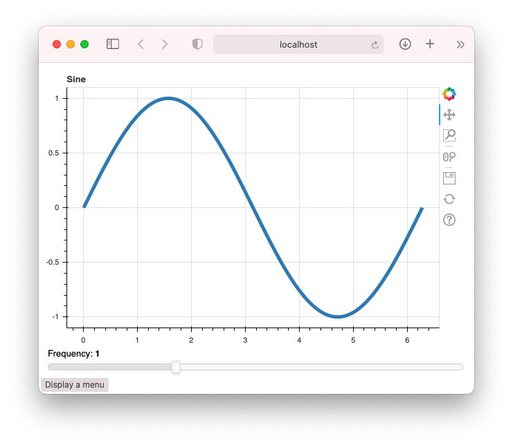
The Slider widget allows users to select a range of floating values. To use this widget, simply set its start value, end value, current value, and the step size (the value to increment/decrement each time the slider moves).
Listing 6 shows an example of the Slider widget where users can select the frequencies of the sine wave to plot.
Listing 6: Saving the file as Slider.py to run it using the Bokeh server
import numpy as np
from bokeh.io import curdoc
from bokeh.layouts import column
from bokeh.models import ColumnDataSource
from bokeh.models.widgets import Slider
from bokeh.plotting import figure

N = 200
x = np.linspace(0, 2*np.pi, N)
y = np.sin(x)

source = ColumnDataSource(data = dict(
                          x = x,
                          y = y)
)

p = figure(plot_height = 400, plot_width = 600, title = "Sine")
p.line('x',
       'y',
       source = source,
       line_width = 5,
       line_alpha = 0.9)

freq = Slider(
    title = "Frequency",
    value = 1.0,
    start = 0.1,
    end = 3.0,
    step = 0.1,
)

freq.width = 600

def update_data(attrname, old, new):
    y = np.sin(new * x)    # new is same as freq.value
    # update the source
    source.data['y'] = y

freq.on_change('value', update_data)

curdoc().add_root(column(p, freq, width = 600))
curdoc().title = "Sliders"
Figure 21 shows the output when the file is run in Anaconda Prompt/Terminal:
$ bokeh serve --show Slider.py
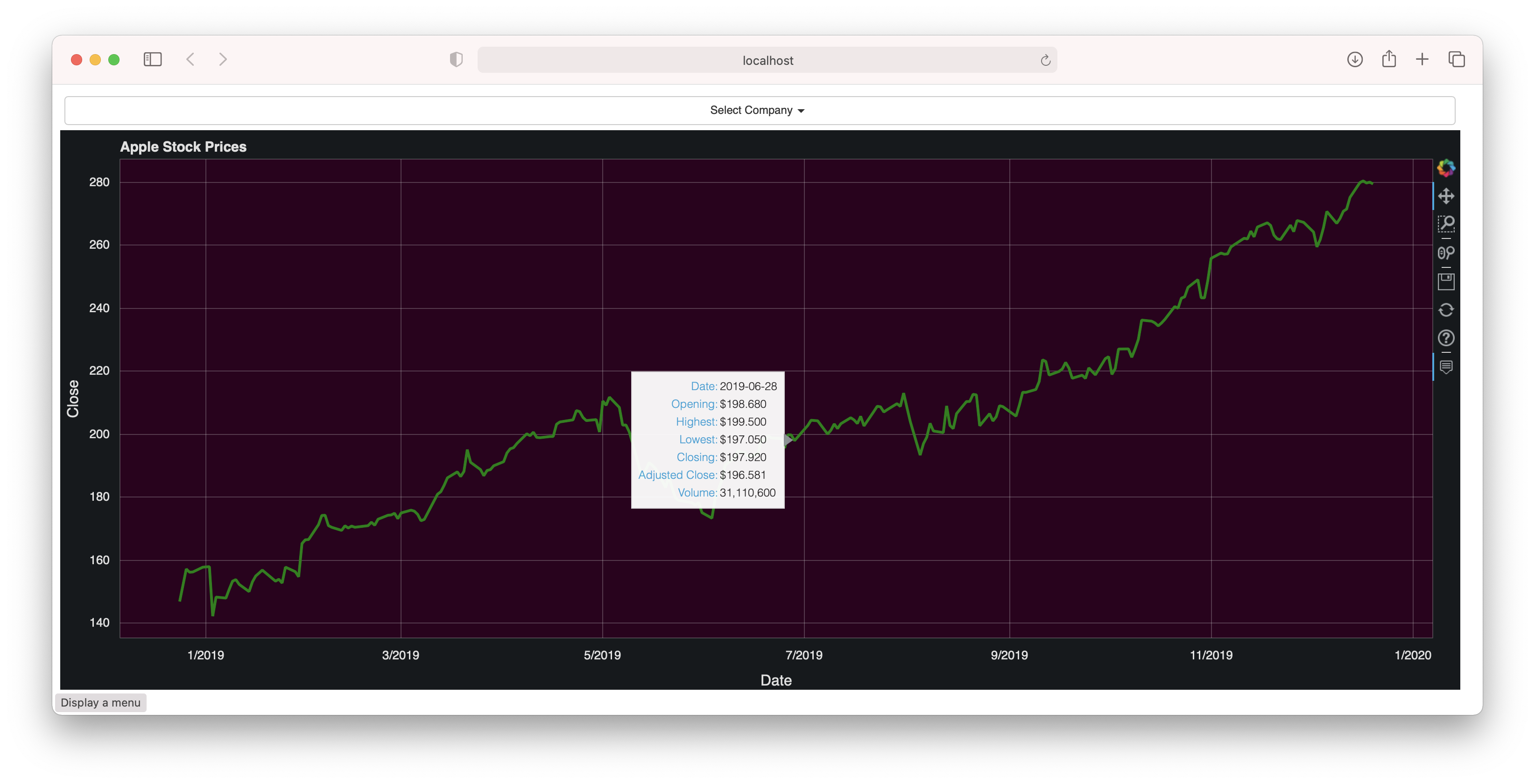
Displaying Tooltips on your Chart
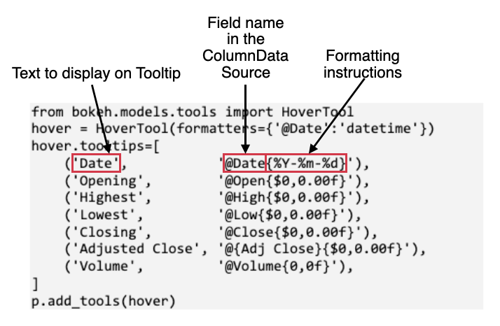
Recall the earlier example where I displayed the stock prices of AAPL? It would be useful to be able to display the various information of AAPL's stock price when the user's mouse hovers over a particular data point on the chart. To do that in Bokeh, you can use the HoverTool class:
from bokeh.models.tools import HoverTool
hover = HoverTool(formatters={'@Date':'datetime'})
hover.tooltips=[
    ('Date',           '@Date{%Y-%m-%d}'),
    ('Opening',        '@Open{$0,0.00f}'),
    ('Highest',        '@High{$0,0.00f}'),
    ('Lowest',         '@Low{$0,0.00f}'),
    ('Closing',        '@Close{$0,0.00f}'),
    ('Adjusted Close', '@{Adj Close}{$0,0.00f}'),
    ('Volume',         '@Volume{0,0f}'),
]
p.add_tools(hover)
Figure 22 explains how the value set in the tooltips property helps to configure the tooltip that's displayed when the user hovers over a data point on the chart.
Listing 7 shows the Bokeh application with the code for the HoverTool class added.
Listing 7: Saving the file as Tooltips.py to run it using the Bokeh server
import pandas as pd
from bokeh.plotting import figure, show
from bokeh.models import ColumnDataSource, Dropdown
from bokeh.layouts import column
from bokeh.io import curdoc

# load the dataframe
df = pd.read_csv('AAPL.csv', parse_dates=['Date'])

# create the data source
source = ColumnDataSource(df)

# called when the Select item changes in value
def update_plot(event):
    if event.item == 'AAPL':
        df = pd.read_csv('AAPL.csv', parse_dates=['Date'])
        p.title.text = 'Apple Stock Prices'
    elif event.item == 'AMZN':
        df = pd.read_csv('AMZN.csv', parse_dates=['Date'])
        p.title.text = 'Amazon Stock Prices'
    else:
        df = pd.read_csv('GOOG.csv', parse_dates=['Date'])
        p.title.text = 'Google Stock Prices'

    # update the date source
    source.data = df

# display a Dropdown menu
menu = Dropdown(label="Select Company",
                menu=[
                    ('Apple','AAPL'),
                    ('Amazon','AMZN'),
                    ('Google','GOOG')])

# callback when the Dropdown menu is selected
menu.on_click(update_plot)

p = figure(x_axis_type='datetime', plot_width=1500)
p.line("Date", "Close",
       source=source,
       color='green',
       width=3)

p.title.text = 'Apple Stock Prices'
p.xaxis.axis_label = 'Date'
p.yaxis.axis_label = 'Close'

from bokeh.models.tools import HoverTool
hover = HoverTool(formatters={'@Date':'datetime'})
hover.tooltips=[
    ('Date',           '@Date{%Y-%m-%d}'),
    ('Opening',        '@Open{$0,0.00f}'),        # format as $
    ('Highest',        '@High{$0,0.00f}'),        # format as $
    ('Lowest',         '@Low{$0,0.00f}'),         # format as $
    ('Closing',        '@Close{$0,0.00f}'),       # format as $
    ('Adjusted Close', '@{Adj Close}{$0,0.00f}'), # format as $
    ('Volume',         '@Volume{0,0f}'),          # format as number
]
p.add_tools(hover)

curdoc().theme = 'night_sky'
curdoc().add_root(column(menu, p))
curdoc().title = "Stocks Chart"
Figure 23 shows the output when the file is run in Anaconda Prompt/Terminal.
Putting It Altogether
If you have been following along up to this point, you've learned quite a few tricks with Bokeh. So, let's now put everything that you've learned to good use and create a dashboard that users can interact with.
You'll make use of the dataframe that I have used earlier:
    teams  males  females
0  Team A      3        4
1  Team B      2       10
2  Team C      9        6
3  Team D      7        3
4  Team E      6        9
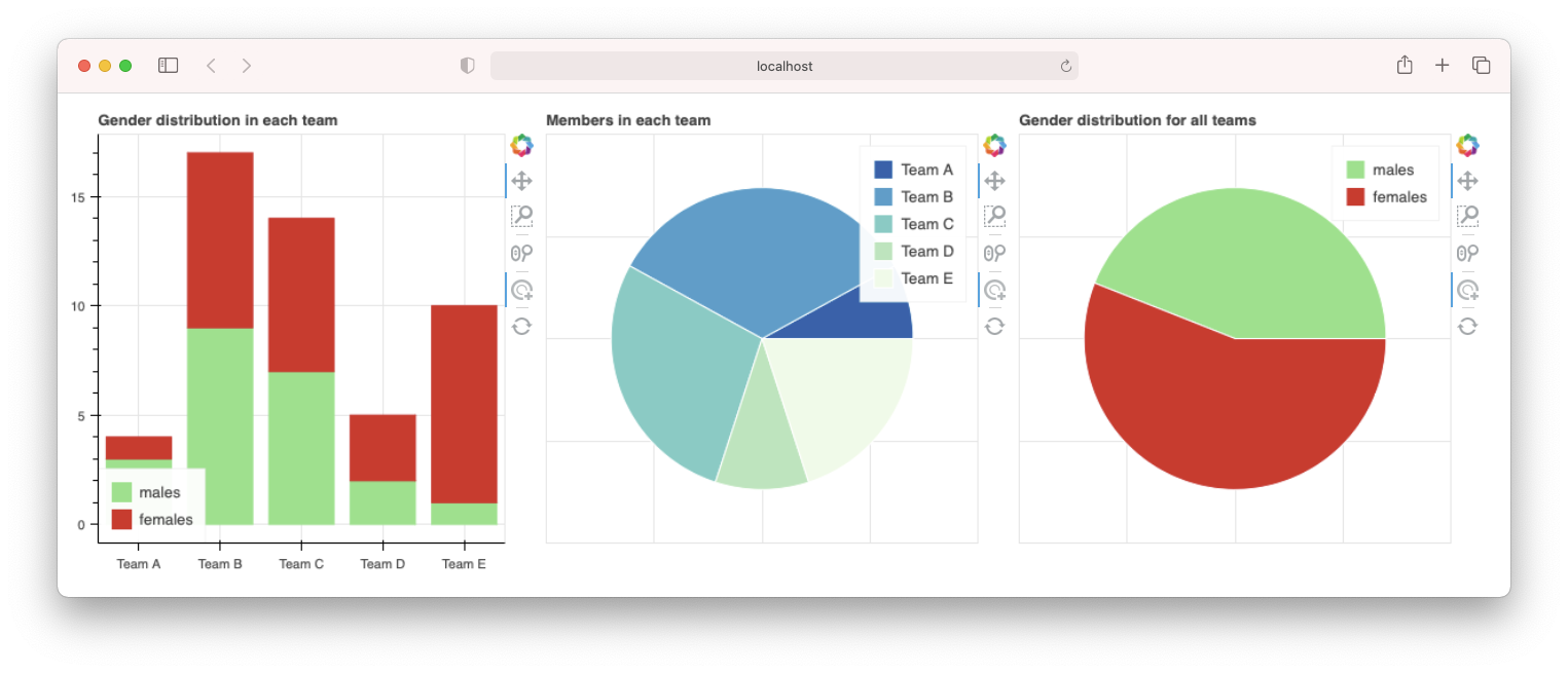
Note that the numbers for each gender in each team is randomly generated, so the chart you'll see later may not correspond to the numbers you see here. Here's what you'll build for your dashboard:
- A dashboard containing three charts:
- A stacked bar chart showing the number of males and females for each team
- A pie chart showing the total number of members in each team
- A pie chart showing the proportion of males and females in each selected team(s)
- When a bar or slice is selected, the other charts update accordingly.
Creating the ColumnDataSource objects
For this application, you'll create two ColumnDataSource objects:
- The first one for use by the stacked bar chart and the first pie chart
- The second one for use by the second pie chart
The data for the first ColumnDataSource object have the following values (the values in the angle column are calculated based on the total number of males and females in each team):
    teams  males  females    angles   colors
0  Team A      3        4  0.745463  #0868ac
1  Team B      2       10  1.277936  #43a2ca
2  Team C      9        6  1.597420  #7bccc4
3  Team D      7        3  1.064947  #bae4bc
4  Team E      6        9  1.597420  #f0f9e8
The data for the second ColumnDataSource object have the following values:
         count    angles   colors
males       27  2.875356  #98df8a
females     32  3.407829  #d62728
The values for this object are updated dynamically whenever the user changes his selection on the bar or pie chart.
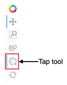
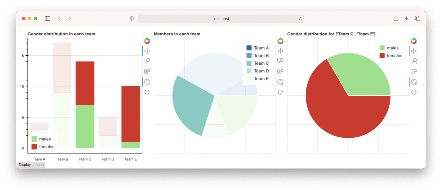
Allowing Items to Be Selected in Your Chart
To allow users to select bars or slices in a bar or pie chart, you need to include the tap tool in the toolbar (see Figure 24). The Tools parameter in the figure() function allows you to select which tools to display in the toolbar:
p1 = figure(plot_width=400,
            plot_height=400,
            x_range=source.data['teams'],
            tools='tap,pan,wheel_zoom,box_zoom,reset')
The Tap tool is, by default, not shown in the toolbar.
Synchronizing Charts
To update all of the affected charts when a selection is made on one, you need to handle the indices event of the ColumnDataSource object:
#---set the event handler for ColumnDataSource---
source.selected.on_change('indices', source_index_change)
The event handler for the indices event has three parameters – attrname (name of the attribute changed), old (old value for the attribute), and new (the new value of the attribute). Here, you'll make use of new to know which item(s) has been selected in the bar or pie chart. Based on the bars or slice(s) selected, you can now recalculate the data for the second ColumnDataSource object:
#------event handler for ColumnDataSource-------
def source_index_change(attrname, old, new):
    # new is a list containing the index of all
    # selected items (e.g. bars in a bar chart, etc)
    # new is same as source.selected.indices

    # if user clicks outside the bar
    if new == []: new = range(len(df)) # set to all selected

    print('Selected column(s):', new)
    print('Total Males:',
        df.iloc[new]['males'].sum())
    print('Total Females:',
        df.iloc[new]['females'].sum())

    # count the males and females for the selected team(s)
    df2.loc['males','count'] = \
        df.iloc[new]['males'].sum()
    df2.loc['females','count'] = \
        df.iloc[new]['females'].sum()
    source2.data['angles'] = \
        df2['count'] / df2['count'].sum() * \ 2*math.pi
    p3.title.text = \
        f"Gender distribution for {[df.iloc[t,0] for t in new]}"
The full code listing for this application is shown in Listing 8.
Listing 8: Saving the file as Dashboard.py to run it using the Bokeh server
from bokeh.plotting import figure, output_file, show
from bokeh.models import ColumnDataSource, Legend
from bokeh.palettes import Category20, Spectral, GnBu
from bokeh.io import curdoc
from bokeh.layouts import row
from bokeh.transform import cumsum

import pandas as pd
import random
import math

df = pd.DataFrame(dict(
    teams = ['Team A','Team B','Team C','Team D','Team E'],
    males = random.sample(range(1,11), 5),
    females = random.sample(range(1,11), 5),
))

#----used for displaying a pie chart---
df['angles'] = (df['males'] +  df['females']) / (df['males'] +
                df['females']).sum() * 2*math.pi
df['colors'] = GnBu[len(df['teams'])]

source = ColumnDataSource(data=df)

#---create another source to store count of males and females---
males = df['males'].sum()
females = df['females'].sum()
df2 = pd.DataFrame([males,females],
    columns=['count'],
    index =['males','females'])
df2['angles'] = df2['count'] / df2['count'].sum() * 2*math.pi
df2['colors'] = Category20[8][5:7]

source2 = ColumnDataSource(data=df2)

#----------------------------------------------------
#      Bar chart
#----------------------------------------------------
p1 = figure(plot_width=400,
            plot_height=400,
            x_range=source.data['teams'],
            tools='tap,pan,wheel_zoom,box_zoom,reset')
v = p1.vbar_stack(['males', 'females'],
            source = source,
            x = 'teams',
            width=0.8,
            color=Category20[8][5:7])
legend = Legend(items=[
    ("males",   [v[0]]),
    ("females", [v[1]]),
], location=(0, 0))
p1.add_layout(legend)
p1.title.text = "Gender distribution in each team"

#----------------------------------------------------
#      Pie chart 1
#----------------------------------------------------
p2 = figure(plot_width=400,
            plot_height=400,
            tools='tap,pan,wheel_zoom,box_zoom,reset')
p2.wedge(x=0,
         y=1,
         radius=0.7,
         start_angle=cumsum('angles', include_zero=True),
         end_angle=cumsum('angles'),
         line_color="white",
         fill_color='colors',
         legend_field='teams',
         source=source)
p2.axis.visible = False
p2.title.text = "Members in each team"

#----------------------------------------------------
#      Pie chart 2
#----------------------------------------------------
p3 = figure(plot_width=400,
            plot_height=400)
p3.wedge(x=0,
         y=1,
         radius=0.7,
         start_angle=cumsum('angles', include_zero=True),
         end_angle=cumsum('angles'),
         line_color="white",
         fill_color='colors',
         legend_field='index',
         source=source2)
p3.axis.visible = False
p3.title.text = "Gender distribution for all teams"

#------event handler for ColumnDataSource-------
def source_index_change(attrname, old, new):
    # new is a list containing the index of all
    # selected items (e.g. bars in a bar chart, etc)
    # new is same as source.selected.indices

    # if user clicks outside the bar
    if new == []: new = range(len(df))
    print('Selected column(s):', new)
    print('Total Males:', df.iloc[new]['males'].sum())
    print('Total Females:',df.iloc[new]['females'].sum())

    # count the males and females for the selected team(s)
    df2.loc['males','count'] =  df.iloc[new]['males'].sum()
    df2.loc['females','count'] =  df.iloc[new]['females'].sum()
    source2.data['angles'] = df2['count'] / df2['count'].sum() * 2*math.pi
    p3.title.text = \f"Gender distribution for {[df.iloc[t,0] for t in new]}"

#------set the event handler for ColumnDataSource-------
source.selected.on_change('indices',source_index_change)

curdoc().add_root(row(p1,p2,p3, width = 1200))
curdoc().title = "Interactive Graph"
Figure 25 shows the dashboard showing the stacked bar chart and the two pie charts when the file is run in Anaconda Prompt/Terminal:
$ bokeh serve --show Dashboard.py
You can click on any of the bars in the stacked bar chart as well as any of the slices in the pie chart (press the Shift key to select more than one item) and the second pie chart will now display the distribution of the gender in the select bars or slices (see Figure 26).
Summary
In this article, I've taken you on a whirlwind tour of Bokeh. I've discussed how to plot different plots using the various glyphs methods, as well as how to group them using the various layout classes. You also learned how to deploy your Bokeh plots using the Bokeh server, and how to use the Bokeh widgets to facilitate user interactions. Finally, I end this article by creating an interactive dashboard where interacting with one plot automatically updates the others. I hope you have fun with your newfound knowledge!