


If you have been following this series of CODE Framework articles, you are already aware that CODE Framework provides the ability to use, create, and customize awesome-looking WPF application themes that also make apps maintainable and easy to build. But not everyone wants to create brand new themes or customize existing ones. Instead, why not just use one of the great themes that ship in the box?
In past articles, we here at CODE Magazine have presented various features offered by CODE Framework, and in doing so, we have usually applied a default theme, such as the Metro or Workplace themes, without giving much explanation as to which themes are available. In fact, in one article, I have even discussed creating custom themes from scratch, which is probably easier than you would think. Still, most people just want to take advantage of what is already there.
Themes in CODE Framework are always evolving. When the framework originally shipped, it only shipped with two or three themes that were meant as starting points for developers to create their own. However, feedback received from the developer community quickly made it clear that people simply wanted to use ready-to-go themes. After all, creating what is often considered “eye-candy” is not what developers are usually good at or enjoy. For this reason, we have made theme creation a high priority in the development of the framework, and we will continue to do so for the foreseeable future. With that in mind, this article is meant to be seen as a “taking inventory” type of article, showing the themes that are available as of spring 2013. Make sure to check back for even more new themes.
What Are Themes?
Before I can really dive into an exploration of the standard themes, it is worth discussing what themes in CODE Framework are. Often, users as well as developers think of “themes” or “skins” as the ability to change the appearance of an application, mainly by switching colors. For instance, I am writing this article in Microsoft Word, and I can switch the color themes of Word in the options menu. Similarly, it is possible to switch the color theme of Visual Studio 2012.
Although it isn't completely wrong to think along these same lines in CODE Framework, it would not do the CODE Framework theming feature justice. Switching simple colors is usually a matter of swapping out color resources while leaving the rest of the application alone. This is certainly something CODE Framework supports, but it pales in comparison to the serious theme switching capabilities provided by the framework.
In CODE Framework, themes switch the fundamental make-up of an application. Does your application use a ribbon, a drop down menu, tiles, or a completely different approach to navigation? Does your app open multiple windows, or are new views opened inside the main window, perhaps inside a tab control or something similar? Themes drive the arrangement and layout of screen, such as data edit forms (which also has the advantage that instead of hand-coding screen layouts, you have the optional ability to let a theme handle the nitty-gritty of that task). Themes change how items are displayed in lists and grids. Themes change the look of status updates, notifications, and message boxes. Themes may change art assets such as standardized icons. There are too many to list.
Different applications have different requirements for themes. Some applications need to switch themes on the fly. Sometimes, the switch may be as simple as changing colors and fonts, and sometimes developers want the user to have the option to switch between a menu and a ribbon approach. Or perhaps the application is meant to be a desktop application using an Office-style user interface, but when the user wants to use the app on a slate with touch support, the application switches into a modern Windows 8-style (“Metro”) design completely on the fly.
Switch your app from a desktop app to a touch enabled slate application simply by swapping themes!
Some developers pick one theme and stick with it. They may not be interested in switching themes on the fly, but each application needs some kind of consistent look, right? Not to mention that some of the automated features provided by the theming engine make development easier and faster as the theme handles many difficult tasks. And who knows? Maybe a few years down the road, the chosen look isn't perceived as particularly modern anymore, at which point a theme switch should be easy and not require a major re-write of the application.
CODE Framework themes are super-powerful and do a lot! More than I can discuss in this article, in fact. I encourage you to take a look at other articles in this series to see some of the fancier theme features at work. (www.codemag.com/framework)
A Sample Application
To demonstrate the different themes, I have created a small sample application. You can download it as an attachment for this article or from www.codemag.com/framework. The sample provides a small version of a magazine management application. The application displays a list of subscribers and allows editing of individual subscriber records. It also displays a list of magazines and can print that list using the CODE Framework document engine. All the data is locally created in the sample (sometimes randomly), so you can run it without having to set up a database or worry about any other external dependencies.
The overall setup of the application is entirely based on the default CODE Framework WPF application template. (See the Downloading CODE Framework sidebar for more information on how to download these tools.) When creating a new CODE Framework WPF application, you can choose which themes you would like to include from a wizard. For my example here, I accepted the defaults to get all the standard themes.
To implement specific examples, I have created a few very small view models, many of which are based on the StandardViewModel class provided by CODE Framework. This makes view model creation a snap, wherever the standard models are applicable, such as in lists, like the results of search screens. I have created matching views for each view model. As you look at the code in the views, you will discover only a handful of lines of code in the XAML files. Usually around 20 or so. I was able to heavily leverage the themed (think “templated”) layout helper features of the framework and did not need to hand-code any of the UI layouts (although I could have certainly chosen to do so if a scenario required it).
I encourage you to take a look at the example code and explore the view models and the views, mainly to see how little code there really is.
As you explore the different themes of the application, you can either switch the themes on the fly (check under “View,” on the menu or the ribbon tab, depending on the theme you are running) or you can change the name of the startup theme in App.xaml.
Using theme features not only creates professional looking apps, but it also improves developer productivity.
It is very important to understand that for all the examples shown in this article, no code changes are required when switching between themes. When looking at screen shots, it may often seem that the app has changed completely, to a point where you might suspect that it must be based on different code. But that is not the case.
Battleship: The Mother of All Themes
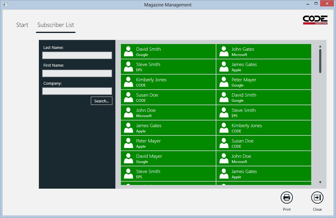
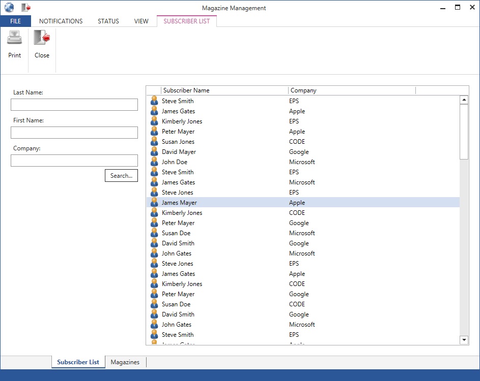
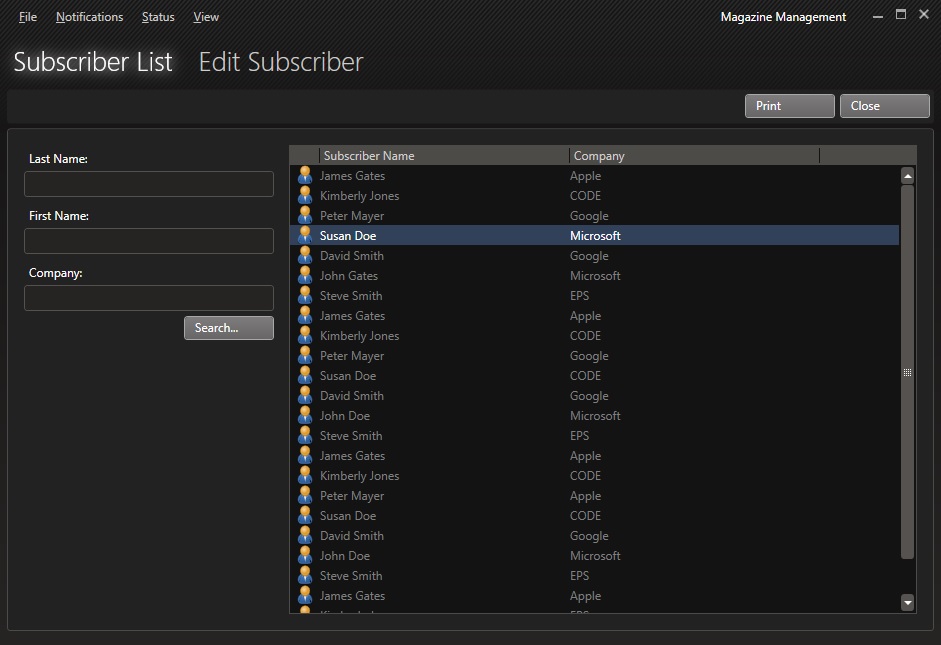
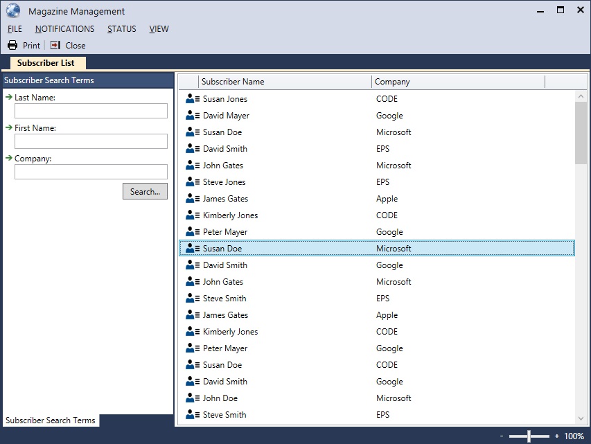
The most logical place to start exploring CODE Framework themes is the Battleship theme, named in (dubious) honor of the battleship-gray applications built in Windows 95 and immediate successor operating systems. (Note: Although this theme, by default, uses quite a few different shades of gray, you are free to customize the colors completely). These are the applications that have a toolbar and a menu across the top, a status bar at the bottom, content in between, and usually secondary windows that pop up when the user takes action. Figure 1 shows the sample application running in Battleship theme, with the subscriber search view open.
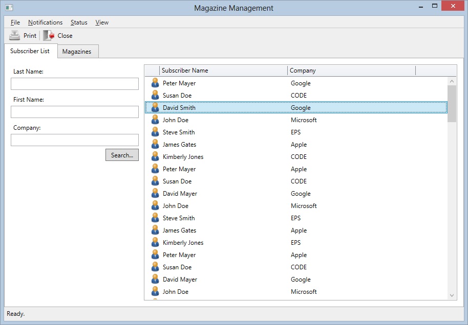
There are a few interesting things of note in the screen shot shown in Figure 1. As you can see, the main application window features a toolbar and a menu. The items in these elements are not put there manually, but instead, the theme picks those up from the views and view models that are currently open. The main window shows all “Actions” defined by the subscriber list's view model. (View models in CODE Framework can have an Actions collection. For more information, see my article on building WPF applications, CODE Framework: Documents, Printing, and Interactive Document UIs).
In addition, there is always an application-wide view model called the start view model, sometimes also referred to as a “global” view model, which launches as soon as the application starts. (It's created by the home controller.) The menu in Battleship consolidates actions from the start view model and the local view model to create a single unified menu. Top level menus (e.g., File, Notifications, Status, View) are driven by categories assigned to each action. If an action has multiple assigned categories, Battleship creates sub-menus. Using this setup, a standard menu structure can be created. (Additionally, following a standard CODE Framework pattern, each action could optionally define its own custom view, in which case, each menu item can show a full-blown WPF interface. A detailed exploration of that technique is beyond the scope of this article.)
The toolbar follows a similar pattern. It also consolidates the actions from the local and the global view models. However, in order to keep the toolbars to a manageable size, not all actions are shown in the toolbar. Instead, Battleship chooses only global actions of high significance (actions have a Significance property that allows defining five levels of importance) and local actions as long as they are above the lowest significance. All view actions with the highest significance show both an icon (if available) as well as a label. View actions with lower significance only show an icon, and in absence of an icon they only show the text.
You probably also noticed the status bar at the bottom (with a “Ready” status). In fact, I have created several example menu items for you to trigger different status updates and see the result in each theme. In Battleship, the status bar is relatively simple. It always shows the status in black on gray. (Note that status bars can also host entire custom views, in which case, you are free to use fancy colors and images and whatever other UI features you want. I recommend that you be careful putting interactive controls like textboxes into the status bar, though.) The Battleship status bar is always there, regardless of whether there is any status text to show or not.
Themes can be switched on the fly or they can be changed over time to keep an application's look modern and fresh.
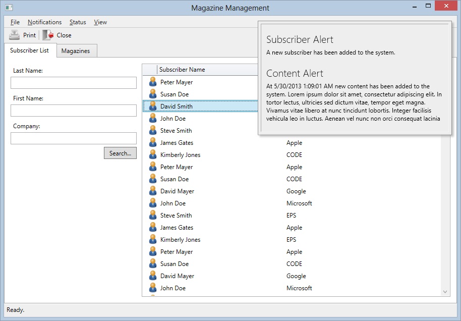
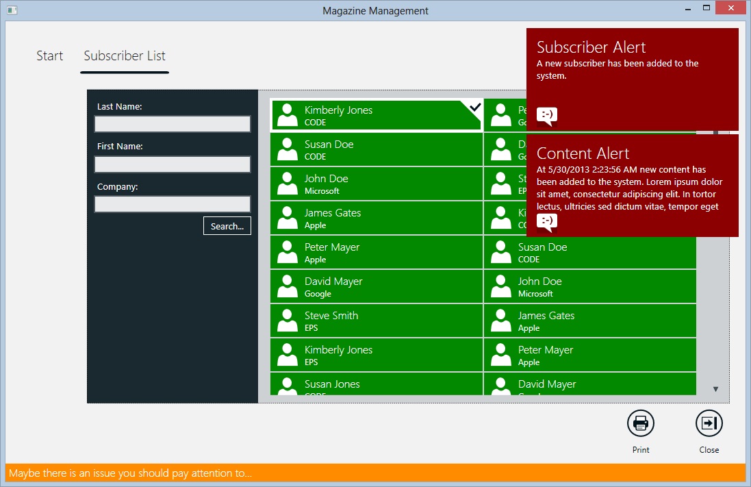
Another feature that all CODE Framework themes support is notifications. This feature allows you to notify the user of some item of importance. (This is similar to Outlook showing you a notification “toast” whenever a new message arrives.) Figure 2 shows the Battleship notifications in action. Notifications show up for a few seconds and then disappear. There can be up to five notifications visible at any given time. When more than five notifications happen before the notifications start to reach their timeout, they are removed quicker to make space for new ones.
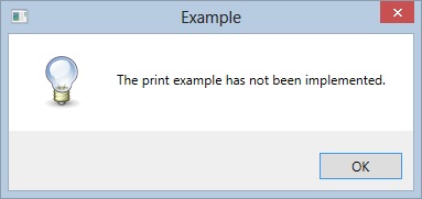
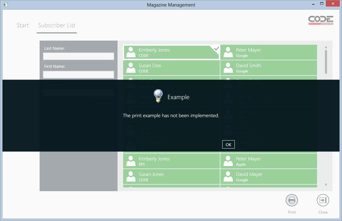
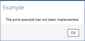
A feature somewhat similar to notifications is message boxes, except that message boxes alert the user of something and need to be dismissed by clicking a button. Message boxes may also offer multiple choices (such as OK or Cancel) and at times, have additional UI features (such as the ability to enter text or tick a checkbox. Again, CODE Framework allows a simplified approach to message boxes as well as complete customization by passing your own views and view models into the message box system.) CODE Framework features a completely themeable message box engine. Figure 3 shows a simple message box in Battleship style.
Of course, one of the most interesting parts is the display of views, such as the list of subscribers shown in Figure 1. Battleship hosts “normal” views (these are views without special attributes) inside a tab control within the main window. The look and feel of that tab control mimics the look and feel of Internet Explorer 10's tabs. If multiple views are open, multiple tabs are shown. Depending on which tab is selected, the menu and the toolbar changes automatically to match the selected tab.
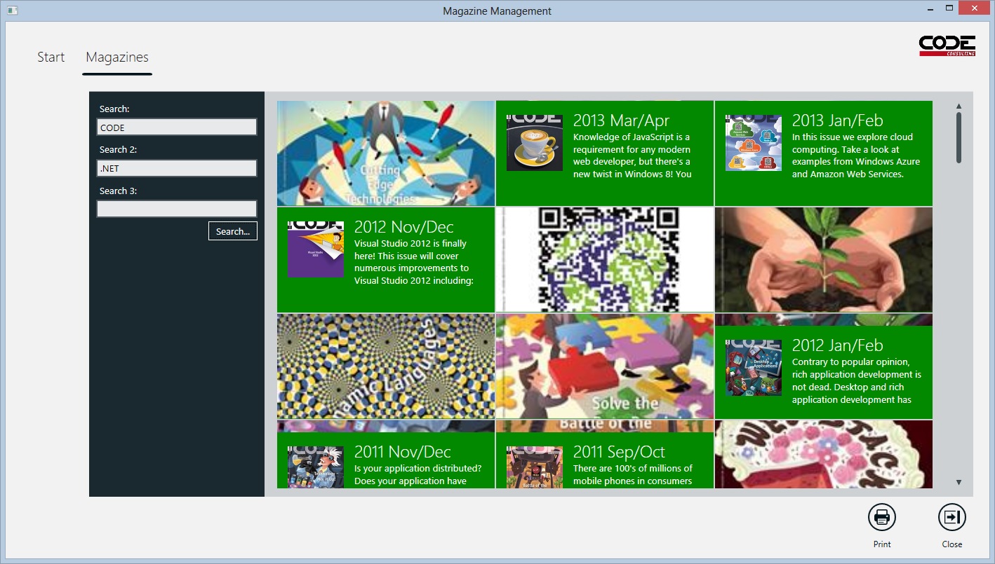
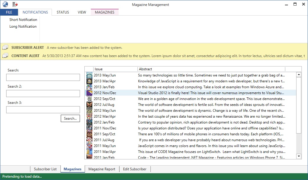
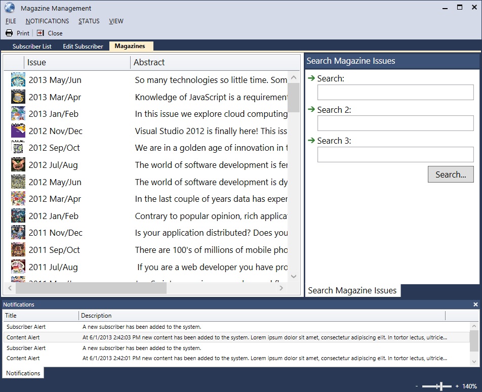
Another very interesting feature that all CODE Framework standard themes support in some fashion is automatic indication of ongoing processes. Figure 4 shows a magazine search form with a green continuous progress bar at the top of the view. This animated progress bar is shown automatically when the view model indicates a busy state.
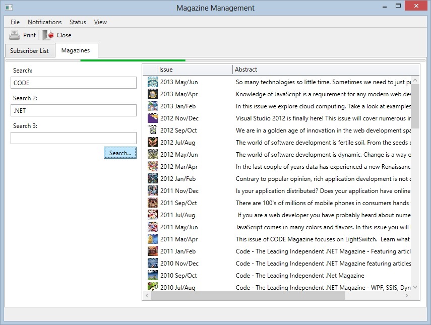
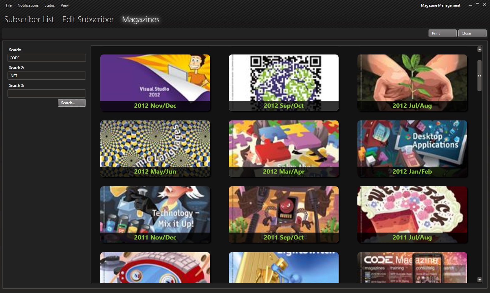
It is also worth noting that both Figure 1 and Figure 4 take advantage of automatic layout features powered by the theme. Both views are so-called “primary/secondary” UIs. The primary part of both UIs is the list of data, and the secondary UI is the part on the left with the search terms. The list of search terms is yet another UI that uses automated layout through a simple form style. It is up to each theme to present these concepts differently. Battleship puts secondary UIs on the left side and assigns the remaining space (the majority of the space) to the primary UI (the list, in this example). For simple forms, Battleship creates a top-to-bottom bidirectional stack. Note that this provides a result vastly superior to using a native WPF stack panel (The theme was smart enough to add a little more vertical space before each label than after the label). Of course, all of this can be customized to your heart's content.
Using these completely optional layout features offers the great advantage of being flexible, easy, and fast to do, and it adjusts itself automatically within themes. Here's the code it took to create the interface shown in Figure 4:
<mvvm:View xmlns="http://schemas.microsoft.com/winfx/2006/xaml/presentation"
           xmlns:mvvm="clr-namespace:CODE.Framework.Wpf.Mvvm;assembly=
                CODE.Framework.Wpf.Mvvm"
           xmlns:c="clr-namespace:CODE.Framework.Wpf.Controls;assembly=
                CODE.Framework.Wpf"
           Title="Magazines"
           Style="{DynamicResource
                CODE.Framework-Layout-ListPrimarySecondaryFormLayout}">

        <ListBox ItemsSource="{Binding Issues}"
                 Style="{DynamicResource Issue-List}"
                 c:ListBoxEx.Command="{Binding EditMagazine}"
                 mvvm:View.UIElementType="Primary"/>

        <mvvm:View UIElementType="Secondary"
                   Style="{DynamicResource
                       CODE.Framework-Layout-SimpleFormLayout}">
            <Label>Search:</Label>
            <TextBox Text="{Binding SearchText}" />
            <Label>Search 2:</Label>
            <TextBox Text="{Binding SearchText2}" />
            <Label>Search 3:</Label>
            <TextBox Text="{Binding SearchText3}" />

            <Button HorizontalAlignment="Right"
                    Content="Search..."
                    Command="{Binding Search}" />
        </mvvm:View>

</mvvm:View>
It's hard to believe that's all you need, isn't it?
Well, there is one more detail to mention here: Part of the theming engine is the ability to display lists of data in various ways. In the example shown in Figure 4, the list of magazines is themes in the view's Battleship resource file (Issues.Battleship.xaml) to use a standard multi-column layout:
<Style x:Key="Issue-List"
       TargetType="ListBox"
       BasedOn="{StaticResource {x:Type ListBox}}">
           <Setter Property="ItemTemplate"
                   Value=
                      "{DynamicResource CODE.Framework-StandardTemplate-DataSmall03}" />
           <Setter Property="Controls:ListEx.Columns">
               <Setter.Value>
                   <Controls:ListColumnsCollection>
                       <Controls:ListColumn
                           Width="30"
                           IsResizable="False"
                           BindingPath="Image1" />
                       <Controls:ListColumn
                           Width="150"
                           IsResizable="True"
                           BindingPath="Text1"
                           Header="Issue" />
                       <Controls:ListColumn
                           Width="500"
                           IsResizable="True"
                           BindingPath="Text2"
                           Header="Abstract" />
                    </Controls:ListColumnsCollection>
               </Setter.Value>
           </Setter>
</Style>
This does two things: First, it tells the system to use the DataSmall03 standard data template to present items in the list. (There is an extensive list of standard templates that each theme supports, which often saves you the trouble of creating your own.) In this particular case, the data template is a special template that supports multiple columns. Just using that template will create default columns. Usually, it is desirable to provide a bit more data about those columns to fine-tune their appearance. In this example, I set the width and caption of the columns as well as whether they are resizable or not. There. Now you know all the details that go into the UI in Figure 4!
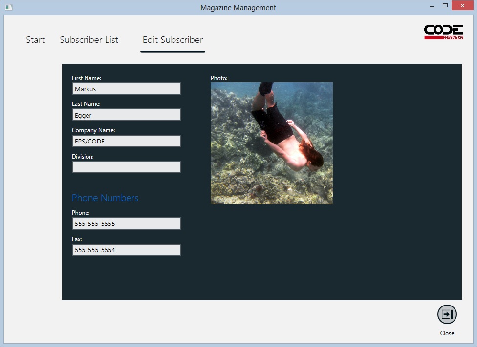
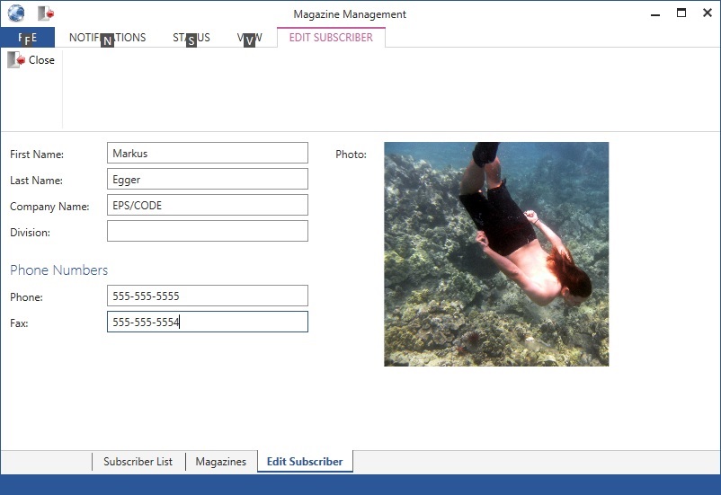
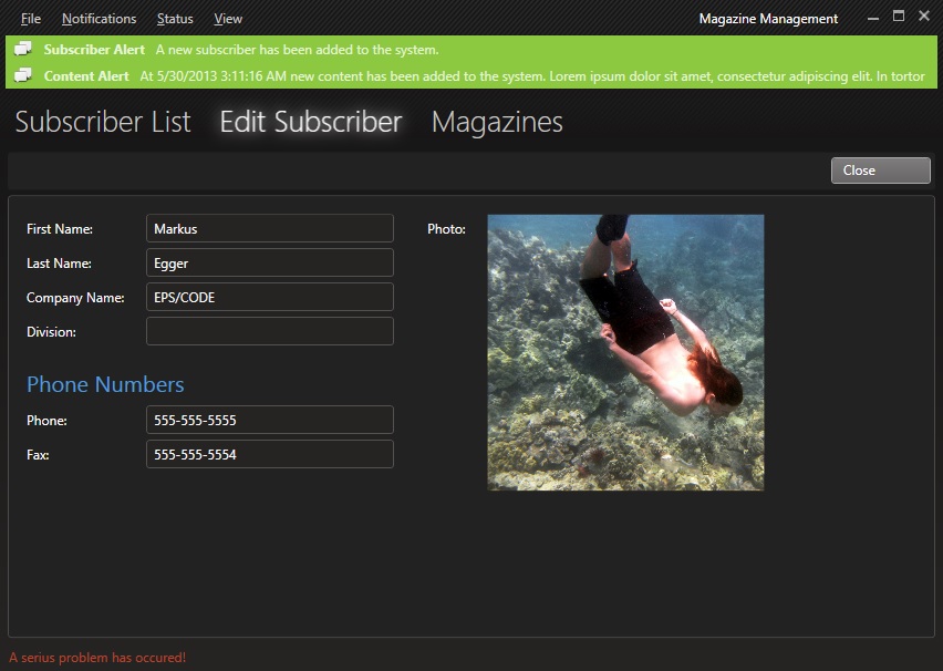
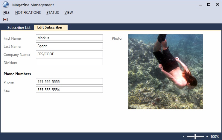
Figure 5 shows a related example. This time, the view uses an edit form style, which is one of the other automatic layout styles each theme supports. If you are a current CODE Framework developer, you already know how this works. Simply stick a bunch of labels and controls into a styled container (such as a view) and let the layout engine handle the layout of each control without having to worry about the details. (This is available for complete forms as well as sub-sections of forms.) Figure 5 is a relatively simple example of the system (see some of other CODE articles here: www.codemag.com/framework for a more complete overview), yet it exposes some very sophisticated features not immediately obvious from the screen shot. For instance, the layout automatically shrinks spacing between controls and even re-flows controls when the screen is resized.
I should point out that views in CODE Framework can run at different levels. Normal views are loaded into the main screen's tab control, as shown in Figures 1, 4, and 5. However, views can be given further attributes, such as being top-level or modal. The Battleship theme loads top-level views into their own windows.
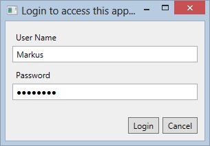
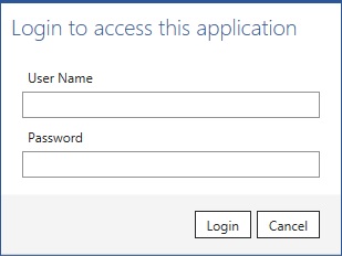
The login dialog box (Figure 6) is a good example of a top-level window. You can load UIs of any complexity into top-level windows. If the view defines standard actions, the Battleship theme shows those actions as a row of buttons across the bottom of the window (such as the Login and Cancel buttons in Figure 6).
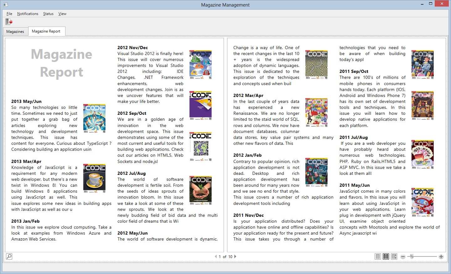
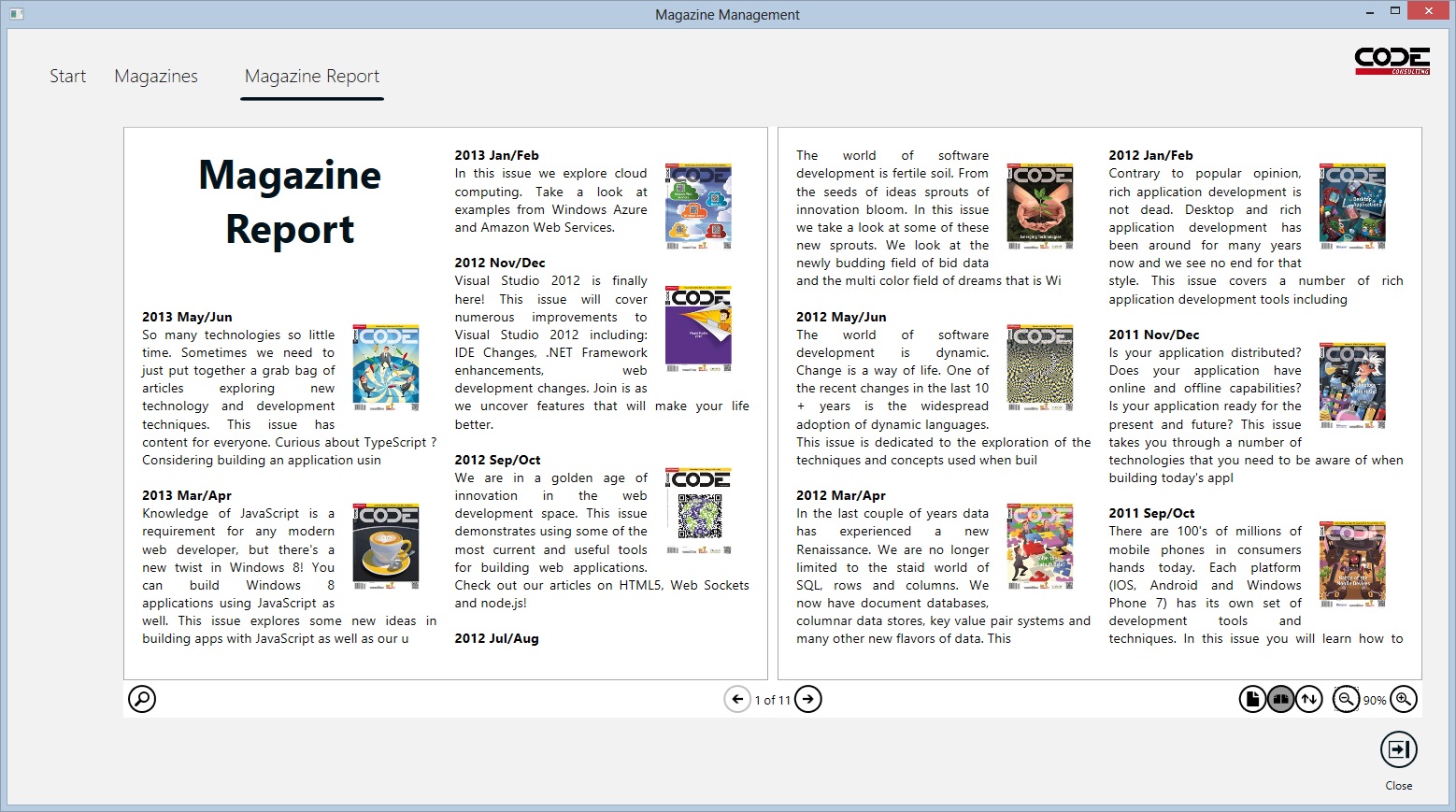
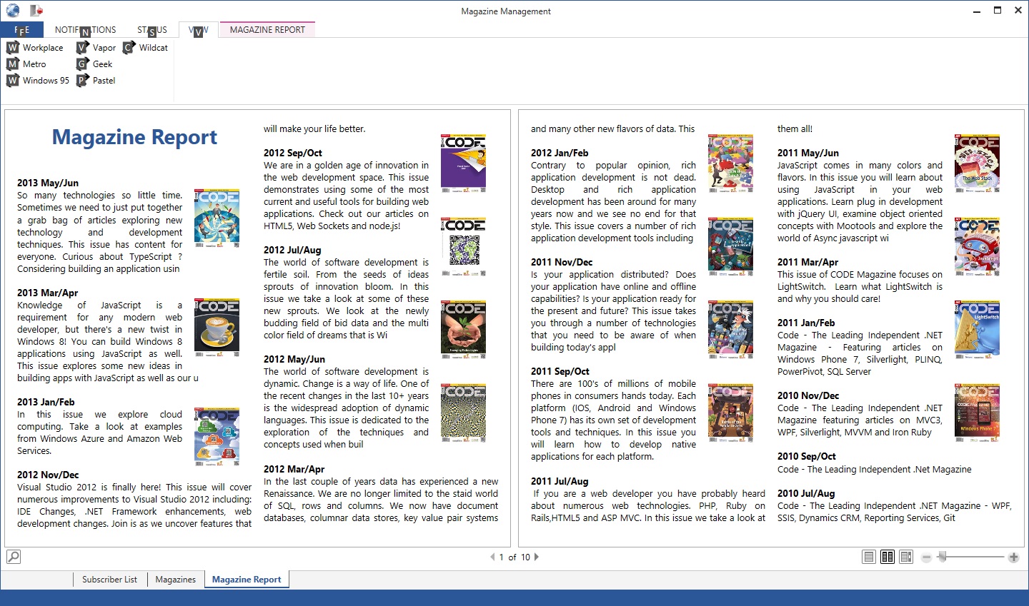
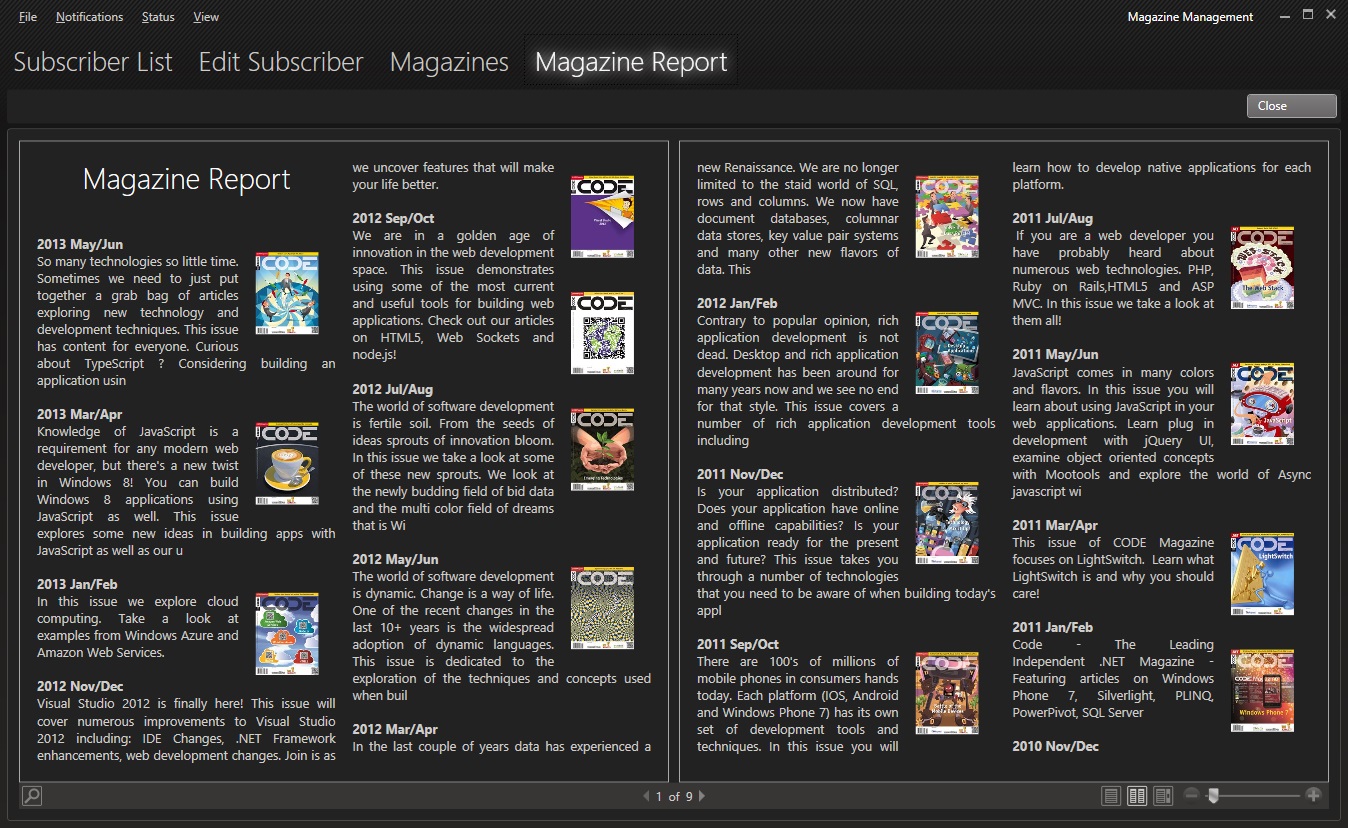
One final feature to mention is that all themes in CODE Framework support printing. Figure 7 shows a print preview of a fancily laid out magazine issue report.
Metro
Now that you have seen some of the most important features that a theme provides, let's switch things up a bit and move on to the Metro theme, either by going into the View menu or by shutting the application down and changing the Theme setting to “Metro” in App.xaml.
Many CODE Framework users know the Metro theme, because it is one of the first themes CODE shipped in the box. It has been very popular, as it allows you to create apps that look like the new Windows 8 Store apps. (And yes, we are still calling this theme “Metro” because after all, we all know that's what it really is. () It is very important to realize that CODE Framework's WPF Metro theme should not be confused with true Windows Store apps that run on top of WinRT. The WPF Metro theme that CODE provides runs on all flavors of Windows that run WPF. In fact, that has been one of the great draws to our Metro theme: Create a standard Windows app that looks and behaves like Windows and runs on older versions of Windows. (To add to the confusion, there also is a CODE Framework flavor that runs on WinRT, but that is a completely different topic altogether.)
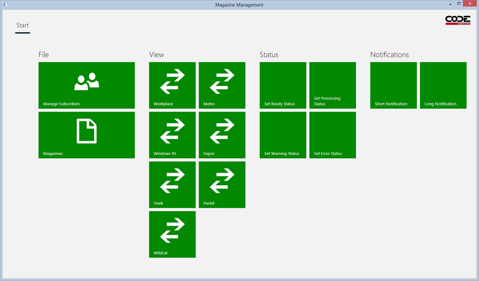
When you switch to Metro and start the app, you first see a start screen that shows all the available global actions (Figure 8). Metro applications do not feature a conventional menu, which makes them very touch-friendly. (Note: The Metro theme still supports keyboard friendly features such as hotkeys and key combinations that are assigned to view actions.) The actual colors and background image and so forth are completely customizable through a provided color resource dictionary (this is very heavily used in Metro, but is available in all themes). In the example in Figure 8, I chose the same color theme as the Windows 8 Store application.
Note that most of the tiles shown in Figure 8 have icons. Icons can optionally be assigned to view actions as “brush resources.” If you are following along with this example and are running the app on your computer, take a close look at the icons shown in the Metro start screen. They are the typical monochrome icons seen in most WinRT applications. However, if you are running the app in Battleship, the individual items in the menu or the toolbar have different icons. That's because themes provide a list of standard icons that can be referenced by name. The standard names are always guaranteed to resolve to some useful icon resource, but they will look different in different themes. Of course, you can override and supplement the list of themed icons.
Launch into the subscriber list to see the Metro equivalent for the subscriber search form (Figure 9). Although the UI is still recognizable as the same UI, it now has a Metro look. Actions that go along with the view are listed along the bottom in rounded app bar buttons. (Unlike in true WinRT applications, the CODE Framework Metro theme always shows these buttons and no specific gesture is required to make these actions visible, which I hope removes a major annoyance factor for most users.) Note that the icons in the app bar buttons (such as the printer icon) are also Metro-specific and different than they were in Battleship.
One of the more obvious changes is that the list of subscribers is now shown in a tile interface in the list, rather than a multi-column grid layout. Again, this is simply a matter of using a standard template. CODE Framework supports all of the standard tile sizes and templates available in Windows 8 as well as a few extra ones. (The one shown in Figure 9 is actually a smaller tile than is available in Windows 8. Often, smaller tiles work well in data-heavy apps.)
Figure 10 shows the magazine search screen, which is very similar to Figure 9. However, for magazine issues, I am using a larger tile size with a built-in animation. The screen shot shows some tiles in different animation states (some caught in mid-action).
Metro also supports the standard styles for automatic form layout. Single-click one of the subscriber tiles (or tap the tile if you are in a touch environment) to load the edit form (note that the theme switched to a single-click behavior for Metro, while Battleship required double-clicking). Figure 11 shows the Metro edit form. Aside from the simple blocky look of the streamlined Metro UI, you may notice several other differences. For instance, the labels are now above the text controls rather than to the left, as in the Battleship theme. Of course, you are free to customize all of that.
Like all other themes, Metro also supports notifications, status updates, and message boxes. Figure 12 shows a screen with a status message and two notifications. Note that status messages are displayed with different background colors (they are customizable, but defaults include red for errors, orange for warnings, and so on). The status bar in Metro is displayed only for short durations. After several seconds, the status bar fades away and will only re-appear the next time the status is updated.
In Metro, all top-level windows and message boxes are displayed in-place inside of a border that always spans the full width of the window. The height re-sizes to the space required. Figure 13 shows a message box using this system.
This only leaves Metro printing, which can be seen in Figure 14. Documents tend to change less with themes, although some themes may use different fonts or different sizes and colors for headings and so forth. This is especially true in preview and interactive document modes (once a document is sent to the printer, you usually don't desire standard theme changes).
Workplace
What is Workplace, you ask? Well, think about it this way: Where do a lot of people go to work? That's right. To the office! (Hey, we can have at least a little bit of fun with our theme names, can't we?)
Workplace is the theme you want, if you want your application to look like the latest version of Microsoft Office. It uses a ribbon approach (the ribbon is styled in and doesn't require custom controls). It uses the white color theme with the dark blue secondary theme color by default, but you can change the colors to fit your needs. In general, the Workplace theme is highly customizable. For instance, the File tab in the ribbon usually brings up a full-screen overlay just like Office does, but you can turn that off if you don't want it. By default, normal views are loaded into the main window with tabs across the bottom (just like Excel), but if you want, you can launch a new main window for each normal view with its own ribbon (just like Word). Figure 15 shows the subscriber list using the Workplace theme.
The ribbon is also highly customizable. If you assign custom views to your view actions, each item within the ribbon becomes a fully customizable UI that you can use any way you want. You can also set default tabs that you want to show when the view first loads because actions can have default properties. The significance of an action defines the size of an item in the ribbon. If an action has its IsPinned property set to true, the action is pinned into the quick launch bar at the top of the window. The ribbon supports hotkeys.
Themes don't just switch the look of an application but also impact layout, mechanics, and behavior.
The overlay that appears when the user activates the File tab has some special features as well. In addition to showing the main file menu items, the special overlay takes over some of the window handling. When the file menu is open and the app launches a non-modal top-level view, that view is loaded in place into the file menu. My current example doesn't take advantage of this, but it results in a very similar appearance to the new document dialog in Microsoft Word. In all other cases, top-level views are launched in stand-alone windows, as can be seen in the login dialog example in Figure 16.
Message boxes also work like other top-level windows. Their look is very streamlined and does not feature an icon (Figure 17).
Workplace uses a similar approach as Battleship when it comes to showing primary and secondary forms, as well as lists of data; the main difference is that fonts and control details have been modified to match the Office look. Edit forms use a very clean and streamlined approach, but the fundamental layout is similar to Battleship (Figure 18).
The Workplace theme also supports notifications and status updates (Figure 19). Notifications are displayed in a bar just below the ribbon. Workplace apps always have a status bar, which changes color depending on the type of status update (Figure 19 shows a green “progress” status).
Printing and interactive documents are pretty straightforward in Workplace (Figure 20). Due to the overall nature of Office-style applications, all features that are document-oriented are a very natural fit. For more information on this, take a look at the article in this series that focuses on the CODE Framework document features. Many of the examples in that article use the Workplace theme.
Vapor
Vapor?!? As in “vaporware?” Who in their right mind would give such a name to a feature of their software? Well, CODE does. And no, this is not vaporware. This theme is now fully supported as a standard CODE Framework feature, although it originally started out as a small sample used in training classes to teach theme creation. (The original theme was homage to Valve Software's Steam service that I am a big fan of. Hence the name Vapor.)
The Vapor theme serves two main purposes: 1) it satisfies the need for a black theme, since people have requested such themes a lot (with apps such as Blend or Office featuring dark themes), and 2), it serves as a great basis for further customization. You would be surprised how much you can squeeze out of the Vapor theme by changing colors and by making a few additional modifications.
Vapor is a theme that fundamentally uses a menu and in-place activated views with a highly stylized tab control as the host. Top level windows open as new windows. Figure 21 shows the subscriber list. Note that the open UIs are listed in large letters across the top with the active one “glowing” (“Subscriber List” in this example. “Edit Subscriber” can be clicked to switch to that view). The menu works just like in Battleship. The toolbar shows all local actions regardless of significance. Toolbar buttons never have icons in Vapor. Most controls have been tweaked for Vapor. Buttons, textboxes, and so forth, all look slightly different in this theme.
One of the interesting aspects about Vapor is that it has a somewhat unique approach to lists. Some lists are formatted like data grids, like the one in Figure 21, and others are formatted as larger, almost tile-like elements, as seen in Figure 22. There is even the ability to switch the size of these templates on the fly.
Vapor takes a high-intensity approach to showing notifications (Figure 23). This is mainly due to the theme colors used, so it can easily be modified to be much more subtle, if that is desired. Status messages are a bit calmer. They appear only when the status changes, and for a short period of time. Different types of status messages appear in different foreground colors (the example in Figure 23 shows an error status message).
Top-level views are always shown in their own windows. Message boxes are handled practically the same way as other themes (Figure 24) and support icons.
Vapor also fully styles printing and document features according to the Vapor color theme, resulting in a somewhat unique and pleasing document experience (Figure 25). Once a document is sent to the printer, it switches to the standard black-on-white approach. And as always, all these colors can be completely customized anyway.
For Geeks
If you are reading this article, chances are, you are a geek. I know I am. And if you fall into this category, I have a special treat for you: A theme geared toward developers and power users! If you want your app to look like an IDE, in particular Visual Studio, the Geek theme is the one you want!
Figure 26 shows the Geek theme in action with the subscriber list open. Generally speaking, Visual Studio 2012's UI is fairly traditional, with a menu, a toolbar, intricate window management, and so forth. Visual Studio does dress things up (or down?) a bit by taking a few hints from Metro-style UIs and the minimalistic approach employed in those UIs. The Geek theme mimics that to a large extent. In fact, it even has the somewhat controversial all-upper-case top-level menu items, although this can be changed by setting a property.
If you take a very close look at the screen shot shown in Figure 26, you will notice several details that are quite different from other themes. Individual views are shown in place in a tabbed approach. Primary and secondary UIs separate the two parts more formally than other themes. In this case, the search terms are docked on the left side and there is a title and a tab page for it. (Titles and tab pages for primary and secondary UI elements show up when their UIElementTitle attached property is set; otherwise, no tabs and headers are rendered). Each label on the search terms has a small visual element (a green arrow in this case) and all other elements are indented a bit. The toolbar and menu behave just like in the Battleship theme, but the icons look more like Metro, except a more colorful version.
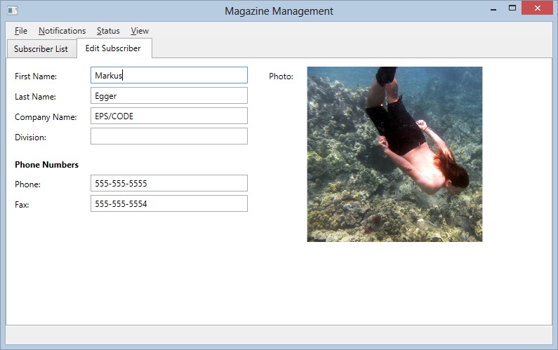
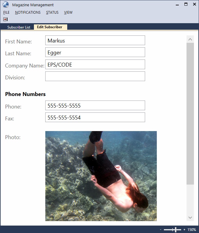
Geek employs a conventional method of rendering various types of forms (see Figure 27) although some aspects are quite powerful. A nifty detail is the scale slider at the bottom right corner of the status bar. All views loaded in the Geek theme can be scaled intrinsically (Figure 28 shows a scaled up version of the same interface as Figure 27). Some forms support content re-flow, which can also be seen in Figure 28. (Note how the photo flows down vertically as there isn't enough room to put it into a separate column.)
All of the other features described for other themes are also supported in Geek. Message boxes and document features, for instance, behave much as they do in Battleship or Workplace. The status bar shows updates with different background colors, just like Workplace does.
One difference in the Geek theme is the handling of notifications. Geek collects a list of up to 250 notifications and keeps them around so they can be shown in a special notifications window. Think of the notifications area in Geek along much the same lines as the Output window in Visual Studio. Figure 29 shows Geek notifications in action.
But Wait, There's More!
This is not all. Code's current internal builds already have a few more themes that are very likely to release as part of an open-source build soon. There is one theme that features a ribbon and some nice color schemes. It's made for people who like the ribbon feature but don't like the minimalistic approach that the latest version of Office takes. Without giving away too much, that new theme will be an intricately crafted theme that combines a modern look with the detail of old-fashioned and highly sophisticated desktop apps.
Another theme is inspired by a popular WPF theme that was shown in many examples several years ago and has served many WPF developers as their guide for creating WPF apps without hiring a graphic artist. The details are being worked out with the original creator of that theme to make sure that no toes are stepped on, but keep your fingers crossed for a public release of that theme in the near future.
And then, of course, there are all the features I wasn't able to talk about in the scope of this article. And there is the ability to completely customize all these themes to your heart's content. After all, you have all the source code; the theme resources are broken out into a separate ZIP file that you can download, so you do not have to dig through the entire code base to find them.
Take a look back through the screen shots in this article and the journey you have taken. From the battleship gray days of Windows 8 through Metro and touch-optimized UIs, to modern Office apps, and beyond, all without changing a single line of source in the sample application! Not to mention that there was extremely little code in the sample app to begin with, as we were able to offload a lot of effort to the theme engine.
When I look at how sophisticated these types of applications are, yet how easy they are to build, I often wonder why there aren't more apps with this degree of flexibility. Why can't Outlook just switch into Metro mode and work well for touch, yet switch back into a rich desktop version when I sit in front of my monitor with mouse and keyboard? Why can't Visual Studio look more like Office when managers or domain analysts have to use it, yet switch to the Visual Studio you know and love when developers dig in? Wasn't all this flexibility and ease of the development the original promise of WPF anyway? Yes it was! Hopefully, I was able to show the way to unlocking some of that power.