The future of the Web needs a deep redesign, and not just another replicable template but an in-depth look at how search is optimized. Although the new hot integrations include increasingly savvy chatbots, artificial intelligence, and augmented reality, the technology underpinnings that propel those futuristic options need an upgrade to improve those experiences. Advancements in personalized SEO (search engine optimization) and embedding flagging enable more targeted content delivery to speed up relevance and improve experiences across the Web.
In this article, you'll read the views of a marketing professional and a technology expert on how the Web must adapt to an always-on world and evolve to deliver the most relatable content to its consumers.
Redesigning SEO
Most website redesigns start with a wire-frame, a blueprint, or a deeply researched user interactive map. One could argue that they should start with SEO as the foundation to impact a more substantial digital presence. To achieve top rankings, optimization is vital to affect website security, page loading speed, high-quality content, backlinks, and enhancing Web accessibility to boost search results' visibility. From Google's perspective, an algorithm is created to measure how the user enjoys the site and gets value. In that vein, measuring user tracking and bounce rates is critical in that if the site isn't what the user expects or wants, Google subsequently de-ranks the site in favor of other sites that do perform to the user's expectations.
Websites are built to be found.
Why Should SEO Dictate a Website Design?
Making a website SEO-friendly means that search engines crawl each page more efficiently for optimized indexing. The better the SEO strategy and the more the SEO team is integral in the front-end design process, the better the chance of indexing and ranking on the first page of search results. Of the billions of people who use search engines daily, fewer than 5% navigate past the first page results; the most imperative goal is to increase organic traffic and be found.
Why is that percentage so low? Controversially speaking, most Web designers focus on being trendy, delivering a more enhanced and sexy design to their users without addressing what they sell or what they do. Although this may be useful for some audiences, individuals looking online for a quick answer to the challenges that force the user into searching for answers, waiting for the experiential design often increases bounce rates and kills the experience for the user. Sites that perform well and rank highly on search engines practice a user-led approach and utilize search intent.
Knowing your ideal user persona and their search intent is becoming more and more of a practical approach for improving the on-site experience. Sure, you want to build an attractive-looking website, but you also don't want to confuse the audience with misleading or unrelated navigation. Make sure that your landing page fits the search intent of your visitors; if this is correctly done, the percentage of visitors who enter your site and leave, otherwise known as bounce rates, will decrease, and the site's efficacy will deliver the goal of the business.
How is this done? Research, of course.
First of all, using the search engine results page (SERP), you can determine search intent by looking for various keywords. And of course, your marketing team should have this list via Google Analytics and other tools. Put yourself in the position of your ideal customer. Type in the keywords you're targeting to see what the search engine comes up with. You'll most likely see the types of results the search engines deem most relevant search intent for each term.
Take beer, for example. Searching for a beer nearby has a different intent than searching for the history of beer or a recipe for a homemade beer. Although the phrasing may all be in the same family of topics, these instances have different user intents. Examples of differential search queries can be seen in Figure 1, Figure 2, and Figure 3.
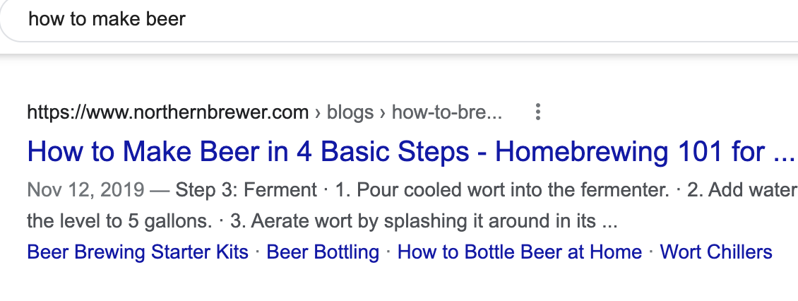
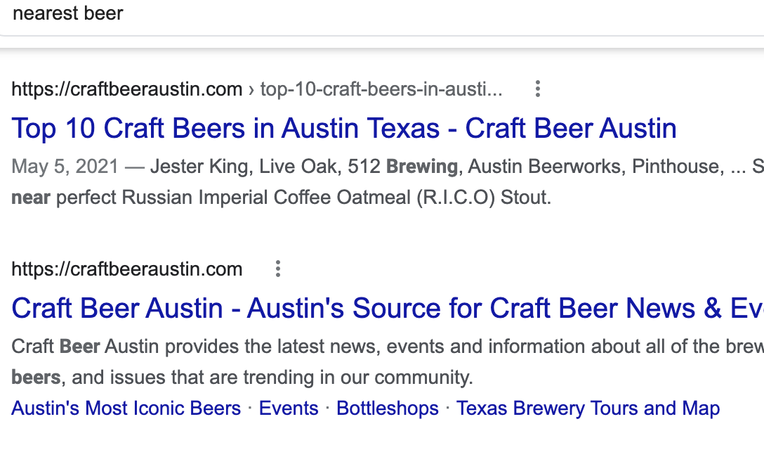
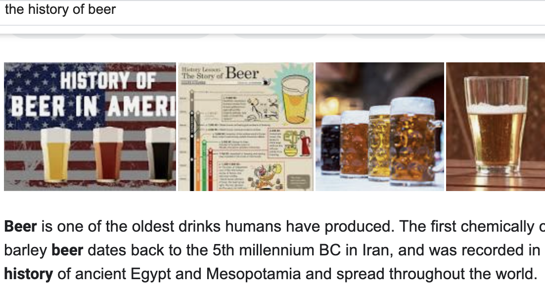
Another example is if you search for “Egypt.” In the United States, you may get significantly different results than if you search for the same subject in Egypt. This kind of difference is especially true in the case of news searches and local searches. Google attempts to classify the user into their local cohort and give them very different but more relevant results. People in the U.S. may be looking to find Egypt for a vacation, and people living there may be looking for demographics or historical information about the country. You will sometimes hear people refer to this as the “filter bubble,” where you only see content related to you. Knowing the user's intent is critical both for Google and for the websites that are trying to divine the goal of the user by the keywords they're typing and ultimately by the pages they end up on.
Now you've locked down the intent. Before you jump into replicating your existing content or redesigning the way you lead your visitors to your page, review a few items to ensure that you're standing out from the rest. It's time to look at the competition.
- How are their pages formatted?
- What is the tone of their pages?
- What points are covered?
- What points are missing?
- Does your competition drive the visitor to an action based on the user's intent (informational, navigational, transactional or commercial)?
Next, it's time to think about making changes.
Implementing Search Intent into Your Website
The key to optimizing for information intent is to use the entire question in the most critical on-page content. Intent optimization can be boiled down to “create pages that answer the user's questions or allow the intended transaction.” It's not a complicated idea. There are some great guidelines when it comes to optimizing for different intents.
Examples look like interrogatives such as “what is” or “how to.” Also include modifiers that indicate informational intent like “history of,” “meaning of,” or “age.”
The key to optimizing for information intent is to use the full questions in the most essential on-page content, including page titles, HTML header tags (<h1> and <h2>), and descriptions.
When you answer the questions, be sure to put the body copy containing the answers directly below the header containing the questions.
Example of a question followed by the answer:
<h1>What is homemade beer?</h1>
<p>Homebrewing can be divided into two types: : all grain and extract.
   Beer is made using the sugars from malted (partially germinated)
   grains....In extract brewing, the homebrewer uses ready-made malt
   extract, because the sugar extraction process has already been done.
</p>
When answering a “how-to” query, structure the content so the <h1> tag contains the query, and then put each step of the process in an <h2> tag. For example:
<h1>How to make beer</h1>

<h2>Step 1: Prepare. Gather your brewing equipment. You'll need: ...</h2>

<h2>Step 2: Brew. Steep the grains. Fill your five-gallon brew kettle with 2.5 gallons of water. </h2>

<h2>Step 3: Ferment. Don't forget to sanitize all your supplies! Then... </h2>

<h2>Step 4: Bottling. After fermentation is complete, in about two weeks, it's time to bottle your beer.</h2>
For additional advice that you want to give to the user, add in body content for each point after the <h2> content. This ensures that the site is both readable and that Google can tell what the website's intent is. The harder you make the user work to find the answer, the higher the bounce rate. It all comes down to giving the best on-site experience possible. If you give your audience what they're looking for; they'll stay longer and ultimately convert.
Many other things aid Google in understanding the site design, like sitemaps, robots.txt, rich/featured snippets, HREFLANG (an element utilized to specify the language and geographical restrictions), canonical URLs, and so on. Still, there's a diminishing return, and ultimately, all of that only helps drive users to the correct page. What they do on the page and how you optimize it for conversion is an entirely different beast.
Aside from ensuring that the landing page is a good fit for visitors' intent, optimizing product pages for more commercial-driven keywords is a good idea. If you sell homemade beer kits, for example, you could, for instance, optimize a product (category) page for [how to make beer]. Perhaps you also have an article about homemade beer. You could optimize that article for the search expression [what do I need to make beer at home].
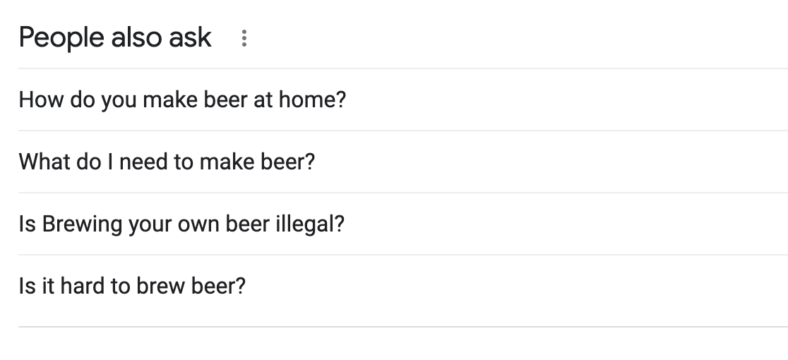
It can be pretty hard to determine the search intent of a query. And perhaps different users will have a (slightly) different user intent but still land on the same page. Luckily, there's a direct source to look at if you want to know which intent fits your keywords: The search results page makes it easier to find out how to create great content that's intent-based and relatable. Look, for example, at Figure 4.
Additionally, keep in mind that cookies being used to enhance the functionality sites visited not only conduct anonymous analytics but also share user information with your analytics to inform how cookies can retarget visitors after leaving your site. Please note that cookies lose efficacy over time because they age and because the browsers appear to be at war with third-party cookies. And browsers are generally starting to go after cookies if they don't provide direct user benefit, which typically means only allowing first-party cookies and only for a limited duration. For now, cookies still work, which can be beneficial for research, but as much as possible, you will likely want to move away from relying on them.
Although using cookies for retargeting may seem like a simple approach, the underpinnings of this simple personalized tactic leads to seamless transitions and enhancing additional advances in Web design. For example, search intent can develop a more intentional conversation between a chatbot and a potential visitor, increasing a deeper connection and enabling a more vital call to action.
Search intent can develop a deliberate conversation between a chatbot and a potential visitor, increasing a deep connection and enabling a more vital call to action.
Redesigning Persona-Based Flagging
User intent can be driven from a wide variety of different data-derived elements. In the old days, it was easy enough to get the referring URL from Google, and that was enough. Google has since made changes to hide the referring URL from websites. Therefore, today's Web design ideally should be much more sophisticated. You need to consider personas if you're really going to attract a lot of hits.
A persona is a character developed to understand and create a target or demographic group for the website. Due to its fictitious nature, a persona can guide decisions about the design and functionality of a website. Additionally, they can be leveraged as a tool to communicate behaviors and goals of a user or customer.
Examples that indicate an attribute of user personas:
- Using an uncommon browser. Uncommon browser usage is indicative of a user who's likely quite technical. Despite what it may seem, the average user doesn't use anything other than their default. Typical defaults are (in no particular order) Edge, Safari, or Chrome.
- Disabled JavaScript, ads, or Google Analytics. Adblock and similar tech usage indicate someone who's likely a bit technical because they have installed plug-ins.
- Substantial screen resolution. Large monitors tend to be gamers, developers, or executives with money to burn who appreciate large screen displays with high DPI.
- A referring URL from a page that discusses different platforms' pros/cons. Depending on the nature of the content, comparison sites are typically used by people who are shopping or making technical decisions.
- Clicks on the user-help section of the site. Users looking for help are either considering using the product and looking for what types of users are on the site, or they're trying to see what kinds of bugs are submitted, or they're an existing user.
- Clicks on a career page. Career page seekers either will be a competitor/investor or a prospective employee.
- IP geo-location maps to a hyper-wealthy neighborhood. Wealthy neighborhood information can be identified with tools/products like ESRI ArcGIS's wealth index and typically implies an executive buyer.
- IPs that map to known VPNs. VPN users are likely going to end up being a technical buyer, or a competitor/journalist trying to hide their origins while they do research on your company or products. VPNs are becoming more mainstream though, so VPN usage should be considered cautiously.
- From a technical page, the user navigates to a video about the architecture of your product. People curious about architectural information are likely to be very technical users/potential buyers.
- From a product features page, the user navigates to a pricing page. Price-curious users are likely to be a buyer, a competitor, or an analyst.
There are countless other examples, but the above should give you some idea of how to flag the user appropriately. Once they've been segmented on the back-end using first-party cookies, you can take many actions. Some examples include:
- Choose a different design layout/scheme to entice them to look at more content that matches their user-persona type. Even something as simple as choosing a dark theme for certain users might make a big difference in their perception.
- Once the user fills out a contact form, you can flag the user for different content afterward and send them to other content depending on their type of user. User personas can also be captured through a form or by manually looking up the user's details via social media platforms.
- Show users different videos or content on an equivalent page. Non-technical users will need overviews, differentiating product features, pricing, etc. Even the word choice on the page could be significant.
- Use different calls to action: Some non-technical users might be sent to Contact Us forms, and some technical users might be best served by downloading sample code, for example.
One cautionary note: If Google thinks that you are changing content for their crawler in order to manipulate search results, they will deem it “cloaking,” which is forbidden and will likely end in a site penalty until it's remedied. However, if the site is simply reacting to user intent, Google won't look askance at that. It's a grey area in SEO, and only search companies get to dictate those rules to the rest of us. Like it or not, companies have to play by the rules of the search companies on this one, or there could be a tremendous change in your company's visibility.
Getting It Right
To conclude, you'll need to take a clear-eyed look at your website. Not only at the design, not even at the slick UI interface you think people are drawn into, but take a deeper look at what's behind those elements. Never forget that no matter what your website is built to market, you are selling to real people. Developing an understanding of key messaging and personal flagging will increase the overall functionality of this potent marketing tool once user intent is captured and optimized correctly. Remember that your website is built to be seen, exposed for all who need the benefits of what you're selling. Don't be afraid to optimize and show your prospects what you're made of.


