


Knowing the flaws in Web server controls and how to work around them before you use them can save you hours of time.
One of the key tenets of .NET is that it makes developers more productive. And this is basically true - it is easier to build applications, including Web applications. You can build a complex Web page with its associated business object and stored procedures in less than four hours. But then you waste two days trying to get a particular Web control to work as you need it to?not very productive!
It is often not the every-day coding that impacts our productivity and causes us to miss our deadlines and overrun our budgets. Rather, it is how quickly we can find answers when .NET does not provide us with the results we expected.
This article looks at several Web server controls, identifies the features of the control that do not work as expected or are challenging to make work, and provides work-arounds for these issues. Specifically, this article will show you how to fill a DropDownList from an Enum, display the CheckboxList control with the correct style, and get the Calendar control to work like a date picker.
Fill a DropDownList from an Enum
The DropDownList is a Web server control that allows an end user to select one or more items from a list. You can bind the DropDownList to a database, and the .NET online help provides many examples of how to do that. But it is more challenging to find sample code for populating a DropDownList from an Enum.
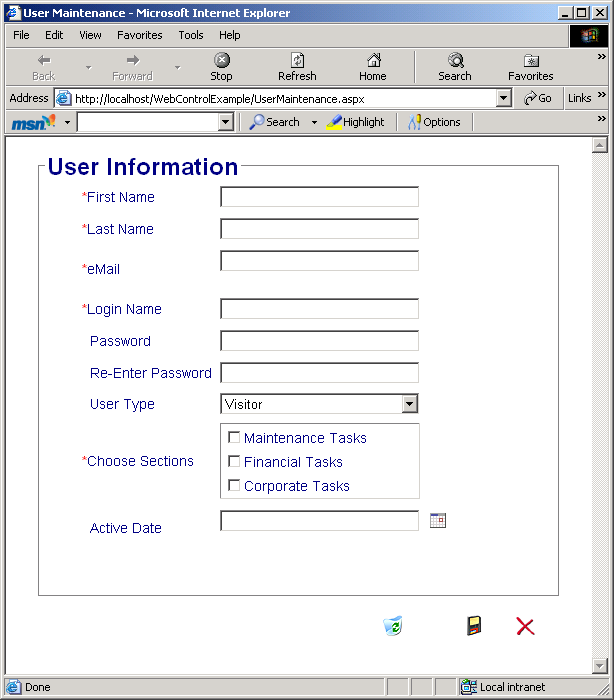
Start by putting a DropDownList on a Web form, such as the User Type DropDownList shown in Figure 1. To match this example, define the DropDownList with an ID of “cboUserType”.
In the code-behind for the Web form, define an Enum named “UserTypeEnum” to provide the set of user types as follows:
Private Enum UserTypeEnum
   Administrator = 0
   Gold_Customer = 1
   Silver_Customer = 2
   Bronze_Customer = 3
   Visitor = 4
End Enum
Add the code to populate the control as a method in the code-behind for the Web form:
Private Sub FillUserType()
 ' Loop through the entries in numerical order
 For Each iValue As Int32 In _
     System.Enum.GetValues(GetType(UserTypeEnum))
  Dim li As New ListItem
  li.Value = iValue.ToString
  li.Text =[Enum].GetName(GetType(UserTypeEnum), _
              iValue).Replace("_", " ")
  li.Selected = False
  cboUserType.Items.Add(li)
  li = Nothing
 Next
End Sub
The GetValues method of the Enum class retrieves an array of the UserTypeEnum constant values. The For/Each loop iterates through each array entry creating an associated ListItem, which defines the contents of the DropDownList.
Note This code must create a new ListItem object for each item to be added to the DropDownList. Otherwise, all of the items added to the DropDownList will reference the same item. To see this incorrect behavior, move the line of code that creates the new instance of ListItem to before the For/Each loop and remove the code that sets the ListItem to Nothing. You will then see that the DropDownList contains the “Visitor” item five times.
The ListItem has two key properties. The Text property is the text that will appear in the list and the Value property is the value that will be assigned to the control if the entry is selected. In this example, the enumeration constant is assigned to the Value property.
The GetName method of the Enum class provides the name of the enumeration that is associated with the defined value. For example, the UserTypeEnum value of “1” has an associated name of “Gold_Customer”. It is not desirable to display the underscore ("_") character to the end user, so the Replace method of the String object replaces the underscore with a space.
The Selected property is initially set to False for each item. By default, the first item is automatically selected in the list when the page is displayed. To specify which item should be initially selected, add the following line after the Next statement:
cboUserType.SelectedValue = _
  CType(UserTypeEnum.Visitor, Int32).ToString
Completing the process, the ListItem is added to the DropDownList Items collection and the ListItem is set to Nothing. The loop repeats until all of the Enum values are processed.
Notice that in some cases the code refers to System.Enum and other times it uses [Enum]. Since by default a Web project has a reference and project import for System, the System namespace prefix is not needed. But Enum by itself is a reserved keyword used for the Enum statement as shown in the first code listing in this article. To distinguish the Enum class name from the Enum keyword, enclose the class name within brackets ([ ]).
If you instead want the values to appear in the DropDownList in alphabetical order, sort them as follows:
Private Sub FillUserType()
 ' Loop through the entries in alphabetical order
 Dim arr As Array
 arr = System.Enum.GetNames(GetType(UserTypeEnum))
 Array.Sort(arr)
 For Each sName As String In arr
  Dim li As New ListItem
  li.Value = CType([Enum]. _
       Parse(GetType(UserTypeEnum), sName), _
       Int32).ToString
  li.Text = sName.Replace("_", " ")
  li.Selected = False
  cboUserType.Items.Add(li)
  li = Nothing
 Next
End Sub
This code loops through the Enum names instead of the values. So the Text property of the ListItem is assigned to the Enum name directly (removing any underscores). The Parse method of the Enum class is used to obtain the value of the Enum, given the name. The result is assigned to the Value property of the ListItem. The remainder of the code in the loop is the same as the prior code listing.
To complete the final step in this example, call the FillUserType method when the page is loaded:
Private Sub Page_Load(ByVal sender As _
 System.Object, _
 ByVal e As System.EventArgs) Handles MyBase.Load
  'Put user code to initialize the page here

  ' The first time through, load the combo
  If Not Page.IsPostBack Then
    ' Fill the User Type
    FillUserType()
  End If
End Sub
This code uses the IsPostBack method of the Page to call FillUserType the first time the page is loaded. If the page is reloaded due to a post back, the DropDownList is automatically repopulated from the ViewState.
When the end user selects an item, your code has the option of processing the selection immediately or processing the selection when the end user submits the page. For better performance, you normally want to process the selection when the end user submits the page, which is the default.
However, there are times when you need to process the end user's selection immediately. For example, you may want to change the contents of other controls based on the selection in the DropDownList. When this is the case, you can set the AutoPostBack attribute of the control to True.
This example demonstrated how to leverage enumerations and display enumerated values in a DropDownList. By understanding the many properties and methods of the Enum class, you will find many other uses for Enums in your applications.
Setting Styles in a CheckboxList
The CheckboxList is a Web server control that creates a multi-selection checkbox group as shown with the Choose Sections control shown in Figure 1. Each checkbox within the group is defined with a ListItem element within the CheckboxList element. The problem with this control is that the style of the ListItems does not work as expected.
Actually, several of the Web controls do not apply styles as you would expect. You can use the techniques presented in this section for those controls as well.
Start by placing a CheckboxList on a Web form, such as the Choose Sections CheckboxList shown in Figure 1. To match this example, define the CheckboxList with an ID of “chkAccessSection”.
There are several ways to define the ListItems within the CheckboxList control including data binding, code-behind, and HTML elements. For this example, define a CheckboxList control with its associated ListItems within the HTML as follows:
<asp:checkboxlist id="chkAccessSection"
  runat="server" Width="200" CssClass="formitem"
  BorderStyle="Groove" BorderWidth="1">

   <asp:ListItem Value="Maintenance Tasks" />
   <asp:ListItem Value="Financial Tasks" />
   <asp:ListItem Value="Corporate Tasks" />

</asp:checkboxlist>
Notice that this CheckboxList element includes a CssClass attribute. This attribute specifies the style class for the CheckboxList. However, this style class is sometimes ignored for the Listitems.
To see this behavior, associate the Web form containing the CheckboxList control with a style sheet by adding the following to the <head> section of the HTML:
<LINK href="Styles.css" type="TEXT/CSS"
 rel="stylesheet">
In the Styles.css file, define a style for an HTML Label element:
label
{
  font-family:   Arial, Helvetica, sans-serif;
  font-size:   12px;
  font-weight:   normal;
  color:      Red;
}
Add a style for an HTML Table Data (td) element:
TD
{
  font-family:   Arial, Helvetica, sans-serif;
  font-size:   16px;
  font-weight:   normal;
  color:      Olive;
}
Finally, define a style class named “formitem” as follows:
.formitem
{
  font-family:   Arial, Helvetica, sans-serif;
  font-size:   14px;
  font-weight:   normal;
  color:      Navy;
}
Each of these styles has a different font size and color so you can easily see which one is applied.
Actually, several of the Web controls do not apply styles as you would expect.
When you view your resulting Web form, either within Visual Studio or at runtime, you see that the style defined with the CssClass attribute of the CheckboxList is ignored. Instead, the standard HTML Label element style is applied. If you remove (or comment out) the Label element style definition in the style sheet, the TD element style is used. If you comment out the TD element as well, the CssClass style is then used.
This may seem odd until you see that, at runtime, ASP.NET generates the CheckboxList Web Server control items as Label elements within a Table Data (td) element. So if you have a style defined for a Label element in your style sheet, that style is used for your list items. If you don't have a Label element style defined, but do have a td element style defined, that style is used for your list items. Otherwise, the CssClass style is used.
The most obvious way to ensure your CssClass style is used would be to set the CssClass for the ListItem element in the HTML. However, there is no CssClass property of the ListItem element. Instead, set the style within the Value property of the ListItem element as follows:
<asp:ListItem Value="<span
 class='formitem'>Maintenance Tasks</span>" />
<asp:ListItem Value="<span
 class='formitem'>Financial Tasks</span>" />
<asp:ListItem Value="<span
 class='formitem'>Corporate Tasks</span>" />
This will ensure that the desired style class is used, regardless of other style sheet entries. Especially if you make extensive use of style sheets, using this technique can save you hours of time trying to figure out why your styles don't always work.
Working with the Calendar
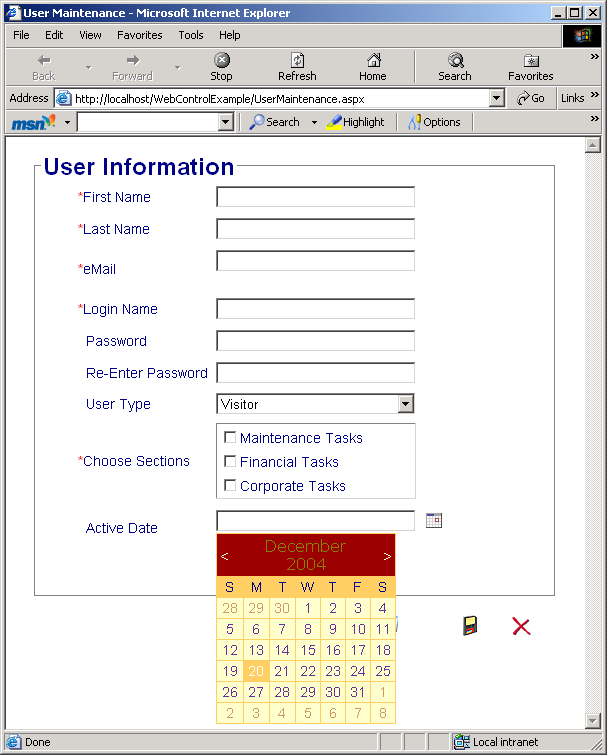
The Calendar is a Web server control that can be used to display a month-by-month calendar. The end user can use the calendar to select a date. On most forms, however, you don't want to display a calendar. Rather, you want to display a Textbox and an Image that, when clicked, will drop down a calendar as shown with the Active Date in Figure 1 and Figure 2. It doesn't seem that this task should be difficult - but it is.
If you want a perfect date picker control, your best answer is to purchase a third-party product that provides a control with the features you need. Or download an open source control, such as the one provided with the book, Developing Microsoft ASP.NET Server Controls and Components, by Nikhil Kothari and Vandana Datye.
If a simple solution will suffice, you can place the Calendar control on a Panel control and hide and show the Panel when the calendar Image control is clicked. This section details this simple solution.
Start by putting a Textbox Web Server control on a Web form with an ID of “txtActiveDate”. Add a simple HTML Image control (IMG) to display an appropriate calendar image as shown in Figure 1.
The resulting HTML is as follows:
<asp:textbox id="txtActiveDate" Runat="server"
 Width="200"></asp:textbox>
<IMG alt="Display Calendar" src="images/cal.gif">
Define the Textbox control as a Web Server control so that it can be accessed in the code-behind running on the server. Create the Image control as a simple HTML control because it does not need to be processed on the server.
Next, define a Panel Web Server control and put the Calendar Web Sever control on the panel. Depending on the styles you apply to your Calendar control, your HTML will be similar to the following:
<asp:panel id="pnlActiveDate"
 style="DISPLAY: none; Z-INDEX: 100; POSITION:
 absolute" runat="server">
<asp:Calendar id="calActiveDate" Runat="server"
 Width="180px" BorderWidth="1px" Height="120px"
 ShowGridLines="True" BorderColor="#FFCC66"
 Font-Names="Verdana" Font-Size="8pt"
 ForeColor="#663399" DayNameFormat="FirstLetter"
 BackColor="#FFFFCC">
  <DayStyle CssClass="formitem" />
  <TodayDayStyle ForeColor="White"
   BackColor="#FFCC66"/ >
  <SelectorStyle BackColor="#FFCC66"/>
  <NextPrevStyle Font-Size="9pt"
   ForeColor="#FFFFCC"/>
  <DayHeaderStyle CssClass="formitem" Height="1px"
   BackColor="#FFCC66"/>
  <SelectedDayStyle Font-Bold="True"
   BackColor="#CCCCFF"/>
  <TitleStyle CssClass="formitem"
   ForeColor="#FFFFCC" BackColor="#990000"/>
  <OtherMonthDayStyle CssClass="formitem"
   ForeColor="#CC9966"/>
</asp:Calendar>
</asp:panel>
The styles on the Calendar control can be set to any desired value. The important settings are in the Panel control's Style attribute. The Display setting defines how the panel is displayed. Define a value of None so that the panel is hidden, which is the desired initial value.
Set the Z-Index to a large number to ensure that the Panel will appear over all of the other controls when it is dropped down. Note, however, that there is a known problem whereby any HTML Select controls (which is what ASP.NET outputs for DropDownList controls) will appear over any other control, regardless of their Z-Index. So you need to place the Panel control in a position such that it won't drop down over Select or DropDownList controls or, put the Select or DropDownList controls in a Panel where they can be hidden when the calendar Panel is dropped down.
Finally, set the Position of the Style attribute to Absolute so that it will allow other controls to flow around it. Otherwise the layout will not appear appropriately.
Now that all of the controls are in place, there are two basic ways to hide and show the Panel containing the Calendar. One way is to change the Image HTML control to a Button Web Server control and handle the button click on the server. The downside of this approach is two-fold: you have the performance hit of a server-side call and you have the flashing of the page caused by the repost.
Alternatively you can use the HTML Image, like in this example, and write some client-side scripting code to hide and show the panel when the image is clicked. The following presents the required client-side JavaScript code.
<script>
  function DisplayCalendar(pnl)
  {
    var ele = document.getElementById(pnl);
    if (ele != null)
    {
      if (ele.style.display=="none")
      {
        ele.style.display="block";
      }
      else
      {
        ele.style.display="none";
      }
    }
  }
</script>
Insert this code in the <head> portion of the HTML for the Web form. The function takes the name of the Panel control as a parameter, allowing for multiple occurrences of the “date picker”. As you are writing this code, don't forget that JavaScript is case sensitive!
The code in the DisplayCalendar function uses the getElementById method of the document (Web page) to find the Panel control on the page. Then, if the Panel is hidden, it shows it by setting the Display style to “block.” If the Panel is shown, it hides it by setting the Display style to “none.” This has the effect of showing the Panel containing the Calendar when the end user first clicks the Image and then hiding the Panel if the end user clicks the Image again.
For this script to work, it has to be connected to the OnClick event for the Image control:
<IMG onclick="DisplayCalendar('pnlActiveDate');"
 alt="Display Calendar" src="images/cal.gif">
Now for the code behind… When the end user selects a date in the Calendar control, the date should appear in the associated Textbox control and the Panel control containing the Calendar should again be hidden. You do this by handling the SelectionChanged event of the Calendar:
Private Sub calActiveDate_SelectionChanged(ByVal _
           sender As System.Object, _
           ByVal e As System.EventArgs) _
           Handles calActiveDate.SelectionChanged
 txtActiveDate.Text = _
     calActiveDate.SelectedDate.ToShortDateString

 pnlActiveDate.Style.Item("display") = "none"
End Sub
This code puts the short date version of the date into the Textbox control. It then hides the Panel containing the Calendar control. Notice that the Display style of the Panel control is used instead of the Visible attribute of the control. Setting the Visible attribute of a Web Server control prevents the control from appearing in the HTML, which means that it cannot be accessed from any client-side scripting. Since this example uses client-side scripting to access this control, the Display style is used instead.
The last event that the code needs to handle is the VisibleMonthChanged event:
Private Sub _
 calActiveDate_VisibleMonthChanged(ByVal sender _
  As Object, _
  ByVal e As WebControls.MonthChangedEventArgs) _
  Handles calActiveDate.VisibleMonthChanged
 pnlActiveDate.Style.Item("display") = "block"
End Sub
The existing code will cause the Panel containing the Calendar to be hidden when the end user clicks on a date, which is desired. But the code will also cause the Calendar to be hidden when the end user clicks on the arrows to change the month, which is not desired. So code in the VisibleMonthChanged event will ensure that the Panel remains shown as the end user clicks through the months.
There you have it, a poor man's date picker control using the Microsoft Calendar control.
Conclusion
It is often not the every-day coding that impacts our productivity and causes us to miss our deadlines and overrun our budgets. Rather, it is how quickly we can find answers when .NET does not provide us with the results we expected.
Knowing about the roadblocks ahead of you and how to get around them will make it easier for you to get to your destination on time.