


Even relatively technical people get confused about screen resolutions and monitor sizes. I wrote about this topic on my blog a while back (www.MarkusEgger.com/Blog), and a lot of people contacted me about it. In fact, a publisher of a newsletter dedicated to high resolution even asked me about re-publishing my post. I think there is good reason for interest in this area. So much so, that I decided to write an article about the topic.
Display resolution is important. Technologies like Windows Presentation Foundation (WPF) are specifically engineered to solve the screen resolution dilemma. The issue with resolution is relatively trivial. The more pixels/dots your hardware can draw on the screen, the better the display quality. For this reason, hardware manufacturers must increase the resolution to achieve better displays. This will help us to get closer to display quality similar to printed content. The trouble is that with today's display technologies, whenever we increase the resolution, everything on screen gets smaller and smaller. As a result, people find it harder to see what they are doing. Personally, I like to work at a 1600 by 1200 resolution with multiple monitors, but many people say that's too small for them.
We really need the ability to drastically increase the number of pixels used by displays and at the same time allow people to use fonts and UI components of the size that is most comfortable to them. Windows Vista will take a big step towards this goal, but we will only really get there with WPF. Vista and WPF deal with the “points vs. pixels” issue a lot better to achieve display output at certain absolute sizes.
Before we can talk about a lot of these details, let me review the terms involved, which seem to be one of the causes for confusion.
A Quick Review of Terms
Screen resolution involves a number of aspects, and people tend to use the associated terms somewhat interchangeably, often in incorrect ways. Let me try to clear things up by starting at the simplest point: The size of the monitor.
Hardware people measure a monitor's size in inches, even if you are in a metric world. (The European Union attempted to introduce cm for monitor measurements but that just completely confused everyone, because nobody knew what a 43.18cm screen was…). A monitor's size, in inches, is the diagonal dimension. So a 19-inch monitor should be 19 inches from the top-left corner to the bottom-right corner. I say “should” because with the old-style tube monitors (“CRT”), the visible area of the screen is less than the advertised size. I am currently writing this article on a 19-inch CRT monitor, but the visible area is only 17.8 inches. which is kind of a rip-off, really. Flat panels (“LCD”) are different in that the visible size is really the size of the monitor. So when you have a 19-inch flat panel, the diagonal dimension is 19 inches. This is why people often say that a 17-inch flat panel is similar to a 19-inch CRT monitor.
So now you understand more about the physical size of the monitor. But physical size only has limited impact on how much is actually displayed on the screen. “How much” depends more on the screen resolution, which is currently measured in X and Y pixels. A typical resolution might be 1024 by 768 or 1280 by 1024. This simply means that the screen is made up of 1280 points horizontally, and 1024 vertically (or whatever the numbers are).
A different way of looking at resolution (and actually the more accurate way) is DPI (dots per inch), which measures how many pixels your monitor can display in each square inch of monitor real-estate. My 19-inch CRT monitor is 14.3 inches wide and 10.8 inches tall. I run at a resolution of 1600 by 1200 pixels. This means that each horizontal inch of my screen gets about 112 pixels, and each vertical inch also gets about 112 pixels. My current system configuration thus has a resolution of 112 DPI. My system runs at slightly higher than average resolution. A typical monitor today runs at 96 DPI, meaning that if one draws a square of 96 pixels on the screen, it shows up as exactly one square inch. However, Windows has little knowledge of displays that are different from the 96 DPI standard. For instance, Windows has no idea that my monitor is set to run at 112 DPI and thus developers have no way to really create output that is one square inch in size.
This leaves users with a situation that is rather lacking for a lot of needs. For an average business application, it perhaps does not matter what the dimension of a textbox control is in inches. However, there are many scenarios where accurate screen output is highly desirable. Also, the problem isn't all that severe if the display is 112 DPI, while Windows assumes 96 DPI. However, if screen resolution was 300 DPI or more, the difference between the assumed output size and the actual size is drastic. Most fonts would appear so small you could not read them at all.
DPI is a very important measurement in many scenarios. For instance, in the publishing and printing business (as in “printing on paper”), we generally consider 300 DPI to be the absolute lower limit of acceptable quality. 600 DPI is normal. 1200 DPI is great. As you can see, computer monitors have a ways to go. (Although some would argue that screens are capable of achieving better display quality with resolutions less than on paper. So 300 DPI may be a very good next goal for computer screens.)
So you now understand pixels and DPIs, but to make things a little more confusing, we have one more unit to deal with: points. Fonts are generally measured in points. Typical font sizes in Windows today are 8, 10, and 12 points. Points are somewhat similar to pixels, but not identical (as is often incorrectly assumed). For instance, a 10-point “T” in the Arial font is drawn 10 pixels tall on my system. A 10-point “T” in the Times New Roman font, on the other hand, is 9 pixels tall. A 24-point “T” in Times New Roman is 21 pixels. So there is a significant difference between points and pixels. A point is 1/72nd of an inch while a pixel is 1/96th of an inch (or at least it is supposed to be). At 8- or 10-point fonts, the difference is minimal, but at larger sizes, the difference is significant. A lot of people get confused because things are so similar, but they are not the same. (Also, differences result due to individual font designs. For instance, a font designer is free to make a “T” significantly taller or shorter than other characters in the same font set.)
Points are a handy measurement, because they allow you to specify the size of the font in absolute terms. A 10-point font's upper case letters are supposed to be about 0.14 inches or about 3.5mm tall. This will be true for things printed on paper, and in theory it should also be true for fonts displayed on monitors. However, since you've already learned that Windows has little knowledge about what size things end up on the screen, this is currently only the case if the monitor happens to be running at exactly 96 DPI. Otherwise, Windows should scale things appropriately (in my case, it should use more pixels for each character), but it doesn't.
Monitor Sizes and Proportions
Let me dig into physical monitor size a bit more: A lot of people think that when they get a bigger monitor, they can see more things at once. While there is a relationship between screen size and maximum resolution (bigger monitors often support higher resolutions), it is not the physical size of the monitor that defines how much can be displayed, but it (currently) only is the resolution that is the defining factor. A 22-inch monitor running at 1024 by 768 can show the same amount of “stuff” as a 15-inch monitor with a resolution of 1024 by 768 pixels. Of course, on the 22-inch monitor, each pixel will look huge in that case, so I would argue that the quality is really lower (the small display would have around 100 DPI, while the big one shows a nasty 60 DPI or so).
What users really need is the ability to use as many pixels as possible, but scale the content to any size they want. For instance, if a user has a 300 DPI display (perhaps running a resolution of 5000 by 3500), then they still may want to show 10-point fonts at 0.14 inches and no smaller. I'd make this my default, but people should be able to smoothly scale interfaces to any size they want. If they feel the font is too small, they should just be able to scale the UI by 50% (or whatever scale they desire) and see things at exactly 1.5 times the original size, with all proportions intact. Also, quality must not suffer by this operation.
The people at Microsoft need to address two key issues to make this happen: First, they need a way to measure the UIs independent of actual pixel counts. They could move to points, but that poses the problem of not being compatible with Win32 UI measurements, which happen in physical pixels. So it is desirable to stay with the same scale as current UI technologies. WPF does exactly that by turning physical pixels into logical pixels. In Windows Forms, for instance, you can create a line that is 96 pixels long. On a 96 DPI display, that line would be exactly one inch long, while on other displays, it may be different. In WPF, you can also create a line that is 96 pixels long, and on a 96 DPI display, it would appear identical to the Windows Forms version. However, since WPF uses logical pixels for all measurements, on a 300 DPI display, the WPF line would still end up one inch long, although the number of pixels used to render the line would now be much greater.
Besides a new logical way of measuring interfaces, we also need a technology to scale UI components without sacrificing quality. WPF achieves this by abandoning Windows's traditional UI approach of handling everything by drawing individual pixels. Instead, WPF uses vector graphics. Vectors have the advantage of being completely independent of display resolutions. A font or a shape defined in vectors can be drawn tiny or huge, and it will always look absolutely crisp. Also, graphics hardware is very good at rendering vector graphics, so WPF will offload much of the burden of rendering to graphics accelerator cards (if available), leaving the CPU more time to handle “the important stuff.”
The WPF high quality rendering approach provides a wide range of advantages, ranging from quality improvements to the ability to perform tasks such as UI scaling that are either impossible or very hard to achieve today.
Important Points About Screen Resolution
Today, most users opt to view their computer screen at 1200 by 1024 or 1024 by 768… few people use lower resolutions than that… keep this in mind when designing your apps. The reason they do not use higher resolutions is technical. Most people look at running in a higher resolution and say “boy, how do you read this text? The characters are so small.”
I think a 10-point font should be of a certain inch/mm size no matter what. So if you look at a 96 DPI monitor with 1600 by 1400 resolution, a 10-point font should be exactly the same size as a 10-point font in a book or magazine. In printing, font sizes of 8 - 10 points are normal. Using 7-point type is even acceptable in terms of readability, but publishers don't usually print that small unless there is a good reason. Publishers may use 12-point fonts for children's books but regular text this large looks amateurish for everything else. Most people do not have trouble reading 8-point fonts.
So why do some people have a hard time reading a 10-point font on a computer monitor? I can suggest a few reasons. Consider contrast, for instance. Remember that Windows cannot scale fonts properly for displays that are not at 96 DPI. However, I think the biggest single problem is resolution. A 10-point font at 96 DPI is hard to read, while a 10-point font at 600 DPI is easy to read. Why? At 96 DPI, fonts are so blurry that the brain/eye combination has to work hard to turn it into something the average human can read as a character.
Consider this screen shot of a “W” at 10-point Times New Roman:

Zoomed in, you can see how pixilated it is:

No wonder your eyes have a problem reading it.
Here I've created the same character at 10-points (so exactly the same size as before) but at 460 DPI. Here it is zoomed in again:

Keep in mind that the original size of this is:
Of course, the render quality of the small version is no better than the 96 DPI version, because you are not likely to have a 460 DPI display. However, come back and reread this article entry a few years from now when you have a better display, and you will see it just as crisp and sharp as the enlarged version.
In short: If manufacturers can improve the resolution of displays, then computer users can use fonts of the same size as fonts in magazines and books, and things will be just as easy and relaxing to read.
Font Smoothing, Anti-Alias, and ClearType
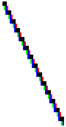
The 96 DPI “W” above is rendered in black color. So why do you see shades of gray when you zoom in then? That is due to font smoothing. If your monitor set only black and white pixels, the font would look even worse than it does now. To explain font smoothing, consider a simple graphic: a straight line. Whenever a straight line needs to be drawn that is not completely horizontal or vertical, it appears pixelated. Look at this zoomed in version of a line:

As you can see, this looks awful. By applying anti-aliasing your computer can achieve a better result. Using this technique, pixels that should be only half set are drawn in a color that is somewhere between the background color and the foreground color. Here is the same line with anti-alias applied (or as good as I can create such a line manually in Paint):

This second version appears much smoother when you look at it in original size. Compare the two versions (note that depending on your monitor and browser settings, the effect may be more or less visible):

The same technique can be applied to fonts and the result is shown further above in the 96 DPI “W”.
Another technique to smooth lines and fonts and graphics in general is known as ClearType, which takes advantage of the way LC Displays (flat panels) work. On a flat panel, each pixel is really made up of a red, green, and blue sliver. Those slivers are aligned horizontally within each pixel. For instance, let's assume the right-most third of each pixel is the red sliver (not all displays use the same order… ClearType only works on some of them). It is possible to create the appearance of a third of a pixel being drawn by only lighting the pixel up bright red (or really by lighting up the other two pixels and leaving the red one dark (black) depending on what the foreground color is). Therefore, it is possible to create a smooth appearance like so:
![]()
To really see what's going on I'll zoom in further:
Of course, this only works on LCD monitors, because on all other displays, the same graphic looks like this:
![]()
The trick is that each sliver within a pixel is so small that it is impossible for the human eye to see the actual color. Instead, the brain assumes the color of the partial pixel to be the same color as the neighboring pixels, and thus the line appears to humans like so:
![]()
This is by far the best version of all the ones you have looked into so far (keep in mind that I am still showing this zoomed in).
These font smoothing techniques rely on biology (the human eye) and how the brain processes information received from the eye. Basically, the human eye/brain combination is much better at seeing patterns than it is at seeing individual colors. Due to this fact, the brain can be tricked into thinking a line is smooth. However, this trickery takes some heavy cognitive processing, and thus a user can easily tire if they have to read a lot of text on the screen.
Some people claim ClearType works well for them even on regular monitors. This is really incorrect. In fact, quality deteriorates on regular monitors when you use ClearType. (The same is true for LCD that use a nonstandard arrangements of the red, green, and blue slivers). But for some people, the “visual placebo effect” appears to kick in.
Aliasing
One of the nastiest things that can happen on LCDs is aliasing. Basically, it is not good to run an LCD display at anything but its maximum resolution. If the maximum resolution of your display is 1200x1024 and you have Windows set to display at 1200x1024 pixels, then each pixel the software puts out maps to a pixel on the screen, and the maximum possible display quality is achieved.
However, let's say you have an LCD with a resolution of 1200x1024 pixels, but have Windows set at 1024 by 768, then each pixel rendered by the software is displayed by 1.17 pixels on the monitor's hardware. There is no way to display 0.17 pixels. Therefore, the information has to be aliased, meaning that it has to be mapped onto the display. Consider this list of pixels:
![]()
If this pixel is to be mapped from 1024 (software) to 1200 (hardware) horizontal pixels, then the first hardware (monitor) pixel displays the first 83% of the pixel the software put out. The second hardware pixel displays the remaining 17% of the software pixel, plus a part of the second software pixel, and so forth. Therefore, each but the first pixel has to show an approximation of two pixels combined, with results in a nasty color mixture. Creating this effect manually, we arrive at something like this:
![]()
Compare the two versions up close:
![]()
![]()
Needless to say that the crispness of the previous version is lost. Add anti-alias or ClearType to the mix and you have a serious mess that is next to unreadable.
I often talk to customers and they look at my resolution and conclude they could never read my screen because everything is too small. Then, when I meet them in their office they have their 1200x1024 display set to show 1024 by 768 pixels, and half an hour later I walk out with a headache. They would be much better off with much better readability if they went with the higher resolution. But I guess since they already can't see things well at the resolution they are at, they conclude that if they increase their resolution, things would get even worse. Quite the opposite is the case.
BTW: It is also possible to go the other way and set Windows to 1600 by 1400, but only have a display that supports 1200x1024 (this often happens with projectors). Aliasing is applied here too, but with even worse results.
How well aliasing works depends on the overall resolution. If you have a monitor that can display 1600 by 1400 and then show an 800x600 output, it will look pretty good, because there are a lot of pixels (each being very small) the aliasing algorithm can work with. However, when resolutions are very close (1200 to 1024 for instance), then things turn nasty.
Conclusion
Screen resolutions are a big deal. We need to improve them drastically to provide more readable and user friendly UIs. WPF will not replace paper, but it will get much closer to this goal. I predict that once high resolution displays are available, it won't take long for people not being willing to read low-res displays. Certainly, prices will have to come down, but once enough software is available supporting efficient scaling, this is sure to happen. 15 years ago, most computer monitors were monochrome (laptop displays even more recently), and for most people, providing color displays to their staff seemed to be outrageous. Today, we face a similar scenario with high-res displays. I don't see why adoption of high-res displays should go a different way than adoption of color displays did. It is just a matter of time. And it is a matter of providing appropriate software. That little detail will be up to you…
ClearType is a registered trademark of Microsoft Corporation.