“Don’t do it! Don’t do it!” the little voice in my head shouted as I contemplated using the worn out cliché “Good things come to those who wait” to describe the experience of designing Windows applications with Visual Studio 2005.
However, that cliché accurately communicates the idea that building Windows Forms applications in Visual Studio 2005 is better, makes you more productive, and provides you with more fun than doing the same in Visual Studio 2003, not to mention VB6!
Part of what makes working with Windows Forms so exciting these days is Microsoft’s renewed emphasis on smart client development. It is no secret that Windows applications provide a richer and better user experience than Web-based applications. Web-based applications have had the upper hand primarily because they are easier to deploy. For years now, IT departments have been willing to sacrifice the user experience in order to take advantage of the deployment advantages offered by Web-based applications.
I think the pendulum is about to swing back in favor of developing rich, user-centric, Windows applications for internal corporate applications.
Microsoft has addressed the Windows application deployment issue with the new ClickOnce technology introduced with Visual Studio 2005. For more information, see “ClickOnce: Bringing Ease and Reliability to Smart Client Deployment” by Patrick Darragh in this issue of CoDe Magazine .Of course Web-based applications will always have their place on the Internet, but I think the pendulum is about to swing back in favor of developing rich, user-centric, Windows applications for internal corporate applications.
This article touches on some of the new enhancements made to the Visual Studio Integrated Development Environment (IDE), new controls, and new components. I chose to code the samples in Visual Basic and I am sure that will not adversely hamper a C# programmer from learning about the new Windows Form features in Visual Studio 2005.
Visual Studio 2005 IDE Features
The Visual Studio IDE and Windows Form teams have been busy adding or improving features that increase your productivity. A reorganized Toolbox will be one of the things you notice when you create your first Visual Studio 2005 Windows Form application. Controls are grouped according to function into categories including Common Controls, Containers, Menus & Toolbars, and Data, to name a few (Figure 1).

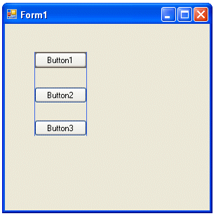
The new snap lines feature will be the next feature you notice. This feature provides visual confirmation that controls are horizontally or vertically aligned (Figure 2). This will save you time because you will never have to set Left or Top properties or use the Format > Align menu option to ensure controls are lined up correctly.
Drop a Textbox control on a form, select it, and you will see a small smart tag arrow in the upper right corner of the control. Clicking this arrow displays the Textbox Tasks dialog box which provides a list of the common operations performed on the control (Figure 3).

I could go on and on about additional enhancements made to the Visual Studio development environment and project structure, but I will leave that for another article. For now, I will move on to specific Windows Form enhancements.
Working with Data
One of the goals for Visual Studio 2005 was to simplify the process of retrieving and binding data to form controls. Two new IDE features have been added-the Data Sources window and the Data Source Configuration Wizard.
The new snap lines feature provides visual confirmation that controls are horizontally or vertically aligned.
Data sources represent the data that you want to work with in your application and are listed in the Data Sources window. As you would expect, your can make data sources from databases, but you can also create them from Web services and business objects. You add data-bound controls to your forms by dragging items from the Data Sources window. Each item in the Data Sources window provides you with a list to select the type of control to create prior to dragging it onto a form.
DataGridView
It’s no secret that the DataGrid control in Visual Studio 2003 was fairly limited, difficult to customize, tough to extend, and was nearly almost universally shunned in favor or more powerful and flexible third-party controls. Trying to fix the problems in the DataGrid, while keeping it backward compatible, proved to be a nearly impossible task. The Windows Forms team decided to go back to the drawing board and design a completely new and better grid control, the DataGridView control.
Be sure to check out Wei-Meng Lee’s article, “Data Binding in Windows Forms 2.0,” in this issue of CoDe Magazine for additional information about data sources and Windows Forms data binding.
ToolStrip Control
The new ToolStrip class (System.Windows.Forms.ToolStrip) located in the Menus & Toolbars section of the Toolbox, replaces the out-of-date ToolBar class and supports a variety of ToolStrip widgets including the ToolStripButton, ToolStripSplitButton, ToolStripDropDownButton, Button,ToolStripLabel, ToolStripProgressBar, ToolStripSeparator, ToolStripCombobox, and ToolStripTextBox. A ToolStrip appears with a modern, Office-style, flat look and supports Windows XP Themes.
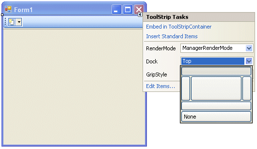
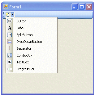
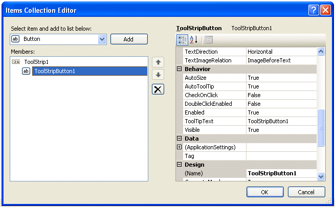
You can position the ToolStrip by selecting its Dock property and clicking on the position indicator (Figure 4). You can add items to a ToolStrip in a variety of ways. Clicking on the AddToolStrip button tool located in the ToolStrip will add a ToolStrip button while clicking the down arrow provides the ability to select one of a number of different ToolStrip controls (Figure 5). Selecting the ToolStrip’s smart tag and selecting Edit Items is another technique for adding items to the ToolStrip. The Items Collection Editor (Figure 6) provides the ability to add new ToolStrip items and/or manage the properties of existing ToolStrip items. Selecting Insert Standard Items… from the smart tag menu automatically adds standard buttons for document management (new, open, save, Print, cut, copy, paste, and help).
All ToolStrip items derive from the ToolStripItem class and support properties such as Text, Image, ImageAlign, Enabled, and Visible. Unlike the legacy ToolBar control which fired an event at the control level when clicked, each button on a ToolStrip control supports its own Click event.
Private Sub ToolStripButton1_Click( _
    ByVal sender As System.Object, _
    ByVal e As System.EventArgs) _
       Handles ToolStripButton1.Click

    MessageBox.Show("Click for the Button")

End Sub
You will not find the legacy ToolBar control on the ToolBox. It, along with controls like the StatusBar (which is replaced by the StatusStrip control), have been left off the ToolBox. If you want to re-add any of the legacy controls, right-click on the ToolBox, select Choose Items, and pick the controls you wanted added from the list.
StatusStrip Control
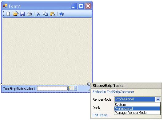
The new StatusStrip class (System.Windows.Forms.StatusStrip) located in the Menus & Toolbars section of the Toolbox derives from the ToolStrip class and replaces the legacy StatusBar class. It supports a variety of ToolStrip items such as ToolStripStatusLabel, ToolStripProgressBar, ToolStripDropDownButton and ToolStripSplitButton. Like the ToolStrip control, it appears with a modern, Office-style, flat look and supports Windows XP Themes (Figure 7). Deriving from the ToolStrip, the StatusStrip shares many of the same features, UI elements, and capabilities as the ToolStrip such as each StatusStrip item supporting its own Click event.
MenuStrip Control
The new MenuStrip class (System.Windows.Forms.MenuStrip) located in the Menus & Toolbars section of the Toolbox also derives from the ToolStrip class and replaces the legacy MainMenu control. It supports a variety of ToolStripMenu items including ToolStripMenuItem, ToolStripComboBox, and ToolStripTextBox. Each ToolStripMenuItem object supports a number of welcome properties including Image, ToolTipText, and Font manipulation.
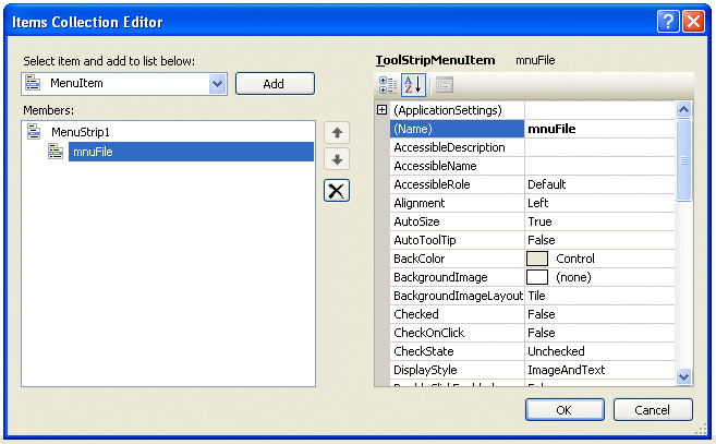
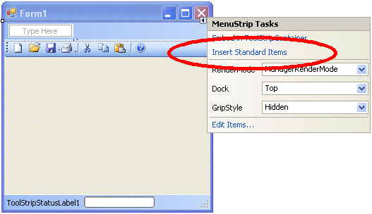
You add menu items in one of three ways. First, like the legacy MainMenu control, you can create and edit menus manually by typing the prompts directly into the menu. The second approach is to select Edit Items… from the smart tag task list and work with the Items Collection Editor (Figure 8). The third and most efficient approach is to select Insert Standard Items from the smart tag task list to automatically populate your menu with a complete menu including File, Edit, Tools, and Help (Figure 9).
ContextMenuStrip Control
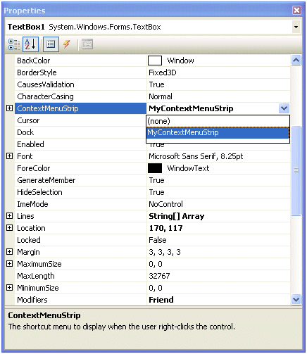
The new ContextMenuStrip class (System.Windows.Forms.ContextMenuStrip) located in the Menus & Toolbars section of the Toolbox derives from the ToolStripDropDown class and replaces the legacy ContextMenu class. Implementing this class works much the same way as the legacy ContextMenu class worked. You construct a ContextMenuStrip and assign it to the ContextMenuStrip property for a control (Figure 10). When the user right-clicks on the control, the ContextMenuStrip menu appears.
MaskedTextBox Control
Back in the Visual Basic 6 days, when you wanted to make sure your user entered data adhering to a specific format, a phone number for example, you used the MaskedEdit control. Prior versions of Visual Studio .NET were missing this capability and that shortcoming has been addressed in Visual Studio 2005. The new MaskedTextBox class, located on the Common Controls section of the Toolbox, derives from the TextBoxBase class and provides the ability to format user data entry. You can set the Mask property manually or you can select from a list of prepared masks accessible by selecting the Set Mask… option (Figure 11) from the smart tag task list (Figure 12).

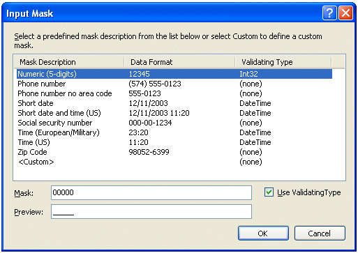
You can act on a user’s invalid keystroke by reacting to the MaskInputRejected event which fires when the input does not match the corresponding mask character in the input mask.
If you want to annoy the users of your application, set the BeepOnError property to True. This will cause the standard error chime to play with each invalid keystroke. You can take advantage of the MaskCompleted property to determine if the user has completed entering data in the MaskedTextBox. The Text property returns the fully formatted value in the control, (515) 123-1234. The InputText property returns the data in the control without the formatting characters; 5151231234, for example.
WebBrowser Control
The new WebBrowser control (System.Windows.Forms.WebBrowser) addresses a number of shortcomings related to adding Web browsing support to Windows .NET 1.0 and 1.1 applications. The WebBrowser control, located on the Common Controls section of the Toolbox, is a wrapper for Internet Explorer and supports printing and saving documents as well as controlling user navigation.
Set the URL property on the control to navigate the user to a specific page. Alternatively, you can call the Navigate method and pass the URL and a Boolean parameter that indicates if a new browser window should be launched. The WebBrowser works asynchronously so your application will not have to wait for the page to finish downloading before continuing.
The ReadyState property tells you if the page has completed loading. You can also code a handler to react to the DocumentCompleted event. The Navigating event fires before navigating to a new page and provides the ability to cancel the navigation if certain conditions have not been met. Set the Cancel property of the WebBrowserNavigatingEventArgs object passed to the event handler to True to cancel the navigation
Private Sub webBrowser1_Navigating( _
   ByVal sender As Object, _
   ByVal e As WebBrowserNavigatingEventArgs) _
      Handles WebBrowser1.Navigating

   If Now.DayOfWeek = DayOfWeek.Monday Then
      'Yes, MsgBox is supported
      MsgBox("No surfing on Monday!")
      e.Cancel = True
   End If
End Sub
The Navigated event fires when navigation to a new page has occurred and the page has begun to load. At this point you can begin to access the page content through the Document, DocumentText, and DocumentStream properties.
AutoComplete
The AutoComplete feature has been added to the TextBox and ComboBox controls. It provides users of your application with the ability to select from previously entered values. The values displayed are drawn from the user’s recent history of activity. The address bar in Internet Explorer provides a perfect example of this feature in action.
Specifying one of three available values (see Table 1) (Suggest, Append, and SuggestAppend) for the AutoCompleteMode property enables the feature for a control.
The AutoCompleteSource property (see Table 2) controls the type of AutoComplete values displayed.
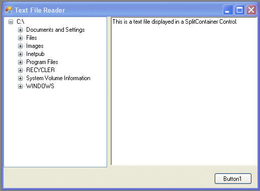
SplitContainer Control
You can think of the SplitContainer control, located on the Containers section of the Toolbox, as the combination of two panels separated by a splitter bar. The user controls the size of each panel by dragging the splitter bar to the left or right. The Orientation property determines if the splitter bar runs top to bottom (Orientation = Vertical) or left to right (Orientation = Horizontal). The vertical orientation creates left and right panels side-by-side, and the horizontal orientation create top and bottom panels, one above the other.
The SplitContainer control provides a number of properties and events to manage it’s operation (see Table 3).
The Text File Reader form shows the SplitContainer control in action (Figure 13).
SystemSounds Class
The SystemSounds class, located in the System.Media namespace, makes easy work of adding the Windows operating system sounds to your WinForm application. When a system event occurs, Windows alerts the user with the sound associated with the event. Since users can choose to associate any sound file with a specific event, in prior versions of .NET it was a challenge to determine and locate the files mapped to the system events. The SystemSounds class remedies this problem.
The SystemSounds class exposes five shared object properties (see Table 4) that correspond to specific operating system events.
Use the Play method to play the sound file associated with the specified system event.
System.Media.SystemSounds.Beep.Play()
System.Media.SystemSounds.Question.Play()
SoundPlayer Class
The SoundPlayer class, located in the System.Media namespace, provides a simple way to play .wav audio content files. Audio .wav files can be loaded from a file path, a URL, a Stream that contains a .wav file, or an embedded resource that contains a .wav file.
The SoundLocation and Stream properties are responsible for the location of the .wav file to be played. The SoundLocation property specifies the file name or URL to load. The Stream property specifies the name of a Stream-based object containing the .wav audio content to load. See Table 5 for properties relating to the SoundPlayer class.
The Load method loads the specified .wav audio content into the control and pauses program execution until the content has loaded completely. Unless the file you are loading is very large, Load should work just fine for you. The LoadAsync method loads the specified .wav audio content on a separate thread and fires the LoadCompleted event when the content has been loaded (see Table 6).
The three methods available to play the loaded audio content are Play, PlayAsync, and PlayLooping. You can load and play audio content .wav files synchronously or asynchronously. Calling the Play method asynchronously plays the audio content on a separate thread so your code can continue executing. PlaySync, on the other hand, will play the audio content synchronously and pause program execution until the playback has completed. PlayLooping works the same as Play except it will continue to loop the audio. Call the Stop method to stop the audio playback.
Dim MySoundPlayer As New System.Media.SoundPlayer
MySoundPlayer.SoundLocation = _
   "C:\Windows\Media\Chord.wav"
MySoundPlayer.Load()
MySoundPlayer.Play()
BackgroundWorker Component
Consider the words “multithreaded programming.” For some people these words conjure up images of late-night coding sessions hunched over .NET Framework books or sifting through the Help file trying to get a solid grip on how to run multiple tasks on separate execution threads. That’s not how I want to spend my nights. I prefer an activity you may have heard of called sleep.
Fortunately I can get plenty of sleep because of the introduction of the new Background Worker class. The BackgroundWorker component makes it easy for time-consuming operations, the type of operations that can cause your user interface to act as though it’s stuck in mud, to run on a separate, dedicated thread. Examples of this type of operation are file downloads, database transactions, connecting to a Web service, or working with large text files.
You can drag a BackgroundWorker component from the Toolbox onto a form or you can create it programmatically. The RunWorkerAsync method begins the execution of the background operation being performed. The RunWorkerSync method fires the DoWork event on a background thread and it is in the handler for this event that you code the operation to take place. If the WorkerReportsProgress property is set to True (see Table 7), the ReportProgress method can be called while the operation is underway. This method raises the ProgressChanged event which is handled on the form to keep the user informed, typically through the use of a progress bar. If the WorkerSupportsCancellation property is set to True, the CancelAsync method can be called to cancel the background operation. The RunWorkerCompleted event fires when the background operation has completed, has been cancelled, or has raised an exception (see Table 8).
The BackgroundWorker Component Test form (Figure 14) uses a BackgroundWorker component to perform a calculation on a separate thread. The Start Operation button launches the thread by calling the RunWorkerAsync method, passing in the length of time the thread should wait, simulating a lengthy process. The Cancel Operation button calls the CancelAsync method and provides the user with the ability to cancel the operation. The Operation Busy? Button calls the IsBusy method and provides the user with the ability to determine if the process is still underway.
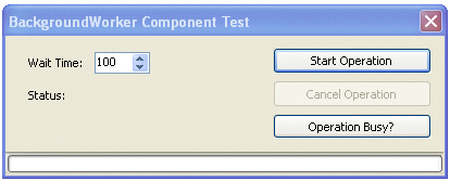
The BackgroundWorker1_DoWork sub handles the DoWork event fired when the RunWorkerAsync method is called. Reviewing the BackgroundWorker1_DoWork procedure code in Listing 1, you can see that the ReportProgress method is called inside a processing loop. The BackgroundWorker1_ProgressChanged sub handles the ProgressChanged event raised and updates the progress bar.
Once the DoWork method is complete, the BackgroundWorker1_RunWorkerCompleted sub handles the RunWorkerCompleted event that is fired and the form is updated to reflect the outcome of the operation. See Listing 1 for the complete code listing for the form.
ClickOnce Deployment
One of the most attractive features of a Web-based application is the ease in which you can deploy and update it. All a user has to do is point their browser at the correct URL and away they go.
With .NET 2.0 comes a new deployment technology called ClickOnce aimed squarely at reducing the number of Web-based intranet applications being developed in favor of developing smart client applications. ClickOnce can create a setup program that can be distributed and installed via traditional measures (a CD), launched over a network, or launched through a Web page. You can also configure ClickOnce applications to automatically check for updates each time the application executes.
For more information, see “ClickOnce: Bringing Ease and Reliability to Smart Client Deployment” by Patrick Darragh in this issue of CoDe Magazine.
Summary
I hope this article gives you a taste of some of the new and exciting Windows Forms features that Microsoft has added to Visual Studio 2005. You can learn more about Windows Forms development by reading the Data Binding and ClickOnce articles in this issue. I hope this article has peaked your curiosity and motivated you to investigate what else Visual Studio 2005 has to offer. As always, I welcome your comments and look forward to hearing from you.


