


Here's a bit of news for you: Despite all the criticism and despite all the naysayers, Windows 8 is actually a very good operating system. Improvements to the desktop are good and welcome. A lot of the underlying tech for WinRT is quite impressive. Microsoft should be applauded for their willingness to invent and change. However, because of a long list of puzzling decisions, and due to a lack of polish and packaging, Windows 8 just doesn't add up to a good product that serves all the market segments it aims to serve. That's a tall order, of course, but anything less has to be seen as a dramatic failure for any version of the Windows operating system.
So what does it take to whip Windows 8 into shape? Is it a lost cause or would a few adjustments make a world of difference? This question is difficult to answer, but this article aims to make a few suggestions for the better.
Start Me Up!
You don't need to read this article to know that the Start screen is the center of much controversy. Some love it, some are impartial, and, although I have never met anyone who loves it, someone must. Looking at it critically, there are two different issues related to this topic. One is that Microsoft replaced the old (familiar) Start menu with a Live Tile-based Start screen. The other is the removal of the Start button on the Taskbar. Microsoft can justify the introduction of the Start screen because they want a consistent look across all their operating systems and they want users to get used to that new approach. Removing the Start button, on the other hand, is a bit more baffling. What could benefit from removing that button?!?
In Windows 8, a user reaches the Start screen by hitting the Windows Key on the keyboard, or by hitting the dedicated Windows hardware button on a slate, or by swiping in from the right edge of the screen (or moving the mouse to the bottom left corner of the screen), which brings up the Charms Bar, from which the user can select the Windows icon. Hitting the dedicated Windows button on a slate is quite intuitive, but all the other options are not. Could it possibly hurt to allow an additional Start button on the Taskbar? Especially on a conventional PC? Even if pressed, I can't think of a reason why a Start button that launches the Start Screen would be counter to Microsoft's strategy or philosophy. At the very least, Microsoft could allow users to enable a Start button as an optional feature.
This simple issue is a perfect example for a few patterns we will discover time and time again in this article. For one, there is Windows 8's unwillingness to allow the user to work the way they want. A cardinal sin in all software, even if Apple shows that a company can be successful despite it. Instead of allowing the user to do things their way, Windows 8 constantly forces the user into patterns they may or may not like. In many cases, whether the user is likely to like the approach depends on whether or not they are using a slate. On tablets, Windows 8 works quite well, while on conventional PC scenarios, users get what has to be seen as a two-finger-salute, and for no apparent reason.
Another emerging pattern is the lack of obvious UI features. For years, developers have been trying to design UIs in ways that offered obvious features and ways to operate them. If there is a button, users will sooner or later click it. If the same feature requires a key combination, a very large percentage of users will never discover that feature, which is a problem. One reason why many modern operating systems remove such obvious “affordances” has to do with limited screen real estate on mobile devices. For full-fledged desktop PCs or even laptops, Microsoft didn't need to cut such features. Most Windows 8 PCs have enough space to render a Start button. Why annoy users by removing it?
Mission Control
Presumably, however, users will sooner or later discover how to get to the Start screen. But are they going to get a lot of use out of the Start screen? Some of the fundamental ideas around the Start screen are quite appealing. Live Tiles turn simplistic and static icons into more powerful and flexible representations of the apps they stand for, including the ability to show data right in the tile. Windows Phones feature these abilities. Pull a Windows Phone out of your pocket, glance at the Start screen, and you get a good overview of the data that is most important to you. Often there is no need to even go any further than that as the user may see everything she was looking for right there. A similar scenario might apply on a slate. But on a PC?
After having used the Start screen on a laptop and desktop PCs for a while, I have come to the conclusion that the system is lacking in some ways and completely useless in others. One main problem with the Start screen is that it gets almost no use on PCs. How often do you just sit in front of your PC starring at the Start screen for minutes at a time? That's right: Never! It just doesn't happen. So when do you actually see the Start screen? As it turns out, the only time you see it is when you want to launch an app. You open the Start screen, you select an app and the Start screen disappears again. How much data did you just see in Live Tiles? Chances are you didn't see any except when you were fumbling around the screen trying to find your app in the sea of tiles, which is an annoyance, not a benefit.
The Start screen could be an interesting “mission control center” type of screen if you had some way to keep it open. Advanced users routinely work with two or three computer monitors, so why not allow the Start screen to remain visible on one of the monitors while working on the other(s)? You could glance over to the Start screen to see interesting data cycle by in the Live Tiles. But as things stand, as soon as you open anything in the Desktop, the Start screen disappears. The same applies for WinRT apps since they always occupy the same screen as the Start screen in a maximized fashion. As a result, the data cycling by in the Start screen can almost never be seen and thus is practically useless for conventional PCs. The simple fix? Allow for an option to keep the Start screen open. “Pin” it, if you will. A relatively simple tweak one would think.
More Modern Tiles
Let's move on and assume Windows 8 provided a way where users actually did look at Live Tiles extensively. How powerful are Windows 8's Live Tiles really? Not very powerful, as it turns out. Live Tiles are used extensively in Windows 8, Windows Phone and the Xbox. Grotesquely, the Windows 8 implementation is the most simplistic. The UI design offers two sizes of tiles and a simple grouping mechanism, and that's it. Even Windows Phone 8 has discovered that the two tile sizes provided by Windows Phone 7 were not sufficient as large tiles used up too much screen real estate even for the relatively small number of tiles one has on a phone. Thus, Windows Phone 8 introduces a new, smaller tile size that is a quarter the size of the old small tile. Windows 8 should do the same and support a small tile, which would be particularly useful for older style apps that still use 32x32 pixel icons that are now displayed in a 150x150 pixel tile.
Furthermore, Live Tiles should allow for larger tiles and generally be more flexible in tile sizes. This way, developers could turn tiles into truly useful and custom spaces that are fully programmable. Live Tiles use a handful of standard tile formats with limited interactivity by rotating a few content elements through. On platforms as sophisticated as PCs, developers could certainly do a whole lot more with tiles than Windows 8 currently supports! This might lead to advanced and power-hungry apps running within tiles at all times, eating through a slate device's battery in no time. Since users can resize tiles, developers have to support the smaller tile formats, which should disable the advanced tile logic. This way, developers could simply disable the larger sizes on slates, while using full capabilities on desktop PCs where battery consumption is not a concern. The best of both worlds.
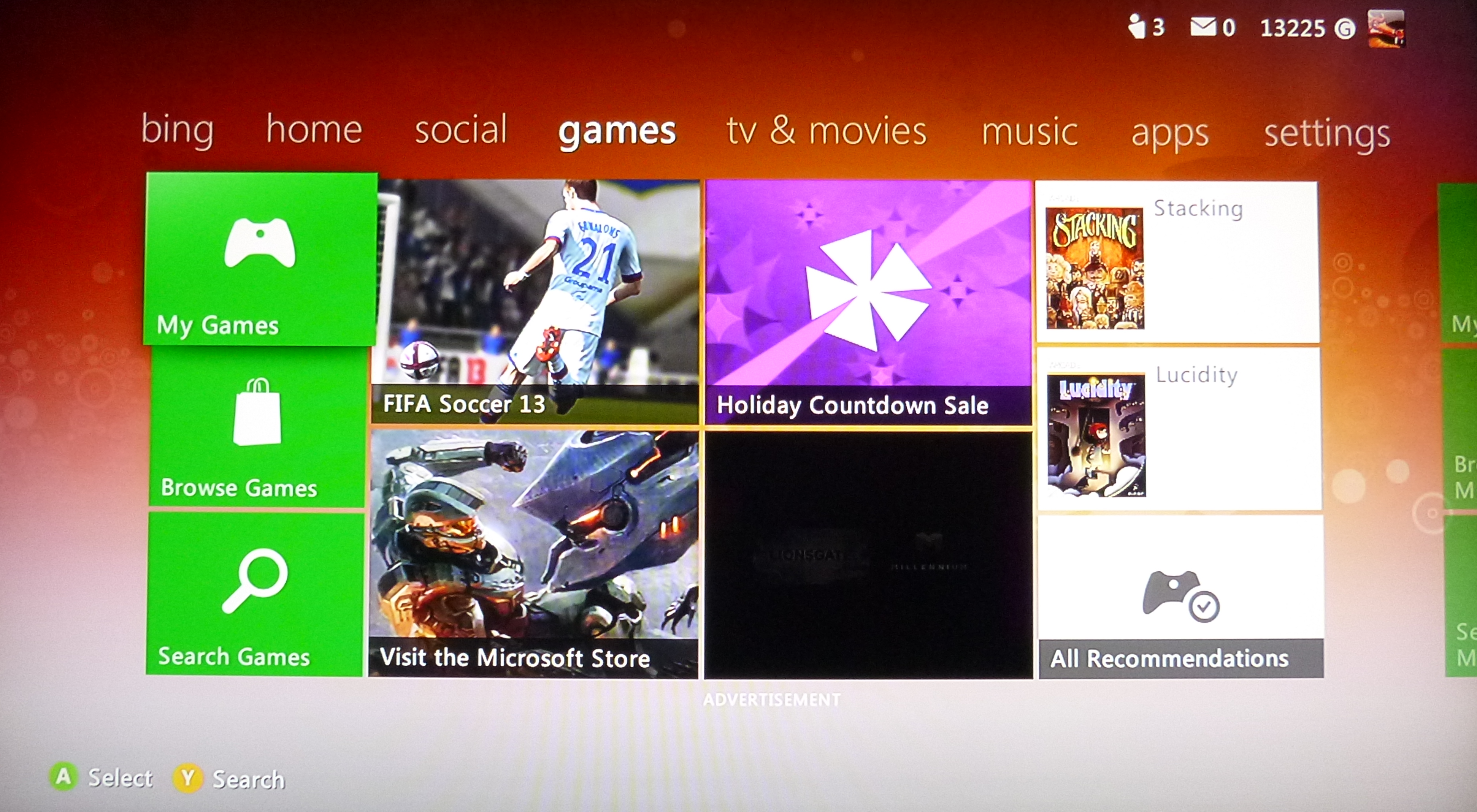
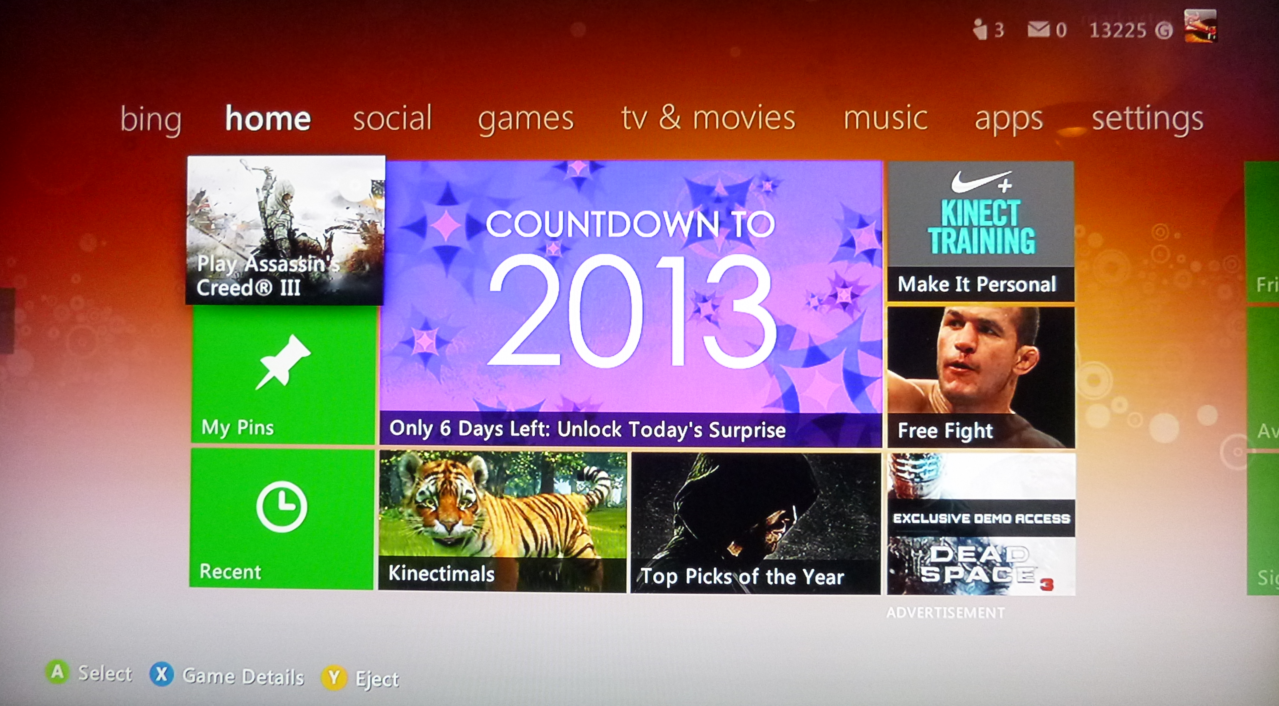
Would that follow the Live Tile paradigm? Does Microsoft use anything like that in any Live Tile style UI? Well, take a look at Figure 1 and Figure 2, which show a screen shot from the Xbox dashboard. Much ado was made about “Metro” UI support in the Xbox, but if you look at these screen shots, you will notice that it doesn't quite look like the Windows 8 Start screen. It is clear that the Xbox' Live Tiles have been somewhat tailored in a way that makes sense for the Xbox and provide more tile sizes and richer content. So why not do the same thing for the PC to make that most of that environment as well? Why keep the PC the lowest common denominator? Enable smaller and larger sizes and allow for more programmability with tiles!
App Cemetery
One other difference you may notice in the Xbox dashboard screen shots is that the categories of tiles are displayed using a different approach. While on the PC, the Start screen simply has categories that are indicated by title and a small horizontal margin, the Xbox version lets you switch to different categories of tiles and then see only those tiles (such as Games, Social,...). And the Xbox doesn't have that many tiles! On a PC, on the other hand, where we may end up with thousands of tiles, we badly need a better way to organize the tiles! Before long, the average PC ends up with gazillions of tiles which you can only view by scrolling horizontally. To make matters worse, all tiles are formatted the same, as only a handful of templates are supported, causing all tiles to look identical, usually with a photo or image in the background, overlaid with some text. This makes it very difficult to find your way around the Start screen, causing many to abandon the idea of using the Start screen altogether and instead always using the search feature. Or, alternatively, they turn off the “live” aspect of the tiles and switch all of them to small tile format, creating rows and rows of simplistic oversized icons that look like the early days of AOL.
Steven Sinofsky famously said that the Windows 8 Start screen would never support folders because folders is “where applications go to die.” In many scenarios using the pre-Windows 8 Start menu, users wouldn't use the folders but simply searched for apps using the text search feature. Which seems fine to me. In many cases, one doesn't use the folders. So what? But in some case, folders are very useful (such as when you want to see all the features that go with the app you just installed). What's the harm in supporting that? One way or another, the Start screen is badly in need of a way to organize it. The way things stand, the Start screen often reminds me of an app cemetery, with its rows and columns of app “tombstones.”
So what should Microsoft change? Well, why not support the concept of folders? Apple added folders to iOS, and a very similar concept would help Windows 8 as well, although I would lobby for folders within folders, to support a more complex hierarchy. I also like the concept of groups that Xbox uses. Why not split the Start screen into different groups one can easily navigate to. You can have a “Productivity” group that only shows business apps and productivity apps. Readers of this article would want a “Development” group for everything needed for development (which might have some of the same stuff as the Productivity group, such as Internet Explorer). And so on. Users should be able to set up groups as they see fit, of course.
Oh, and since we are talking about customizing the Start screen: What's up with the lack of customization options? Users can't even pick a custom background image. Seriously? Microsoft should fix that at once. For an example of how to customize the Start screen well, check out Stardock's Decor8 utility (www.stardock.com).
Today's Special: A New Menu!
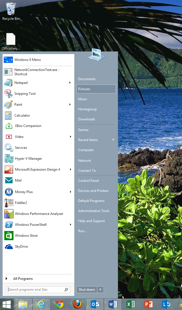
Stardock is also the creator of Start8 (Figure 3), which adds a Start button and Start menu back into the Windows 8 desktop. (Other vendors offer this, but Stardock offers one of the more popular ones, thanks to its plethora of features.) If you miss the Start button and/or menu, then buying this tool is the best five bucks you will ever spend. It is more feature rich even than Windows 7's Start menu, and it is highly customizable and shows exactly what Windows 8 could be like, had Microsoft chosen to preserve the feature. You can choose exactly what happens when one clicks the Start button (show the menu or go to the Start screen) and what items are to be shown on the Start menu. One can also always get back to the Start screen from the menu. But there could be more even, and it isn't hard to see how useful this feature could be and how it could be enhanced with more features than even Stardock has thought of.
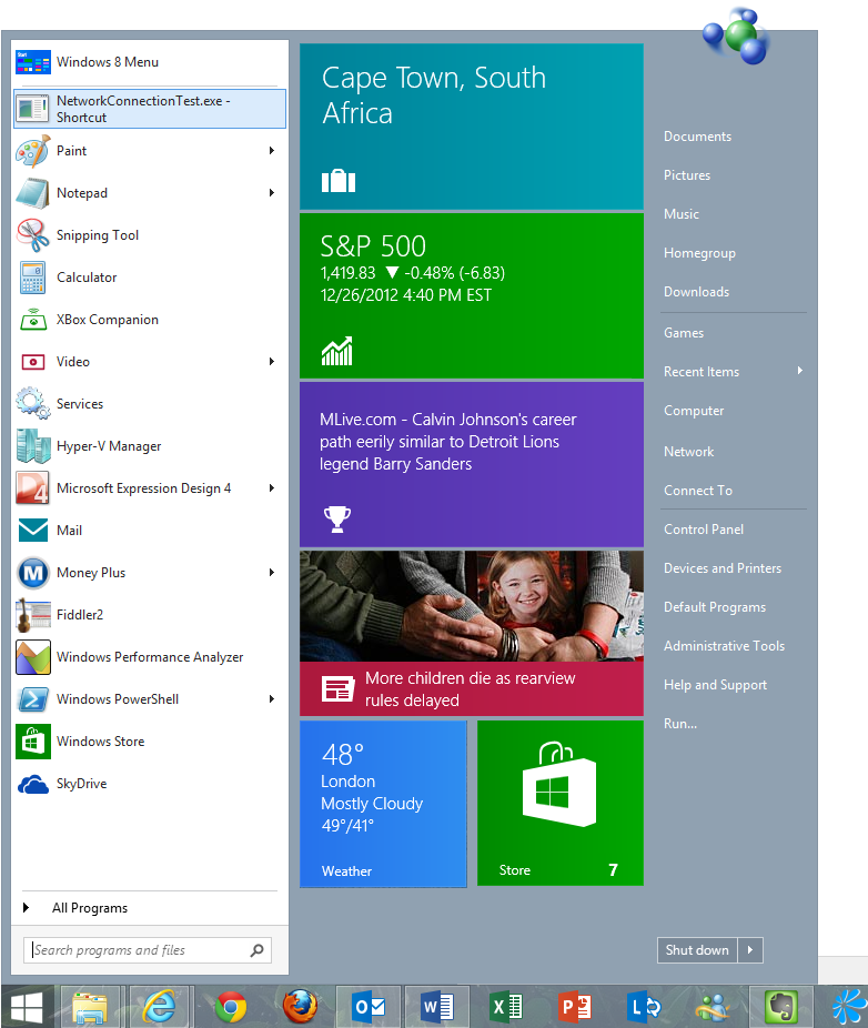
Microsoft will of course tell you that the Start menu had to be replaced with the Start screen because of Live Tiles. But I am skeptical. I don't think one needs a Start screen to show Live Tile content. Live Tiles are already driven by standard content templates (which are XML based). As we discovered above, even larger tile sizes and more customizable tiles would preserve that feature. So why not show Live Tile content right in the Start menu for those who prefer this approach? Figure 4 shows a mockup of such a feature (which I added to the Start menu as Start8 presents it). You could format the content differently (smaller perhaps) since you could choose to display the XML that drives Live Tiles in any number of additional formats.
Using this approach, one could use Windows 8 in “classic” mode if that was one's preference. I could even live with Microsoft defaulting to the new Start screen if there was an easy way to switch everything into classic mode, which would still preserve the Start screen and WinRT apps, but by default, one could use the Start menu and the desktop.
You WinRT a Little, You Lose a Little
The topic of classic apps steers us right into the next major topic: Windows 8 style apps, Windows Store apps, Windows 8 apps, or whatever today's name is for apps based on WinRT. You know, the apps we used to call “Metro” before. Most people understand that when they get themselves into Windows 8 they get the Start screen and Live Tiles. But most of them do not realize they also get a whole bunch of WinRT apps by default as well, tied to many file types as the default apps. You double-click an image: You get the WinRT image viewer. You double-click a video: You end up in the WinRT media app. You open a PDF: You get the WinRT PDF viewer. You open… well, you get the idea. WinRT is everywhere! And while that is cool on slates, it frankly is awful on the desktop. When I am sent a PDF file for review on the desktop, I do not want to have a full-screen app open that PDF that lacks many basic features and hides everything else I was working on. I am willing to bet that the average user will have a hard time figuring out how to print from that app.
There are two changes I would plead for here: First, let us switch Windows 8 into classic mode, and with it, app defaults should switch to use desktop apps. We shouldn't promote WinRT apps by forcing people to use them and in the process, lose many of the features and the flexibility they were used to. Instead, we should have users who want to use WinRT apps, because they rock! Which brings me to the second item that needs to change here: WinRT apps need to be a whole lot better! Most WinRT apps are kindergarten-level apps. Why limit features so drastically? There is no reason the WinRT PDF viewer couldn't be as powerful as desktop versions. If anything, the WinRT app should be better! Why would anyone want to switch to a desktop that has poorer features than an older version?!? Yes, on slates, it may be a different story, but Windows 8 needs to also work well on desktops, and I don't see the technical reason WinRT apps couldn't be better.
Two more examples: The Mail and the Calendar apps are awful.
Why is the email app on Windows worse than on Windows Phone? It is hard enough to handle the amount of email that is coming one's way in the best of cases. Who wants to downgrade to software that is less productive than what they had before?
The calendar app doesn't feature a good way to show reminders? Who wants to switch to a calendar app that causes them to miss meetings? WinRT is badly in need of a good notification system. And all of this has nothing to do with the quality of the operating system. Microsoft can enhance the WinRT apps to fix all of this.
WinRT Redefined
WinRT is an interesting technology. It forms the basis for runtime execution on Intel and ARM platforms, and thus provides the basis for a very appealing cross-platform operating system story that can span anything from phones to slates to laptop and PCs to even servers and living room devices (think “Xbox”). On top of that sits a UI framework that has been optimized for touch. It is also usable with the keyboard and the mouse, which is great, but its current UI framework clearly works best for touch. For keyboard and mouse, it fits Alan Cooper's “dancing bear ware” definition in his book, The Inmates are Running the Asylum: It dances the mouse and keyboard dance, but like a dancing bear, it doesn't dance very well. Which of course begs the question: Could it be made to dance better? Could it, in fact, be a good system for all platforms it aims to run on? In particular, can it still serve the PC power user scenarios well?
I don't see why not! It forms a solid technical foundation and all the current limitations seem to be rather artificial and driven by the needs of slate platforms. For instance, WinRT only uses one screen. This makes sense on slates since they only have a single screen. But could it be made to run on multi-screen desktop environments? Sure it can. WinRT apps could span more than one screen horizontally. They already all scroll horizontally, so why not span the app across multiple screens? Or maybe make a different screen show different apps.
One could say that WinRT apps fundamentally follow a single-app paradigm. Multi-tasking is an exception in the case of background apps. Oh, and of course we can run two apps at a time in a snapped fashion, so execution of two apps at the same time is certainly supported. So why not allow for more? They consume too much battery power on slates you say? But so what? This doesn't apply to slates since they only have one screen. On desktop apps plugged into a power outlet, I really want the ability to run more than one full app at a time. Microsoft should add support for this to WinRT for desktop scenarios in addition to multi-monitor support.
My suggestion for this enhancement is not just about running multiple apps at the same time. It is also about opening multiple things in a single app. I want to open more than one PDF and compare them side-by-side. I want to open multiple emails. Maybe I want to copy from one email and paste into another. You can't currently do that easily. The only way to go is to save the email you are working on, close it, open the other email, copy your text, then re-open the saved draft and continue from there. Of course you can do this in some sort of automated fashion, but it isn't very intuitive. Do you trust your email will automatically be saved to drafts as you navigate away? What if you get side-tracked and forget your draft email? How obvious is it that it is still in drafts? The answer to this may vary with the specific app you are using, but I have had cases where I forgot about completing an email, just to discover days or weeks later that I failed to send an important message.
You could say that this is a problem that is up to each individual app to solve, but I disagree. It is a problem that is introduced by the fundamental paradigm provided by the platform. Yes, each individual app can work around this issue, but I don't think that is a good answer. We should have a common way to fix such a common usage scenario. In the desktop world this is handled by the ability to open multiple windows. What could a WinRT equivalent be? Tabs? Then Microsoft should offer a standard way to do tabs, rather than forcing every developer to figure out a way on their own, which then disable other common patterns we want to establish for WinRT (mainly navigation).
Another option is split-screen. Maybe Microsoft could provide standard ways to split the screen into multiple content areas. On a 1080p display, there are 1920 horizontal pixels (and we expect higher resolution displays later…). This means that if split horizontally, one could have two content areas of almost a thousand horizontal pixels each (which is what many websites are optimized for). Figure 5 shows a mockup of a web browser that uses a split screen approach to show two websites at once. We could even support splitting the screen in more slices than two, scaling content, and providing a simple way to zoom in. Using this approach, it would be easy to handle multiple content elements at the same time. WinRT could provide standard components that handle this type of content navigation. It could even combine the ability to do full-screen, split-screen, and tabbed displays, and this setup would be consistent across all WinRT applications.
The fundamental need to re-think a lot of these paradigms comes from one common problem: It is problematic to support anything movable or resizable in touch-screen environments. Moving windows around with touch is hard. Resizing them is harder. Hence eliminating this task provides better touch interfaces, and thus WinRT poo-poos the idea of resizing or sliders. And where it provides them (in snap display), they are plump and clunky controls and provide very limited adjustments in an attempt to aid touch operation.
But do we consistently have this problem? Of course not! We only have this problem in touch scenarios. The majority of user scenarios use keyboard and mouse. So why not simply sense which environment a WinRT app runs in and then provide a more appropriate interaction model? When using a finger, allow only one snap-size for apps. When using a mouse, make the slider thinner and let me adjust freely, with snapping only when the size is within a few pixels of the standard snap size (similar to window handling in Windows 7). In fact, why not add the concept of a window to WinRT? Touch operation could support only the split-screen and tab approach, but as soon as mouse operation is detected, all the “content areas” can also be treated as windows that can freely float and be resized just like regular windows in desktop mode. I don't think anything in WinRT would fundamentally preclude that. It would allow developers to build very powerful apps for keyboard and mouse support, yet when operated with touch, they would snap back into “simple mode” and behave well for finger-operation.
While we are going this far, why not allow users to resize the whole WinRT app and let it integrate into the desktop. I do not see the downside of allowing a WinRT app to float around the desktop with all my other applications. Let me resize the WinRT app just like all other windowed desktop apps. Let me run multiple apps at once! What's to keep us from it, other than this artificial differentiation between WinRT and the desktop? Granted, this may be a bit of a simplification, but it is certainly within the realm of possibility. You say it would be more work to support resizing apps? Well, yes, that is true. But the apps would be better. Not to mention that every Windows app we have written over the last decades, as well as every website, faces the resizing problem, and we have coped with that problem very well.
If Microsoft continues to add features to WinRT so it becomes a much more powerful technology (really, WPF's UI capabilities should be the yardstick), then WinRT could become a very powerful UI platform indeed. It currently reminds me of a tech demo, but the possibilities are endless. This would lead to a scenario where WinRT apps could be highly desirable and cover a very wide range of features and scenarios. People might actually go out of their way to want to use them.
At that point, we'd probably have to think about bringing more and more users on board. I understand that Microsoft wants people to upgrade to Windows 8, but realistically, it will take a while before the masses do. Corporations will require time. How could we let them use those apps early? By supporting WinRT on Windows 7. It's the strangest thing really that nobody is calling for that. When WPF first came out, it was only supposed to be supported on Windows Vista. But all kinds of people wanted to use WPF, so there was an outcry and Microsoft eventually decided to also support it on Windows XP. Why is that not happening for WinRT apps? I do not know for sure what the answer is, but I suspect people just don't care enough about WinRT apps in their current state. But if these apps became as powerful yet more flexible than current desktop apps, then everyone would want them. Adding WinRT support to Windows 7 could aid adoption greatly.
Desktop Love
It isn't just enough to bring WinRT closer to the desktop. It should also work the other way. The desktop should be a first class citizen in Windows 8. Windows 8 provides many interesting new features such as system-wide search, share contracts, unified settings, Live Tile updates, notifications, lock screen support, and more. Yet desktop applications are locked out from all these features. Why would it not be possible to use the Windows 8 search feature for desktop apps? Why force desktop apps to use the Live Tile Start screen yet provide no ability to update and integrate Live Tiles? Why can't content be shared from a desktop app? Cloud integration of many desktop apps is lacking. Desktop apps cannot use the new Windows 8 dialogs. None of this makes any sense to me. At the very least, the standard .NET Framework should provide APIs for these features so any app on Windows 8 can access these Windows 8 features and provide users a great and consistent experience.
And then we have the Windows Store. The Windows operating system, counting all versions, is by far the most widely deployed platform of all times. Wouldn't it make sense to have an app store that allows developers to serve that platform? Instead, we have a WinRT app store that provides somewhat simplistic apps to a user base that has to be re-built from scratch (an uphill battle at best). Microsoft should re-consider their decision and also provide a store experience for desktop applications. Ideally all integrated in one store (and combine Windows Phone apps into the same store while they are at it). Yes, it would be a bit of a messy situation, as there is potential for people to be confused as to what runs where, but that is a problem we already have regardless. Perhaps the store could be smart enough to only show appropriate apps and inform the user as to why certain apps are not applicable.
At the very least, Microsoft's own app store should support .NET ClickOnce applications. These apps already have similar deployment infrastructure in place, and whatever is missing could be added with relative ease. .NET security could be enhanced, or, more accurately, simplified, by creating groups of permissions reminiscent of WinRT capabilities. This way, .NET applications would provide an install and upgrade experience that is practically identical to WinRT apps. Best of all: Most of this technology already exists and thus a very large number of .NET apps could directly be added to this store without much effort. If Microsoft wants to beat Apple's and Google's numbers of apps in the store with a very wide range of app types supported, and some of those apps steam-rolling iOS and Android apps in terms of popularity and features, then this would be a good way to go.
Conclusion
Windows 8 is a good operating system. It is an improvement on Windows 7 in many ways, and Windows 7 is a great OS. Windows 8 provides great technology and great features. Microsoft has taken great risk in innovation. Unfortunately, the new things are not put together in a polished way that makes for a good product. Yet Microsoft is not far off. The list of suggestions in this article represent my opinion of some things that Microsoft could easily change. It is not a complete list of even my own ideas, and you may be able to think of some of your own.
Microsoft needs some critical thinking and some good decision making. Microsoft could release a service pack or an 8.1 release quickly to address some of these issues and give people a way to use a polished version of Windows 8 the way they want to use it. Or perhaps Microsoft should push out a version of Windows with new branding much quicker than people expect. Windows 9, here we come!
Until then, question everything!
The Skeptical Coder