Bootstrap is an incredibly popular open-source toolkit containing CSS, fonts, and JavaScript extensions to help enrich interface components on a website or Web application. The included CSS enhances and extends standard interface controls when accompanied with the calls to certain CSS classes. Fonts from Glyphicons.com are included in the toolkit, with 180 icons that you can use.
The JavaScript extensions are in the form of jQuery plug-ins and offer additional interface elements along with extending the functionality of standard interface elements. The toolkit includes the distribution files, templates, examples, and all the source files needed to further develop against the toolkit. Throughout this article, however, I will stick with only the distribution folder.
Bootstrap is an incredibly popular open-source toolkit containing CSS, fonts, and JavaScript extensions to help enrich interface components on a website or Web application.
Although compatible with the latest versions of all major browsers, Bootstrap has only partial compatibility with some older versions of browsers because the toolkit uses various properties only available with CSS3-enabled browsers. Fortunately, this only affects some of the extensions of the toolkit and doesn’t affect the actual functionality of the interface components themselves.
Bootstrap allows richly stylized websites to be seen clearly whether on a desktop computer, tablet, or mobile phone. Due to Bootstrap’s responsive design support, the layout of websites adjusts dynamically based on the characteristics of the device. With this functionality available, the time to create a complete website with full device support is greatly decreased by taking away the need to develop a mobile-only version of the same website.
The time to create a complete website with full device support is greatly decreased by taking away the need to develop a mobile-only version of the same website.
The following components are some of the core interface components available to use after attaching Bootstrap to a website.
Grid System
One of the most important components within the Bootstrap toolkit, the grid system, allows alignment of columns within divisions with the .row class. Defined by device type (Mobile, Tablet, Desktop) to help customize responsiveness of a website’s layout, the length of these columns in a row must add up to 12. The following example defines a grid of four equal-width columns.
<h3>Four columns</h3>
<div class="row">
    <div class="col-md-3">Column 1 content</div>
    <div class="col-md-3">Column 2 content</div>
    <div class="col-md-3">Column 3 content</div>
    <div class="col-md-3">Column 4 content</div>
</div>
Described in detail later in this article, the grid system underwent a major update in Bootstrap 3.0.
Typography
Bootstrap adds functionality to already-existing HTML text-based controls but also adds additional text-based controls to enhance the way text is displayed. The added text-based controls contained in the toolkit allow modification of font styles and, although the usability of HTML-based counterparts doesn’t change, it’s recommended to use these new font controls so that Bootstrap can style them properly. In addition, Bootstrap includes classes to emphasize text using color and to align text within a text control.
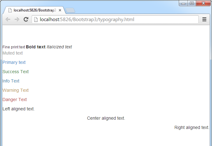
The following example, demonstrated by Figure 1, shows some of these additional controls and classes to emphasize and align text in different ways.
<!      -- Font Emphasis --      >
<small>Fine print text </small>
<strong> Bold text </strong>
<em> Italicized text</em>
<!      -- Color Emphasis --      >
<p class="text-muted">Muted text</p>
<p class="text-primary">Primary text</p>
<p class="text-success">Success Text</p>
<p class="text-info">Info Text</p>
<p class="text-warning">Warning Text</p>
<p class="text-danger">Danger Text</p>
<!      -- Text Alignment --      >
<p class="text-left">Left aligned text.</p>
<p class="text-center">Center aligned text.</p>
<p class="text-right">Right aligned text.</p>
Form
The form-related classes within Bootstrap allow clean grouping and styling when requesting data entry from the end user. The toolkit contains three form types: basic, horizontal, and inline.
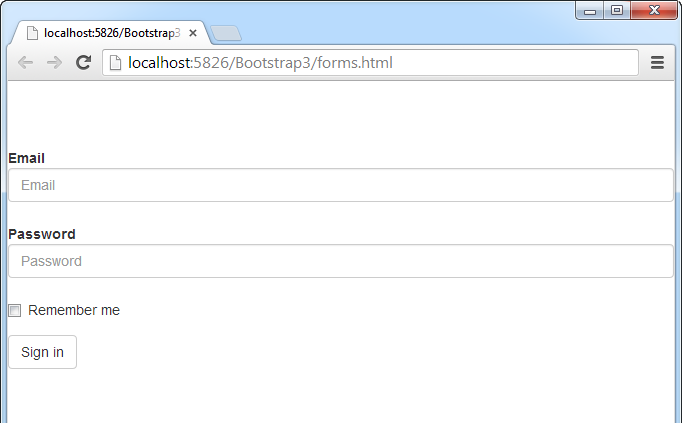
In a basic form, all form-based input controls have a width of 100% and can be grouped together for optimal white spacing within the group. Unlike the basic form, using the horizontal form makes the description label and the input control exist on the same line. Condensed into a single line, an inline form is optimal for use when real estate on a website is scarce. The example in Listing 1 uses the horizontal form and the result can be seen in Figure 2.
Buttons
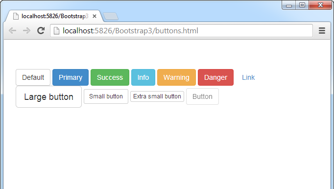
Bootstrap supplies stylized buttons to help differentiate the actions of multiple buttons that may appear on a website. To use the button functionality, the class property within an HTML button tag must contain the .btn class along with a desired button style type and an optional button size. The example in Listing 2 shows a variety of examples using the different style and sizes demonstrated in Figure 3.
Images
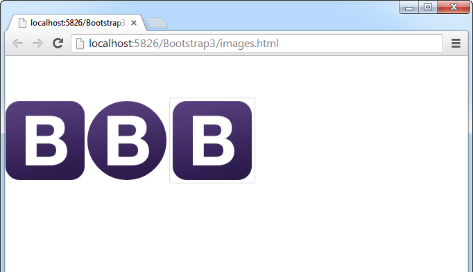
Bootstrap’s image formatting classes help display images in different layout styles. The following example shows the Bootstrap logo on a page as a rectangle with rounded corners, as a circle, and as a thumbnail. This example is exhibited within a browser in Figure 4.
<img src="bootstrap.png" class="img-rounded">
<img src="bootstrap.png" class="img-circle">
<img src="bootstrap.png" class="img-thumbnail">
Glyphicons
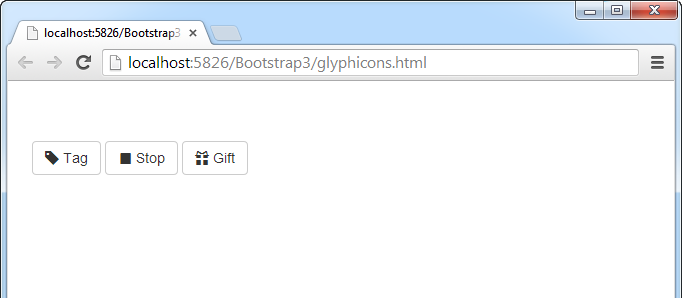
The 180 icons from Glyphicons provide a professional look and feel across your site. Icons are specified by class and can be used anywhere plain text appears. Demonstrated in Figure 5, the following code displays a variety of icon buttons.
<button type="button" class="btn btn-default">
  <span class="glyphicon glyphicon-tag"></span>
  Tag
</button>
<button type="button" class="btn btn-default">
  <span class="glyphicon glyphicon-stop"></span>
  Stop
</button>
<button type="button" class="btn btn-default">
  <span class="glyphicon glyphicon-gift"></span>
  Gift
</button>
Navs
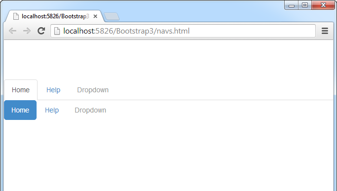
Used to help with creation of menus, calling .nav classes within unordered lists can occur in one of two ways: tabs or pills. Called within the list items in the unordered lists, active and disabled classes allow for additional interface functionality of a Nav control. Displayed in Figure 6, the following example shows the difference between tab and pill Navs along with the active and disable functionality of the list items.
<ul class="nav nav-tabs">
  <li class="active"><a href="#">Home</a></li>
  <li><a href="#">Help</a></li>
  <li class="disabled"><a href="#">Dropdown</a></li>
</ul>
<ul class="nav nav-pills">
  <li class="active"><a href="#">Home</a></li>
  <li><a href="#">Help</a></li>
  <li class="disabled"><a href="#">Dropdown</a></li>
</ul>
Drop-Down Menus
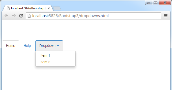
Bootstrap allows for any type of menu to include a drop-down menu. These drop-down menus help group together similar menu items into a single list. To build on the Nav code example, the following example changes the disabled menu item into a drop-down menu.
<ul class="nav nav-tabs">
  <li class="active"><a href="#">Home</a></li>
  <li><a href="#">Help</a></li>
  <li class="dropdown">
    <a class="dropdown-toggle"
      data-toggle="dropdown" href="#">
      Dropdown <span class="caret"></span>
    </a>
    <ul class="dropdown-menu">
      <li><a href="#">Item 1</a></li>
      <li><a href="#">Item 2</a></li>
    </ul>
  </li>
</ul>
To allow for the drop-down menu to work properly, placement of the following JavaScript code needs to occur below the location of bootstrap.js file referenced in the webpage:
<script>
  $('.dropdown-toggle').dropdown()
</script>
Figure 7 displays the previous code example for a dropdown within the Nav menu.
Modals
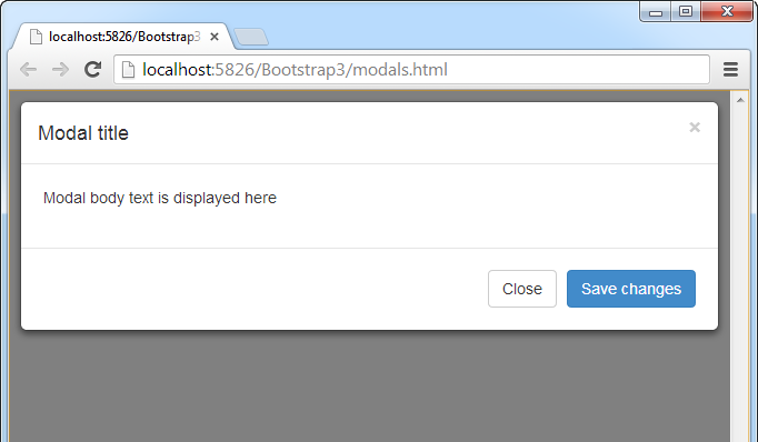
The Modal functionality included with Bootstrap allows users to perform an action, such as a button click, to display an interactive dialog box. Any type of functionality can be populated into this dialog box. Whether it contains a form control, simple text, or any other types of controls, Modals provide a sleek form of workflow through a website. Listing 3 displays the code of the modal seen in Figure 8.
Now, take a look at some of the differences between Bootstrap 2.x and Bootstrap 3.
Bootstrap 3: Change Has Arrived
Bootstrap 3.0 introduces significant changes. Some of these changes are more impactful than others but nonetheless, you will be doing some work to upgrade your site from a prior version of Bootstrap. Bootstrap 3 is a full-point upgrade, so don’t expect to drop in the new style sheet and JavaScript files and have everything work as expected. It won’t.
Fortunately, there are a number of resources on the Web to help with an automatic migration-but I’m getting ahead of myself. Let’s start with a look at what’s new and how it will impact your existing Bootstrap sites.
Bootstrap 3 is a full-point upgrade, so don’t expect to drop in the new CSS and JavaScript files and have everything work as expected. It won’t.
Mobile First
The most significant change isn’t a technical one but a change in design perspective. Bootstrap 3 adopts the “mobile first” responsive Web design practice as the overriding theme throughout the framework.
Mobile first means exactly what is says. It’s a paradigm shift that focuses on designing the user interface for smaller mobile screens before designing it for larger desktop screens. Instead of trying to take a desktop design and shrink, squeeze, and compress it down for mobile screens, mobile first flips things around and does the exact opposite. You have limited real estate on a smart phone screen, so mobile first makes you focus on the design that puts the most critical and important content on that small screen. As the screen size increases, to a tablet screen, for example, your design grows and begins to accommodate more content and information. As the screen size maxes out on a large desktop screen, your design accommodates all the content and information for the page. Adopting the mobile first approach means no longer having to make desktop and mobile versions of the same page.
Mobile first means exactly what is says. It’s a paradigm shift that focuses on designing the user interface for smaller mobile screens before designing it for larger desktop screens.
Although embracing the mobile first approach is new in Bootstrap 3, responsive design features exist in prior versions of Bootstrap but they required adding the bootstrap-responsive.css file. That requirement goes away with Bootstrap 3 because all responsive classes and styles are included in the core bootstrap.css file. This means that Web page elements like textboxes, paragraphs, buttons, images, and so on automatically scale based on the size of the viewing area from small smartphone screens, to mini- and full-size tablets, to larger desktop monitors. Before you ask, yes, you can disable the responsive capabilities if you need to build a fixed-width page.
Getting Bootstrap 3
The getting started page (http://getbootstrap.com/getting-started/) offers a few different ways to get Bootstrap 3. The easiest is to download the compiled and minified version, which includes the CSS, JavaScript, and fonts. You can also download the latest source files from GitHub or Clone/fork your own version from GitHub.
Getting Your Pages Ready for Bootstrap 3
All you need to do is add a viewport meta tag to your <head> tag to make sure rendering and touch zooming works properly.
<meta name="viewport"
    content="width=device-width, initial-scale=1.0">
Using the New Grid
The new grid system stands out as the most obvious change in Bootstrap 3 so I’ll start with that first. Gone are the days of working with the grid in either fixed-width column mode or in a fluid, responsive mode. The new grid is fluid, mobile first-centric and percent-based. This means that instead of working with a fixed-width grid (940 pixels), you now work with a grid that is designed with a mobile-based layout and then scale everything out from there.
Let’s take a look at the changes you need to make in your HTML code. In prior versions, rows were specified with the .row class or .row-fluid class for fluid grids and columns that you defined with a span* class prefix. Twelve was-and still is-the magic number that the span classes had to add up to.
<!-- Bootstrap 2 -->
<div class="row">
<div class="span4">One</div>
<div class="span8">Two</div>
</div>

<div class="row-fluid">
<div class="span6">Three</div>
<div class="span6">Four</div>
</div>
The Bootstrap 3 grid is 100% fluid and only requires the use of the .row class. The 12-column structure from prior versions remains the same but the columns are not fixed width. Instead of a span* prefix on column classes, you now use one of four new device-specific column class prefixes. These new column classes provide support for smart phones, tablet, desktops, and large desktops. Table 1 lists grid options for each screen size including container width, maximum column width, and the CSS class prefix to use with each.
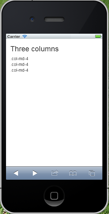
Let’s take a look at a sample grid with three columns of equal width. The columns are defined with the .col-md- class prefix so the columns appear across the page for screens 970 pixels or wider, and stacked on smaller devices.
<!-- Bootstrap 3 -->
<h3>Three columns</h3>
<div class="row">
    <div class="col-md-4">.col-md-4</div>
    <div class="col-md-4">.col-md-4</div>
    <div class="col-md-4">.col-md-4</div>
</div>
Figure 9 demonstrates how the above code looks in a desktop browser.
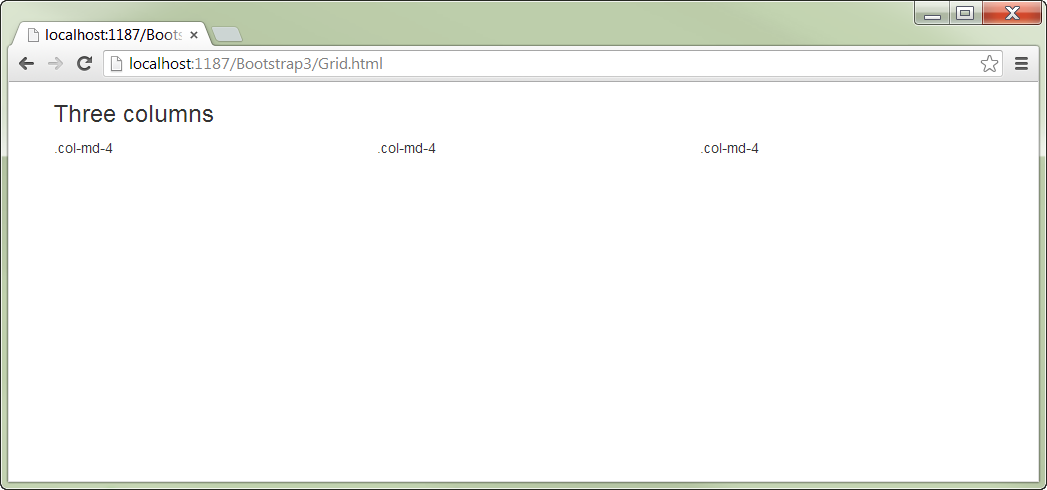
Figure 10 displays how the same code looks in a smart phone. Notice the lack of gutters on either side of the stacked columns in Figure 10.
Column offsetting has changed in Bootstrap 3 as well. You will need to replace any offset* class references with the new offset-* classes.
<!-- Bootstrap 2 -->
<div class="row">
<div class="span4">...</div>
<div class="span3 offset2">...</div>
</div>

<!-- Bootstrap 3 -->
<div class="row">
<div class="col-md-4">.col-md-4</div>
<div class="col-md-4 col-md-offset-4">Offset column
  </div>
</div>
Nesting columns has changed in Bootstrap 3. Bootstrap 2.x nested columns added up to the number of columns in the hosting span. In the code snippet below, the two nested columns of span6 and span3 add up to the parent row with span9.
<!-- Bootstrap 2 -->
<div class="row">
<div class="span9">Level 1 column
<div class="row">
<div class="span6">Level 2</div>
<div class="span3">Level 2</div>
</div>
</div>
</div>
In Bootstrap 3, nested columns need to add up to 12 and not the number of columns in the hosting span like in Bootstrap 2.x. In the code snippet below, the nested columns add up to 12 and not 9 like the Bootstrap 2 code.
<!-- Bootstrap 3 -->
<div class="row">
<div class="col-md-9">Level 1
<div class="row">
<div class="col-md-6">Level 2</div>
<div class="col-md-6">Level 2</div>
</div>
</div>
</div>
More New Pieces and Parts
Bootstrap 3 only has a few truly new components because the focus was primarily on flat and mobile-first design features. There are a number of new classes that implement the mobile-first design paradigm. Table 2 lists the new elements, both components and classes. There are a few new components you will want to familiarize yourself with, specifically the Panel, the List Group, and the Jumbotron.
Panels
Panels are containers to put content in. At their simplest, they apply basic border and padding around your content. Figure 11 gives you an idea of what the new panel does. Panels are implemented with a starting class of .panel, followed by additional type and formatting classes.
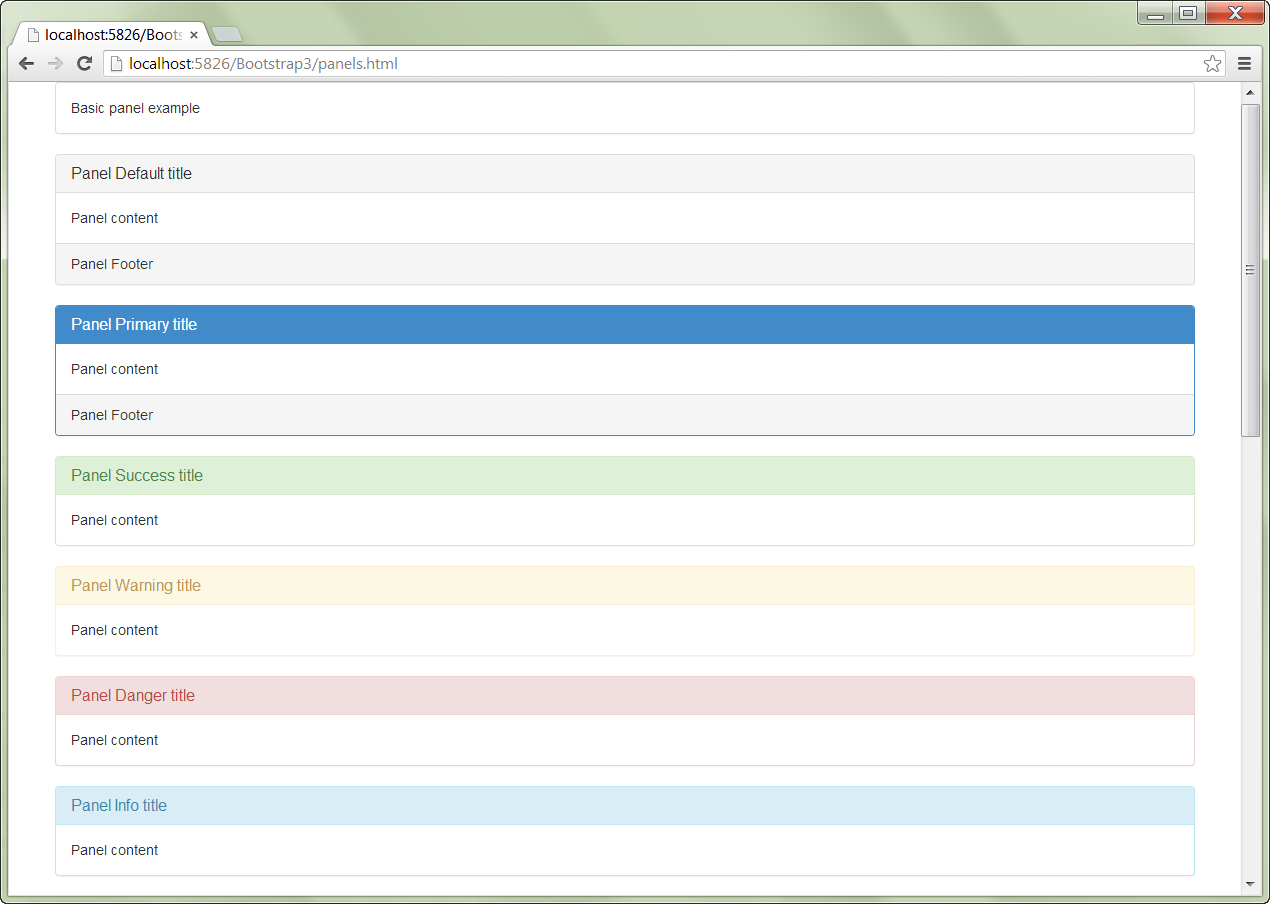
Panels can have a heading and a footer section.
<div class="panel panel-primary">
<div class="panel-heading">
        <h3 class="panel-title">Panel title</h3>
</div>
    <div class="panel-body">Panel content</div>
<div class="panel-footer">Panel Footer</div>
</div>
Additional .panel- classes are available to further customize the appearance of the panel component based on the usage type you have in mind.
<div class="panel panel-success">
<div class="panel panel-warning">
<div class="panel panel-danger">
<div class="panel panel-info">
Listing 4 contains the code that created the page you saw in Figure 11.
List Groups
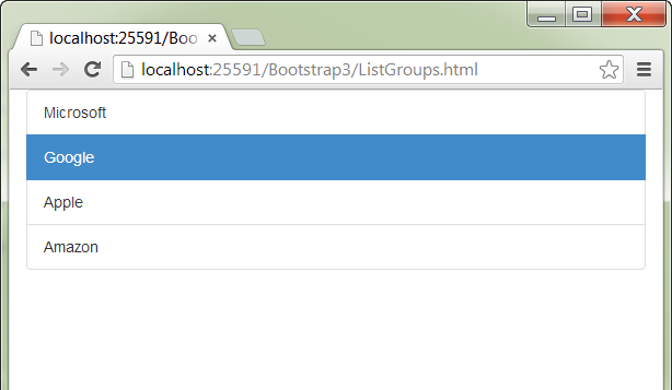
List groups provide a way to display mobile-like lists. You implement them with the .list-group class and associated items of .list-group-item class.
<ul class="list-group">
<li class="list-group-item">Microsoft</li>
<li class="list-group-item active">Google</li>
<li class="list-group-item">Apple</li>
<li class="list-group-item">Amazon</li>
</ul>
Figure 12 gives you an idea of what the new list group component does.
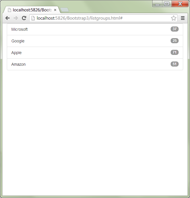
The badge class adds the ability to add badges to the right of a list group item.
<ul class="list-group">
<li class="list-group-item">Microsoft
       <span class="badge">37</span>
</li>
<li class="list-group-item">Google
<span class="badge">25</span>
</li>
</ul>
Figure 13 displays a list group with badges.
What would a list be if the items weren’t linked to something else? Anchor tags can be used in place of list items and that means swapping out the unordered list tag for a div tag.
<div class="list-group">
<a href="#" class="list-group-item">Microsoft
<span class="badge">37</span>
</a>
<a href="#" class="list-group-item">Google
<span class="badge">25</span>
</a>
</div>
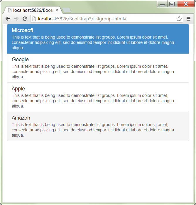
You are not limited to simple HTML within a list group. Additional classes allow you further customize the contents of each list group with classes to optionally mark a specific item as active, add an item heading, footer, and item text.
<div class="list-group">
<a href="#" class="list-group-item active">
<h2 class="list-group-item-heading">Microsoft</h2>
<p class="list-group-item-text">This is text that is
      being used to demonstrate list groups. </p>
<h4 class="list-group-item-footer">This is the
      footer!</h4>
</a>
Figure 14 displays a list group which takes advantage of the more complex capabilities of the list group component. Listing 5 displays the code used to create the page in Figure 14.
Jumbotron
The new .jumbotron class replaces the Bootstrap 2.x .hero unit class. Like the .hero-unit class, you use the .jumbotron class to display highlighted content on your site. Jumbotron differs from the .hero-unit class in that it provides a container class that limits the width of the jumbotron. Omitting the container class causes the jumbotron to span the entire width of your viewport. The following code highlights the difference between the .hero-unit and .jumbotron classes.
<!--Bootstrap 2-->
<div class="hero-unit">
<h1>Heading</h1>
<p><a class="btn btn-primary btn-large">Info</a></p>
</div>

<!--Bootstrap 3-->
<div class="jumbotron">
<div class="container">
<h1>This is Jumbotron content!</h1>
    <p><a class="btn btn-primary btn-lg">Info</a></p>
</div>
</div>
Existing Element Updates
The majority of the changes in Bootstrap 3 revolve around the class changes made to support the mobile-first focus and the responsive design paradigm.
Forms
One update in the forms-related classes is that field input controls now default to a width of 100%. This was done to insure that data entry forms look correct on mobile devices.
Two new classes, .form-group and .form-control, affect how <input>, <textarea>, and <select> elements are styled. Wrapping them with .form-control sets their width to 100% by default. Wrapping all labels and controls in a .form-group class optimally spaces all the elements.
<form role="form">
<div class="form-group">
<label for="txtEmail">Email address</label>
<input type="email" class="form-control"
       id="txtEmail"
       placeholder="Enter email">
</div>
The new .input-group and .input-group-add-on classes provides the ability to extend text-based form controls by adding text or buttons before, after, or on both sides. Figure 15 gives you an idea of what the .input-group-addon class does.

These new classes replace the Bootstrap 2.x .input-append, .input-prepend, and .add-on classes.
<div class="input-group">
<span class="input-group-addon">$</span>
<input type="text" class="form-control">
<span class="input-group-addon">.00</span>
</div>
You can add the .input-group-lg and .input-group-sm classes to the .item-group to automatically resize all the controls without having to size each element.
<div class="input-group input-group-lg">
<span class="input-group-addon">@</span>
<input type="text"
     class="form-control" placeholder="Username">
</div>

<div class="input-group input-group-sm">
<span class="input-group-addon">$</span>
<input type="text" class="form-control">
<span class="input-group-addon">.00</span>
</div>
Checkbox and Radio Button
In Bootstrap 2.x, checkboxes were wrapped in a <label> with a checkbox class. In Bootstrap 3, a <div> is now used to wrap the <label>, which still wraps the checkbox.
<!-- Bootstrap 2 -->
<label class="checkbox">
<input type="checkbox" value="">I agree.
</label>

<!-- Bootstrap 3 -->
<div class="checkbox">
<label>
<input type="checkbox" value="">I agree.
</label>
</div>
Radio buttons worked the same way in Bootstrap 2.x and received the same update in Bootstrap 3.
<!-- Bootstrap 2 -->
<label class="radio">
<input type="radio" name="optionsRadios" id="Radio3"
    value="option1">This is radio button #1
</label>

<!-- Bootstrap 3 -->
<div class="radio">
<label>
<input type="radio" name="optionsRadios" id="Radio4"
     value="option1">This is radio button #1
</label>
</div>
Modals
Modals have undergone some fairly minor changes. You no longer need to specify the .hide class in the modal declaration line like you did in Bootstrap 2.x because modal dialogs are hidden now by default.
<!-- Bootstrap 2 -->
<div class="modal hide fade">
<div class="modal-header"></div>
<div class="modal-body"></div>
<div class="modal-footer"></div>
</div>
Two additional classes have been added, .modal-content and .modal dialog. These new classes provide increased customization options for modals. The .modal-header, .modal-body, and .modal-footer are all wrapped inside of .modal-content. The .modal-content class is wrapped inside of .modal-dialog.
<!-- Bootstrap 3 -->
<div class="modal fade">
<div class="modal-dialog">
<div class="modal-content">
<div class="modal-header"></div>
<div class="modal-body"></div>
<div class="modal-footer"></div>
</div>
</div>
</div>
Typography
The most noticeable change in the typography features is the use of a semi-bold Helvetica font for headings. Changes were also made in the emphasis classes. The .muted class was renamed to .text-muted.
<!-- Bootstrap 2 -->
<p class="muted">This is muted text.</p>

<!-- Bootstrap 3 -->
<p class="text-muted">This is muted text.</p>
The .text-error class has been renamed to .text-danger.
<!-- Bootstrap 2 -->
<p class="text-error">Danger, Will Robinson!</p>

<!-- Bootstrap 3 -->
<p class="text-danger">Danger, Will Robinson!</p>
Navbar
Navbars provide navigation headers for your site. They have benefited from the focus on responsive design by starting out collapsed on mobile devices and expanding horizontally as the display screen widens. One primary difference is that navbars now use the HTML5 <nav> tag. The .navbar-inner class has been deprecated, so you need to remove any .navbar-inner <div> tags. The .brand class has been changed to .navbar-brand, so you need to change any .brand <div> tags.
<!-- Bootstrap 2 -->
<div class="navbar">
<div class="navbar-inner">
<a class="brand" href="#">Title</a>
<ul class="nav">
<li class="active"><a href="#">Home</a></li>
<li><a href="#">Link</a></li>
<li><a href="#">Link</a></li>
</ul>
</div>
</div>
Navbars require a .navbar-header to wrap the new .navbar-brand and .navbar-toggle classes. You also need to add the .navbar-nav class where you use .nav. Refer to Listing 6 for a complete implementation of the .navbar class.
Images, Icons, and Buttons
The Bootstrap 2 .img-polaroid class has been replaced with the .img-thumbnail in Bootstrap 3.
<!--Bootstrap 2-->
<img src="..." class="img-polaroid">

<!--Bootstrap 3-->
<img src="..." alt="..." class="img-thumbnail">
Images are not responsive by default and the new .img-responsive class makes images responsive-friendly by setting the max-width to 100% and height to auto. This resizes the image to the size of the parent element.
In Bootstrap 3, images are placed using a <span> tag instead of using an <i> tag like they were in the prior version. All icons also require using the Glyphicon base class and then the specific class for the icon you’re using.
<!--Bootstrap 2-->
<a class="btn" href="#"><i class="icon-search"></i></a>

<!--Bootstrap 3-->
<a class="btn" href="#">
   <span class="glyphicon glyphicon-search"></span>
</a>
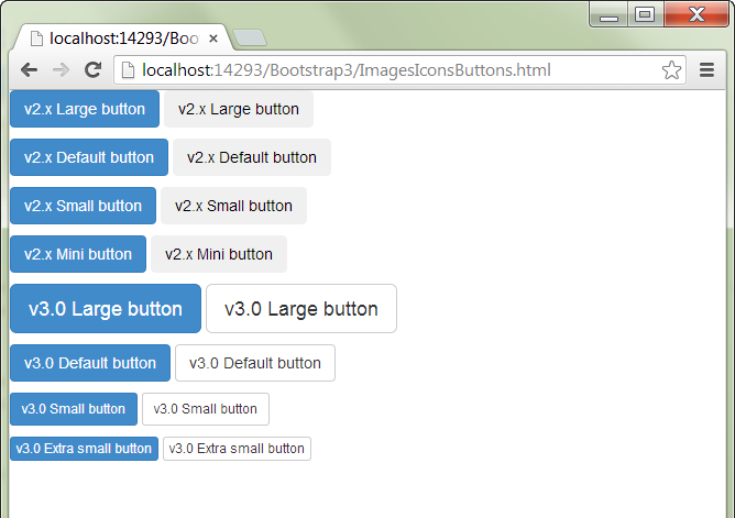
The button class structure changes are not all that complex, but they’re changes you definitely need to be aware of. The .btn-mini, .btn-small, and .btn-large classes have been replaced by .btn-xs, .btn-sm, and .btn-lg respectively. Default buttons now have their own class, .btn-default, and the .btn-inverse class has been removed. The code in Listing 7 shows the Bootstrap 2.x button classes and their Bootstrap 3.0 equivalents. Figure 16 illustrates the visual changes that occurred in the update from v2.x to v3.0.
Carousel
Only minor changes are needed to existing carousel controls. The changes consist of using the new Glyphicon chevron images as the next and previous buttons.
<a class="left carousel-control"
   href="#carousel-example-generic" data-slide="prev">
     <span class="glyphicon glyphicon-chevron-left">
     </span>
</a>
<a class="right carousel-control"
    href="#carousel-example-generic" data-slide="next">
<span class="glyphicon glyphicon-chevron-right">
    </span>
</a>
Responsive Utilities
If you’re using the responsive utilities on your Bootstrap 2.x site, you’re going to need to update those class references as well. Table 3 lists the responsive utility class changes in Bootstrap 3.
Some Things Had To Go
“Out with the old and in with the new,” is how the saying goes. That also applies to Bootstrap 3. There are a number of elements from the prior version that have been depreciated. Table 4 lists the Bootstrap 2.x items that were removed along with the corresponding Bootstrap 3 replacement.
Summary
I have come to the end of the article and I didn’t have the space to cover every new Bootstrap 3 feature, but I did cover quite a few. By now, I’m sure you’re realizing that you’ve got some work to do updating your Bootstrap 2.x sites to Bootstrap 3. Fortunately there are a number of resources and tools available to help you do just that.
The first place to start will be the Bootstrap site itself. The documentation has been updated to include information about migrating from 2.x to 3.0 (http://getbootstrap.com/getting-started/#migration). Here is a list of online tools that will help you migrate your Bootstrap 2.x code over to Bootstrap 3.
Listing 1: Horizontal form usage and functionality
<form class="form-horizontal" role="form">
  <div class="form-group">
    <label for="inputEmail1" class="col-lg-2 control-label">
      Email
    </label>
    <div class="col-lg-10">
      <input type="email" class="form-control"
        id="inputEmail1" placeholder="Email">
    </div>
  </div>
  <div class="form-group">
    <label for="inputPassword1" class="col-lg-2 control-label">
      Password
    </label>
    <div class="col-lg-10">
      <input type="password" class="form-control"
        id="inputPassword1" placeholder="Password">
    </div>
  </div>
  <div class="form-group">
    <div class="col-lg-offset-2 col-lg-10">
      <div class="checkbox">
        <label>
          <input type="checkbox"> Remember me
        </label>
      </div>
    </div>
  </div>
  <div class="form-group">
    <div class="col-lg-offset-2 col-lg-10">
      <button type="submit" class="btn btn-default">
        Sign in
      </button>
    </div>
  </div>
</form>
Listing 2: Code example of Bootstrap’s Button functionality
<button type="button" class="btn btn-default">
  Default
</button>
<button type="button" class="btn btn-primary">
  Primary
</button>
<button type="button" class="btn btn-success">
  Success
</button>
<button type="button" class="btn btn-info">
  Info
</button>
<button type="button" class="btn btn-warning">
  Warning
</button>
<button type="button" class="btn btn-danger">
  Danger
</button>
<button type="button" class="btn btn-link">
  Link
</button>
<br />
<button type="button" class="btn btn-default btn-lg">
  Large button
</button>
<button type="button" class="btn btn-default btn-sm">
  Small button
</button>
<button type="button" class="btn btn-default btn-xs">
  Extra small button
</button>
<button type="button" class="btn btn-default" disabled="disabled">
  Button
</button>
Listing 3: Code example of Bootstrap’s Modal functionality
<button type="button" data-toggle="modal" data-target="#myModal"
class="btn btn-primary btn-lg">Launch modal</button>
<div class="modal fade" id="myModal" tabindex="-1" role="dialog"
aria-labelledby="myModalLabel" aria-hidden="true">
<div class="modal-dialog">
<div class="modal-content">
<div class="modal-header">
<button type="button" class="close" data-dismiss="modal"
aria-hidden="true">
&times;
</button>
<h4 class="modal-title">Modal title</h4>
</div>
<div class="modal-body">
Modal body text is displayed here
</div>
<div class="modal-footer">
<button type="button" class="btn btn-default"
data-dismiss="modal">
Close
</button>
<button type="button" class="btn btn-primary">
Save changes
</button>
</div>
</div>
</div>
</div>
Listing 4: Code example of Bootstrap’s Panel Component functionality
<!DOCTYPE html>

<html lang="en">
<head>
<meta charset="utf-8" />
<meta name="viewport" content="width=device-width,
initial-scale=1.0">
<title></title>
<!-- Bootstrap core CSS -->
<link href="css/bootstrap.css" rel="stylesheet">
</head>
<body>
     <div class="container">
<div class="panel panel-default">
<div class="panel-body">
Basic panel example
</div>
</div>

<div class="panel panel-default">
<div class="panel-heading">
<h3 class="panel-title">Panel Default title</h3>
</div>
<div class="panel-body">
Panel content
</div>
<div class="panel-footer">
Panel Footer
</div>
</div>

<div class="panel panel-primary">
<div class="panel-heading">
<h3 class="panel-title">Panel Primary title</h3>
</div>
<div class="panel-body">
Panel content
</div>
<div class="panel-footer">
Panel Footer
</div>
</div>

<div class="panel panel-success">
<div class="panel-heading">
<h3 class="panel-title">Panel Success title</h3>
</div>
<div class="panel-body">
Panel content
</div>
</div>

<div class="panel panel-warning">
<div class="panel-heading">
<h3 class="panel-title">Panel Warning title</h3>
</div>
<div class="panel-body">
Panel content
</div>
</div>

<div class="panel panel-danger">
<div class="panel-heading">
<h3 class="panel-title">Panel Danger title</h3>
</div>
<div class="panel-body">
Panel content
</div>
</div>

<div class="panel panel-info">
<div class="panel-heading">
<h3 class="panel-title">Panel Info title</h3>
</div>
<div class="panel-body">
Panel content
</div>
</div>
</div>
</body>
</html>
Listing 5: Code example of Bootstrap’s ListGroup Component and its complex HTML functionality
<!DOCTYPE html>

<html lang="en">
<head>
<meta charset="utf-8" />
<meta name="viewport" content="width=device-width,
        initial-scale=1.0">
<title></title>
<!-- Bootstrap core CSS -->
<link href="css/bootstrap.css" rel="stylesheet">
</head>
<body>

<div class="container">
<div class="list-group">
<a href="#" class="list-group-item active">
<h2 class="list-group-item-heading">Microsoft</h2>
<p class="list-group-item-text">
         This is text that is being used to demonstrate list
         groups. Lorem ipsum dolor sit amet, consectetur
         adipisicing elit, sed do eiusmod tempor incididunt
         ut labore et dolore magna aliqua.</p>
         <h4 class="list-group-item-footer">This is the footer</h4>
       </a>
<a href="#" class="list-group-item active">
<h2 class="list-group-item-heading">Google</h2>
<p class="list-group-item-text">
         This is text that is being used to demonstrate list
         groups. Lorem ipsum dolor sit amet, consectetur
         adipisicing elit, sed do eiusmod tempor incididunt
         ut labore et dolore magna aliqua.</p>
       </a>
<a href="#" class="list-group-item active">
<h2 class="list-group-item-heading">Apple</h2>
<p class="list-group-item-text">
         This is text that is being used to demonstrate list
         groups. Lorem ipsum dolor sit amet, consectetur
         adipisicing elit, sed do eiusmod tempor incididunt
         ut labore et dolore magna aliqua.</p>
       </a>
<a href="#" class="list-group-item active">
<h2 class="list-group-item-heading">Amazon</h2>
<p class="list-group-item-text">
         This is text that is being used to demonstrate list
         groups. Lorem ipsum dolor sit amet, consectetur
         adipisicing elit, sed do eiusmod tempor incididunt
         ut labore et dolore magna aliqua.</p>
       </a>
   </div>
</div>
</body>
</html>
Listing 6: Code Example Using the New Navbar classes
<nav class="navbar navbar-default" role="navigation">
<!-- Brand and toggle get grouped for better mobile display -->
<div class="navbar-header">
<button type="button" class="navbar-toggle"
      data-toggle="collapse"
      data-target=".navbar-ex1-collapse">
<span class="sr-only">Toggle navigation</span>
<span class="icon-bar"></span>
<span class="icon-bar"></span>
<span class="icon-bar"></span>
</button>
<a class="navbar-brand" href="#">Brand</a>
</div>

<!-- nav links, forms, and other content for toggling -->
<div class="collapse navbar-collapse navbar-ex1-collapse">
<ul class="nav navbar-nav">
<li class="active"><a href="#">Link</a></li>
<li><a href="#">Link</a></li>
<li class="dropdown">
<a href="#" class="dropdown-toggle"
           data-toggle="dropdown">Dropdown <b class="caret"></b></a>
<ul class="dropdown-menu">
<li><a href="#">Action</a></li>
<li><a href="#">Another action</a></li>
<li><a href="#">Something else here</a></li>
<li><a href="#">Separated link</a></li>
<li><a href="#">One more separated link</a></li>
</ul>
</li>
</ul>
<form class="navbar-form navbar-left" role="search">
<div class="form-group">
<input type="text" class="form-control"
             placeholder="Search">
</div>
<button type="submit" class="btn btn-default">Submit</button>
</form>
<ul class="nav navbar-nav navbar-right">
<li><a href="#">Link</a></li>
<li class="dropdown">
<a href="#" class="dropdown-toggle" data-toggle="dropdown">
            Dropdown <b class="caret"></b></a>
<ul class="dropdown-menu">
<li><a href="#">Action</a></li>
<li><a href="#">Another action</a></li>
<li><a href="#">Something else here</a></li>
<li><a href="#">Separated link</a></li>
</ul>
</li>
</ul>
  </div>
</nav>
Listing 7: Code example comparing v2.x and v3.0 button classes
<!--Bootstrap 2-->
<p>
<button type="button" class="btn btn-large btn-primary">
     v2.x Large button</button>
 <button type="button" class="btn btn-large">
     v2.x Large button</button>
</p>
<p>
<button type="button" class="btn btn-primary">
     v2.x Default button</button>
<button type="button" class="btn">
     v2.x Default button</button>
</p>
<p>
<button type="button" class="btn btn-small btn-primary">
     v2.x Small button</button>
<button type="button" class="btn btn-small">
     v2.x Small button</button>
</p>
<p>
<button type="button" class="btn btn-mini btn-primary">
     v2.x Mini button</button>
<button type="button" class="btn btn-mini">
     v2.x Mini button</button>
</p>

<!--Bootstrap 3-->
<p>
<button type="button" class="btn btn-primary btn-lg">
     v3.0 Large button</button>
<button type="button" class="btn btn-default btn-lg">
     v3.0 Large button</button>
</p>
<p>
<button type="button" class="btn btn-primary">
     v3.0 Default button</button>
<button type="button" class="btn btn-default">
     v3.0 Default button</button>
</p>
<p>
<button type="button" class="btn btn-primary btn-sm">
     v3.0 Small button</button>
<button type="button" class="btn btn-default btn-sm">
     v3.0 Small button</button>
</p>
<p>
<button type="button" class="btn btn-primary btn-xs">
     v3.0 Extra small button</button>
<button type="button" class="btn btn-default btn-xs">
     v3.0 Extra small button</button>
</p>
Table 1: Grid options with container, columns, and CSS class settings.
| Extra Small Devices Phones (< 768px) | Small Devices Tablets (>=768px) | Medium Devices Desktops (>=922px) | Large Devices Desktops (>=1200px) | |
|---|---|---|---|---|
| Max Container Width | None (auto) | 750px | 970px | 1170px |
| Number of Columns | 12 | 12 | 12 | 12 |
| Max Column Width | Auto | 60px | 78px | 95px |
| Class Prefix | col-xs- | col-sm- | col-md- | col-lg- |
Table 2: New Bootstrap 3.0 Classes & Elements
| Element | Description |
|---|---|
| Panels | .panel .panel-body .panel-title .panel-heading .panel-footer .panel-collapse |
| List groups | .list-group .list-group-item .list-group-item-text .list-group-item-heading |
| Jumbotron | .jumbotron |
| Glyphicons | .glyphicon |
| Large grid (>1200 px wide) | .col-lg-* |
| Medium grid (>992 px wide) | .col-md-* |
| Small grid (>768 px wide) | .col-sm-* |
| Tiny grid (<768 px wide) | .col-xs-* |
| Column Offsets | .col-sm-offset-* .col-md-offset-* .col-lg-offset-* |
| Column Push | .col-sm-push-* .col-md-push-* .col-lg-push-* |
| Colum Pull | .col-sm-pull-* .col-md-pull-* .col-lg-pull-* |
| Thumbnail image | .img-thumbnail |
| Responsive images | .img-responsive |
| Modal | .modal-dialog .modal-content |
| Alert links | .alert-link |
| Well sizes | .well-sm .well-lg |
| Navbar | .navbar-default .navbar-text .navbar-btn |
| Navbar header | .navbar-header |
| Justified tabs / pills | .nav-justified |
| Form controls | .form-control .form-group |
| Button group sizes | .btn-group-xs .btn-group-sm .btn-group-lg |
| Input groups | .input-group .input-group-addon .input-group-btn |
| Inline controls | .checkbox-inline .radio-inline |
| Contextual panels | .panel-success .panel-danger .panel-warning .panel-info |
| Contextual table rows | .success .danger .warning .active |
Table 3: Responsive utility changes in Bootstrap 3
| Bootstrap 2.x | Bootstrap 3 |
|---|---|
| .visible-phone | .visible-sm |
| .visible-tablet | .visible-md |
| .visible-desktop | .visible-lg |
| .hidden-phone | .hidden-sm |
| .hidden-tablet | .hidden-md |
| .hidden-desktop | .hidden-lg |
Table 4: Classes and Components Removed in Bootstrap 3
| Element | Removed From Bootstrap 2.x | Bootstrap 3.0 Equivalent |
|---|---|---|
| Grid | .span* | .col-md-* |
| Fluid container | .container-fluid | .container |
| Fluid row | .row-fluid | .row |
| Icons | .icon-* | .glyphicon-* |
| Hero Unit | .hero-unit | .jumbotron |
| Nav list | .nav-list | .list-group |
| Navbar inner | .navbar-inner | - |
| Navbar button | .btn-navbar | .navbar-btn |
| Thumbnails | .thumbnails | .col-* and .thumbnail |
| Form actions | .form-actions | - |
| Input append / prepend | .input-append .input-prepend .add-on | .input-group |
| Tab alignments | .tabs-left .tabs-right .tabs-below | - |
| Dropdown submenu | .dropdown-submenu | - |


