Considering the increasing number of mobile applications on the market, simply getting a user to download your app presents a challenge in and of itself. However, that challenge only represents half of the battle. Once a user downloads the app, you have several other problems to overcome. For instance, how do you engage the user in the short-term and retain them long-term? A download doesn't mean much if you can't convert it into a user. Furthermore, users lose significant value unless you can keep them engaged and active.
Think about the application from the user's perspective. They download an app, open it up, and get presented with an initial login screen. At this point, the user hasn't seen your application in action, experienced it first hand, or really had any chance to discover its brilliant allure. What incentive do they have to register? In fact, Apps that require registration before use can lose up to 56% of their users at this point. An initial onboarding experience when an application is launched can play a key role in gripping your potential user and getting them excited to use the app.
In cases where an application has no login, users can get inundated with flows and views that they don't yet know how to interact with. Tapping around in an app without direction can prove frustrating to less experienced users, especially if the app contains unfamiliar user experiences or interactions. In a case like this, progressive onboarding can help guide users as they explore certain aspects of the app, without having to force-feed them all the information up front. Users can get the direction they need when encountering specific flows for the first time.
Developers go to such lengths to create incredibly robust, entertaining, and meaningful experiences in the native space. Why would a developer spend so much time, money, and effort to bring an application's vision to life and not take the little bit of extra time to properly onboard users, guide them through the application's intended use cases, and help them get the maximum value from the product? In this article, you'll take a look at the various onboarding approaches in detail and then code an interactive parallax style pre-login onboarding flow in Objective-C.
What is Onboarding?
Mobile onboarding can take on several forms. Often it refers to the process of guiding a user through using an application for the first time or helping spotlight the app's key features. You only get one chance to make that first impression, and onboarding walkthroughs present great opportunities to showcase the highlights of your product and set user's expectations.
Mobile onboarding is the process of walking a user through an app's features and use cases to help demonstrate its benefits and also setting the user's expectations.
Is Onboarding Really Necessary?
According to Optimizely (a customer experience optimization software company), 80% of downloaded applications only get opened once before they're eventually deleted (https://blog.optimizely.com/2014/05/09/the-optimized-app-ab-testing-goes-mobile/). Converting each app download into a user and retaining each of those users is a difficult challenge for developers. Is onboarding a necessary variable in the equation that solves this problem? If you research mobile onboarding, you will find differing opinions on this question's answer.
One opinion describes onboarding as a frustrating obstacle that, if needed, signals a fundamental failure in design. It further reasons that needing to walk a user through an application's features indicates an over complicated user experience. These statements may logically have merit, but I feel that the conclusion is too much of a sweeping generalization. It's undeniable that the mobile space has pioneered its own set of rules and practices that users have grown accustomed to; for example, a thumbs up means “like,” a star means “favorite,” and a trash can means “delete.” These straightforward interactions don't need explaining and doing so would likely just annoy your users.
Every app has some level of uniqueness and often developers attempt to push the envelope with new and innovative ideas and concepts. This feeds into the second opinion that onboarding provides a sure-fire way to account for this variation, with user-friendly and intuitive ways to engage and better retain users. Based on my experiences in the mobile space, I feel this second opinion holds the most merit. Let's take a look at some different approaches that help demonstrate the effectiveness of using onboarding.
Pre-registration Onboarding
As mentioned previously, login and signup flows can be a barrier of entry for a potential user. Often, users want to evaluate the usefulness of the application before handing over personal information. Using an interactive onboard flow, similar to the one you'll code later in this article, you can showcase the benefits and most compelling features of your application in an attempt to coax the user through that next step.
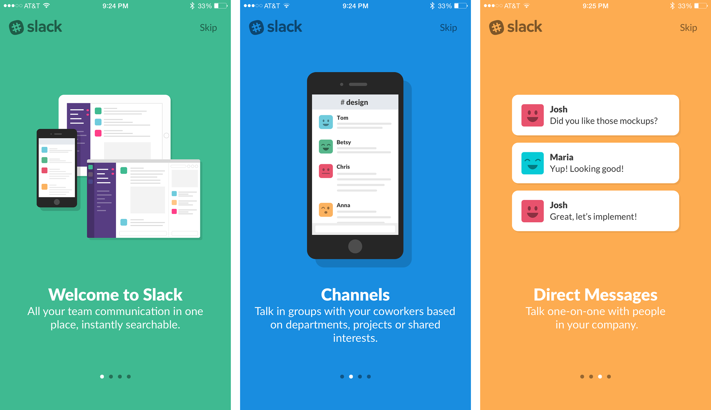
Figure 1 demonstrates this concept. The application is called Slack (created by Slack Technologies, Inc.) and by looking at the intro slides, you can easily derive that it's a company-based chat program for both mobile devices and the Web. Notice that each screen highlights one specific feature in a clear and concise manner. You want to avoid overdoing it by inundating the user with excess information. Target the most pivotal selling points of the application and, for best results, keep the number of overall slides to a handful. Making the user swipe through ten slides before a registration flow is likely to frustrate them more than inform them.
You'll also notice a skip button in the upper right hand corner. This gives seasoned users the option to jump right in and get started. However, the decision to have a skip option should really depend on how crucial the information is that you're presenting. You will find that users often press a skip button just because it's available, which can cause them to miss important information.
Empty State Onboarding
Often times, an application may rely on user input or user-generated content to populate various views. When a user first accesses the application, those views will most likely be empty. When an application launches to an empty view, the user can be left feeling unsure of what to do next. Empty state onboarding can curb this and nudge the user along the right path.
Take Figure 2, for example. The leftmost image is taken from the official Tumblr app created by Tumblr. For a new user, when they sign into the application for the first time, their dashboard starts off empty. Imagine that same screenshot with no message in the middle. Users would launch into a blank blue screen with no indication of what that screen does. It would almost seem broken, like something should have loaded but didn't. Instead users can see exactly what this screen does and get a nudge to go follow blogs so content will start appearing.
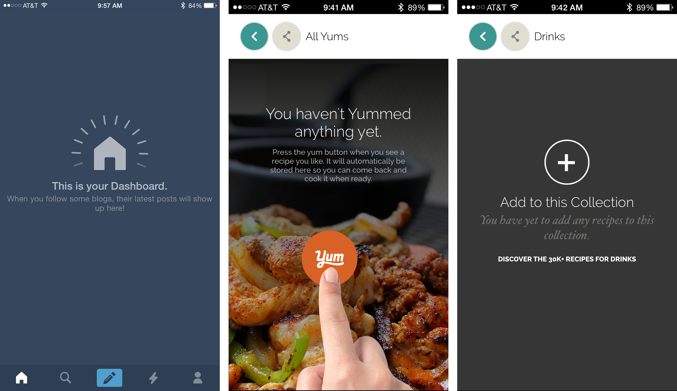
Along those same lines, the two screenshots to the right (taken from Yummly Recipes & Grocery Shopping List created by Yummly) demonstrate similar empty state onboarding techniques. Both clearly describe the action a user must do in order to populate the view. Rather than just saying “no collections added yet,” it has a call to action that compels you to go look through drink recipes and start adding them.
Onboarding Unconventional Interactions
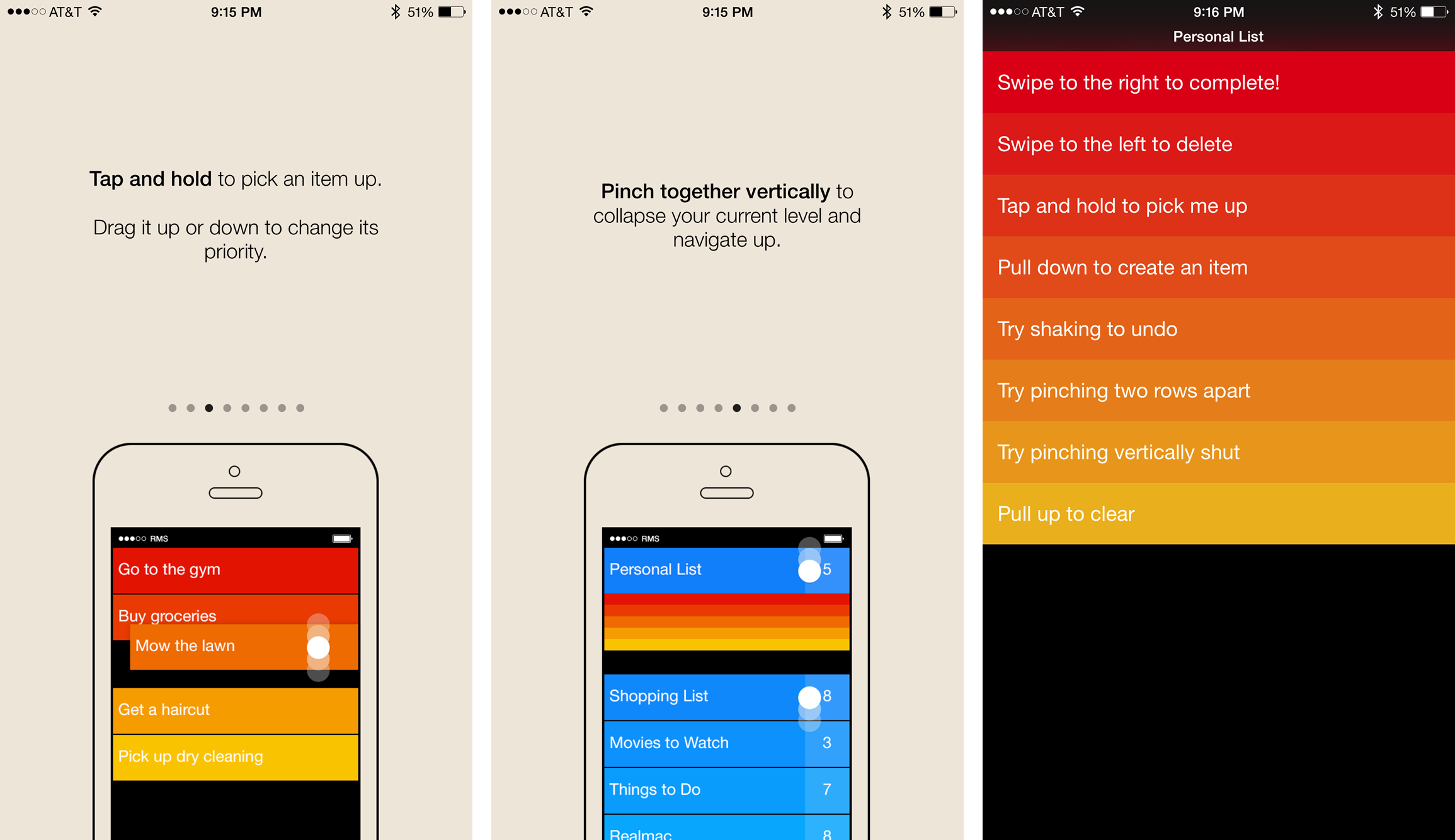
Applications that try to innovate using custom interactions that don't necessarily follow the standard mobile conventions make another strong case for onboarding. Take Clear - Tasks, Reminders & To-Do Lists, created by Realmac Software, shown in Figure 3, for instance. The application uses a minimal user-interface but relies heavily on some unconventional gestures. For instance, to move between varying levels of the navigation hierarchy, you pinch in or out as demonstrated by the middle screen in Figure 3. It could be argued that this gesture is anything but intuitive. If the application didn't explain this gesture ahead of time, many users may have used the application without ever realizing that functionality existed.
Similarly, the far-left screenshot demonstrates another gesture that allows a user to reorder their tasks. These represent two of the many gestures used throughout the application. Rather than add an additional dozen introduction slides to explain each gesture individually, only the most important gestures get explained up front. However, the developers didn't stop there. The far right screenshot in Figure 3 demonstrates what your task queue looks like after you make it past the introduction walkthrough. Notice that each task name has a specific direction aimed at introducing you to the remaining gestures. This clever spin on empty-state onboarding transforms a user's initial task list into a tool, helping get them acquainted with the application through use rather than reading about it on another introduction slide.
As intuitive as Clear's interactions became once I finished onboarding, without onboarding, the application would be very confusing initially. I likely would get frustrated and opt for another, simpler, to-do list application or I'd poke around until I stumbled my way through it enough to figure it out. What percentage of your user base will take the latter approach over the former? When dealing with interactions or gestures that users don't have exposure to on a regular basis, it's better not to leave that answer to chance and, instead, use onboarding to set your users on the right path.
Progressive Onboarding
In addition to the previously mentioned methods, you can gradually onboard the user when they perform certain actions for the first time, which is called “progressive onboarding.” The primary concept here involves recognizing when a user enters an area or flow that they haven't yet seen. At this point, the application uses popovers or overlays to draw the user's attention to key features or actions to help them get acquainted with the unfamiliar flow. The app keeps a record that these flows have been visited so that subsequent visits don't continue to trigger the onboarding overlays.
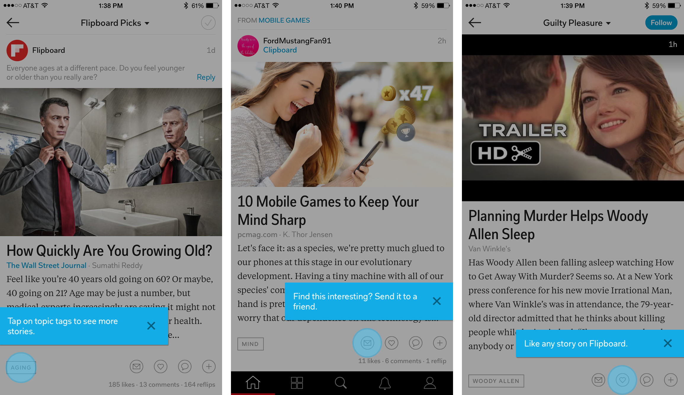
Figure 4 demonstrates one way to use progressive onboarding. Notice a dimming overlay that helps take focus away from the contents and emphasizes the blue coaching mark on screen. Rather than highlighting all the elements and actions on the screen at once, the coach marks appear in three distinct articles. They appeared over the course of the first five minutes I spent browsing around in the app and gradually directed my attention to specific features and functionality, while still giving me the breathing room needed to explore the application on my own.
Progressive onboarding also works great when dealing with complex workflows that need context to be better understood. For instance, consider an application that helps a user file their taxes. It probably doesn't make sense to instruct a user that they may need a 1099-INT form to show interest income before they've even had a chance to create an account. However, once they've arrived at this portion of the process and indicated that they have interest-bearing accounts, the context of the situation now warrants this explanation. Contextually aware hints and walkthroughs can prove invaluable in helping your users get the individualized help they need based on the use case they currently face.
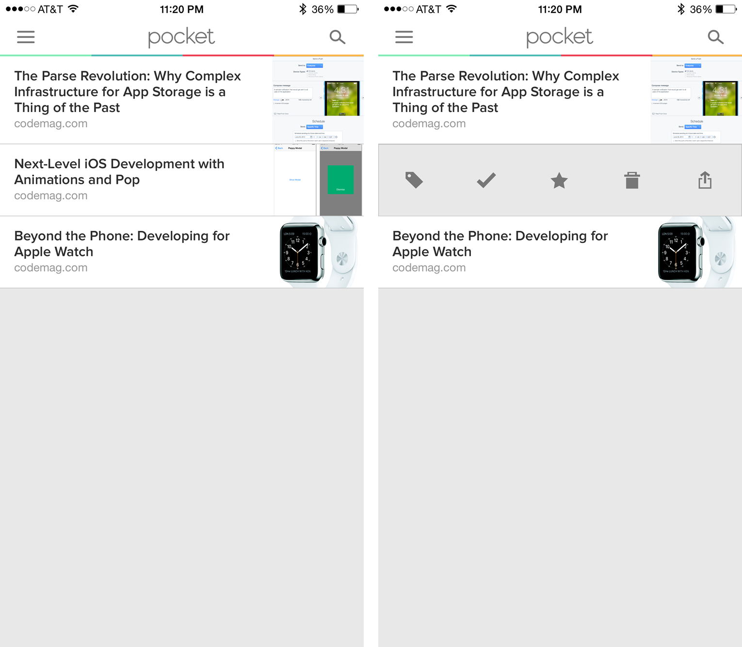
Additionally, progressive onboarding is useful for spotlighting hidden functionality. If it isn't inherently evident where to go to access certain features within your application, a simple onboard flow or modal works well to point the user's attention in that direction. Figure 5 depicts an application called Pocket, created by Read It Later, Inc. Notice that on the left-hand side, I've saved several CODE Magazine articles to read at a later point in time. The right hand screenshot shows what happens when you swipe left on any one of those rows. You get a series of additional options to share, delete, favorite, etc. This hidden functionality never gets spotlighted, so unless you discover it via trial and error, it's plausible that you'll never know that it existed. When I saved my first article for later, the application could have taken that opportunity to let me know about the extended options available.
Onboarding Best Practices
The previous sections demonstrate a small sampling of the various shapes and sizes an onboarding process can take. Each has its own benefits and use-cases and which one you choose will be dictated by the functionality of the application you're developing. However, regardless of the onboarding approach you incorporate into your specific application, the following best practices should be taken into consideration:
- Be Consistent: Whether it's intro slides or a functionality spotlight, being consistent in both visuals and verbiage will go a long way in creating a coherent experience.
- Priority is Key: Your users don't have the attention span to read dozens of slides or modals. Prioritize the information you need to communicate in order for your users to get maximum value.
- Brief is Better: When spotlighting or drawing attention to a feature, use high-impact short phrases to communicate the objective rather than long-winded explanations. Users likely won't take the time to read more than a dozen words.
- Ignore the Obvious: Avoid reiterating functionality that most users will already understand how to use.
- Listen to Your Users: if you haven't done an adequate job onboarding your users, chances are that they'll let you know in some form or fashion. User feedback and reviews can indicate onboarding missteps. Once you recognize a feedback pattern, you can use A/B testing to help better determine which onboarding approach will work most effectively in your application
- Spotlight Value: Onboarding isn't just about how to use specific features within an app, it also gives you a chance to communicate the value that your application has to offer and even recommend use-cases that a user would not normally consider.
Onboarding Pitfalls
Onboarding can help make the difference between a good application and a great one; however, onboarding missteps can have the opposite effect, often frustrating users rather than informing them. The following onboarding practices should be avoided:
- Overdoing It: The biggest onboarding pitfall is forcing the user to digest more information than is needed. You must find a balance between the minimum information the user needs to use the app successfully and how to show that information in a non-disruptive way. When doing pre-login walkthroughs or spotlights, you'll want to limit the information presented to the core features and highlights of the application. You may have 10 slides of content you want to show, but your user likely won't take the time to digest that much information before using the application.
- Supplementing Poor Design: Walkthroughs don't make up for poor design. If you have a confusing or poorly constructed user experience, adding a walkthrough to offset design pitfalls equates to the age-old adage “putting lipstick on a pig.”
- Sensory Overload: Resist the urge to explain every feature on screen at the same time. Remember the example from Figure 4. While the onboarding flows did eventually highlight all the actionable items within that article view, it did so over time as I visited the view repeatedly. This helped to avoid me having to digest five popovers on screen at once.
- Highlighting the Obvious: A user likely doesn't need to be told that a heart means “like” or that a star means “favorite.” Highlighting these features can annoy users and detract from the apps overall experience.
Adding a walkthrough to offset design pitfalls is much like “putting lipstick on a pig.”
Coding an Interactive Onboard Flow
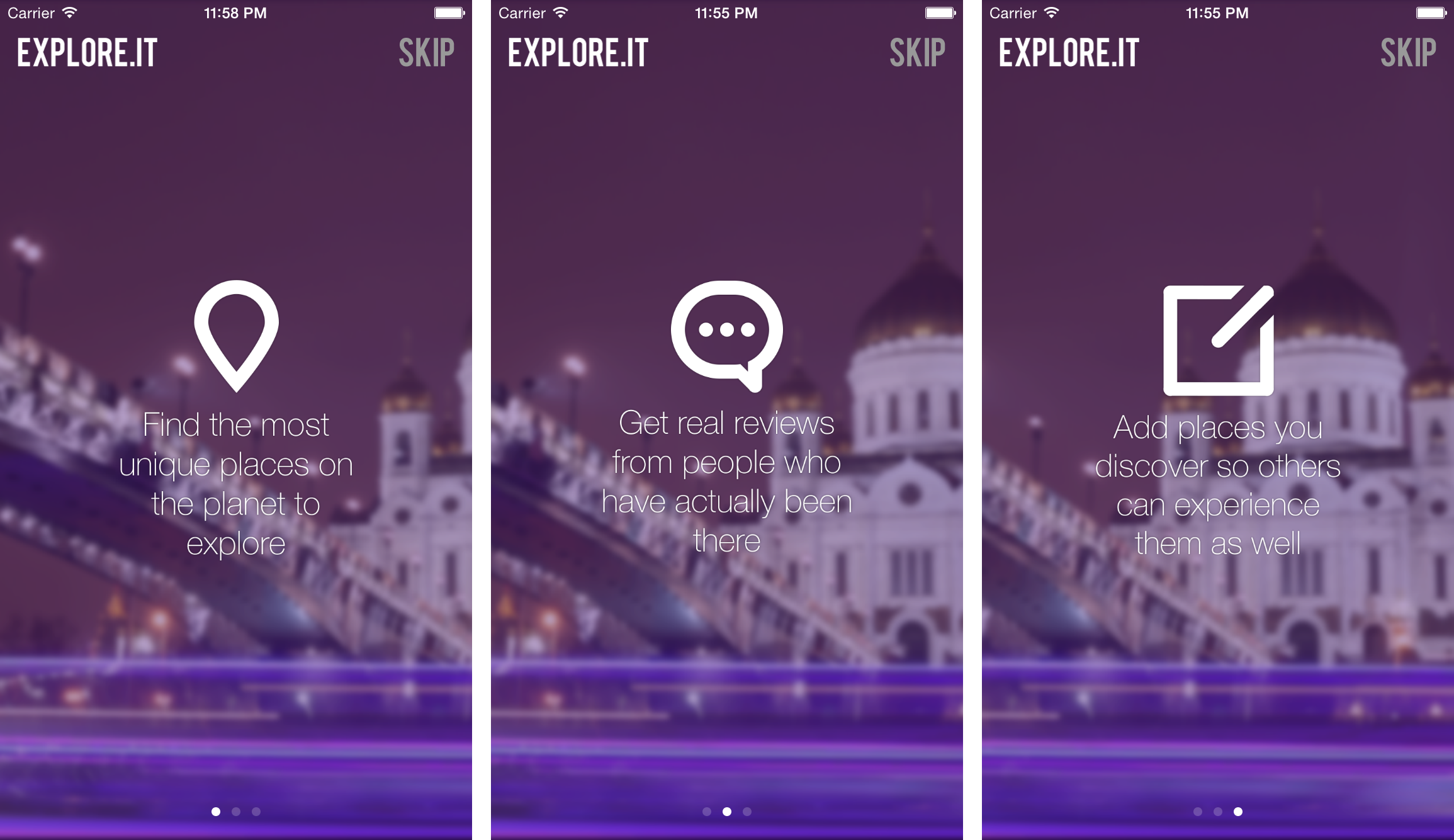
Now that you have been through some basic onboarding approaches, let's code an interactive onboard flow. In the following example, you'll code a three-page spotlight introduction flow with a background parallax effect. It mimics the Slack example from Figure 1. Users will swipe left/right to navigate from slide to slide. Pagination dots indicate on which page they currently reside. When swiping between pages, the background moves at a varying pace to create an illusion of depth.
The walkthrough spotlights an imaginary app called Explore.It, created specifically for this example. Figure 6 demonstrates what the end result of the slides looks like. The flow consists of several different components. The main container is a UIScrollView with paging enabled. This allows the user to swipe back and forth between the sections. The background image is a UIImageView that sits behind the scroll view and is animated independently. When the page swipe occurs, the background animation gets initiated in parallel.
Getting Started
You want to start with a new project in Xcode. When choosing your project template, select the single-page application template. For this example, I've created a controller called OnboardController to house the onboard flow. Once you have a controller in place, you need to initialize a few variables in OnboardController.m as shown in the following code snippet.
@interface OnboardController (){
    IBOutlet UIScrollView* onboardScrollView;
    IBOutlet UIPageControl* onboardPageControl;
    IBOutlet UIImageView* onboardBackground;

    IBOutlet UIView* slide1;
    IBOutlet UIView* slide2;
    IBOutlet UIView* slide3;
}
Notice the elements declared: a UIScrollView to house pages, a UIPageControl to indicate the current page, a UIImageView for the background, and three UIViews, which make up the pages. The next step involves initializing the scroll view and configuring the pages that reside in it. The following function indicates the configuration needed for this implementation.
- (void)configureScrollView {
  [onboardScrollView setPagingEnabled:TRUE];
  [onboardScrollView setDelegate:self];
  [onboardScrollView setShowsHorizontalScrollIndicator:FALSE];

  [slide1 setBackgroundColor: [UIColor clearColor]];
  [onboardScrollView addSubview:slide1];

  [slide2 setBackgroundColor: [UIColor clearColor]];
  [onboardScrollView addSubview:slide2];

  [slide3 setBackgroundColor: [UIColor clearColor]];
  [onboardScrollView addSubview:slide3];
}
The code from the previous function starts by enabling paging on the scroll view. This prevents the scroll view from scrolling continuously. Instead it only scrolls for a duration equal to its width and then automatically pauses. This creates the desired pagination effect. Next, you set the scroll view's delegate to self. This will come in handy later when you need access to the scrollViewDidScroll method. In order for that to work properly, you'll want to open up OnboardController.h and add the UIScrollViewDelegate reference. Next, you disable the horizontal scroll indicator because you'll use a UIPageControl to indicate position and a scroll indicator is redundant. Lastly, set all three slides to have a transparent background so that the main background image shows through, and then add them to the scroll view like this:
@interface OnboardController : UIViewController
<UIScrollViewDelegate>
In Interface Builder, using Auto Layout, the scroll view and the background image gets set to 100% of the screen's bounds. The actual image used in the background is quite a bit larger than the screen width. This allows you to animate it across the screen to create the parallax effect. Additionally, the slides each get created as their own UIView. For the purpose of this illustration, a single image gets used for the slide contents. That image should be centered in its corresponding slide. Lastly, a title and skip button get added on top of the scroll view and a UIPageControl added to the bottom. The state of interface builder should resemble Figure 7.
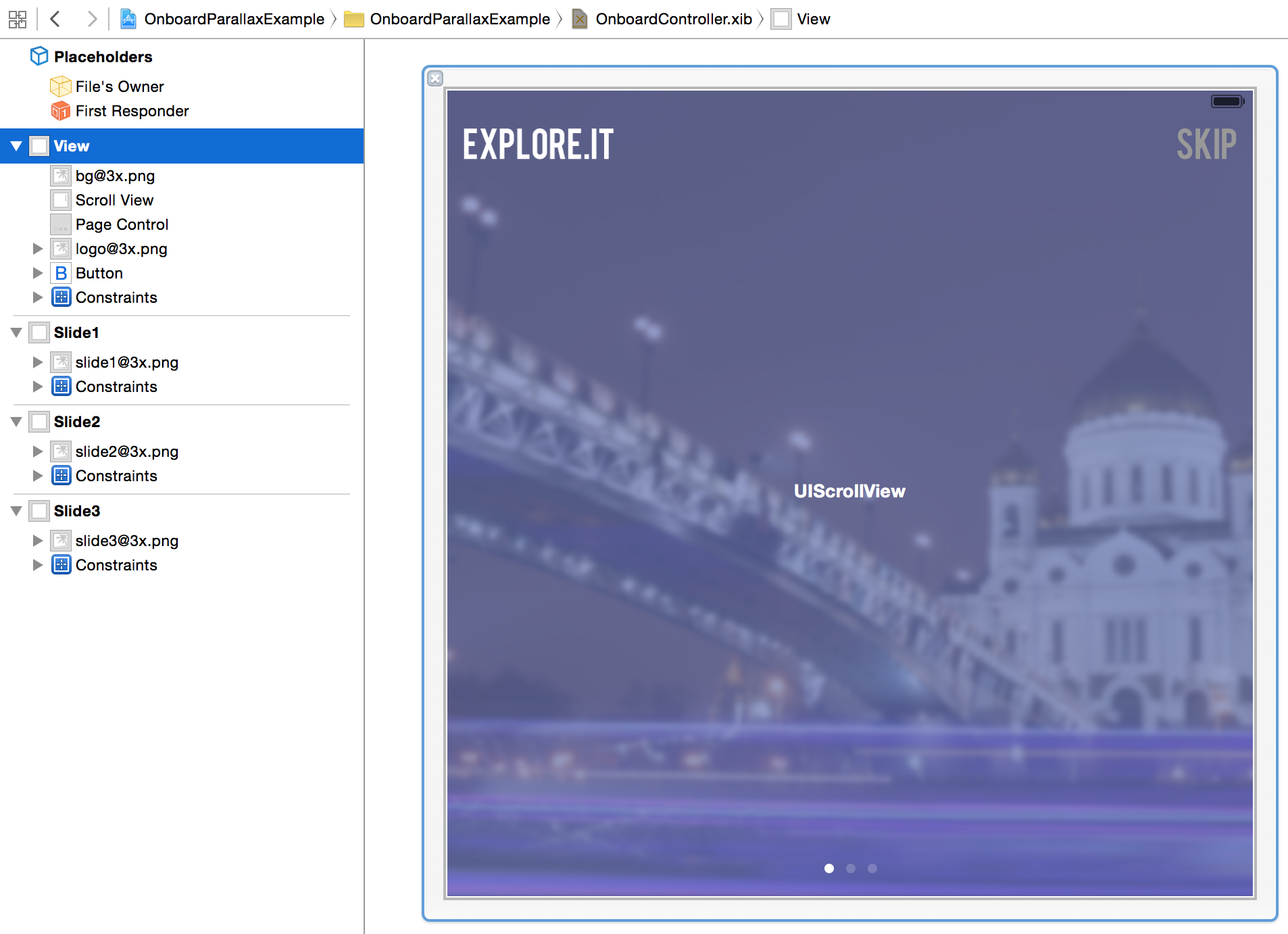
The visuals can take any form you like. The important thing to monitor is the structure, which is a UIScrollView with paging enabled and three slides, in the form of UIViews, and added as subviews. In order for this to paginate properly, you need to set the frame of the slides to equal the screen width. You also need to set the content size of the scroll view to be three pages wide, which in this case equates to the screen width times three. You can do all of this in the viewDidLayoutSubviews method, as shown in the following snippet.
- (void)viewDidLayoutSubviews {
    [onboardScrollView setContentSize:CGSizeMake(SCREENWIDTH * 3,
      onboardScrollView.frame.size.height)];

    [slide1 setFrame:CGRectMake(0, 0, SCREENWIDTH, SCREENHEIGHT)];
    [slide2 setFrame:CGRectMake(SCREENWIDTH, 0, SCREENWIDTH, SCREENHEIGHT)];
    [slide3 setFrame:CGRectMake( (SCREENWIDTH * 2), 0, SCREENWIDTH, SCREENHEIGHT)];
  }
SCREENWIDTH and SCREENHEIGHT represent constants, declared as follows.
#define SCREENHEIGHT  (int)[[UIScreen mainScreen] bounds].size.height
#define SCREENWIDTH  (int)[[UIScreen mainScreen] bounds].size.width
Notice that the content size of the scroll view gets set to three times the screen width and since the view's width equals the screen width, this equates to three full pages to swipe among. Next, each slide gets positioned. Notice that the first slide gets positioned at an x-coordinate equal to 0. The next slide gets set with an x-coordinate equal to SCREENWIDTH. Since each page is the width of the screen, you want to align the left edge of the second page just off of the right edge of the screen so it can swipe in when the user moves from page 1 to page 2. Lastly, slide 3 gets set to SCREENWIDTH * 2.
Connecting the Dots
At this point, you should have three slides that you can move back and forth among. Next up, let's add in the UIPageControl to indicate which page is currently visible. To do this, add the following code to the scrollViewDidScroll delegate method. Each time the user swipes left/right, this code detects and visually indicates the page the user lands on.
- (void)scrollViewDidScroll:(UIScrollView*)sender{
    // Update the page when more than 50% of the
    // previous/next page is visible
    CGFloat pageWidth = onboardScrollView.frame.size.width;

    int page = floor(
      (onboardScrollView.contentOffset.x – pageWidth / 2) / pageWidth) + 1;

    onboardPageControl.currentPage = page;
}
The last piece of the puzzle involves animating the background image when the page changes. To do this, add the following method to your controller.
- (void)pageChanged:(int)page {
    [UIView animateWithDuration:.5 delay:0.0
     options: UIViewAnimationOptionCurveLinear
     animations:^{
         [onboardBackground setFrame: CGRectMake(0 + (page * -80), 0,
          onboardBackground.frame.size.width,
          onboardBackground.frame.size.height)];
     }completion:^(BOOL finished){}];
  }
Once added, call this function from the end of the scrollViewDidScroll function that you edited earlier, like so.
[self pageChanged:page];
From the code, you can see that each time this function triggers, it animates the background image on the x-axis relative to the current page. If the user lands on the first page (page = 0), the image returns to its initial state. Otherwise, the image moves 80 pixels left/right each time the slide changes. The distance this image travels directly influences the prevalence of the parallax effect. In this setup, the slide must move the entire width of the screen (it varies based on individual devices but is at least 340px) while the background image only shifts by 80px. This difference in space simulates distance between the elements in the foreground and the scene in the background.
Wrapping Up
When taking the time to design and develop mobile applications, consider onboarding. With as little effort as it takes to implement (this example is about 20 lines of code), an onboarding flow can add that extra engagement needed to draw your users in and help them get the maximum benefit that your application has to offer. The code covered in this example has been included with this article so you can test it out for yourself. Additionally, check the sidebar for some links to various onboarding examples for inspiration.


