At the Build 2015 conference in April 2015, when Windows 10 was on the verge of release, Microsoft revealed a significant shift in strategy. Microsoft made it clear that they were betting heavily on the Universal Windows Platform (UWP) and that XAML was back as the centerpiece of native-Windows user interface development. In the keynote at that conference, I saw the most innovation packed into a Microsoft keynote that I've seen since PDC 2000. The vast majority of the keynote demonstrations used XAML as the UI stack.
At the Build 2016 conference a year later, Microsoft continued this track, rolling out the UWP and XAML to HoloLens, Xbox, and embedded devices. Microsoft didn't build much hype around the UWP. They just used it a lot and there were lots of sessions about it. It was casually mentioned in a couple of sessions that the Windows 10 shell is written in XAML. So are various parts of the Office 2016. Plus it's the default choice for the built-in apps for Windows 10 and for the vast majority of third-party apps in the Windows Store.
XAML is the default choice for the built-in apps for Windows 10 and for the vast majority of third-party apps in the Windows Store.
With those two conferences, Microsoft put to rest the idea that XAML has no long-term viability. Instead, XAML was quietly promoted to be the UI stack of choice for leveraging the most innovative parts of the Windows 10 world.
This was quite a reversal in Microsoft's attitude from late 2010 to 2014. During those days, I was sagely assured by various people within Microsoft that XAML was on the way out. HTML was The One True Way - the only viable technology for user interfaces. I was told that “virtually all business software UIs will be done in HTML5/JS in eighteen months” (that's a direct quote from a Microsoft Product Manager in 2012). Open systems and all that, and you just can't resist it, so give in. Come on Billy. Let the pod settle in on your brain and turn you into one of us.
I doubted all of that because I knew that XAML was a powerful and innovative technology. I found it hard to believe that Microsoft would simply throw it away. XAML's decline was caused much more by political infighting inside Microsoft than by any technological considerations. So I felt vindicated by Microsoft's re-emphasis on XAML as a key technology.
Please don't misunderstand. I don't hate HTML/JS; not at all. I just don't think it's a magic bullet or universal answer. Most systems that we build have a Web-facing portion built in HTML/JS, along with a desktop or mobile interface in native technologies. We understand what HTML/JS can do, and if all or part of an application must have broad reach, that's the platform of choice.
But we also know the power of XAML, and have built many modern apps leveraging that power. For most of those applications, it would have been too costly, or even impossible in some cases, to give them the sophisticated interactions and visualizations we needed using HTML5/JS.
How About WPF?
Although XAML on the UWP is getting most of the love right now, out in the real world, most companies still have some users on Windows 7. Microsoft recognized this, and rebuilt the WPF team. XAML in WPF is getting some new features, and is a quite viable choice if you have no idea when your users might all be on Windows 10.
In essence, if you want to do new native development that runs on Windows 7, WPF is the last man standing. Windows Forms has been quiescent for over ten years. Silverlight was mortally wounded during Microsoft's political infighting and is rapidly fading away.
WPF applications also run on the Windows 10 desktop, of course. So you have a pretty good medium-term shelf-life for new WPF applications. Plus, although learning any flavor of XAML is a steep climb, once you learn WPF, switching to UWP XAML for Windows 10 won't be hard. The underlying concepts in XAML, such as layout, data binding, and templating, work the same on all XAML platforms.
Applications for Tablets
Although WPF is fine for typical corporate desktop applications, I honestly can't recommend it for mobile apps on tablet form factors such as the Surface. Getting a smooth touch experience on WPF is quite hard, while touch is elegantly handled in UWP apps. Even for WPF shops, I generally recommend that mobile apps for tablets be done in Windows 10 /UWP. Those devices come with Windows 10 installed, so compatibility with Windows 7 is generally a non-issue for mobile apps.
Getting Value Out of XAML
I must admit something about XAML, though. Most teams who adopt XAML don't really take advantage of its power. They tend to write XAML apps that are colorized versions of desktop apps that they would have written ten or twenty years ago.
Most teams tend to write XAML apps that are colorized versions of desktop apps they'd have written ten or twenty years ago. It's time to change that.
Leveraging XAML means thinking about how you interact with the user at a different, deeper level. Here's an example.
I recently began work on an application that manages fuel deliveries to tanks. Each tank has a fuel level, which might be from a remote sensing gauge or from a projection based on usage. When the app shows a list of tank locations, the user needs to see that level.
During the design phase, the team sketched out a cross-section of a fuel tank with the level shown graphically. We then implemented that design in XAML. The result looked like Figure 1.

Developers rarely design using such visualizations. They expect the amount of work involved to be too much for the additional value of the visualization. In general, for other platforms, they're correct. It's not that it can't be done on those platforms - it just takes too much cost and effort for the value returned.
Using XAML, the team did the visualization in Figure 1 in about ten minutes. The XAML for it contains a Grid element as a container, four Rectangle shapes (some of them with rounded corners), and a TextBlock. The XAML for that visualization, plus a Slider to control the fill percentage, is in Listing 1.
Listing 1: The XAML for creating the fuel tank visualization
<Grid Background="Gray">
    <Grid.Resources>
        <local:FillPercentToRectangleHeightConverter x:Key="PercentConverter" />
    </Grid.Resources>
    <Grid Name="PropaneTankGrid"
        Height="45" Width="120"
        Background="Gray">

        <Rectangle Fill="#FFFAE937"
            RadiusX="20"
            RadiusY="20"
            Opacity=".8"
            Margin="6, 8, 6, 4" />
        <Rectangle Fill="Gray"
            VerticalAlignment="Top"
            Height="{Binding Path=Value,
            ElementName=PercentSlider,
            Converter={StaticResource PercentConverter}}" />
        <Rectangle Stroke="#FF111111"
            StrokeThickness="2"
            RadiusX="20"
            RadiusY="20"
            Margin="5, 8, 5, 4" />
        <Rectangle Fill="#FF111111"
            Height="12"
            Width="40"
            VerticalAlignment="Top"
            Margin="0,1,0,0" />
        <TextBlock Foreground="White"
            HorizontalAlignment="Center"
            VerticalAlignment="Top"
            Margin="0,14,0,0">
        <Run Text="{Binding Path=Value, ElementName=PercentSlider}" />
        <Run Text="%" />
    </TextBlock>

    </Grid>
    <Slider VerticalAlignment="Bottom"
        Margin="5"
        Value="30"
        Maximum="100"
        Minimum="0"
        Name="PercentSlider" />
</Grid>
The XAML in Listing 1 uses a simple value converter to change the “percent full” value into the appropriate height for one of the rectangles. The UWP code for that value converter is in Listing 2.
Listing 2: A simple value converter
Public Class FillPercentToRectangleHeightConverter
    Implements IValueConverter

    Public Function Convert(value As Object,
            targetType As Type,
            parameter As Object,
            language As String) As Object
            Implements IValueConverter.Convert
        If value Is Nothing OrElse CDbl(value) < 0 Then
            Return 0
        End If
        Dim h As Double
        h = 38.0 - (30 * CDbl(value)) / 100.0
        Return h
    End Function

    Public Function ConvertBack(value As Object,
            targetType As Type,
            parameter As Object,
            language As String) As Object
            Implements IValueConverter.ConvertBack
        Return Nothing
    End Function
End Class
The WPF equivalent for Listing 2 has a slightly different argument signature, but the logic is the same. The XAML in Listing 1 works on either platform. You can obtain the full UWP version of the example, plus the other demonstration applications I'll be covering below, by downloading the zip file at http://bit.ly/CodeMagXAML. (Editor's note: This example is no longer available on Billy's website.)
Notice that the fuel tank visualization depends on the layering capabilities of the XAML-rendering engine. If you don't see what the XAML in Listing 2 is doing, here's an English version of what's happening:
- The bottom layer of the tank's rendering is a Grid with a gray background.
- The next layer is a rounded rectangle representing the fuel. It has a
Fillof #FFFAE937, which is a yellowish color. Rounding the corners just right gives it the capsule shape that's appropriate for a propane tank. This rounded rectangle represents fuel at the 100% level. - The next layer is a gray rectangle that obscures part of the rounded rectangle representing the fuel. It drops down from the top, with a value converter to determine its height. That height is calculated to leave enough of the fuel showing for the current percentage full.
- The next layer is another rounded rectangle. It furnishes the outline of the tank. It has a nearly-black
Strokefor the tank outline, but it has noFill, so the earlier layers show through. - Finally, the
TextBlockshowing the percent full is layered on top of everything else.
As the team continued to design, the need for different colors to represent different fuel types became apparent. Also, fuel tanks vary in shape, and the user may need to know the capacity of the tank. All of these were added, again with very modest amounts of XAML, giving results like those shown in Figure 2.

The team ended up creating a XAML control for this functionality because it was used over and over, but that control wasn't conceptually much more complex than the examples in Figure 1 and Figure 2.
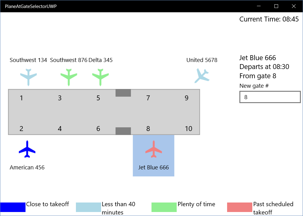
XAML is also a great fit for information that has some sort of spatial positioning in the real world. I've done that for a number of clients, from managing helicopters in the air to arranging cattle feedlots on open ground. Figure 3 shows a simplified example of using XAML to work with data that corresponds to positions in the real world. It's an airport terminal with planes shown at gates. I often use it as an example in conference sessions, because I can explain every part of it to an audience in about ten minutes.

I have both WPF and UWP versions of the example in Figure 3. The planes are shown in a ListBox in WPF and a ListView in UWP. In other words, the same XAML controls that are used to get a boring vertical list of data items can also be used to show items positioned in a coordinate system, with colors and shapes for visualization.
The same XAML controls used to get a boring vertical list of data items can also be used to show items positioned in a coordinate system with colors and shapes for visualization.
The layering capabilities of XAML are an essential part of the planes-at-gates example, along with some other capabilities rarely used by XAML developers. You can download the complete code examples for both UWP and WPF versions of the example in Figure 3 from my website (www.nextver.com), but here are some of the techniques used in the example:
- One
Canvaspanel is used to contain the rectangles and text elements that make up the concourse. - Another
Canvasis used as theItemsPanelof theListBoxorListView. That allows the items in the ListBox or ListView to be precisely positioned. That second Canvas is layered right on top of the first Canvas. The ListBox/ListView has a transparent background so that the first Canvas containing the concourse shows through. - The ListBox or ListView containing the Canvas is bound to a list of data items representing planes.
- The data template for the ListBox or ListView contains the shape of the plane as a
Pathplus information about the flight bound to text elements. Value converters are used to calculate the position of the plane and its angle relative to the gate.
This example contains only about 150 lines of XAML and 120 lines of code. A production version with top-notch aesthetics might need double that amount of XAML.
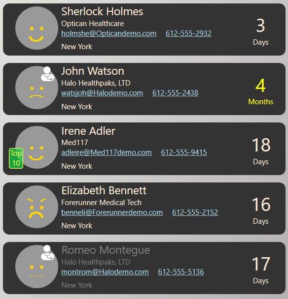
Figure 4 shows a final example of a list that presents information to the user in a highly visual way using the capabilities of XAML. The list contains contacts for a healthcare application. Some contacts are physicians and others are not. The data contains information on the last date I talked to them and on their satisfaction level with the services.

This screen requires no training to see the most important information. The archetypal figure for physician is used, along with a face to communicate the contact's satisfaction with our services. The layering capabilities of XAML are again used to compose those elements.
The human brain is optimized to gain information from faces, so the satisfaction level is much more quickly understood with a smile or frown than from an equivalent number in the database. The last contacted information is presented as a timespan rather than a date, because that's the way users want to see it. Inactive contacts are shown with a muted gray foreground, which most users intuitively think of as inactive.
Exposing the data as shown in Figure 4 was about an hour of work. With that kind of productivity, the bottleneck in getting to better UX with XAML isn't usually time or cost. The challenge is breaking free from past habits rooted in experience with older technologies, and learning how to design the right experience for your data and your users.
Wrap up
Even in a Web-based world, a lot of the economy still runs on complex, data-heavy desktop applications. Touch-based mobile applications have been added for many business scenarios, and in the future, we'll use devices like the HoloLens to raise innovation to new levels.
XAML is often superior to other platforms for those scenarios. It allows you to quickly and cost-effectively create intuitive, compelling, and innovative applications that offer higher productivity, lower training, better decisions, and fewer errors.
There's a lot more I'd like to discuss - deployment, state management, security, layered service architecture, and other factors that influence the platform choice for an application. But I'm out of space, and right now, my main message is that XAML is back, and you should know what it can do so that you can make the best decisions for your own applications.


