


Once you've learned a little bit about accessibility – what it is, why it's important, how to start implementing it – you naturally also start to think about testing and verifying accessibility. How do you know that these changes you're making are good, or right or helpful? What if you're just making new, more interesting mistakes? Or maybe you've been told that a third party will be doing an accessibility audit on your site or application, and you want to see for yourself what kind of issues may be found.
What if you're just making new, more interesting mistakes?
I'll give you a bit of a spoiler: There's no “one neat trick” for accessibility; there's no such thing as a 100% accessible website or application; and it's always something you'll be working on, just like security and performance. Two people with the same disability can have different accessibility needs, and accessibility fixes or accommodations for one user can make things worse for a different user. Fortunately, there are a number of tools and resources out there to help you with this journey, and more are being created every day.
Standards
Accessibility has been around since the very beginning of the Web, so it's no surprise that there are official standards out there. You're probably familiar with the World Wide Web Consortium (W3C) (https://www.w3.org/), which is the primary standards body for the Web. The Web Accessibility Initiative (WAI) (https://www.w3.org/WAI/) is a part of the W3C that focuses on accessibility and is where you will find all the official standards and documents for Web accessibility.
WCAG
One of the primary standards created by the WAI is called the Web Content Accessibility Guidelines, or WCAG. Currently at version 2.1, version 2.0 was released in 2008, and version 3 is being developed. If you're being held to WCAG 2.0, you can use version 2.1, as they are backward compatible, and of course there have been many developments in the last 10 years that you don't want to miss out on.
WCAG has three levels, or ratings: single A, double A (AA) and triple A (AAA), where A indicates the lowest level of accessibility, and AAA is the highest. For the most part, you'll want to aim for AA, as this is the level commonly targeted by legislation and the first functional level for actual accessibility.
AA is the level commonly targeted by accessibility legislation.
In some cases, it'll be relatively easy to jump up to AAA for some criteria, so keep those in mind and aim for AAA when at all possible. For instance, the AA criteria for sufficient color contrast is 4.5:1, while the AAA criteria is 7:1. If you're already working to create an accessible color palette, focusing on meeting AAA instead of AA won't be much, if any, extra work.
POUR
There are four major principles of digital accessibility: Perceivable, Operable, Understandable, and Robust, or POUR. Every WCAG criterion falls under one of these principles in some way or another, so if you're confused or not sure how to make a feature accessible, start with POUR:
- Is it Perceivable by all users, including those with low vision, those who are blind, and/or users who are d/Deaf or hard of hearing?
- Is it Operable by all users, even if they don't use a mouse? Is it always clear where you are on the page, and are users able to interact with all the controls?
- Is it Understandable by all users? Is your language too esoteric, or is your functionality obscured by the use of non-standard icons?
- And finally, is it Robust? Can users choose their own technologies, including devices, browsers, and assistive technology?
ARIA
Accessible Rich Internet Applications (ARIA) is a technique used when it's not possible to make a feature or control accessible using the standard functionality and behavior that exists in HTML. ARIA should always be considered a solution of last resort, which can seem a bit odd at first glance. It's right in the name: ARIA means making accessible Internet applications, so having ARIA is better than not having ARIA, right? Well…
Many disabled people are familiar with how sites and elements break for them: This is (unfortunately) a frequent occurrence, and they have learned to recognize common issues and know how to work around them. When ARIA is introduced and used badly, the result can be strange and unknown ways for things to break, leaving the assistive technology user more lost than ever.
WCAG, POUR, and ARIA are the standards and guidelines you'll be using to check and verify that your sites and apps are accessible, but how do you actually use this information?
Understanding WCAG
For WCAG, you may want to refer to these three documents when working to meet the criteria:
- Understanding WCAG 2.1 (https://www.w3.org/WAI/WCAG21/Understanding/)
- Techniques for WCAG 2.1 (https://www.w3.org/WAI/WCAG21/Techniques/)
- How to Meet WCAG 2 (Quick Reference) (https://www.w3.org/WAI/WCAG21/quickref)
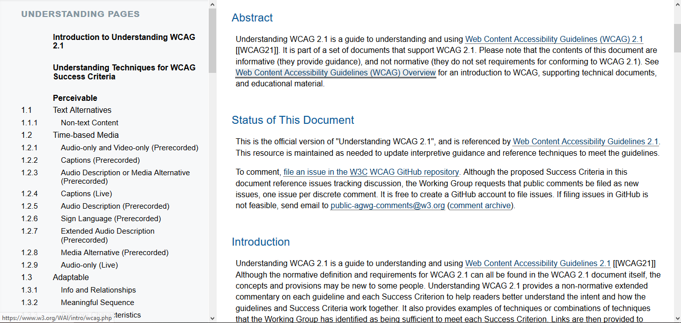
Understanding WCAG 2.1 provides detailed information on each of the principles, as well as suggestions for implementing accessible functionality. As seen in Figure 1, it's an official document and isn't very accessible!
The primary issue with these documents is that they are official, and in some cases, legally binding standards. If you're not already familiar with a significant amount of accessibility-specific jargon, it's going to be very hard to read through or even skim for what you're interested in. In addition, the language throughout is very formal and uses longer, more complicated words when shorter, clearer ones would do the job just and well (and more accessibly).
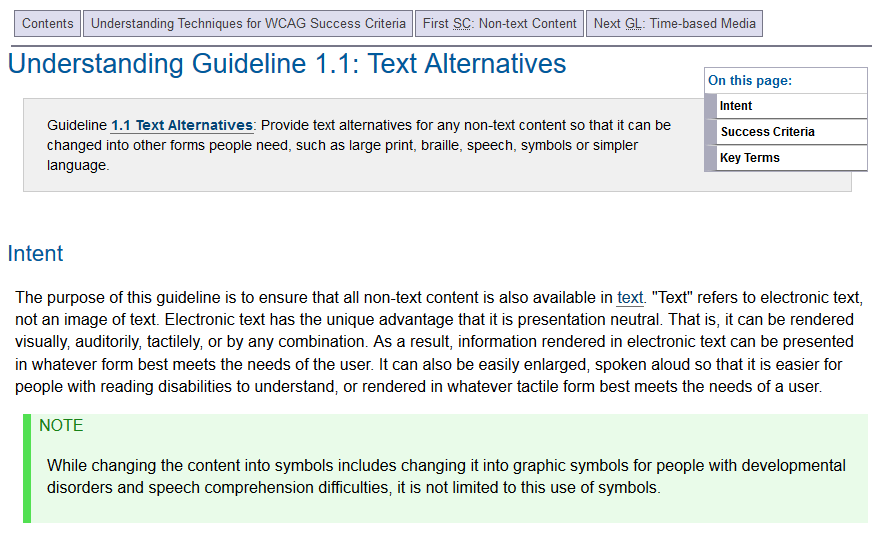
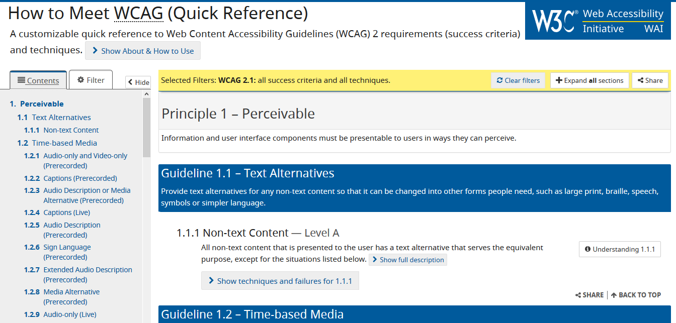
Once you dig into a specific guideline – let's go with Text Alternatives, as seen in Figure 2 – you can see that it's a little more readable. The initial paragraph describing the criteria is relatively straightforward and clear, and the Intent section provides some handy background as to why this criterion is important for accessibility. The Success Criteria are also helpful – it's always nice to have an example of good accessibility to work toward.
In general, this document is overly complicated and it's a lot to parse, especially if you're not sure what you should be looking for.
Techniques
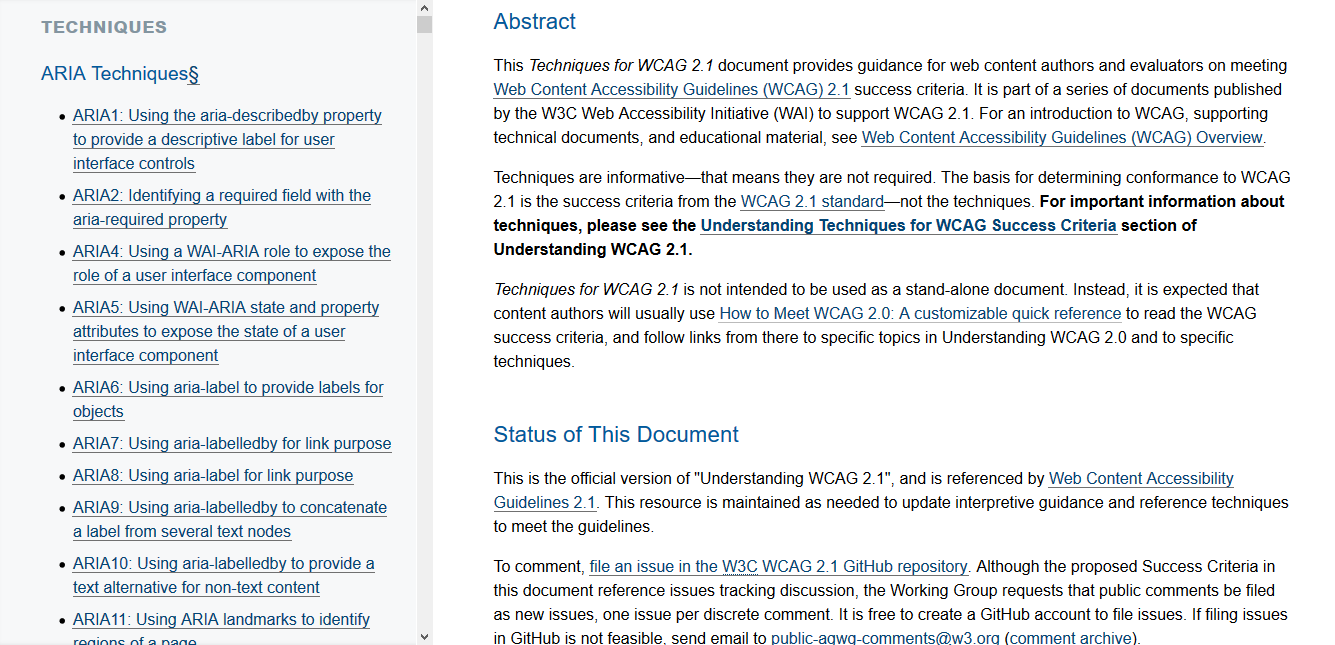
Next is the Techniques document (Figure 3), which focuses on ARIA, client-side scripting, and CSS techniques for accessibility. As mentioned earlier, ARIA should only be used when absolutely necessary, but when that does happen, it's important to follow the guidelines and rules that have been developed.
The Techniques document is very similar to the Understanding document: It's an official specification, the language isn't very accessible, and it's not very easy to understand without reading it through multiple times.
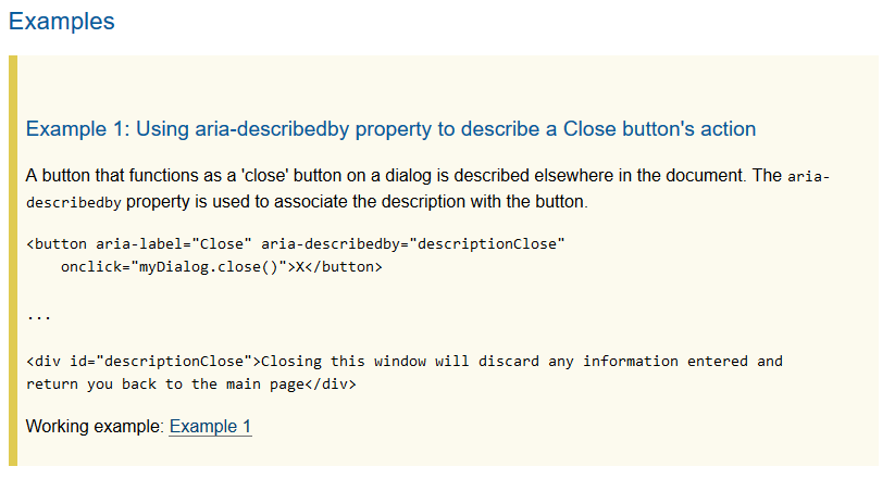
One neat thing about the Techniques document is the examples section. As seen in Figure 4, near the bottom of each criterion you'll see a simplified code example of how to use a specific ARIA or CSS feature. If you're unsure how to implement a specific technique, start with one of the examples provided, and build up from there.
Quick Reference
Last, there is the How to Meet WCAG Quick Reference, which is an interactive document that you can filter to show the levels, techniques, and technologies that you're interested in (Figure 5).
Out of the three documents, I use the Quick Reference most frequently. Accessibility-wise it's the easiest and most straightforward of the three documents, and the built-in filtering can be very useful. If you have any questions or would like more detail on a criterion, it includes links to the Understanding and Techniques documents.
Let's take a more in-depth look at the Quick Reference and how you may want to use it.
First, there's the Filters section, as you can see in Figure 6. As I mentioned before, you'll want to target version 2.1, which is conveniently also the default. Remember that 2.1 is backward-compatible with 2.0, so you shouldn't need to target version 2 specifically.
The Tags filters can be helpful if there's a specific type of functionality you're looking to make accessible. For instance, maybe you have a carousel of hero images at the top of your site, so you can add the Carousel tag to filter the results down to criteria that are specific to that type of functionality.
For the Levels filter, I'd suggest removing the checkmark by Level A to clear out some of the clutter and allow you to focus on the AA and AAA criteria. One interesting thing to note: Un-checking a level doesn't remove any of the content from this page, which is an interesting way to keep the guide accessible; it simply collapses the criteria down to their headers and makes them inactive.
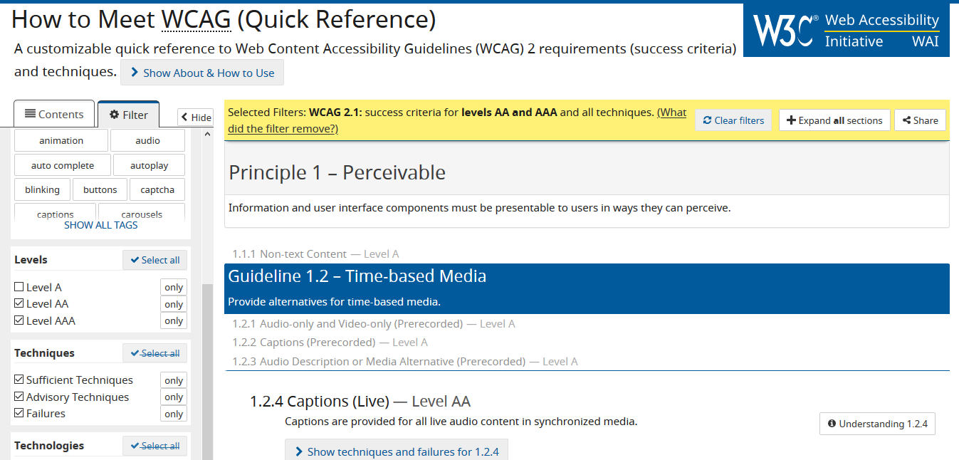
The last couple of filters (Techniques and Technologies) can be handy if you're already aware of what you're looking for, but I'll suggest leaving them alone at first, until you're more comfortable with this document and the information it provides.
Switching back to the Table of Contents tabs, you'll see four main sections, one for each of the POUR principles (Perceivable, Operable, Understandable, and Robust).
Within each section, you'll find a breakdown of the various aspects of a criterion. For example, under Perceivable, you can see Distinguishable, which covers areas like making sure that color isn't the only thing that distinguishes two pieces of information and ensuring that there's enough contrast between the background and text colors.
Make sure that color isn't the only thing that differentiates two pieces of information.
You can click on any of the headers in the table of contents to jump directly to that section. If you look for guidelines around contrast, you can see that it's in the list twice: once for Minimum and once for Enhanced.
Note that Contrast (Minimum) is the AA criterion, while Contrast (Enhanced) is the AAA criterion. Just as with Level A, if you were to go into the filters and uncheck Level AAA, the Contrast Enhanced option would be grayed out and disabled.
In Figure 7, you can see that each criterion consists of a short description and then a longer, more detailed description hidden in a hide/show area. If you expand the full description for Contrast (Minimum), you can see that larger text has a smaller required contrast ratio and that you don't need to worry about the contrast ratio of decorative images or logos.
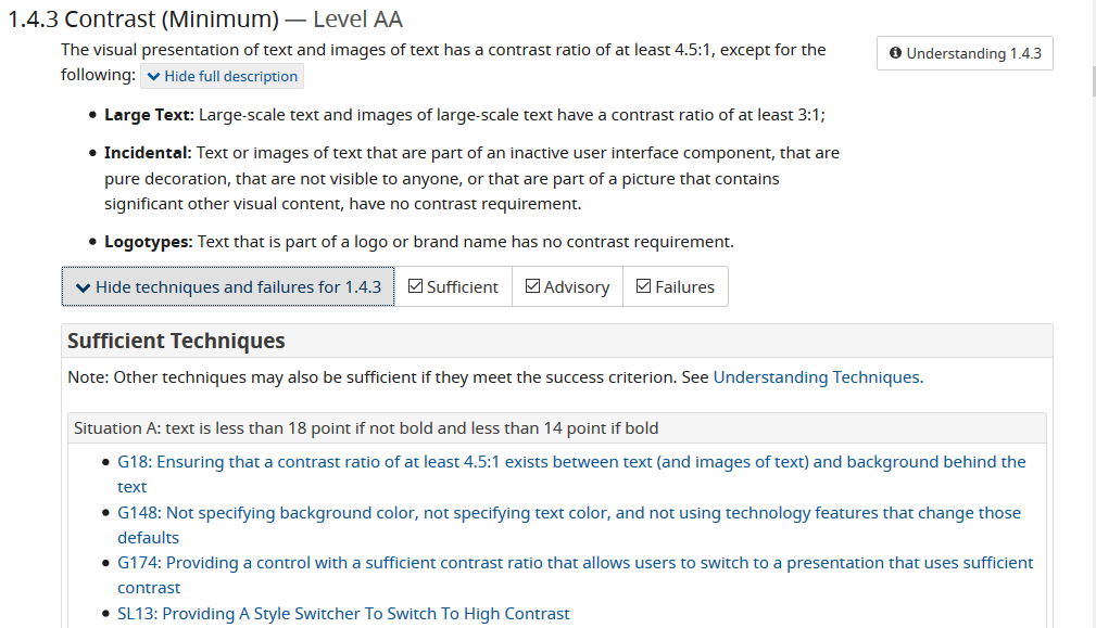
Each criterion also includes information on techniques for implementation and examples of what failures may look like. For Contrast (Minimum), two very useful scenarios are provided under Sufficient Techniques, offering exact text size guidelines and links to the Techniques document for even more information.
The failures listed for contrast aren't terribly interesting, as it's a pretty straightforward principle, but for more complicated criteria, it can be helpful to know what a failure might look like.
The Quick Reference, in particular, is a great resource, but are you really going to open up your site or app and go through this document manually to check that you've met all the criteria? Not likely! Fortunately, there are several automated and semi-automated ways to get started with checking accessibility, and they're easy to integrate into your current design, development and testing processes.
Checking Accessibility
It's critical to understand that accessibility testing CANNOT be fully automated – there's just too much nuance and too many judgment calls to eliminate humans from the process. However, there are a huge number of tools and processes that will help with some of the verification and allow you to automate what you can, so you can focus your limited resources where they're needed most.
Accessibility testing CANNOT be fully automated.
Linting
As with other best practices, accessibility linters are out there to do some basic checking as you write your code. If you're using Vue or JSX, look for ESLint plugins, and there are many others for different languages and frameworks.
If you can't find one for your particular situation, all of the information you'd need to create your own is freely available. You're probably not the only person looking for accessibility linting in a specific language, so think about creating one and putting it up on GitHub for everyone in the community.
It wasn't a linter per se, but at Neovation, we ended up doing something similar for a project that makes heavy use of iframes, which tend to confuse a lot of automated accessibility checkers. In our case, it was easier to start from scratch and develop a tool that would work for us and our very particular situation than to jerry-rig an existing tool.
As with any kind of testing, the earlier in the development process you can begin accessibility checking, the better. You don't want to be trying to do a bunch of testing and verification the day before you're due to go live or even worse, skipping it altogether.
CI/CD Pipeline
Along with a linter, you'll likely want to add some automated accessibility checking to your code check-in and deployment processes.
A tool from Deque Labs, called axe, is an excellent automated accessibility checker that you can add to your continuous integration and/or continuous deployment pipeline. It's open-source and hosted on GitHub, making it easy for those who might be interested in making changes or improvements.
Although I do recommend automated accessibility checking tools such as linters and pipeline integrations, remember that automated testing will never find all accessibility issues. These types of tools are really good at finding the low-hanging fruit, but at some point, you're going to need to get your hands dirty and do some manual testing.
Extensions and Bookmarklets
Browser extensions and bookmarklets are a perfect place to start your manual checking: They are easy to find and use, and they provide a lot of value.
Although extensions and bookmarklets are similar to automated testing in that they are checking the obvious and easy things, some also provide a checklist of items that can't be tested automatically. More importantly, they get you actually using a site or app and seeing how items pass or fail in the real world.
The axe tool is also available as a browser extension, which makes it available in your browser's dev tools. As you will see, the line between extensions and dev tools is pretty fuzzy. I had to choose to install axe, so that's where I've decided to draw the line: Dev tools are built right into the browser and available by default, and extensions require some manual intervention to use.
By first using axe as a browser extension, you can start to see how it works and what the results of a scan look like. This can be a good first step before adding axe to your pipeline so you know what to expect.
Once axe is installed, it will be available as a tab in your dev tools (F12) with some general update and version information, as well as a big Analyze button. Activating this button kicks off the checking process, and you'll get back a list of issues for your page, such as “Elements must have sufficient color contrast” or “Images must have alternate text,” as shown in Figure 8.
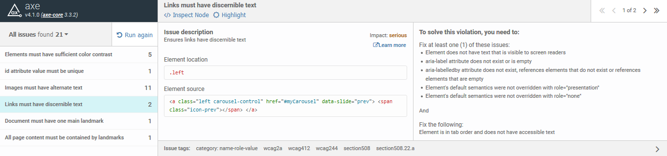
Selecting an issue provides you with more information, including a link to inspect the problematic code, a description of the issue, and suggestions about how to fix it. For any color contrast issues, axe provides you with the hex color values for the background and text, as well as the current contrast value.
For alt text errors, you'll be provided with a list of ways to fix the problem: You could simply add an alt or title attribute to the image; you could use ARIA to indicate that the image is decorative and doesn't require alt text; or you could provide a label with aria-label or aria-labelledby.
Alt text is crucial for non-decorative images: A screen reader user who encounters an image without alt text will have the image's file name read out as a fallback. Depending on your file names, this could be inconvenient – or absolutely awful. A file called “MyCompanyLogo.png” is probably pretty easy to figure out, but one named “4d7946696c65576974684e6f416c7454657874.jpg” provides absolutely no information about the image whatsoever. The crucial consideration for alt text is whether it provides the same experience to screen reader users as it does to sighted ones.
Provide the same experience to screen reader users as you do to sighted ones.
Figure 9 shows another accessibility checking extension that I like to use: WAVE from WebAIM (Web Accessibility in Mind), a nonprofit focused on Web accessibility. As you use more of these types of tools, you'll notice that they generally pick up on the same types and categories of issues, even if the UI and organization of each tool is unique.
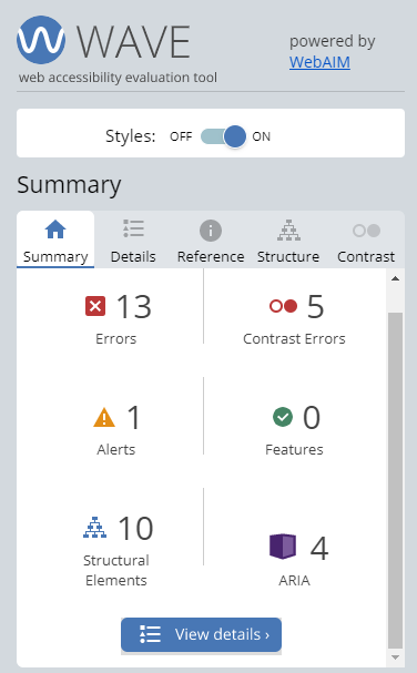
WAVE adds icons to the page for each of the accessibility issues it finds, which makes it very easy to find all of the issues detected without needing to individually inspect them.
One unique issue picked up by WAVE is the order of headings on the page. These are reported as structural errors, and there's also a tab dedicated to Structure. Many screen readers have hotkeys that allow users to navigate through a page via the headings, so it's crucial to ensure that your headings are used in order, without skipping a level. Think of it like reading a table of contents or a bulleted list:
- If the list
- Starts out like this
- Then having it suddenly skip an indentation level
* Like this- Would be really confusing
- Then having it suddenly skip an indentation level
- Starts out like this
It's easy to control how headings display visually, so there's no reason to use levels out of order or to skip one (or more) levels.
A feature of WAVE that I like to use is the Styles toggle. Turning this off strips all of the CSS and other styling from the page and gives you an HTML-only version. Some people, disabled or not, may prefer to interact with sites in this way, due to problems with contrast or color schemes, so it can be enlightening to see what your site looks like naked. Is everything still in the correct order? Does anything strange happen with the content, making it unreadable or inaccessible?
Finally, there is HTML_CodeSniffer, which picks up on most of the same issues you've seen with other tools. I like the UI for CodeSniffer and the fact that you can choose your WCAG level before running a scan. Additionally, CodeSniffer is available as a JavaScript bookmarklet, rather than a browser extension, so it can be a bit easier to use on locked down systems.
Browser Dev Tools
Both Chrome and Firefox have accessibility tools that come installed by default. For example, both browsers have built in contrast checkers in their code inspectors. Select an element and open the color picker for the text/foreground color, and you'll see a little icon indicating success or failure as well as the contrast value. To try this for yourself, you'll need to open your dev tools (F12), and inspect an element. Then you can click on the color preview (the circle or square showing the color) in the Styles pane to see the color picker and the contrast information in the popup that appears.
Firefox has an Accessibility tab in dev tools with an automated accessibility checker similar to others that you've seen already in this article. It also has a really unique and interesting feature – it provides a visual representation of the accessibility tree.
If you're familiar with the DOM (document object model), the accessibility tree is similar, but it's generated based on anything relevant for accessibility, rather than the entire code base for the page. CSS and styling are stripped out, anything that's hidden from assistive technology is removed, etc.
You can think of the accessibility tree as a more robust version of WAVE's Styles toggle that allows you to see exactly what information is being presented to assistive devices, such as screen readers. Understanding and interacting with the accessibility tree is an advanced technique, so keep it in your back pocket until you're ready to level up your accessibility skills.
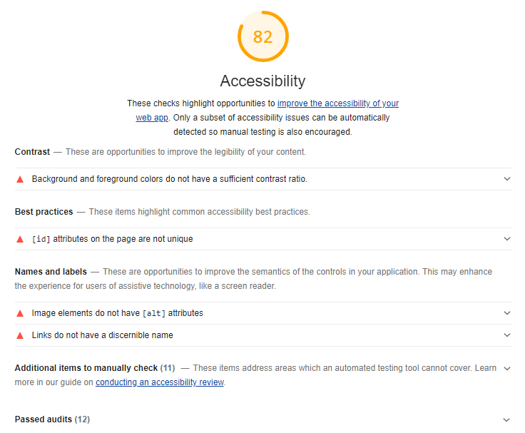
Chrome has an Audits tab that you may be familiar with: You can run Performance, Progressive Web App, Best Practices, and Accessibility audits, while also emulating desktop or mobile displays, or throttling your connection to look at loading speeds. The accessibility audit is, again, a fairly standard automated test, but the nice thing about this one is that it provides you with a list of items that need to be manually tested, including tab order and keyboard navigation, heading levels, and whether landmark elements are properly used to improve navigation.
The Chrome accessibility audit also provides an accessibility “grade,” as it does for the other types of audits (Figure 10). I'm not fond of the idea of putting a number value on accessibility for a couple of reasons: These types of tests can't check or find all possible issues. There's no such thing as 100% accessible, and, how accessible a site is varies from user to user.
There's no such thing as 100% accessible.
However, the “grade” can be a good way to present information to a manager or to non-technical team members. If you have a site that's getting 70% on the audit, and you have five color contrast issues and 10 images without alt text, it can help to say something like “we're at 70% right now, but if we spent half an hour fixing these 15 small issues, we'd be over 80%!”
There are many options for automated accessibility checking, and they're all quite similar, so I won't recommend any one solution specifically. It's more important that you have any accessibility checking at all, so pick whichever tool or tools that you (or your company) prefer.
Keyboard Navigation
There's one accessibility test that can't be automated, but it's so easy and simple to do that it's baffling to me that it's not tested more often: keyboard navigation. Unplug your mouse, turn off your touchpad and try to navigate through your site. Is it always clear where you are on the page (focus state)? Can you interact with controls as expected? Do you ever get trapped somewhere, like in a menu or pop-up, with no ability to get back to the main content of the page?
Marcy Sutton recently released a NPM package called No Mouse Days (https://github.com/marcysutton/no-mouse-days) that allows you to force developers to use only their keyboard, configurable by day of the week. Maybe it's time to implement No Mouse Mondays in your company or team?
As you start tabbing through your site, you'll want to keep an eye out for distinct focus states on every interactive element. A lot of the time, you'll see nothing more than a dotted light gray outline, which is the browser default kicking in. When you see this, it's almost always because the CSS for this site has deliberately removed focus states, and the browser is attempting to compensate for that removal. And don't forget about contrast – your focus state must meet contrast criteria on all elements!
When you hit an interactive element – a button or link, a menu, a drop-down, or an input field – can you activate it, enter and remove data, and move between options? When you tab out of a field and there's client-side validation on the page, does tabbing out trigger that validation, or does it rely on click events?
If you've launched a pop-up or overlay, are you placed into the pop-up, or do you keep moving through the page underneath instead? Is there a way to close this overlay via the keyboard, or is it click-only? When you reach the end of the content in the pop-up, does it bring you back to the top of the pop-up content, or do you move back to the main page while the pop-up remains open?
Keyboard navigation is also considered a feature for power users: I'm usually comfortable tabbing through a well-designed site, rather than reaching for my mouse every few seconds. This means that useful, consistent, and well-designed keyboard navigation will benefit more than just your disabled users.
Contrast and Color Blindness
Color contrast is more crucial and more complicated than people expect. Someone with low vision may have difficulty with common color schemes that use light gray text on white backgrounds. Buttons and links can have hover states with different colors; these also need to be checked for contrast. And of course, you need to have enough contrast on focus states as well.
Fortunately, checking for color contrast is both easy and easily automated – mostly. Automated tools won't generally be able to pick up on hover states or links that change after they're clicked, so you may need to use a different kind of tool to check your entire palette at once.
I don't do a lot of design work, so one I like to use is Contrast Ratio by Lea Verou (https://contrast-ratio.com/). This is a Web-based tool that allows you to enter your colors by name, Hex, HSLA, or RGBA. It also provides a link for your color combination and shows you how the two colors look against each other right on the page.
Focusing on contrast is meant to make things easier for low-vision users, as well as those who are colorblind. Additional issues that can affect colorblind users include only using color to distinguish elements. You can use a colorblindness simulator to check for issues like this: Access your site or take a screenshot of it (or use a mockup or prototype) and play around with the different types of colorblindness. You'll see issues that you never would have expected, like that your beautiful corporate color scheme looks significantly less beautiful to one in 10 users. Oops!
Text Analysis
Depending on your role, you may not be responsible for developing text or content, but if you are, keep in mind that language choices matter to accessibility.
As a general guideline, you'll want to target a fourth-grade reading level on the Flesch-Kincaid scale. Use tools like the Readability Analyzer, shown in Figure 11, to check your content.
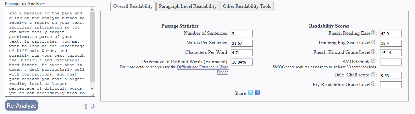
Add a passage to the page and click on the Analyze button to receive a report on your text, including information that helps you more easily target problematic parts. In particular, you may want to look at the Percentage of Difficult Words and possibly run your text through the Difficult and Extraneous Word Finder. Be aware that it doesn't deal particularly well with contractions. Also note that, just because you have a higher reading level or larger percentage of difficult words, that doesn't necessarily mean that you need to make any changes to your text.
As with almost everything, these types of checks are contextual – if you're in a situation or speaking to an audience with domain-specific knowledge, it's likely that you'll receive numbers that are “too high” from both of these tests. You could make changes to your text to make it more readable for general audiences, but that will probably negatively affect the readability for your particular audience. Run the analysis but use your best judgment before making any changes.
Accessibility is always going to be a series of judgment calls. There are types and aspects of disability that conflict with each other, and you'll need to pick a direction. Or maybe there's an extremely good reason to go outside of the WCAG criteria in some situations; you'll need to decide if it's worth any potential accessibility (or usability) problems.
Accessibility is always going to be a series of judgment calls.
Screen Readers
I strongly believe that everyone (developers, designers, project managers, product owners) should be familiar with the basics of how a screen reader works. Screen readers are highly specialized tools, though, and they are difficult to master when not used on a consistent basis.
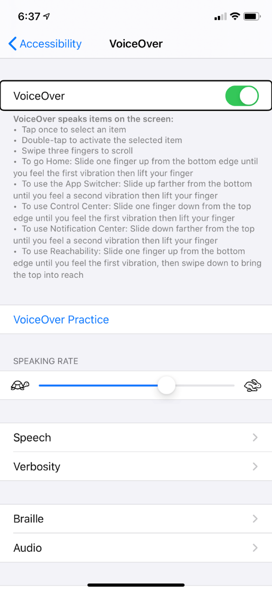
Because of this, as well as availability, licensing, and pricing issues, I'll suggest becoming familiar with the screen reader built into your phone or tablet. On both Apple and Android devices, a built-in screen reader is available in the Settings, usually under Accessibility (Figure 12). The Apple screen reader is called VoiceOver, and Android's is TalkBack. They're both relatively easy to pick up and start using, although they can behave differently from what someone might expect based on previous experience with desktop screen readers, such as NVDA or JAWS.
One issue to be aware of for all screen readers is that they rely on the information provided via the accessibility tree of the browser. This means that using the same screen reader in two different browsers can provide completely different results. As you progress in your accessibility efforts, you'll need to move beyond browser testing in a single dimension and instead create a matrix of browsers and screen readers.
When beginning to use a screen reader, you'll want the voice speed to be relatively slow. If you ever have the chance to watch someone who uses a screen reader frequently, you'll notice that they usually have the voice speed set very fast. This is similar to speed reading or visually skimming a page, where the user learns to listen for certain keywords, rather than fully listening to each element as it's announced.
Test with Actual Disabled People!
There's another browser extension out there called Funkify (https://www.funkify.org/) that bills itself as a disability simulator. The idea is that you browse to a website and then pick a persona from Funkify, each of whom have a specific type of disability. Selecting a persona/disability will then change the site in some way – the low-vision persona may make the content blurry, or the fine motor control persona will add some jerkiness to your mouse movements.
As interesting and enlightening as tools such as Funkify can be, they are absolutely not a replacement for testing your site or application with actual disabled human beings. In the same way that it's not sufficient to only perform automated accessibility checking, it's highly unlikely that your team alone will find or be aware of all the accessibility issues that can exist on your site. Even if you're lucky enough to have one or more disabled people on your team, or in your company in general, disabilities are different for every person, and there's a huge variety of disability and accessibility needs out there.
Test your site or app with actual disabled human beings.
If you're doing user research or A/B testing, make sure to include people with a variety of disabilities, whether in person or online. It's also possible to hire disabled people as contractors or advisors to assist with planning and testing.
When Neovation was first starting out with accessibility in our newest product, we worked with the Canadian National Institute for the Blind (CNIB) who put us in contact with a blind woman. She came into our office and showed us how she interacts with commonly used sites like Facebook and Twitter. It was very early in our planning stages, so we didn't have anything of our own to have her try out, but experiencing how she uses a screen reader gave us a lot of information on what works, what doesn't – and why.
In many cases, companies effectively outsource this type of testing to their users by releasing their application or site and waiting for feedback. If this is how you plan to handle accessibility checking, above and beyond automated testing, be aware that someone experiencing accessibility issues with a site or app isn't going to be very motivated to file a bug report. Most of the time, they're just going to go somewhere else.
Connecting with disability groups and organizations in your community and asking members to test your site or application is beneficial for both parties. It's also less risky than leaving proper accessibility testing to your prospective or existing users.
Easy Accessibility Wins
As you start with linting and automated accessibility checking, you'll notice that a lot of accessibility issues are small and very quick to repair. In that spirit, I'd like to suggest a few more changes that you can implement in five minutes or less that will significantly improve usability for anyone using your site or application – not just people with disabilities.
Setting the Language
It's crucial to set the language appropriately for your site and for any content that doesn't use the page's default language. Not only is this an accessibility issue because it controls the voice and pronunciation used by screen readers, it's also critical for internationalization because it allows browsers to identify whether a page needs to be translated and it also determines the dictionary used for spell checking. It's a win-win-win!
If all content on your page is in one language, you only need to set the lang attribute on the HTML element:
<html lang="en"></html>
If your page contains content in multiple languages, you still need to set the primary language on the HTML element, but you can also override it on individual elements, such as divs or paragraphs:
<html lang="en">
  <p lang="fr"></p>
</html>
There's also an attribute called hreflang indicating that activating a button or a link will change the primary language of the page. This is particularly useful if you have a language switching element on your site:
<html lang="en">
  <ul>
    <li lang="en" hreflang="en">English</li>
    <li lang="es" hreflang="fr">French</li>
    <li lang="es" hreflang="es">Spanish</li>
  </ul>
</html>
This code indicates that the page's content is in English. Each item in the list has its language specified: English, French, or Spanish, as well as the hreflang attribute letting users know that selecting this option will change the primary language for the page. If you had a drop-down that allowed users to set their language for their profile, you wouldn't use hreflang in that case, just the lang attribute.
Associate Labels and Controls
When creating a form, ensure that each label has a for attribute that correctly associates the label with its input. This has multiple benefits: Users will be able to use labels to activate controls, providing more affordance for users without fine motor control. And screen reader users will always know which labels and controls belong together, even if something odd or unexpected has happened with the visual order of the controls in the form.
As an aside, if you're thinking that this means you can't use placeholders to label your form fields – you're right! Using placeholders instead of labels is a terrible design pattern for all users, not just those with disabilities. What happens when someone fills out multiple fields in a form and then starts getting errors? How are they to know which data was supposed to be entered into each field – and what was that format for phone numbers again? Just say no to placeholders as labels.
Just say no to placeholders as labels.
200% Zoom
A large (and growing) number of people have vision issues that require them to use zoom functionality of some kind, whether it's the magnifier on their computer or phone or the browser's zoom feature, so it's crucial to make sure that it works as expected.
The criterion for browser zoom is that it should work up to 200% without any controls overlapping each other or pushing any content off the page. You'll also want to work to ensure that there's little to no horizontal scrolling, as this is annoying and tedious for zoomed-in users. This is less of an issue than it used to be, due to more focus on responsive design, but it still needs to be checked.
Start by using relative units in your CSS: EMs, REMs, and percentages will all help with creating clean and usable sites when zoomed, whereas anything specifically in pixels won't respond nearly as well. And of course, browser zooming is just as easy to test as keyboard navigation, so make sure that it's on your manual testing list.
Semantic Code
Although I haven't mentioned it explicitly, the first and primary thing you should focus on when developing accessible websites and apps is to use semantic code. Semantic code provides context and meaning to your code beyond what you've explicitly written and is heavily used by assistive devices to present relevant information to users.
For websites and Progressive Web Apps (PWAs), this means never doing things like styling a div to look like a button or using some kind of custom drop-down element you've created yourself. In HTML in particular, each element has functionality and accessibility built in, and you can either take advantage of this or start from scratch – and inevitably miss or forget to re-implement a crucial feature.
If you're developing an app, use native controls as much as possible. If you've got a drop-down in your app somewhere, the native component is going to be much more familiar, usable, and accessible to users than any third-party library or custom implementation you can come up with.
Move toward building accessible websites and applications by becoming familiar with the standards and guidelines, start with automated accessibility testing, and don't forget to include manual testing on your own, as well as with disabled users, community members, and testers.