


Microsoft debuted the Power BI application in 2015 to enable scalable data analysis, analytics, and visualizations across even the largest of organizations. Opening up a Power BI dashboard enables users to dynamically interact with the data and visuals they see on the screen. Microsoft officially defines these dashboard views as reports, but I think the term dashboards invites users to interact with the data dynamically rather than statically, as you would with a paper report, for example. I recommend that you pick your own data visualization applications (if you can) based on how you anticipate that the end user will interact with the data.
The capabilities of Power BI lie in the semantic layer of the application, which enables you to create powerful models with an unlimited number of calculations. Creating financial models in Power BI presents challenges like how to replicate financial calculations dynamically so the user can control the input. The solution comes through creating DAX measure calculations using Microsoft's DAX language.
Insurance Aggregates Risk Among Many
When you buy an insurance policy, you're distributing the quite low risk for needing your policy benefits with the many other similar policyholders in your much larger insurance pool. The likelihood that one individual in the entire risk pool will receive a payout is quite high, but the probability that you will personally receive a payout is, conversely, quite low.
Centuries ago, merchants swapped cargo space on their ships with other merchants to mitigate the risk of losing all their goods in a catastrophic event, such as the ship sinking. These risk mitigation activities eventually evolved into more organized insurance exchanges, such as Lloyd's of London, which today serves as the standard bearer of the modern insurance exchange market.
The term insurance refers to a wide range of insurance product types. You can purchase insurance policies for your house, car, and business. Large companies purchase commercial insurance policies to mitigate their risks. Insurance companies enter into reinsurance contracts to redistribute their larger risks among an even larger pool of insurers. I'm going to focus on personal insurance contracts, and more specifically life insurance contracts as the data source for this article.
Setting Up Insurance Calculations
When you purchase a life insurance policy, you select the desired face amount for the policy that your beneficiaries will receive as the death benefit value in the event of your death. In exchange for a financial offset to the event of your death, you pay premiums to the insurance company to keep the policy in force. Insurance companies calculate the premium they will charge for you to enter their insurance pools by analyzing factors such as:
- The face amount of the insurance policy
- The age of the policyholder when they purchase the contract
- Underwriting risks such as smoking and general health
- Duration of the life insurance contract
- Interest rate projected over the policy duration
You can set up these calculations dynamically using DAX measure calculations, which allows the users to select some of their own assumptions to put into the model. For example, you will see that higher interest rates lead to lower premiums because of how the time value of money impacts the cash flow over the term duration.
Actuarial Life Tables
In the last few years, the premise of merging a traditional business segment, such as finance or insurance, with the capabilities of technology went from niche discussion areas to widely known buzzwords such as “Fintech” and “Insurtech.” The actuarial science profession, which predates most of modern technology, calculates the costs of financial risks and determines how to mitigate them.
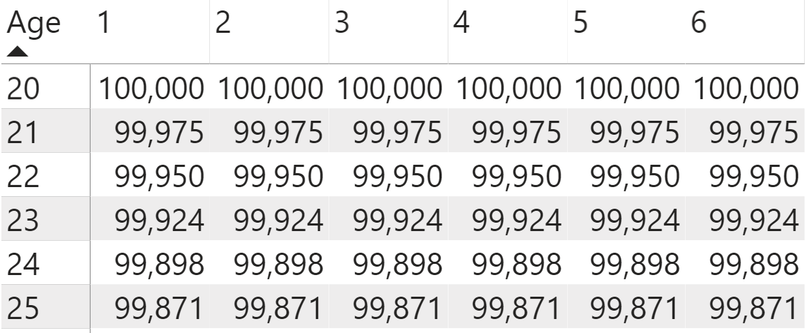
Actuarial tables refer to standardized life tables that provide data to use in risk analysis and in insurance calculations. To create your own life insurance calculations, you're going to use the life tables provided by an actuarial professional organization, the Society of Actuaries. These tables provide key figures for actuarial calculations, such as the numbers of surviving lives for each aggregated age cohort (Figure 1). These tables can also break down risks into more detailed categories, such as gender and smoking risk factors, but for the sake of simplicity, let's use a single standardized life table.
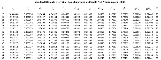
You can check out the Society of Actuaries tables on their webite, here: https://www.soa.org/globalassets/assets/Files/Edu/2018/ltam-standard-ultimate-life-table.pdf
Setting Up Financial Models in Power BI
I chose to use Power BI for this data visualization endeavor because it lets you develop impressive financial models using the application's built-in capabilities. In Power BI, Microsoft combines functionalities from Excel, Access, Power Query, and PowerPivot together in a single power tool.
Functionalities from Excel, Access, Power Query, and PowerPivot combine into a single power tool called Power BI.
Data Connections in Power Query
To import the data into Power BI, you create a new query in the Power Query Editor for a Web connection to the online life tables from the Society of Actuaries website that's available in a PDF format. You want to specifically connect to the tables that provide the number of surviving lives by each age. This data spans across two pages in the PDF, so you need to combine these two table objects into a single data table. The code below, written in the Power Query M language, connects to the online tables separately and then combines them with the Table.Combine function.
let Surce1 =Pdf.Tables(Web.Contents("https://www.soa.org/globalassets/assets/Files/Edu/2018/ltam-standard-ultimate-life-table.pdf")),
    Table1 = Source1{[Id="Table003"]}[Data],
    Headers1 = Table.PromoteHeaders(Table1, [PromoteAllScalars=true]),
    Table2 = Source1{[Id="Table004"]}[Data],
    Headers2 = Table.PromoteHeaders(Table2, [PromoteAllScalars=true]),
    Source = Table.Combine({Headers1,Headers2}),
    Columns = Table.SelectColumns(Source,{"x", "l_{x}"}),
    Type = Table.TransformColumnTypes(Columns,{{"x", Int64.Type}, {"l_{x}", Int64.Type}}),
    Rename = Table.RenameColumns(Type,{{"l_{x}", "l(x)"}})
in
    Rename
To set up your own query connection in Power BI:
- Open a new Power BI Desktop file.
- On the splash screen, select Get Data.
- When the Power Query Editor dialog window opens, search for the Blank Query option.
- Don't populate the formula bar in this new query, but instead select Advanced Editor from the top ribbon.
- This opens another dialog box where you delete the existing M code in the frame and copy and paste the above into the now empty space. Then select Okay. Make sure to remove any spaces between the code if you are having trouble getting the query to work.
- Double click on the query name in the query list on the right side of the screen and rename it SOA Life Tables.
- Select Close and Load in the upper left side of the screen to load this Web data connection into Power BI.
I encourage you to learn more about Power Query because it allows you to easily import large data sets, perform ETL processes on them, and refresh the data queries. Its functionality scales across other Microsoft tools, including Excel. For the purposes of this article, I want to focus your Power BI efforts on the DAX language, so you only need to copy the query into your own Power BI file to proceed into the next steps.
Working with the DAX Language
To set up the financial model in Power BI, you're going to leverage the DAX programming language. Microsoft didn't create DAX specifically for Power BI, but they do maximize its capabilities within the application by letting you create an amazing array of calculations. Many Power BI developers don't like using it because it takes them out of their comfort zones. This means that they miss out on creating powerful models in Power BI. I personally really like DAX because involves a lot of creativity, data interaction, and critical thinking to set up the calculations that I want the model to do.
For those new to DAX, you will find the language syntax pretty straightforward. Unlike many other programming languages, it does not give you grief for case sensitivity. Understanding the logic behind DAX, however, presents a much bigger challenge. You'll find that putting the calculation into the context of how DAX returns results will best help you understand how to create the intended calculation. In this Power BI financial model, you're going to use two different DAX functionalities:
- DAX queries
- DAX measures
DAX Calculations, Part 1: Premiums
If you go out to purchase an insurance policy, you can choose among many insurance product options or whether you want to pay the premium monthly or annually. For these calculations, you want to simplify the assumptions for the life insurance model to eliminate the noise and make it easier to replicate. Your term life insurance model works under the following assumptions:
- Term life insurance contracts have fixed durations. You'll use a thirty-year term period for your calculations.
- The face amount of the policy represents the amount the beneficiaries will receive if the policyholder dies before the end of the thirty-year term.
- The insurer pays the death benefit out at the end of the year if the policyholder dies that year.
- The policyholder pays level premiums at the beginning of each year to keep the policy in force.
- If they die, they no longer need to pay premiums on the policy (the death benefit gets paid out instead).
- The policy pays out the face amount if the policyholder dies, nothing otherwise. Some insurance products have cash values, but term life insurance does not have cash values.
Determining Relationships Between Tables
When I started learning DAX several years ago, I learned that getting the DAX measures to work started with understanding the context of the calculations I wanted to do. The Lives table you imported into Power BI gives you the numbers of lives surviving to a given age. If you look at the data trends, you see that at age 20, the table says 100,000 lives. This actual number doesn't mean much, other than giving a benchmark to set up the rest of your calculations against. At age 21, you see a slightly smaller number of lives because some in the age group died in the intervening year. The difference between those two numbers represents the number of deaths that year relative to the 100,000 lives the tables starts with at age 20. This logic continues down the table for the rest of the age cohorts.
Starting at the age when the policyholder purchased the contract, they get older each year into the term duration. Therefore, the life insurance calculations need to use the age at each subsequent year into the policy term rather than the initial purchase age. To get the DAX logic to work for this scenario, you need to disconnect the purchase age from the life table by creating a separate table for these ages.
The life tables ages range from 20 to 100, but you realistically want to set the upper age to 70 because that means the last year of a thirty-year term duration occurs when they turn age 100. You can create this table in multiple ways, but because you're already working in DAX, you can create a new table through the DAX function GENERATESERIES. This function produces a table of continuous values over your specified numbers range that you enter in the formula using the following steps:
- Select the option in the Home ribbon for New Table.
- In the formula bar, enter the DAX function to create a continuous table starting at 20 and ending at 70 using the GENERATESERIES function you see below. You don't need to enter the third formula term because the GENERATESERIES function defaults to using 1 as the interval unless you specify otherwise.
Ages = GENERATESERIES(20,70)
In order to set up life insurance calculations over a thirty-year period, you also need to create a separate table for the years. The term duration, unlike the ages, doesn't already exist in the data, but it will serve as a table to do the DAX measure calculations against. You can also set it up using the GENERATESERIES function.
Years into Term = GENERATESERIES(1,30)
You can rename the Value field in both these tables to Ages and Year, respectively, to make them easier to recognize when setting up the visuals and DAX measure calculations.
Start your modeling process by adding a matrix visual to the Power BI dashboard. In the matrix, you can add fields for the rows and columns. You then add values that populate the cells in the middle of the matrix visual. Think of the cell locations as the pivot coordinates where the row and column values create the matrix table dimensions. In this matrix table, you're going to populate the values in the middle with the DAX measures that you set up to model the life insurance calculations. Unlike other programming languages, the results that the DAX measure calculation returns depend on context that you evaluate the results at, or, more simply, the pivot coordinates.
Building DAX Measures Step-by-Step
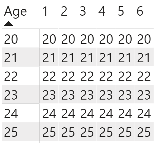
DAX measures work as portable formulas that allow you to create dynamic calculations in Power BI dashboards. Unlike other programming languages, the results that a DAX measure calculation returns depend on the context in which you're evaluating the expression. DAX measures don't depend on any other DAX measures in the matrix or table visual, but they do depend on the row and column dimensions (the pivot coordinates) that you add to the tables. You're going to create DAX measures to populate the values field of this matrix visual. Because the starting age remains the same no matter how many years into the term duration that you're calculating the measure at, you expect to see these numbers remain unchanged for each of the column's pivot coordinates within each of the fixed row pivot coordinates (Figure 2).
Let's set up a matrix with the purchase age in the rows, and the years into term in the columns:
- Select the Matrix visual from the visualization pane options at the top (next to the Table visual).
- Add the Ages field to the rows field space in the visualization pane, and the Year to the columns fields below that.
- Make sure that Power BI doesn't aggregate either of these fields by right-clicking on the drop-down arrow in the field name and selecting Do Not Summarize.
- This leaves us with the Values field to populate. If you drag the lives field to this space, notice that Power BI throws as error because you set up the tables in the disconnected format, which means that it can't recognize the relationship between them. To populate this field, you need to build out your DAX measure calculations.
To make it easier to track calculations, you can create a separate table to hold only these DAX measures:
- Select the option in the Home ribbon to Enter Data.
- Don't enter anything in the dialog box that opens but rename this table Calculations and hit Okay to close it.
- After you add the Starting Age measure to this table, you'll see that the new DAX measure has a calculator icon next to it.
- You can then delete Column1 from the model and the entire table will contain only measures you need for this financial model. From there, you just add more DAX measures to the table.
- To add a DAX measure to the Calculations table, keep this new table selected, and choose New Measure from the Home menu. You now see a formula bar appear at the top where you can enter the DAX code.
Another key to setting up DAX measures is building them in pieces. You first create a starting age measure that references the age values in the row dimension. In setting up your calculations, you need to convert the starting age from the values in the age table to a DAX measure for the starting age. If you drag the Age field to the values space, Power BI gives an error message. Not only does this Age field not tie to the Years in the columns, but you also need to turn the age into a DAX measure. You need to set up a parameter harvesting measure to convert these ages from field values into DAX measure values.
You use MAX as the function to reference the age in the DAX measure formula below, but you can theoretically use other DAX calculation functions such as MIN or SUM as well. I default to using the MAX function for consistency across many calculations as I build out the model. You also see this function nested inside the CALCULATE function. I'll discuss the CALCULATE function in much more detail later, but for now, I added it as a safety step to make sure that the DAX measure works in the built-out calculations.
Starting Age = CALCULATE(MAX(Ages[Age]))
Unlike other coding, where the code gets us to the result, DAX calculates the result through the pivot coordinates that you see through the row and column labels for example. When you add the Starting Age measure to the Values field space for the matrix visual, you see the same age for each row of the table across all the columns (Figure 2).
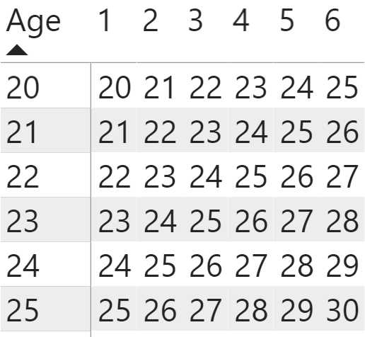
You now need to determine the age of the policy purchaser at each year into the term duration that represents their current ages. This means that you need to create a new DAX measure to reference the Year values in the column labels, and you also need to add it to the existing starting age measure and subtract one year from this expression.
Current Age = CALCULATE(MAX('Year in Term'[Year]))+[Starting Age]-1
When you replace the starting age, this DAX measure represents the policyholder getting older within the duration of the policy. You now see a table matrix (Figure 3) filled with ages that change depending on the pivot coordinates of the row and the column dimensions within the table.
On their own, these ages don't tell us much, but you want to use these DAX measures to determine the corresponding number of lives for each age. Getting these DAX measures for the number of lives by age cohort (or group) set up requires understanding the logic behind DAX measures. The CALCULATE function can work as a conditional function, like the logic you see in the SUMIF or COUNTIF Excel functions. You can break this logic into two components to make setting up the formulas become a more methodical process:
- Work backward in the expression by first setting up the filters on the tables you want to reference. The FILTER function allows you to select a table, then create a condition to match fields within this table. You want to filter the Life Table by the age field x so that it matches the Current Age measure.
- Take this table that you just filtered and apply a calculation on this filtered table. Because the Life Table only contains unique age values, the filtered table at each pivot coordinate in the table only matches up to one age in the filtered table. This means that you can use any arithmetic function, such as SUM or MAX, and the expression will return the same result.
Current Lives (Start of Year) =
    CALCULATE(MAX('Life Tables'[l(x)]),
    FILTER(ALL('Life Tables'), 'Life Tables'[x]=[Current Age]))
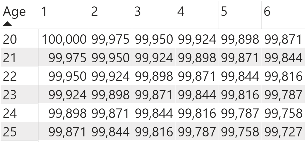
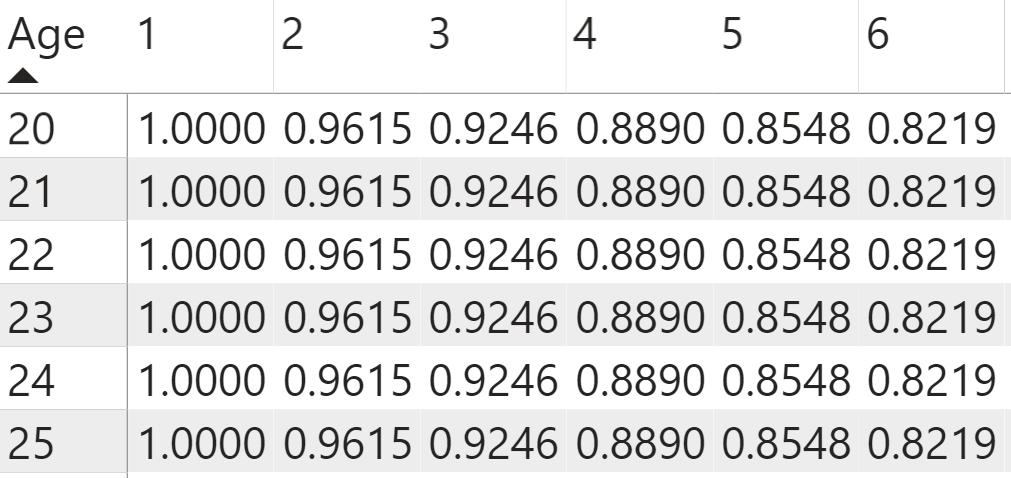
You can add this measure to the matrix table by first removing the Current Age measure from the Values section and replacing it with the Current Lives measure. You see that the number of lives reflects the matching age in the life table that matches the age of each of the policyholder age at the pivot coordinates in the values (Figure 4), and that the number of lives decreases as the years progress into the term duration.
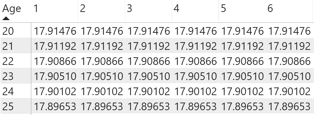
To get the starting lives for each of the ages, you set up another DAX measure using similar logic to the Current Lives measure, except you want to reference the Starting Age measure rather than the Current Age as the filtering condition. Notice that each row in the matrix visual has the same starting age that matches the age you see in the row dimensions when you swap the new DAX measure into the matrix visual (Figure 5), and each of the columns in a row has the same starting lives.
Starting Lives =
    CALCULATE(MAX('Life Tables'[l(x)]),
    FILTER('Life Tables', 'Life Tables'[x]=[Starting Age]))
Calculating Probability Rates
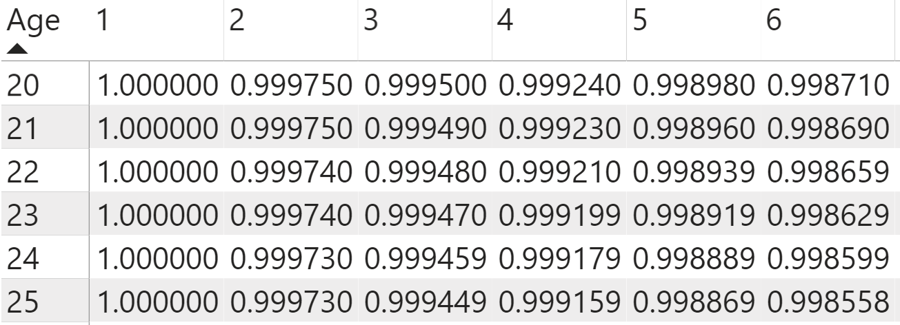
You can then use the built-out DAX measures calculating the number of surviving lives by age in other DAX measures to determine key probability numbers at each of these age cohorts. You can determine the likelihood of an age group as a whole surviving to a given age by dividing the number of surviving lives for each age within the 30-year term by the starting number of lives at the age when they purchased their life insurance policy. Using the DIVIDE function works in the same way as the divisor symbol within a DAX expression, except that you can add an alternative result (in this case the value of 0) to return in case the calculation returns an error.
Survival Probability = DIVIDE([Current Lives (Start of Year)],[Starting Lives],0)
You can see the trends of these probabilities in Figure 6.
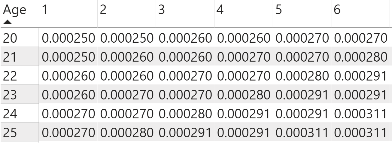
You also need to determine the probability of death each year by age group. To get this likelihood, you first need to determine the number of deaths for a given age group in a single year. The Current Lives value represents the number of lives at the beginning of the year. The number of lives at the beginning of the next year represents the same number as the lives at the end of the previous year.
Current Lives (End of Year) =
    CALCULATE(MAX('Life Tables'[l(x)]),
    FILTER('Life Tables', 'Life Tables'[x]=[Current Age]+1))
The difference between the two measures gives us the total number of deaths that year. Because you already set up both these calculations as DAX measures, you can simply subtract the Lives (n+1) from the Current Lives measure.
Deaths = [Current Lives (Start of Year)]-[Current Lives (End of Year)]
To determine the likelihood of death each year, the policyholder must first survive to the start of that year and then die in exactly that year. You can also think of it as the number of deaths each year divided by the starting number of lives. Like the calculation for the probability of survival, you can use the DIVIDE function to efficiently set up the probability of death in a given year.
Probability of Death at current age = DIVIDE([Deaths that year],[Starting Lives],0)
You can see the numbers changes by each age cohort in Figure 7.
Calculating Time Value of Money
In financial modeling, you want to make assumptions for the time value of money to use in your calculations. You can make these assumptions complex by modeling the interest rates on their own or using historical numbers, and you can also use an interest rate assumption to make the calculations easier (at least to start with). Let's use a 4% interest rate for the calculations because this closely reflects the interest rate you see toward the end of 2019. Historically, life insurance calculations used a 6% interest rate, but let's set up the initial calculations using the more realistic lower interest rate. I recommend storing fixed values (such as the current selected interest rate) as standalone DAX measures, which makes it easier to change these numbers later.
Interest Rate = 0.04
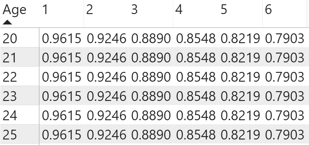
You use this 4% interest rate to calculate the time value of money or the projected discounted amount of money at a time period in the future. For timing purposes, you can anticipate the policyholder pays insurance premiums at the beginning of the year, and the insurance company pays out any death benefits at the end of the year. This means that you need to factor for two discount factors for each year in the term. You don't need to reference the ages for this calculation, as you'll see that each age group has the same discount rate for each year into the term's duration. You use the POWER DAX function to calculate the time value of money. You then reference the interest rate measure in the first part of the function, and the pivot coordinates for the Years columns in the second part of the function. To reference the years in the columns, you need to set up a parameter harvesting measure to reference this field as a measure by putting a MAX function around it.
Discount Factor = POWER(1+[Interest Rate], -CALCULATE(MAX('Year in Term'[Year])))
You also need to put a negative sign in front of this parameter harvesting measure because you're discounting the interest rate that in turn makes the time value of money grow smaller over time (shown in Figure 8).
You also want to calculate the time value of money at the beginning of the year. You set this up using the same structure for calculating the discount factor at the end of the year, except you need to add one to the second part of the expression after the parameter harvesting measure to move it back a year (as seen in Figure 9).
Discount Factor (n-1) = POWER(1+[Interest Rate], -CALCULATE(MAX('Year in Term'[Year]))+1)
Calculating Present Values
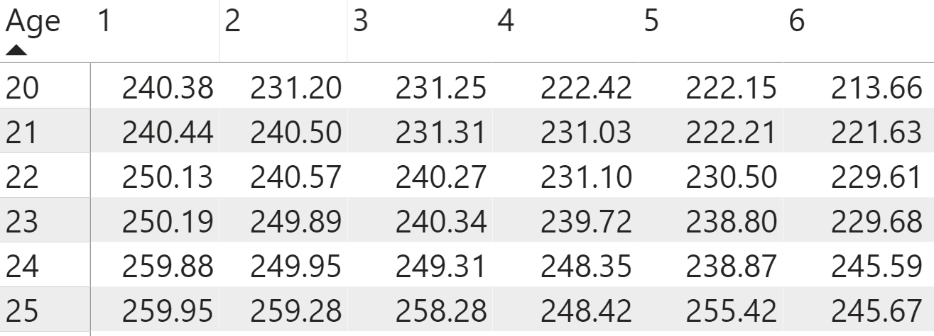
Once you create the calculations for the mortality rates, as well as the discount factors, you can start to create the DAX measures that directly shape the financial model from these other previously built-out DAX measure calculations. For your example, assume a face amount for a term life insurance policy of $1,000,000. Enter the face amount as a standalone DAX measure to make it easier to reference and change later if you decide to do so.
Face Amount = 1000000
The death benefits represent the amount that the insurance company pays out to beneficiaries if the policyholder dies. It doesn't represent the face amount, but rather projected cash payment per policy based on the probabilities and discount factors you already set up. To calculate the death benefit by year (this logic works the same for all the age groups), think about doing the financial projection not at each year within the term duration, but instead the purchase year of the policy at the beginning of year one when the insurer issues the policy, which I will refer to as “time zero.” For thirty years into the future, you want to know the cost of insurance, but you want to measure when they issue the policy by bringing back the death benefit at each year and age to this period of time zero.
“Time zero” is the beginning of the first year that the insurance policy is issued.
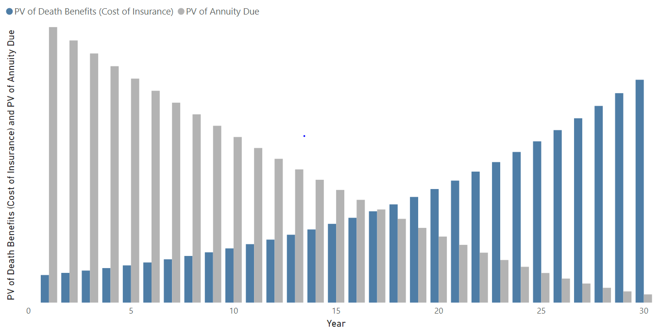
Each one of these years has a cost of insurance that represents the present value of the death benefits for each year calculated at time zero. To calculate the value of a death benefit, you now multiply the likelihood of death each year by the discount factor for each year by the face amount of the insurance policy. This gives the present value of the cost of insurance for each year. You see that because the chance of death rises as the policyholder gets older, that the cost of insurance also rises, even though the discount factor offsets the calculations in the other direction (as shown in Figure 10).
PV of Death Benefits (Cost of Insurance) = [Face Amount]*[Death Probability]*[Discount Factor]
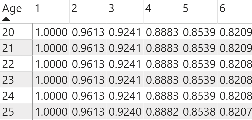
You use a similar logic to get the present value of what the policyholder pays to keep the insurance policy in force every year, again calculated when the insurer issues the policy at time zero. This time, you need to multiply the probability that they'll survive to the beginning of that year (which means that they make a payment that year) by the time value of money discounted to the start of that year in the term duration. You see that these values decrease over time as the probability of survival and the time value of money decrease over the years in the term duration (as shown in Figure 11).
PV of Annuity Due = [Survival Probability]*[Discount Factor (n-1)]
Solving for Premiums
The present value of the payments into the policy (which you initially set to $1), and the present value of the cost of insurance each year, serve together as key components to the calculations, but this doesn't answer the key question that you ask when you purchase a policy: How much do you need to pay each year for the premium?
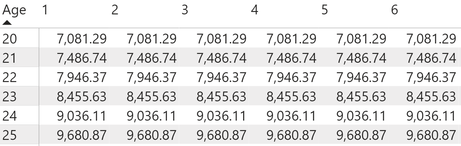
You calculated the present value at time zero for each year in the term duration, but now you need to add the cost of all of the insurance pieces together to get the net present value of the death benefit. To accomplish this, you use the SUMX function to override the term year dimension in the columns. Like the CALCULATE function, you set up the SUMX function by first thinking about the filters to apply to the expression. In this case, you already calculated the present values of the annuity and insurance based on the row and column pivot coordinates. Each row's coordinates represent a different age. You want to keep this dimension to the matrix visual. You want to filter the term-year column coordinates so that the DAX expression no longer references the column coordinate, but instead references all the column values from 1-30 years. You place the ALL function around the year field to remove the filters for the years and reference all the years when you do perform the calculation. The second part of the expression references the DAX measure that you created for the present value for each year. When you add this new DAX measure to the matrix, notice that you now get the same NPV (net present value) of death benefit for each year in the term duration (as shown in Figure 12).
NPV of Death Benefits (at Time 0) = SUMX(ALL('Year in Term'[Year]), [PV of Death Benefits (Cost of Insurance)])
If you're purchasing a term life insurance policy with a single lump sum payment, the NPV of the death benefit technically represents the total cost of the life insurance policy. However, you want to set up your calculations using thirty flat yearly premiums. You can again use the ALL and SUMX function to calculate the NPV of the annuity due at time zero (as shown in Figure 13).
NPV of Annuity Due (at Time 0) = SUMX(ALL('Year in Term'[Year]), [PV of Annuity Due])
You calculate the premium by setting the NPV of the death benefit equal to the annuity due multiplied by the premium that you want to solve for. This means that you divide the NPV of the death benefit by the annuity due to get the premium as a DAX measure calculation (as shown in Figure 14).
Premium = DIVIDE([NPV of Death Benefits (at Time 0)], [NPV of Annuity Due (at Time 0)],0)
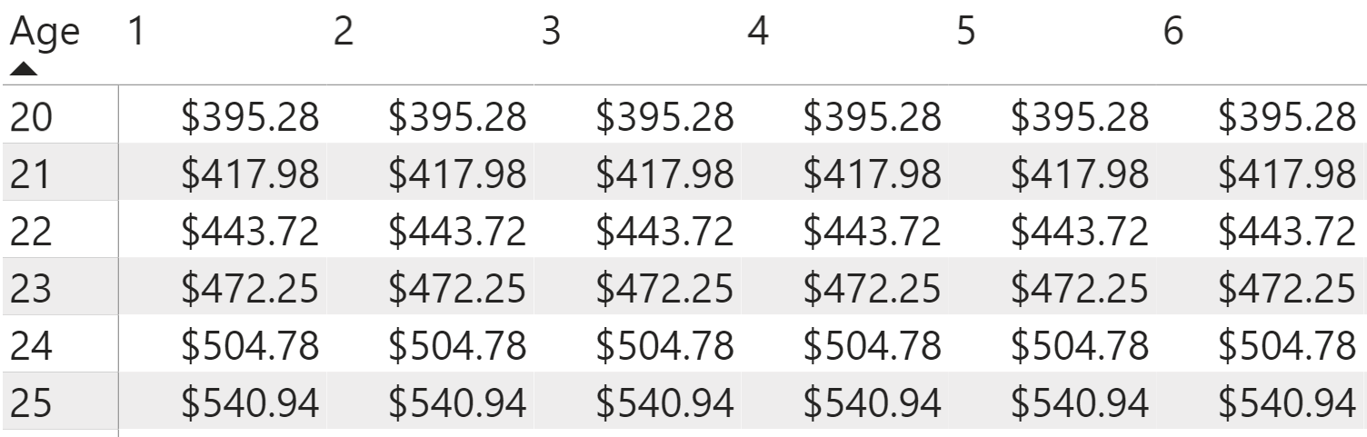
Notice that the premium remains even over the course of the term duration, so you don't even have to use the year field to analyze the life insurance calculations anymore. These tables can become fatiguing to read, so you can convert these DAX calculations into the visuals to make sure easier to digest and maximize the Power BI graphic capabilities.
Encouraging User Interactivity
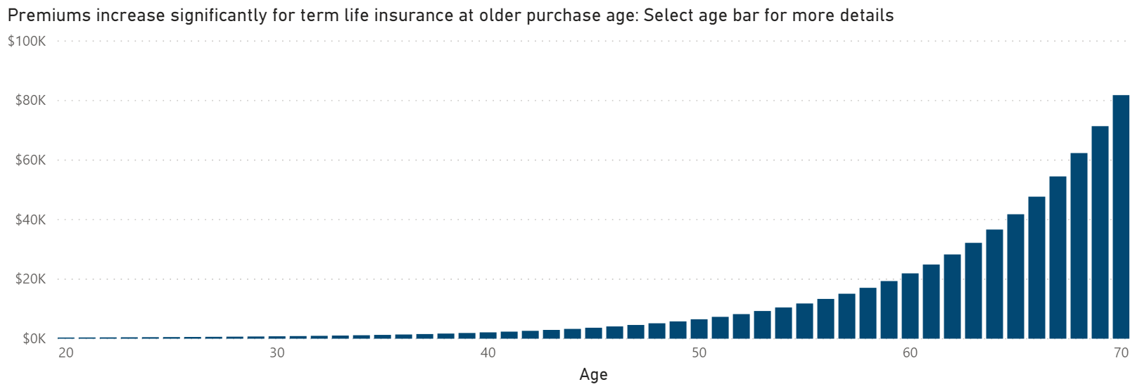
You just calculated the yearly premium amount for a range of fifty years for the policyholder in a table visual format. I highly recommend setting up and testing the DAX measures using these table and matrix visuals because it allows you to easily confirm that the calculations work as you expect them to. However, the end users of your dashboard will much more easily see the trends in the data and calculations if you represent them in stacked bar charts (like that shown in Figure 15), where you put the age on the axis and the premium DAX measure you just created in the values field. Make sure that the chart only shows the age ranges from 20-70. I also selected color in this visual (and the other visuals in the final dashboard) based on the colors in the Society of Actuaries' logo. To change the color values in the bar chart, go to the formatting section, and in the Colors menu, select Custom Color. You then can enter the hex value that matches up the colors you want to use, such as 4E7DA6 for this bar chart.
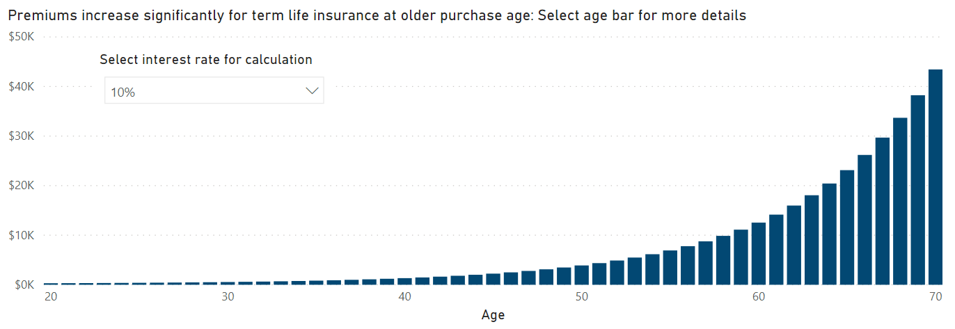
You set up the life insurance calculations using a fixed interest rate of 4%. Although this makes it easy to set up and test the DAX measure calculations, it limits the users' interactivity with their dashboard. To make the dashboard more dynamic, you can let the user select the interest rate that they want to model in the calculations. You first create a new table for the interest rates using the DAX GENERATESERIES function. The formula starts the values at 1% and continues until 20% in intervals of 1%, which you add as the third component in the DAX expression.
Interest Rates = GENERATESERIES(0.01,0.2,0.01)
You then need to update the interest rate DAX measure that you already set up to replace the fixed interest rate for setting up the calculations. To make these updates, you go to the Interest Rate DAX measure in the Calculations table and change the fixed 4% interest rate to the MAX function with new interest rates table field you created using GENERATESERIES nested inside it. It defaults to using the maximum interest rate value of 20% you don't have an interest rate selected in the dashboard.
Interest Rate = MAX('Interest Rates'[Interest Rate])
To allow the user to dynamically select the interest rate they want to use, you need to set up a separate slicer visual as a user-selected filter when you design the dashboard, which you need to add as a visual. You want to use the interest rates field you just created with the GENERATESERIES function, and not the interest rate DAX measure used in the life insurance calculations. Changing the slicer visual format into a drop-down menu rather than a list saves space in the dashboard. You can turn off the formatting for the slicer visual header and turn on the title. You want to nudge the user to change the interest rate used in the calculation by putting a very brief instruction at the top of this visual. Rename the title of the slicer visual “Select interest rate for calculation” and change the font size and color (to a dark gray) to make the title easier to read.
Notice how the premiums decrease if you select a 10% interest rate instead of 4% (as shown in Figure 16). This occurs because higher interest rates mean that the time value of money will decrease in the future, which then means that the present value of future death benefits decreases as well.
DAX Calculations, Part 2: Actuarial Reserves
Financial modeling allows you to analyze numbers and calculations from several different perspectives. At the time the insurer sold the policy, the NPV (net present value) of the death benefit for the face amount equals the NPV (net present value) of the premiums. However, these balances change a year later if you calculate the NPV balances again for both the death benefits and premiums. Because the aggregated population dies at higher rates at older ages, you see an initial premium higher than the payouts that the insurance company expects to make to the policyholders. In later years, this pattern reverses and the payments become higher than the premiums. You see a year into the policy that this balance changes for the present values for each year (as shown in Figure 17). The difference between the NPV of death minus the NPV of premiums at a given year in the term duration represents the actuarial reserve that the insurance company needs to set aside to pay projected death benefits in the future.
Calculating by Time Dimensions
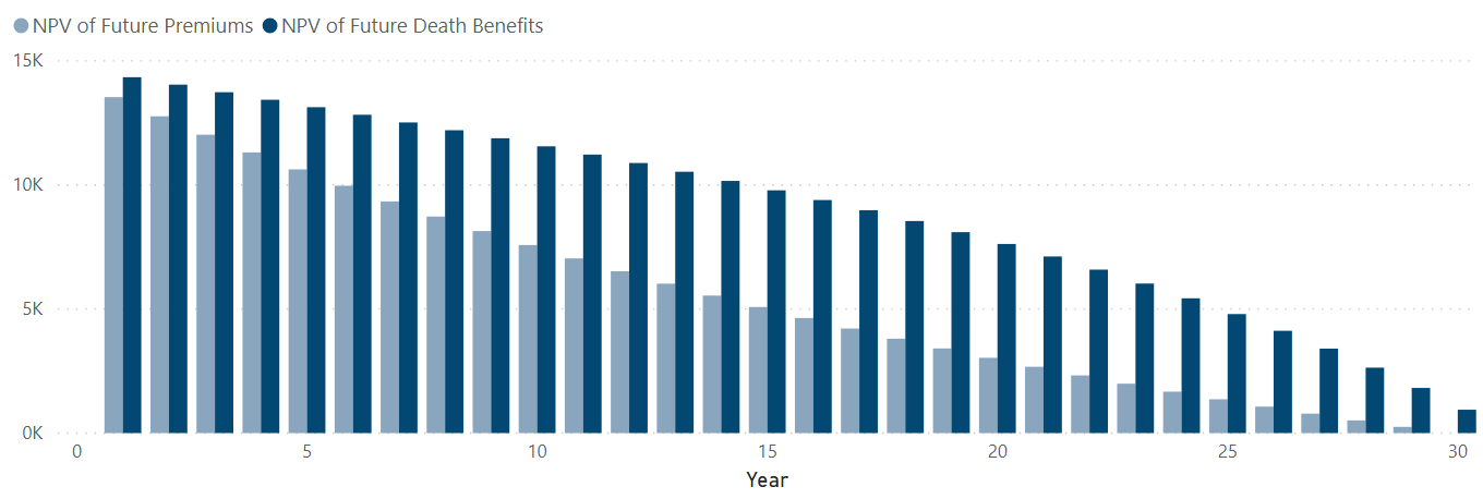
In this model, you assume no expenses or profits for the insurance company so that you can focus on setting up the calculation logic in DAX measures. You can calculate the NPV of the future death benefits for each year in the term duration again using the SUMX function. First, you set up the filters for the function using the FILTER function on the year in term table. Unlike the NPV of the death benefits and payments at time zero, however, you don't want to set up the filter to calculate the expression across all the years in the term, but instead use the ALL function to remove the filters for the pivot coordinates that define the present value for the year in term field. Next, you can set up the conditions for the filters where you filter the year in the term duration to only refer to the years after the current year referenced in the calculation.
NPV of Future Death Benefits = SUMX(FILTER(ALL('Year in Term'), 'Year in Term'[Year]>=MAX('Year in Term'[Year])), [PV of Death Benefits (Cost of Insurance)])
From there, you just calculate the net present value over the remaining years. You do the same for the present value of premiums over the same time period. Notice that the second part of the DAX expression for the premiums multiplies the premium by the present value of the annuity due for each of the future years.
NPV of Future Premiums = SUMX(FILTER(ALL('Year in Term'), 'Year in Term'[Year]>=MAX('Year in Term'[Year])), [PV of Annuity Due]*[Premium])
If you put each of the NPVs for the future death benefits and premiums together in a single chart, you can see the difference in the trends between the two future NPV amounts (Figure 18). I used hex value 8AA6BF for the light blue in the premium bars, and the hex value 024873 for the blue death benefits bar. The difference between the trends gives you the actuarial reserve at each year.
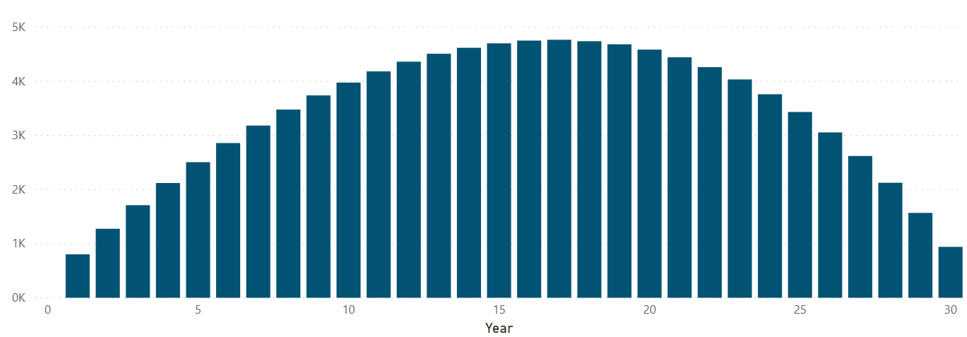
Actuarial Reserve = [NPV of Future Death Benefits]-[NPV of Future Premiums]
Let's see what the actuarial reserve looks like in a bar graph over the entire duration of the term life insurance policy (Figure 19). Notice the humpback shape of the trends. I find it helpful to think of the numbers as calculated measurements at each year within the term duration, where the highest measurements represent where the policyholder pays a lot of the premium for the policy, but still has the risk to receive death benefits from the policy. Again, I used a color from the Society of Actuaries' logo, except this time I formatted the bar using the teal color in hex value 025373.
Curating Dynamic Dashboards
To provide the best path for the user to interact with your calculations and maximize their understanding of this financial model, you want to communicate the premiums and reserves trends through visuals that also interact with one another. Put the Premiums chart at the top of the dashboard toward the right (as shown in Figure 20). Now put the reserves bar chart directly underneath it so they have the same width. I put a thin gray line horizontally to separate the charts and indicate to the end user the difference in the dimensions that you want to nudge the user to see. I also added the Society of Actuaries logo to the top left corner, along with a label underneath it that gives the user the title of the dashboard. Underneath that, you can add a filter for the interest rate slicer, as well as adding a slicer visual with an actual slider that you can move around for the ages. Add nudge prompts to the titles of these slicer visuals so that the user knows to select input values that update the rest of the dashboard. You also want to indicate on the premium bar chart that they can select the bar in the chart to filter the rest of the dashboard by that purchaser age.
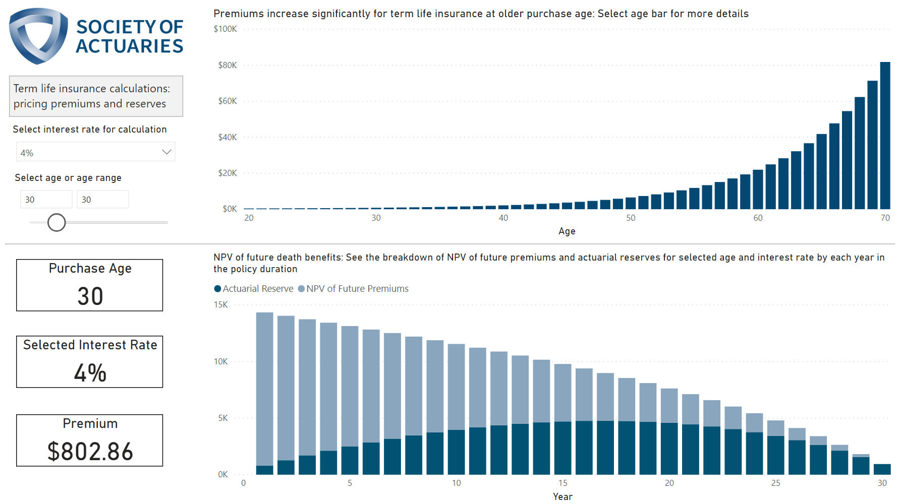
You can also add other helpful summaries for the end user, such as summary card visuals, to show the premium and interest rate. If you add borders to the summary cards and place them in prominent locations on the dashboard, this allows those selected total numbers to stand out as key figures numbers in the dashboard. Nudge prompts give instructions in the titles to encourage the end user to interact with the dashboard by subtly telling them to make selections within visuals. You can also line up the color scheme to match up with the Society of Actuaries logo so that the blues and grays in the logo match the blue and gray in the bar charts.
For first-time users of the DAX language, the syntax and logic seem intimidating, but testing out DAX measure calculations really teaches you to learn the language logic, even if it involves a little frustration along the way. As you can see with this example, Power BI allows you to perform some incredible financial modeling calculations once you understand how the logic works. What financial modeling do you want to do? Don't let the initial hurdle of trying to understand DAX all at once intimidate you. Think about how the calculations work, and then build and test these calculations step-by-step until you arrive at the model you want to see in your dashboard.