In Part 1 of this article, you learned how to create a Windows 8 look and feel for your WPF applications. You were shown a high-level overview of the various components that made up the shell for navigating. In part 2 of this article you will learn to create a WPF Button user control, a Message Box you can style, and a simple Message Broker System. All of these components are used to create the “Windows 8 Style” WPF shell you learned about in part 1.
Create Your Own WPF Button User Control
In Figure 1 you see examples of standard WPF Button controls. You can add a drop shadow and you can change the color, but you can't change much else without creating a whole new control template. For example, you are unable to modify the BorderBrush or the BorderThickness properties of the Button control. You might also want to use some animation other than the default, which again requires you to change the control template.
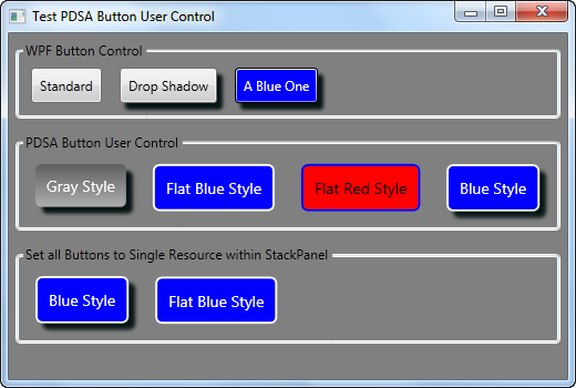
Sometimes all you want is just some simple buttons where you can modify the border brush and the thickness and have different color options via styles. I have found that instead of working with the whole control template thing, just creating a user control is sometimes much easier.
There are many ways to create custom buttons and there are advantages and disadvantages to each way. One method that is easily understood by almost any XAML programmer is to create a user control. User controls have been around since the Visual Basic 4.0 days. Most developers understand the value of using user controls. With XAML user controls you can put these controls into a WPF User Control Library or a Silverlight Class Library and reference those DLLs from any WPF or Silverlight application. Using a DLL gives you great reusability. Using resource dictionaries and styles can make your user controls very customizable as shown in Figure 1. The second row of buttons you see are the same button user control with just different styles applied.
The Simple Button User Control
The XAML for your Button user control is actually very simple. You use a single Border control and a TextBlock control within that Border as shown in the code snippet below.
<Border Name="hoverBorder"
        Style="{DynamicResource hoverBorder}"
        MouseDown="hoverBorder_MouseDown"
        MouseUp="hoverBorder_MouseUp"
        MouseEnter="hoverBorder_MouseEnter"
        MouseLeave="hoverBorder_MouseLeave"
        MouseLeftButtonUp="hoverBorder_MouseLeftButtonUp">
   <TextBlock Text="{Binding Path=Text}"
              Name="tbText"
              Style="{DynamicResource hoverTextBlock}" />
</Border>
The definition for this user control is in a DLL named PDSA.WPF. Notice that there are styles applied to both the Border and the TextBlock controls. These style definitions are in a default resource dictionary located in the same DLL as this user control. This resource dictionary or one you create can be used to theme your Button user control. You can see the three different themes we created in Figure 1. The Gray Style button uses a resource dictionary that is contained in the PDSA.WPF DLL. The other two styles are in the main project and can be referenced from your App.xaml or from within the window/user control where you need the button.
Changing Colors in Response to Mouse Events
When a user moves over a button or presses a button, you should give some visual feedback to that user. You can do this with animation using the Visual State Manager or Event Triggers in WPF. For this Button user control you might want to just respond to the various mouse events and change the Background property to a different color. When the mouse is pressed, you might also want to change the Foreground color of the Text in the TextBlock control. Listing 1 shows the code for each of the mouse events.
Listing 1: You can change color by responding to various Mouse events
private void pdsaButtonBorderStyle_MouseEnter(
    object sender, MouseEventArgs e)
{
    pdsaButtonBorderStyle.Background =
        (Brush)this.FindResource("pdsaButtonOverStyle");
}

private void pdsaButtonBorderStyle_MouseLeave(
    object sender, MouseEventArgs e)
{
    pdsaButtonBorderStyle.Background =
        (Brush)this.FindResource("pdsaButtonNormalStyle");
}

private void pdsaButtonBorderStyle_MouseDown(
    object sender, MouseButtonEventArgs e)
{
    // Save old Foreground Brush
    _TextBrush = tbText.Foreground;

    pdsaButtonBorderStyle.Background =
        (Brush)this.FindResource("pdsaButtonPressedStyle");
    tbText.Foreground = (SolidColorBrush)this.FindResource(
        "pdsaButtonTextBlockStylePressed");
}

private void pdsaButtonBorderStyle_MouseUp(
    object sender, MouseButtonEventArgs e)
{
    RestoreNormal();
}

private void RestoreNormal()
{
    pdsaButtonBorderStyle.Background =
        (Brush)this.FindResource("pdsaButtonNormalStyle");

    tbText.Foreground = _TextBrush;
}
Use the FindResource method instead of accessing the this.Resources[] collection on the user control. Using FindResource allows you to set the resource dictionary at any level in your application, not just on this user control. The FindResource method searches upward through the UI tree looking for a resource that match the names you see that start with “pdsa”.
You will need a Click event that you can raise when the user clicks on the button. It is in this Click event that you can write code to respond to the user clicking on this button. Listing 2 shows the definition of the Click delegate and the RaiseClick method to raise the Click event.
Listing 2: Create a Click event that can be raised from your button control
private void pdsaButtonBorderStyle_MouseLeftButtonUp(
    object sender, MouseButtonEventArgs e)
{
    RaiseClick(e);
}

public delegate void ClickEventHandler(object sender,
    RoutedEventArgs e);

public event ClickEventHandler Click;

protected void RaiseClick(RoutedEventArgs e)
{
    if (null != Click)
    Click(this, e);

    RestoreNormal();
}
The Default Resource Dictionary
Listing 3 shows the definition of the resource dictionary file contained in the PDSA.WPF DLL. You can use this dictionary as the default look and feel for any button control you add to a window. I have included two additional resource dictionaries in the main project as examples of how you can change the resources to give your buttons a different look. You need to keep the x:Key names the same, but you can change the color and thickness attributes. You can even change from Gradient colors to a SolidColorBrush as you can see I did when you look at the different resource dictionaries.
Listing 3: Having a default resource dictionary gives you an initial look and feel until you can create your own
<ResourceDictionary xmlns="http://schemas.microsoft.com/winfx/
                                  2006/xaml/presentation"
                    xmlns:x="http://schemas.microsoft.com/winfx/
                                  2006/xaml">
    <!-- Hover TextBlock Style -->
    <Style TargetType="TextBlock" x:Key="pdsaButtonTextBlockStyle">
        <Setter Property="Foreground" Value="GhostWhite" />
        <Setter Property="Margin" Value="10" />
        <Setter Property="FontSize" Value="14" />
    </Style>
    <!-- Hover Brush for Pressed Hover Button Text Block -->
    <SolidColorBrush x:Key="pdsaButtonTextBlockStylePressed"
                     Color="Black" />
    <!-- Hover Border Thickness -->
    <Thickness x:Key="pdsaButtonBorderStyleThickness"
               Bottom="0"
               Left="0"
               Right="0"
               Top="0" />
    <!-- Hover Border Brush -->
    <SolidColorBrush x:Key="pdsaButtonBorderBrushStyle"
                     Color="Black" />
    <!-- Style for when hovering over button -->
    <RadialGradientBrush x:Key="pdsaButtonOverStyle">
        <GradientStop Color="#FF5F5F5F"
                      Offset="0" />
        <GradientStop Color="#FFADADAD"
                      Offset="1" />
    </RadialGradientBrush>
     <!-- Style for when button is pressed -->
     <LinearGradientBrush EndPoint="1,0.5"
                          StartPoint="0,0.5"
                          x:Key="pdsaButtonPressedStyle">
        <GradientStop Color="#FF5F5F5F"
                      Offset="0" />
        <GradientStop Color="#FFADADAD"
                      Offset="1" />
    </LinearGradientBrush>
    <!-- Style for normal button -->
    <LinearGradientBrush EndPoint="0.5,1"
                         StartPoint="0.5,0"
                         x:Key="pdsaButtonNormalStyle">
        <GradientStop Color="#FF5F5F5F"
                      Offset="0" />
        <GradientStop Color="#FFADADAD"
                      Offset="1" />
    </LinearGradientBrush>
    <!-- Overall Style for Hover Button -->
    <Style TargetType="Border"
           x:Key="pdsaButtonBorderStyle">
        <Setter Property="Margin"
                Value="6" />
        <Setter Property="CornerRadius"
                Value="5" />
        <Setter Property="Background"
                Value="{StaticResource pdsaButtonNormalStyle}" />
        <Setter Property="BorderBrush"
                Value="{StaticResource
                        pdsaButtonBorderBrushStyle}" />
        <Setter Property="BorderThickness"
                Value="{StaticResource
                        pdsaButtonBorderStyleThickness}" />
    </Style>
</ResourceDictionary>
Using the Button Control
Once you make a reference to the PDSA.WPF DLL from your WPF application you will see the “PDSAucButton” control appear in your Toolbox. Drag and drop the button onto a window or user control in your application. I have not referenced the PDSAButtonStyles.xaml file within the control itself so you do need to add a reference to this resource dictionary somewhere in your application such as in the App.xaml as shown in the code snippet below.
<Application.Resources>
    <ResourceDictionary>
        <ResourceDictionary.MergedDictionaries>
            <ResourceDictionary Source="/PDSA.WPF;component/
                                        PDSAButtonStyles.xaml" />
        </ResourceDictionary.MergedDictionaries>
    </ResourceDictionary>
</Application.Resources>
This will give your buttons a default look and feel unless you override that dictionary on a specific window/user control or on an individual button. The “Gray Style” button shown in Figure 1 is what the default button looks like after setting the above code in your App.xaml and then dragging a button onto a window. If you wish to give a specific style to just a single button you can override the default by using the code below:
<my: PDSAucButton HorizontalAlignment="Left"
                  Margin="6"
                  Text="Flat Blue Style"
                  x:Name="btn2"
                  Click="btn2_Click"
                  VerticalAlignment="Top">
    <my:PDSAucButton.Resources>
        <ResourceDictionary Source="FlatBlueButtonStyles.xaml" />
    </my:PDSAucButton.Resources>
</my: PDSAucButton>
If you want to override a series of buttons within one specific StackPanel, or within a specific window or user control, you simply set the Resources section for that control as shown in Listing 4.
Listing 4: You can override styles for buttons within any parent container of the buttons
<StackPanel Orientation="Horizontal" VerticalAlignment="Top">
    <!-- Set Styles for All Buttons.
         This overrides the App.xaml styles -->
    <StackPanel.Resources>
        <ResourceDictionary Source="FlatBlueButtonStyles.xaml" />
    </StackPanel.Resources>
    <my:PDSAucButton HorizontalAlignment="Left"
                     Margin="6"
                     Text="Blue Style"
                     x:Name="btn11"
                     Effect="{StaticResource mainDropShadow}"
                     VerticalAlignment="Top" />
    <!-- Can assign a custom set of styles -->
    <my:PDSAucButton HorizontalAlignment="Left"
                     Margin="6"
                     Text="Flat Blue Style"
                     x:Name="btn12"
                     VerticalAlignment="Top" />
</StackPanel>
A WPF Message Box You Can Style
You can go to great pains to add styles, colors, gradients and a really cool look and feel to your WPF application only to have that ruined by the standard Windows message box as shown in Figure 2.
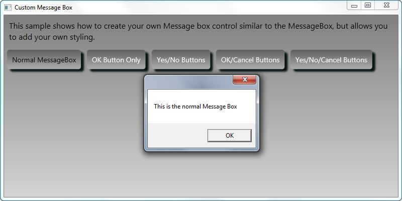
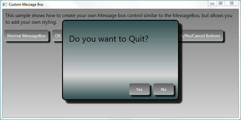
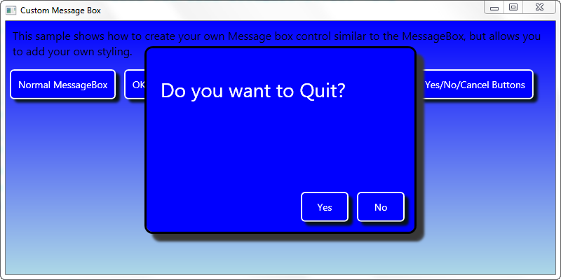
It would be nice if Microsoft offered us a Message Box control that we can style, but they don't. It is up to you to create a window that you can style and modify the look and feel. In Figure 3 and Figure 4 you can see examples of a message box that you can change to match your specific theme of your application.
The PDSAMessageBoxView XAML
The first step in creating your own custom message box is to add a new window to your WPF project. You then need to set some styles to get a borderless window. You set the following attributes on your window:
- WindowStyle=“None”
- ShowInTaskbar=“True”
- ResizeMode=“NoResize”
- AllowsTransparency=“True”
- Background=“Transparent”
The WindowStyle attribute allows you to set a single border, 3-D border, or a Tool Window border. Setting this attribute to None eliminates the border altogether. The ShowInTaskbar attribute is optional, but if you are doing a dialog window you probably want this window to show up in the taskbar. Since this is a dialog window, you probably do not want to allow the user to resize this window, thus you set the ResizeMode to “NoResize.” The next two attributes, AllowsTransparency and Background, work together. You must set AllowsTransparency to True to allow the Background to be set to Transparent. If you do not set these two attributes, then the chrome on your message box will still show up.
Listing 5 shows the complete XAML for the PDSAMessageBoxView.xaml file. This XAML contains a Border, a Grid, a TextBlock for the message, and a StackPanel control with four PDSAucButton controls. All of the attributes for the border, the text block and the buttons are controlled via styles in a resource dictionary file. Using a resource dictionary allows you to create new resource dictionaries with different colors and other attributes to style the message box in any manner you see fit.
Listing 5: All it takes is a few controls on a borderless window to create a custom message box dialog
<Window x:Class="PDSA.WPF.PDSAMessageBoxView"
    ...
        xmlns:my="clr-namespace:PDSA.WPF"
        WindowStyle="None"
        AllowsTransparency="True"
        Background="Transparent"
        ResizeMode="NoResize"
        ShowInTaskbar="True"
        FontFamily="Segoe UI"
        WindowStartupLocation="CenterScreen"
        Height="300"
        Width="420"
        MouseLeftButtonDown="Window_MouseLeftButtonDown"
        Deactivated="Window_Deactivated">
    <Window.Resources>
    <!-- Set style for PDSA Button -->
    <Style TargetType="my:PDSAucButton">
        <Setter Property="Effect"
                Value="{StaticResource pdsaMessageBoxButtonShadow}" />
        <Setter Property="Width"
                Value="80" />
    </Style>
    </Window.Resources>
    <Border Style="{StaticResource pdsaMessageBoxBorder}">
        <Grid>
            <Grid.RowDefinitions>
                <RowDefinition Height="*" />
                <RowDefinition Height="Auto" />
            </Grid.RowDefinitions>
            <TextBlock Name="tbMessage"
                Style="{StaticResource pdsaMessageBoxTextBlock}"
                Text="Message goes here..."
                TextWrapping="Wrap" />
            <StackPanel Grid.Row="1"
                Style="{StaticResource pdsaMessageBoxStackPanel}">
            <my:PDSAucButton Text="Yes"
                             x:Name="btnYes"
                             Click="btnYes_Click" />
            <my:PDSAucButton Text="No"
                             x:Name="btnNo"
                             Click="btnNo_Click" />
            <my:PDSAucButton Text="OK"
                             x:Name="btnOk"
                             Click="btnOk_Click" />
            <my:PDSAucButton Text="Cancel"
                             x:Name="btnCancel"
                             Click="btnCancel_Click" />
            </StackPanel>
        </Grid>
    </Border>
</Window>
Styles for PDSAMessageBox Class
As mentioned previously, all of the styles for the PDSAMessageBoxView class are contained within a resource dictionary. There is a resource dictionary in the PDSA.WPF DLL where the PDSAMessageBoxView class is located. However, there is an additional resource dictionary in the main project with a blue theme as shown in Figure 4. You can look in the sample application that comes with this article to see the different resource dictionaries used to create both themes shown in Figure 3 and Figure 4. Feel free to modify any of the styles in the resource dictionaries to make the message box look like however you want.
The PDSAMessageBox Class
Just like .NET has the MessageBox class in order to display the dialog, I have created a PDSAMessageBox class with a Show method as well. I made the Show method with the same parameters as the MessageBox class in order to help you make an easier transition to the PDSAMessageBox class. I do not use any of the MessageBoxImage parameters, so you will need to remove any of these, or add an image to your message box window if you so desire. Listing 6 shows the PDSAMessageBox class with the static Show methods defined.
Listing 6: Create a class to display any of your custom dialog windows
public class PDSAMessageBox
{
    public static MessageBoxResult Show(string message)
    {
        return Show(message, string.Empty, MessageBoxButton.OK);
    }

    public static MessageBoxResult Show(string message, string caption)
    {
        return Show(message, caption, MessageBoxButton.OK);
    }

    public static MessageBoxResult Show(string message,
        string caption, MessageBoxButton buttons)
    {
        MessageBoxResult result = MessageBoxResult.None;
        PDSAMessageBoxView dialog = new PDSAMessageBoxView();

        dialog.Title = caption;
        dialog.tbMessage.Text = message;
        dialog.Buttons = buttons;
        // If just an OK button, allow the user to just
        // move away from the dialog
        if (buttons == MessageBoxButton.OK)
            dialog.Show();
        else
        {
            dialog.ShowDialog();
            result = dialog.Result;
        }

        return result;
    }
}
All of the Show methods end up calling just a single Show that takes care of displaying the PDSAMessageBoxView dialog. One thing I did change in my Show method is that if the user pops up a message box with just an “Ok” button, I do allow the user to navigate away from this dialog without pressing the Ok button. To me, it does not make sense to force the user to press a single button on the form. This could have side effects however, if you have code immediately following the call to the Show method because this is no longer a modal dialog. Again, feel free to modify this code if you do not like this functionality.
Calling the PDSAMessageBox
The code snippet below shows an example of calling the PDSAMessageBox. The Show method will return a MessageBoxResult enumeration. There was no need to change the return value from that of the normal MessageBox class. You can find the code in the sample that you download for this article (see the end of this article for download instructions).
private void btnOKOnly_Click(object sender, RoutedEventArgs e)
{
    PDSAMessageBox.Show("This just displays an OK Button",
                        "OK", MessageBoxButton.OK);
}

private void btnYesNo_Click(object sender, RoutedEventArgs e)
{
    MessageBoxResult result;

    result = PDSAMessageBox.Show("Do you want to Quit?",
                                 "Quit?", MessageBoxButton.YesNo);

    MessageBox.Show("Result is " + result.ToString());
}
A Communication System for XAML Applications
A goal to strive for in any application is to keep the coupling between your objects as loose as possible. Coupling happens when one class contains a property that is used in another class, or uses another class in one of its methods. If you have this situation, then this is called strong or tight coupling. If you couple classes together then you make it harder to reuse one class in another project without including the coupled class that you might not need. You can also inadvertently introduce memory leaks if one object does not release the other coupled object. One popular design pattern to help with keeping objects loosely coupled is called the Mediator design pattern. The basics of this pattern are very simple; avoid one object directly talking to another object, and instead use another class to mediate between the two. Creating a robust message broker is beyond the scope of this article, but this section will show you the basics of how most message brokers work.
IPDSAMessageBroker Interface
As with most implementations of a design pattern, you typically start with an interface or an abstract base class. In this particular instance, an Interface will work just fine. The interface for our message broker class contains a single method SendMessage and one event MessageReceived as shown in the following code.
public delegate void MessageReceivedEventHandler(
    object sender, PDSAMessageBrokerEventArgs e);

public interface IPDSAMessageBroker
{
    void SendMessage(PDSAMessageBrokerMessage msg);

    event MessageReceivedEventHandler MessageReceived;
}
PDSAMessageBrokerMessage Class
The SendMessage method requires a type of PDSAMessageBrokerMessage to be passed to it. This class has a MessageName that is a �string' type and a MessageBody property that is of the type �object' so you can pass whatever you want in the body. You might pass a string in the body, or a complete object such as a Customer or Employee. The MessageName property will help the receiver of the message know what is in the MessageBody property. You will see examples of the usage of this class later.
public class PDSAMessageBrokerMessage
{
    public PDSAMessageBrokerMessage() {
    }

    public PDSAMessageBrokerMessage(string name, object body) {
        MessageName = name;
        MessageBody = body;
    }

    public string MessageName { get; set; }

    public object MessageBody { get; set; }
}
PDSAMessageBrokerEventArgs Class
Whenever you raise an event you should create your own event argument class. The PDSAMessageBrokerEventArgs class inherits from the System.EventArgs class and adds a couple of additional properties: MessageName and Message. The MessageName property is simply a string value. The Message property is a type of a PDSAMessageBrokerMessage class.
public class PDSAMessageBrokerEventArgs : EventArgs
{
    public PDSAMessageBrokerEventArgs() {
    }

    public PDSAMessageBrokerEventArgs(string name,
        PDSAMessageBrokerMessage msg) {
        MessageName = name;
        Message = msg;
    }

    public string MessageName { get; set; }

    public PDSAMessageBrokerMessage Message { get; set; }
}
PDSAMessageBroker Class
Now that you have an interface class and a class to pass a message through an event, it is time to create the PDSAMessageBroker class (Listing 7). This class implements the SendMessage method and will also create the event handler for the delegate in your Interface.
Listing 7: Create a simple message broker class to avoid coupling between objects in your application
public class PDSAMessageBroker : IPDSAMessageBroker
{
    public void SendMessage(PDSAMessageBrokerMessage msg)
    {
        PDSAMessageBrokerEventArgs args;

        args = new PDSAMessageBrokerEventArgs(
            msg.MessageName, msg);

        RaiseMessageReceived(args);
    }

    public event MessageReceivedEventHandler MessageReceived;

    protected void RaiseMessageReceived(
    PDSAMessageBrokerEventArgs e)
    {
        if (null != MessageReceived)
        MessageReceived(this, e);
    }
}
The SendMessage method will take a PDSAMessageBrokerMessage object as an argument. It creates an instance of a PDSAMessageBrokerEventArgs class, passing to the constructor two items: the MessageName from the PDSAMessageBrokerMessage object and the object itself. It may seem a little redundant to pass in the message name when that same message name is part of the message, but it does make consuming the event and checking for the message name a little cleaner - as you will see in the next section.
Create a Global Message Broker
In your WPF application, create an instance of this message broker class in the App class located in the App.xaml file. Create a public property in the App class and create a new instance of that class in the OnStartUp event procedure as shown in the following code:
public partial class App : Application
{
    public PDSAMessageBroker MessageBroker { get; set; }

    protected override void OnStartup(StartupEventArgs e)
    {
        base.OnStartup(e);

        MessageBroker = new PDSAMessageBroker();
    }
}
Sending and Receiving Messages
Let's assume you have a user control that you load into a control on your main window and you want to send a message from that user control to the main window. For example, you might have the main window display a message box, or put a string into a status bar as shown in Figure 5.
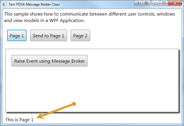
The first thing you do in the main window is to hook up an event procedure to the MessageReceived event of the global message broker. You do this in the constructor of the main window:
public MainWindow()
{
    InitializeComponent();

    (Application.Current as App).MessageBroker.MessageReceived +=
        new MessageReceivedEventHandler(MessageBroker_MessageReceived);
}
One piece of code you might not be familiar with is accessing a property defined in the App class of your XAML application. Within the App.Xaml file is a class named App that inherits from the Application object. You access the global instance of this App class by using Application.Current. You cast Application.Current to App prior to accessing any of the public properties or methods you defined in the App class. Thus, the code (Application.Current as App).MessageBroker, allows you to get at the MessageBroker property defined in the App class.
In the MessageReceived event procedure in the main window (shown below) you check to see if the MessageName property of the PDSAMessageBrokerEventArgs is equal to “StatusBar” and if it is, then display the message body in the status bar text block control on the window.
void MessageBroker_MessageReceived(object sender,
                                   PDSAMessageBrokerEventArgs e)
{
    switch (e.MessageName)
    {
        case "StatusBar":
            tbStatus.Text = e.Message.MessageBody.ToString();
        break;
    }
}
In the Page 1 user control's Loaded event procedure you will send the message “StatusBar” through the global message broker to any listener using the following code:
private void UserControl_Loaded(object sender, RoutedEventArgs e)
{
    // Send Status Message
    (Application.Current as App).MessageBroker.SendMessage(
        new PDSAMessageBrokerMessage("StatusBar",
            "This is Page 1"));
}
Since the main window is listening for the message “StatusBar,” it will display the value, “This is Page 1” in the status bar at the bottom of the main window.
Sending a Message to a User Control
The previous example sent a message from the user control to the main window. You can also send messages from the main window to any listener as well. Remember that the global message broker is really just a broadcaster to anyone who has hooked into the MessageReceived event.
In the constructor of the user control named ucPage1 you can hook into the global message broker's MessageReceived event as shown in the following code snippet:
public ucPage1()
{
    InitializeComponent();

    // Hook to the Global Message Broker
    (Application.Current as App).MessageBroker.
        MessageReceived += new MessageReceivedEventHandler(
            MessageBroker_MessageReceived);
}
You can then listen for any messages that are sent to this control by using a similar switch-case structure like that in the main window.
void MessageBroker_MessageReceived(object sender,
                                   PDSAMessageBrokerEventArgs e)
{
    // Look for messages intended for Page 1
    switch (e.MessageName)
    {
        case "ForPage1":
            MessageBox.Show(e.Message.MessageBody.ToString());
        break;
    }
}
Once the ucPage1 user control has been loaded into the main window you can then send a message from the main window using the following code:
private void btnSendToPage1_Click(object sender, RoutedEventArgs e)
{
    PDSAMessageBrokerMessage arg = new PDSAMessageBrokerMessage();

    arg.MessageName = "ForPage1";
    arg.MessageBody = "Message For Page 1";

    // Send a message to Page 1
    (Application.Current as App).MessageBroker.SendMessage(arg);
}
Since the MessageName matches what is in the ucPage1 MessageReceived event procedure, ucPage1 can do anything in response to that event. It is important to note that when the message gets sent, it is sent to all MessageReceived event procedures, not just the one that is looking for a message called “ForPage1.” If the user control ucPage1 is not loaded and this message is broadcast, but no other code is listening for it, then it is simply ignored. For an alternative to using a broadcast approach for a message broker, please read the sidebar, Register Objects with Message Broker.
Remove Event Handler
In each class where you add an event handler to the MessageReceived event, you need to make sure to remove those event handlers when you are done. Failure to do so can cause a strong reference to the class and thus not allow that object to be garbage collected. In each of your user controls, make sure in the Unloaded event to remove the event handler.
private void UserControl_Unloaded(object sender, RoutedEventArgs e)
{
    if (_MessageBroker != null)
        _MessageBroker.MessageReceived -=
        _MessageBroker_MessageReceived;
}
Problems with Message Brokering
As with most “global” classes or classes that hook up events to other classes, garbage collection is something you need to consider. Just the simple act of hooking up an event procedure to a global event handler creates a reference between your user control and the message broker in the App class. This means that even when your user control is removed from your UI, the class will still be in memory because of the reference to the message broker. This can cause messages to still be handled even though the UI is not being displayed. It is up to you to make sure you remove those event handlers as discussed in the previous section. If you do not, then the garbage collector cannot release those objects.
Summary
In part 2 of this article, you learned how some of the various pieces of our overall Windows 8 look and feel were created. Creating a button out of a user control gives you a lot of flexibility on functionality and theming for your application. Using your own window to create a message box dialog allows you to avoid the ugly built-in Windows dialog. Use a message broker system to avoid strong coupling between the objects within your application. The message broker system presented in this article is very simplistic, but it does show the benefits of using such a system. In part 3 of this article you will see more of the user controls used to build the WPF Windows 8 shell.


