Microsoft's Power BI works as the ultimate power tool for data analytics. It lets you connect to many different data source types (even within the same model) and then transform the connections into useful data tables. You can then use this data to create DAX calculations, and build visuals to communicate model trends, outcomes, and key numbers. The main languages of Power BI are M (in Power Query) and DAX.
Data science is an area in the data analytics space focusing on models like those that make predictions. Artificial intelligence is an area of data science that lets you use cognitive science to recognize and act on patterns within the data points that you have. Machine learning models are a subgroup of AI that involve using feedback loops to further improve the model. You can combine and use these data science models to create visuals and make forecasts and better decisions in the future. The three main languages of data science are SQL, R, and Python.
Given the power of Power BI and data science, how can you combine these two facets of data modeling together? The data for this article focuses on economic and weather trends in the greater Houston, Texas area. One data table contains employment numbers from the U.S. Bureau of Labor Statistics (BLS Data Viewer at https://beta.bls.gov/dataViewer/view/timeseries/LAUCN482010000000004 and BLS Data Viewer at https://beta.bls.gov/dataViewer/view/timeseries/LAUCN482010000000005). The other data table contains the daily high temperatures at the city's Hobby Airport over the last two years from the NOAA Climate Data Online (CDO) data portal (https://www.ncdc.noaa.gov/cdo-web/).
Ways to Leverage Algorithms in Power BI
One way you can explore a combined framework with BI and data science is through the capabilities of Power BI. To see the opportunities for these algorithms, let's divide the AI and machine learning functionalities within Power BI into three categories.
- Those that Power BI automatically runs
- Pre-built models you can connect to within Power BI
- Models you can build yourself using R, Python, or even DAX
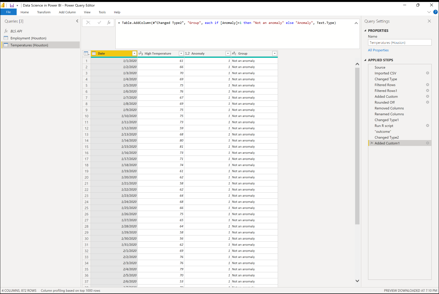
Power BI makes these algorithms available to you in the Power Query Editor once you load the data into Power BI Desktop through the modeling and visualization options. Figure 1 shows the combined capabilities available within a single query for all three categories listed above.
Power BI Guesses
In Figure 1, you can see that Power Query automatically chooses the data type for each column in the existing query so far. You can change the data types yourself if it doesn't already do this, or if the automatically selected data types don't match with the data types you want to use. Power Query uses the first 1000 rows of data that appear in the table preview to make an educated guess for the actual data types. Similarly, it can also guess whether you want to promote the first row of the data table into the header position or, given enough information, it can also guess an entire series of query steps that you can see in the Applied Steps on the right.
Once you load the data into Power BI, you can explore several visuals where you pick the visual, but it nudges you toward the next step. For example, in the Model view, you might see the tables automatically joined together based on how Power BI thinks the dimension and fact tables connect. You should also check to make sure that it joins the tables on the fields you want them to join on.
When you configure visuals, the decomposition tree and key influencers visuals use AI to predict the next step that you or the end user should take in analyzing the data in the visual. You can also leverage the smart narrative visual for the insights that Power BI automatically provides as to why trends or metrics might occur.
Connect to a Model
Power BI also lets you connect to built-in algorithms directly in the Power Query Editor as part of the transformation process with the AI Insights options like Text Analytics, Vision, and Azure Machine Learning, like the options you see in the options for the Add Column ribbon in Figure 1. In the Power Query Editor, for example, you can connect to models from Azure Cognitive Services and Azure Machine Learning models built outside Power BI and Power Query. Examples of available Azure Cognitive Services models include Image Recognition and Text Analytics. Within Text Analytics, you can choose from algorithms like language detection, key phrase extraction, and score sentiment (which tells you the positive or negative tone of a text input).
The fuzzy matching algorithm uses natural language processing (NLP) to match together similar strings of text. If you're using Power BI dataflows in the Power BI service (either Pro or Premium accounts), you can connect to the cluster values algorithm to transform the existing data table by either adding a column or grouping the existing values in the grouped column together. Both functionalities use a very similar fuzzy matching algorithm to what you see in the merging functionality, except it only returns results on a single data table instead of combining two tables together. Fuzzy matching uses NLP to match together similar strings of text. You can configure the parameters for the matching within the fuzzy matching options for all three iterations of this algorithm.
Another example of an NLP model within a Power BI visual is the Q&A visual, which lets you ask questions and get responses about the data. With the visualization options, you can also connect to the built-in machine learning algorithms directly to find clusters or anomalies in existing data points. You can also use linear regression to find trend lines and forecasting to project the data trends into the immediate future. With any of these pre-built models, you'll want to either know or have an idea of the fields you want to use in the model. Even though you don't have to build them yourself, it's still important to know what fields you can pass into the model as parameters to get the outcome you're looking for (and the requirements to make the models work properly).
Constructing Your Own Visuals
Finally, you can build your own visuals to represent the outcomes of these algorithms. One way you can do this is using custom visuals from the Power BI AppSource store. Many of these visuals use R behind the scenes to construct the visual, but you don't need to write any R code yourself. Examples of models supported by custom visuals using R include ARIMA, TBATS, clustering, and outliers. Power BI installs packages. Make sure you're using the right versions of the library packages.
In addition to importing custom visuals that run R behind the scenes in Power BI, you can also write R scripts directly in the R and the Python visuals, as well as running scripts for both languages in the Power Query Editor. For the sake of simplicity in this article, I'm going to use R as the sample code, but you can absolutely use Python too. One of the challenges I encounter is that although the Power BI service supports almost one thousand R packages, it only supports a few Python libraries. To use these languages directly in Power BI, you need to do the following:
- Install R or Python on your own computer.
- Enable R and/or Python scripts to run in Power BI (and while you're at it, enable Python scripts because I'll discuss this later).
What Are You Looking For?
Build machine learning models through building scatter plot and line chart visuals as starting points for understanding the high-level behavior of the data. Understanding algorithms can seem intimidating but you can divide what you're looking for into three different goal categories.
- Trends
- Groups
- Outliers or anomalies
Trends
When you're looking at data points, you want to see if there's a direction that they orientate in. For example, if you look at the time series trends for employment and unemployment data by month on the left side of Figure 2, you can see that since the beginning of 2020, the overall employment numbers increased in the Houston area, while the overall unemployment numbers decrease over the same period. You can add these dashed lines directly to several types of visuals, including the line charts you see representing the time-series trends for both these metrics. To add these lines, turn them on directly through the analytics options in the Visualizations pane. The lines you see represent the outcomes of linear regression modeling using ordinary least squares (OLS). If you calculated this yourself, whether that's through downloading the data to Excel, running an R or Python script on it, or even calculating it directly using DAX, you'll get the same slope and intercept that you see on these charts (see Figure 2).
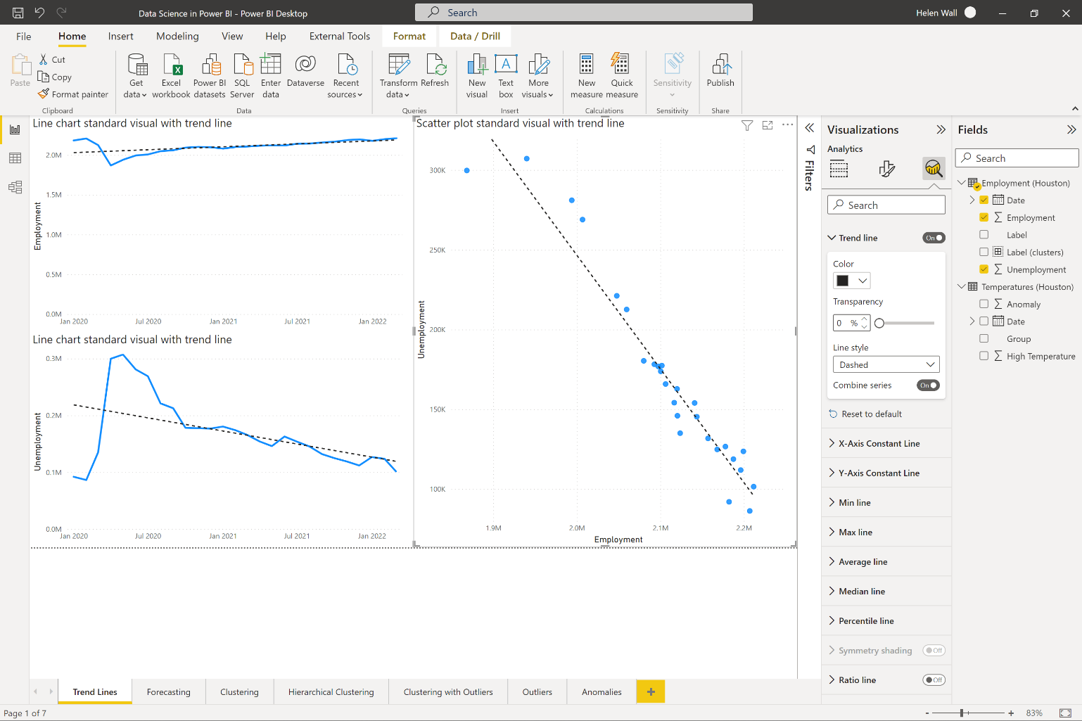
You can also see how linear regression looks on a scatter plot instead of a time series chart in the visual on the right of Figure 2. This models two variables against each other. You can see that as employment increases in Harris County, Texas, the numbers for unemployment also go down. Power BI lets you add the trend line in the same way you could for the line chart visual on the scatter plot. Again, it uses OLS for linear regression to calculate the intercept and slope of this trend line.
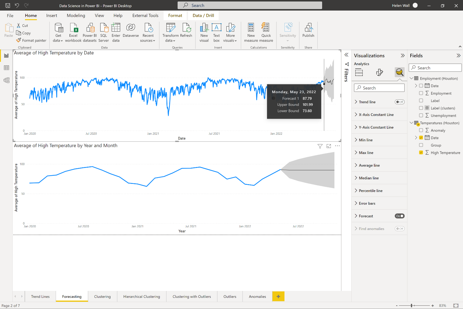
Let's say you want to forecast the outcomes of time-series data into the future. You can do this through the forecasting option available at the bottom of the same analytics pane as the trend line options that you see in Figure 3. Note though, that the forecasting option only works on visuals like line charts with a time-series field on the x-axis, like dates. Within the formatting options, you can also change the length of the forecast, and whether to ignore some historical data points, and, most importantly, you can also choose to include seasonality. Notice that the forecast option adds both a line and a gray shaded area around it representing the confidence interval.
Groups
Another way you can apply machine learning algorithms to data points is by grouping them together. Examples of clustering algorithms include names you might already know like KMeans and hierarchical clustering. If you have an existing scatter plot, let Power BI find the clusters for you using the built-in clustering algorithm. This adds a new clusters field to existing fields that contain the outcomes of the clustering model in the table that you choose to add them to. Within the clustering options, you can let Power BI automatically determine the number of clusters. You can also change them manually. In the scatter plot on the left in Figure 4, you can see that the built-in clustering algorithm you add to the visual creates four clusters for the data. You can also find clusters for more than two fields if you use a table visual instead of a scatter plot.
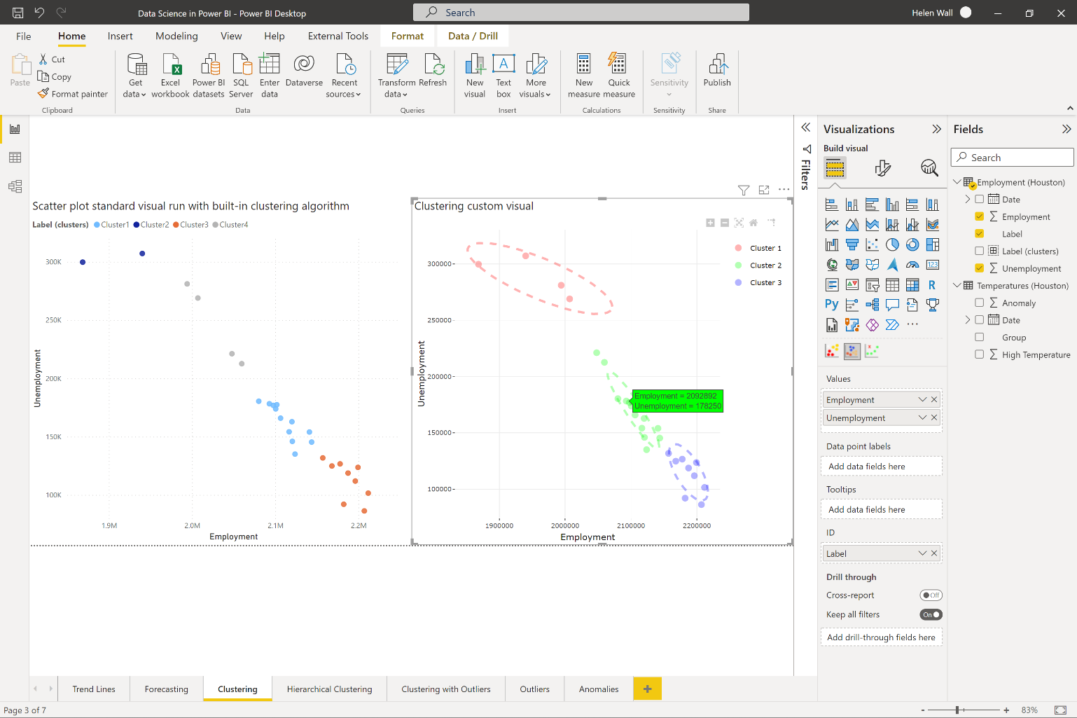
On the right of Figure 4, you can see what the clustering algorithm gives you if you import the clustering custom visual from the Power BI AppSource store. This means that you can add the ellipsis around the data points in the clusters that the visual determines. This gives an example of an algorithm where the R script runs behind the scenes, but you don't have to write the R code yourself for it to appear. You can see that they also display in the green tooltip in the highlighted visual.
Another way you can find clusters to group data points together is using the hierarchical clustering algorithm. At this point, you don't have a visual or algorithm you can plug the data into to create the visual you see on the right in Figure 5, but instead, you can construct it using R code.
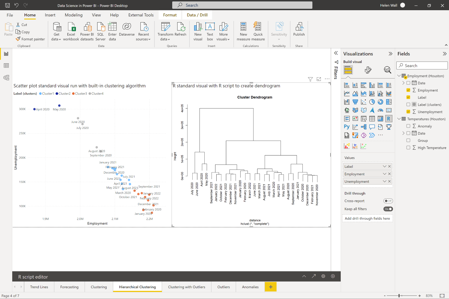
First calculate the distances between data points on the left of Figure 5 using the dist function on the data.frame dataset variable with the text labels removed. You then group each set together in pairs using the hclust R function. In order for these visuals to properly display, use the standard R visual in Power BI. Before you create these visuals directly in Power BI Desktop, make sure you install R (or Python) and then enable it directly in Power BI.
# The following code to create a dataframe and
# remove duplicated rows is always executed and
# acts as a preamble for your script:

# dataset <- data.frame(Label, Employment, Unemployment)
# dataset <- unique(dataset)
# Paste or type your script code here:

rownames(dataset) <- dataset$Label
#determine row labels in final visual
distance <- dist(dataset[, c('Employment', 'Unemployment')] , diag = TRUE)
#2D distance between data points
hc <- hclust(distance)
#model hierarchical clustering
plot(hc)
#create cluster dendrogram plot
You might also find it helpful to test out your code first on an IDE like RStudio, which makes it easier to troubleshoot issues. Although Power BI is an amazing tool, it's also a bit limited in terms of ways to test out code before implementing it.
Outliers or Anomalies
Finally, in data points, you want to determine whether points are part of the rest of the data points or not, which you can do through algorithms like outlier and anomaly detection. In Figure 6, you can see the clustering with the outlier detection custom visual compared to the built-in clustering algorithm. You can see the outliers denoted by small gray Xs in the visual on the right that fall outside the two clusters marked in teal and red.
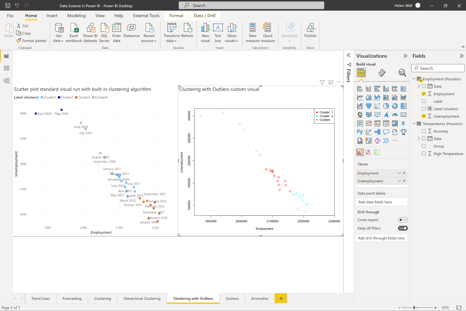
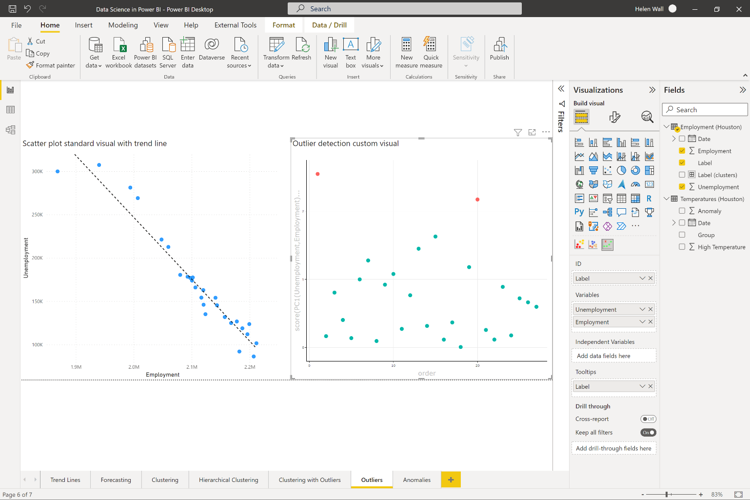
Grouping data together in clustering and determining the points outside these clusters as outliers represents one way to find outliers, but there are other ways to do it. You can also determine outliers using the outlier detection custom visual you see in Figure 7. This visual lets you separate the outliers from the rest of the points (the main group) using a z-score calculation to determine their sigma thresholds. The farther out points represent the outliers in red and the rest of the points aren't part of the outlier group. Like the clustering with outliers visual, the outlier detection visual also runs R code behind the scenes without you having to write any of it.
Besides outliers, anomalies are data points that also don't fit into the expected pattern of behavior for data points. On a high level, outliers represent deviations from where you are, and anomalies represent deviations from where you should be. You can see the outcome of running the built-in algorithm to find anomalies in the top line chart of Figure 8, which you access through the analytics pane of the selected visual. For Power BI to automatically find the anomalies for you, put a time-series field on the x-axis or it will gray out the algorithm in the analytics pane so you can't access them.
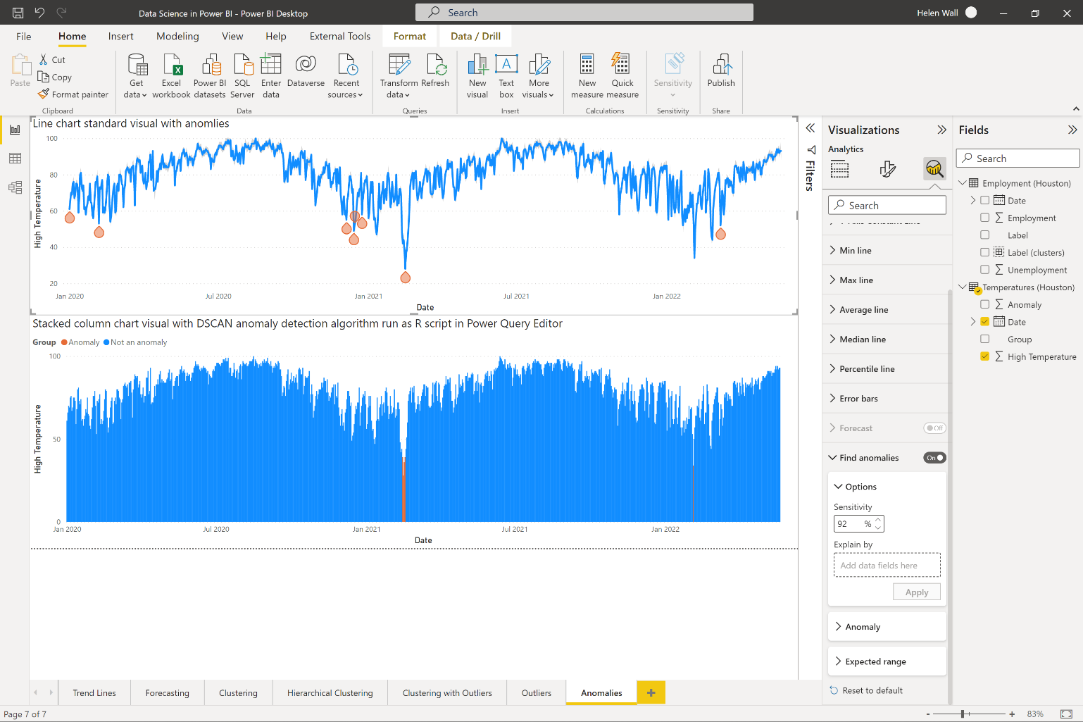
Notice that you can change the input parameters for finding the anomalies by changing the sensitivity of the algorithm. A higher sensitivity number makes the identified anomalies more sensitive to swings, which means that you'll see the algorithm identify more data points as anomalies. If you'd like to format the anomalies themselves, you can change their shape and color (from gray to orange like you see in this example).
In the lower visual in Figure 8, you can see the outcomes of running an anomaly detection algorithm directly with an R script. You can see it reflected in the outcome of a standard stacked column chart visual where you use conditional formatting so that orange can mark the anomalies while the rest of the dates display as a blue color. The algorithm itself can run as a standard R visual, but you can also use the R script integration options in the Power Query Editor to add a column for the anomaly detection model in Figure 1.
With the applied step for running an R script in the list of these steps on the right, the code below shows what this R code looks like. Once you import the fpc library, you then set the seed so you can run the anomaly detection algorithm with the dbscan function. Then assign the outcome results cluster column as a new column in the existing dataset variable and assign the entire dataset to a new results variable in Power Query.
# 'dataset' holds the input data for this
#  script
library(fpc)   #loading package
set.seed(220)  #setting seed
results <- dbscan(dataset$High,eps=2,MinPts=1)
dataset$Anomaly <- results$cluster
#add cluster to dataset data.frame
outcome <- dataset
Why would you choose one approach for clustering or anomaly detection over another (for example, built-in algorithms versus writing your own R code)? There isn't a single right answer for this. You might want different levels of control over the outcomes, or you might want to see a certain level of efficiency or speed that one approach provides. Like with everything else in data science, there isn't one right approach for the way to do something, but rather a selection of options to choose from.
Additional algorithms to explore include logistic regression, principal components analysis (PCA), classification, and much more. I go into these topics in much greater depth in several of my LinkedIn Learning courses: https://www.linkedin.com/learning/instructors/helen-wall.


