


I first learned about the impact of data visualization several years ago from the late great Hans Rosling, the Swedish physician and public health professor. His colorful animated bubble charts tell you, despite what you may otherwise believe, that the world is indeed becoming a better place. I use Power BI a lot these days to create my own visualizations. Power BI lets you create scalable dashboards containing updated data analysis to share with a wide user group. It does, however, have limitations for customizing visuals. One way around this leverages the powerful graphic libraries in R to create visuals directly in Power BI. Combining the capabilities of Power BI and R together gives you a visual power punch.
Setting Up Power BI
For this example, you're going to use a volatile dataset that gets updated daily: the WTI spot price. WTI stands for West Texas Intermediate and it's a common measurement of energy futures found in pricing models. It's available from the EIA (Energy Information Administration) government website (https://www.eia.gov), which provides not only analysis for US energy trends but also access to a vast array of datasets you can easily query with its API query tool. You can initially analyze the overall trends for this spot price in a page on the EIA website (https://www.eia.gov/dnav/pet/hist/RWTCD.htm).
If you're following along on your own, you'll need your own API token for the EIA data to place in your own block of M code for the Power Query Editor, which you can find on the EIA website: https://www.eia.gov/opendata/register.php. If you're new to using the EIA API connection, you'll see a form space within this page where you can enter your email address and agree to the terms and conditions for using the API connection to register for your own API token. Once you fill out this form, you'll receive an email with details on how to access your own new API token. You don't need to register for a new API token through the EIA if you already have one, but if you forget yours you can get it from this page as well.
Get Data
Power BI enables you to easily connect to and refresh datasets from a variety of data sources. This project doesn't focus on how to implement the ETL framework in the Power Query Editor, but you can see how to set up a similar project using an API query in an earlier article I wrote on Power Query in CODE Magazine: https://www.codemag.com/Article/2008051/Power-Query-Excel%E2%80%99s-Hidden-Weapon. Note that while the earlier article uses the Power Query Editor in Excel, you can transfer its functionalities and M code directly into Power BI. You can get the data directly in Power BI Desktop by updating the attached starting Power BI Desktop file.
- Select the Transform data button from the top Home ribbon.
- Make sure to select the WTI Prices query from the query list on the left, then double click on the Source step in the Applied Steps list on the right.
- In the open dialog box, where it says <your_api_token_goes_here> delete only this character string in the Web connection URL and replace it with your own API token.
- Confirm this update and you'll see that your query now contains the updated WTI prices from the EIA API.
Choose the Color Palette
If you look at the top of the EIA website (www.eia.gov), you can see their logo. I'd like to bring in not only their logo but also incorporate the colors of the logo into the visuals. I matched the colors in the logo to their hex values using the Adobe color matching tool.
You can see the logo colors displayed in the palette of five colors (Figure 1). Keep this color palette on hand, as it will become helpful throughout this project to select consistent colors from the EIA logo.
Framing Time and Trends
The WTI price, as an oil commodity price, fluctuates frequently and you do want to ultimately illustrate these trends in tandem with the R visual you'll create. Placing several visuals in the same Power BI view creates an insightful analysis for the consumers of this data. For those of you starting in the *.PBIX file I included in this article's file, once you update the data to include your own API token, you'll see the initial framework for the analysis that you'll continue to build in this project including:
- EIA logo image
- A date range slicer visual to dynamically select the date range for this analysis
- A line chart visual showing the daily WTI price trends
- Analytics displaying the reference lines on the line chart for the maximum, average, and minimum WTI prices
- Summary cards in on the left displaying the KPIs matching to the reference lines on the line chart
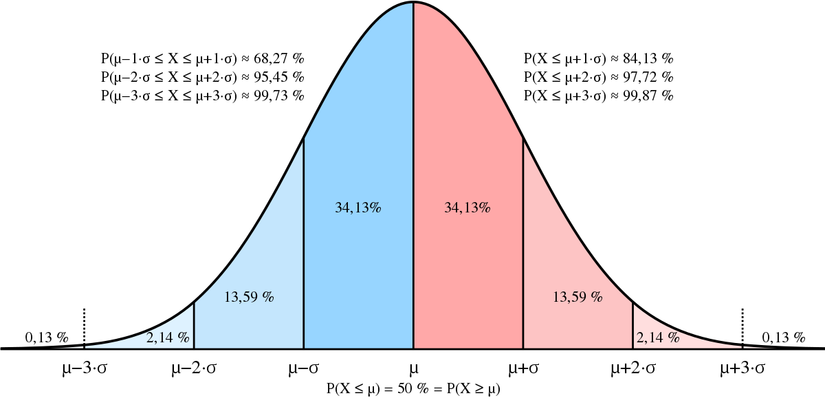
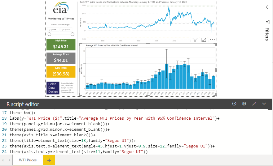
You can see that the price fluctuates quite a bit by the neither smooth nor consistent line chart shape (Figure 2). Also, notice the color scheme of the line chart matches up to the blue in the EIA logo for the daily WTI price. The green and yellow colors of the references lines and summary cards match up to the EIA logo as well. The hex values for these colors come directly from the color hex values displayed in the EIA color palette (as you saw in Figure 1).
Below the line chart visual, you'll add the R visual to the current white space. My approach for creating Power BI visuals starts with first creating a table visual. This ensures that the dataset values make sense, and the DAX measures I calculate for the model directly in Power BI make sense as well. Let's create a table visual by selecting the standard table visual from the Visualization pane. Next, add the WTI Date field to the Values field bucket, then add the WTI price field to the right, so it appears in the table in that order. Notice that it already aggregates the prices. If you compare this to the actual WTI prices, they're the same because this table uses a daily date dimension. But you can also see that adding the date field automatically adds four date dimensions to the table instead of one.
You want to ultimately create an R visual illustrating the averages and distributions by year, so let's remove all the date dimension fields from the table visual except Year. Notice that the aggregated values for the WTI price can change. This occurs because you just changed the pivot table coordinates of the table. Whereas before the table aggregated the WTI price by day, it now aggregates the price as a summation over the year. You can see its aggregation type by navigating to the WTI Price field in the Visualization pane, then selecting the down arrow to see the available aggregation options. For numeric values, Power BI defaults to the Sum aggregation type. For this summary though, you want to see the average price for the entire year because prices work like rates, which means that summing up the numbers doesn't make much sense. Once you have a summary table for the average WTI price by year, you can start to create the DAX measure calculations and check them by adding them to the table.
Calculate DAX Measures
Before you start to add DAX measures to the Power BI model, you can create a separate table solely to store these measures. This keeps the model clean and organized because not only can you easily identify the model's DAX measures, but more importantly, others can as well. I already created a Calculations table in the Power BI Desktop model. You can create your own Calculations table by following these steps:
- Select Enter data from the top Home ribbon.
- In the open dialog box, give this table a new name , like Calculations, then select Load to save the table.
- Add a DAX measure to this new table.
- You can then delete the current existing column and it will only contain this new measure.
- If you collapse the Fields pane by selecting the arrow point right at the top of the pane and then expanding it again, you'll see that the table name appears with a calculator icon next to it. This indicates that it's a table exclusively for measures and remains that way as you add more measures to it.
You can see a measure already in the Calculations measures table in the existing Power BI Desktop file. This is the dynamic chart name for the line chart visual. If you want to see how it applies to the title name, you first select the line chart visual, then choose the formatting options for this visual. Open the Title submenu and look for the fx button, then select it. This opens a dialog box where you see the selected measure already applied for the title name. You can see in the visual title that this measure formula below gives a dynamic date range for the chart depending on the date range you select.
The VARs in this DAX measure formula let you set the variables for the first date selected and the last date selected, which pull from the date range slicer on the left of the view. Each of these formulas uses the DAX function FORMAT to display the date as a long date rather than the short date it displays by default. You then use these two variables to create a concatenated string that RETURN saves as the calculated output value.
Title Line Chart =

VAR first_date = FORMAT(FIRSTDATE(
ALLSELECTED('WTI Prices'[Date])), "Long Date")

VAR last_date = FORMAT(LASTDATE(
ALLSELECTED('WTI Prices'[Date])),"Long Date")

RETURN "Daily WTI price trends and fluctuations
between " & first_date & " and " & last_date
First, you're going to create a DAX measure that calculates the average for each year, although this may seem odd because you already calculated this in the table visual as the aggregated average WTI price. You're creating this DAX measure because you'll later use it directly in other DAX measures. Select New Measure from either the top ribbon in Power BI or by selecting the ellipsis (three little dots) next to the Calculations table name. Next, you want to add the DAX measure expression into the formula space. You can calculate the average price by setting it equal to the CALCULATE function, which you'll wrap around the AVERAGE function to return the average WTI price.
Average Price = CALCULATE(AVERAGE(
'WTI Prices'[WTI Price]))
The table pivot coordinates determine the results of this calculation. When you add it to the table visual, it calculates the average WTI price by year. However, if you add perhaps the month date dimension to the table, these aggregation values will change because you're no longer evaluating the calculation on a yearly basis, but a monthly basis.
Next, you want to calculate the standard deviation for the WTI price by creating a new measure for the standard deviation Like the average price DAX measure, you'll use the CALCULATE function, but inside the function you'll use the STDEV.P function. The P on the end of this function indicates that you're calculating the standard deviation on a population. Now you add it to your table visual, to make sure the calculation looks correct alongside the average prices for the year.
Standard Deviation = CALCULATE(STDEV.P(
'WTI Prices'[WTI Price]))
But what exactly does the standard deviation mean? Let's take a step back to examine key concepts of statistics in the context of this analysis. The average WTI price comes from calculating this aggregation for each day in the work week for a year, which amounts to about 260 data observations per year. The prices can fluctuate quite a bit even within a single calendar year. The standard deviation measures the variance of these prices. You can take this standard deviation value and add or subtract it from the average yearly price to determine the lower and upper bounds of the range containing roughly 68% of that year's data, which you see in the two middle shaded sections of Figure 2 (source is https://commons.wikimedia.org/wiki/File:Normal_Distribution_Sigma.svg). Adding or subtracting two standard deviations gives you the range for 95% of the data (Figure 2). Let's calculate a price range using two standard deviations to get the Min Price and Max Price.
Next, you want to take a standard deviation DAX measure to calculate the minimum and maximum values representing a 95% confidence interval to display in the R visual. You'll create another new DAX measure for the minimum price lower bound. You will then take your average price DAX measure and subtract two times the standard deviation DAX measure from it. Notice that you're not using the CALCULATE function in this calculation because you're referencing two already calculated measures.
Min Price = [Average Price]
- 2 * [Standard Deviation]
Lastly, you'll create another DAX measure for the maximum price, but this time you'll add two times the standard deviation to the average price DAX measure instead of subtracting it from it.
Max Price = [Average Price]
+ 2 * [Standard Deviation]
Once you create these measures, add them both to the table visual alongside the average price measure (Figure 3). You can see how you now have a range of calculated values for each year, including a minimum calculated price, a maximum calculated price, and the average price.
To create the R visual, you want to leverage these three fields plus the Year date dimension from the model. This means that you can delete the other fields in the table to clean it up before moving to the next step of this project. Once you select the R visual for this set of data, you're going to transition to using R exclusively to build out the visualization.
Tapping into R Visualizations
Install R
First, you need to install R on your own computer if you don't already have it there. You can have multiple versions of R on your computer, but you'll specify the version for Power BI to connect to. Set up the R-CRAN for the area of the world that you live in. Once you install R, open the RGui to install the additional libraries you'll use in this project. In the interface, type in install.packages(“ggplot2”). Then you'll want to install the packages for “scales” and “extrafont” in the same way.
Enable R Scripts
You also need to enable R scripts directly in Power BI Desktop. Navigate to the options menu within the Power BI Desktop home page and choose to enable R scripts. You'll receive a confirmation message for this set up. You also want to make sure that you select the R version 3.6 from the drop-down menu. The R version will certainly change in the future, but for now, make sure to select this version of R for the scripts to run properly.
Initiate Visual
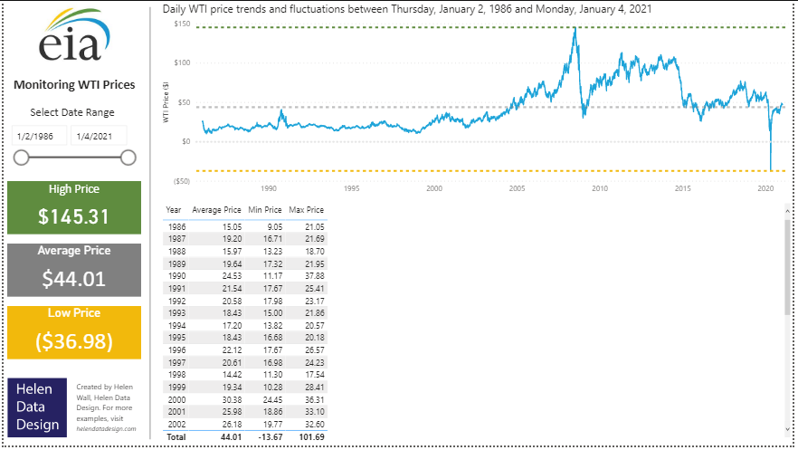
To check that you enabled the R scripts to correctly set up a table in Power BI, convert it to an R visual by selecting the R icon in the visualization option list. Power BI automatically sets up initial code for the R visual script denoted with green font using the data fields you already selected (Figure 4). This lets Power BI do some of the planning process for running the R script for you. Power BI brings in the data into an R data.frame it calls a dataset, then runs another command directly after that to create a unique dataset for the visual. If you remove one of the data fields from this R visual and then added another field, the dataset wouldn't update, but rather you could leave the existing fields alone, or you can change the field names manually yourself. You can also see that the dataset has another line of code below it that returns the unique dataset. You see a final line that says paste or type your script here. Here's where you start to add your own code to create your custom R visual.
First, make sure to enable R script by selecting the yellow button directly on your R visual (see message for “R script visuals are not enabled” in Figure 4). Even though you imported the packages for this visual in the RGui, you also need to import them directly in this code to properly run the R script. To run the ggplot2 package in this visual, you add it to the first line of your own code by telling the R visual to load the ggplot2 library. You'll do the same for the scales and extrafont library (Figure 5). The next line of R code with the loadfonts command tells the R script that you're running this R script on Windows so it references the font options on the appropriate operating system.
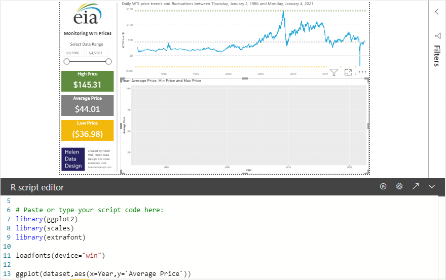
In the next line, you call the ggplot function to initialize your R visual. You'll then reference the dataset that Power BI automatically created initially for the R visual as an input for this function, along with identifying the fields that go on the axes of this visual. Let's put the Year on the x-axis and the Average Price on the y-axis. Notice the back quotes around the Average Price field. Because the Average Price field contains spaces to make it easier to read, you need to add single-quotation characters around the field name for the R script to properly run the code. Otherwise, the script errors out because the field name isn't a single string, but two separate words separated by spaces. Next, you'll hit the play button icon in the top right of the R script window to run the R script within Power BI Desktop. This creates an R visual on the canvas with those fields on the axes. Notice that there's no chart yet. You'll create this chart in the next line of code.
Create the Bar Chart
You can choose from many chart options to run in R, but let's create a bar chart in this example. To create the bar chart, you want to first add a plus sign (+) to the existing code, and then use the geom_bar function to create a bar chart within this space. Set the stat for the geom_bar function to `identity', which tells the R script to use the x-axis field you already set in the previous line of code. When you hit the play button to run the R script in Power BI again, it now creates a bar chart in the same space (Figure 6). If you want to explore other R visual options, check out this guide to R visuals from the R Studio website: Create Elegant Data Visualisations Using the Grammar of Graphics. (Editor's note: This updates the link that appeared in the printed version of CODE Magazine.)
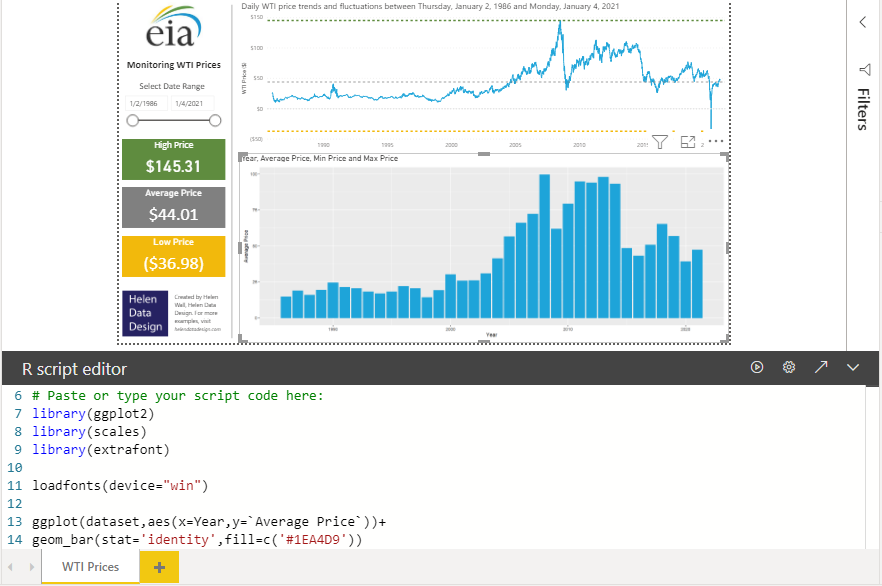
If you don't include the fill within the chart function, the visual defaults to a very dark grey chart color. There are several different ways you can add colors to your R script. You can add more code after stat = ‘identity’ to pass the fill color into the R script. You can set this fill parameter to a particular color like ‘blue,’ but you can also specify the exact color to match a hex color value like those in the EIA logo (Figure 1)., when you run the R script again, Power BI displays a bar chart visual with bars that exactly match the blue hue in the EIA logo.
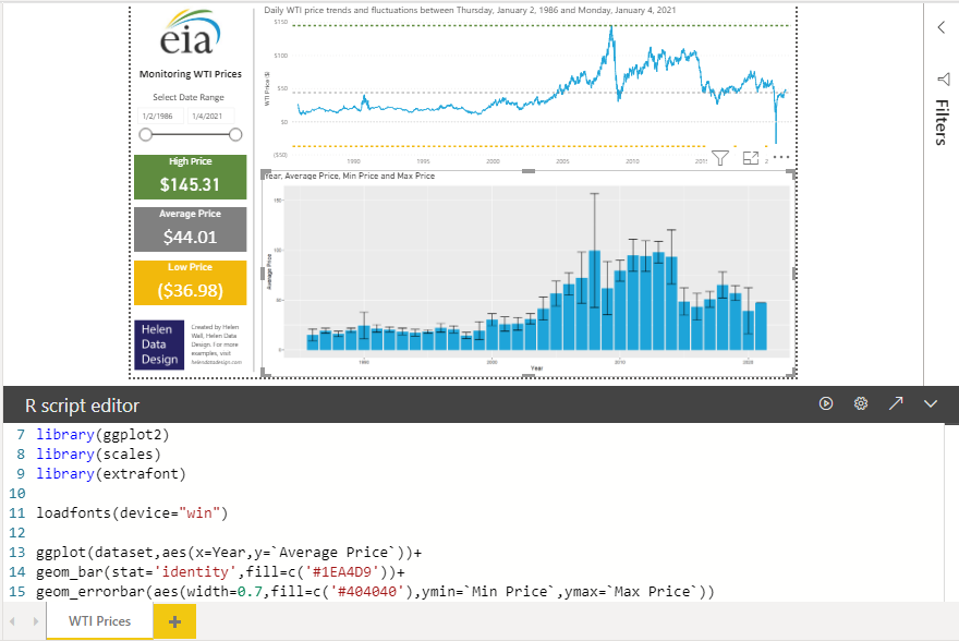
Add Standard Deviation Bars
Next, let's add error bars to the existing bars in the visual to illustrate the range of values in the 95% confidence interval for each year of WTI price data. The error bars go directly on top of the blue bars representing the average WTI price for each year. To add them to the R script, first put the plus sign (+) at the end of the previous line of code. Then, in the next line, you'll use the geom_errorbar function to create these error bars. Within this function, you'll need to nest the aes function. The aes, or aesthetics function in ggplot2 creates visual characteristics within a chart including color and fill, point shapes, line type, size, or group. The aesthetics function lets you bring in groups or fills into your charts. For geom_errorbar, this includes the width of the error bar, which you set to 0.7, but you can set it to another value. If you play around with this value, you can see how changing to impacts the appearance of the R visual.
You can also set the color of these bars to the dark grey color in the EIA logo by using the fill = c(#404040) in a similar way to which you set the bar color to the blue in the EIA logo. To pass in the parameters for the bottom of the error bar, set ymin within the aes function to the Min Price field already added to the R visual. You'll do the same to add the top of the error bar by setting the ymax equal to the Max Price field. Remember to include back quotes around each field name because their names do contain spaces, otherwise, the R script will error out! When you run the visual, you'll see the error bars neatly added to the top of the blue bar chart (Figure 7).
Reformat Axes
Adding scale_x_continuous to your R script tells Power BI that you want the R visual to display the x-axis to using even breaks for the years. To do so, you want to use a function from the scales library that works with the ggplot2 library. You also want to calculate within the R script the number of years to use along this axis, which you do by calculating the length of the dataset Year field. Putting this within the scale_x_continuous function that you're adding to the line of code that creates the error bars lets you scale the x-axis tick marks to equal to the number of years in the date range of the current dataset. When you run this code, the R visual adds a label for each year with a tick mark to the x-axis for each bar in the bar chart (Figure 8).
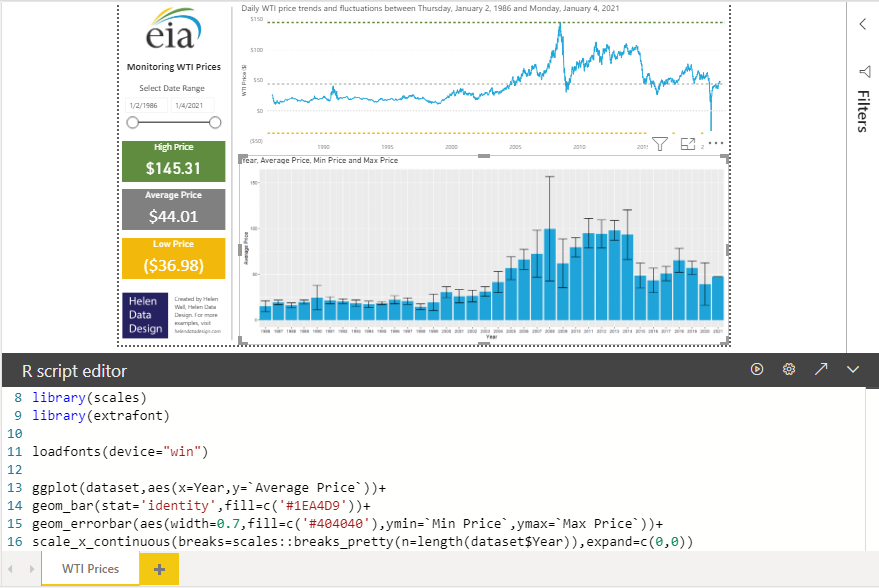
If you run the R script without adding the expand parameter at the end of this function, you'll notice that the chart displays a few leading and trailing years without data to the beginning and end of the date range before 1986 and after 2021. Eliminating these extra years in the visual improves readability, but more importantly, it also removes any confusion of potentially thinking the WTI prices are zeros in these years.
Change the Background View
Notice that even after updating the formatting for the x-axis in the previous step, the visual still displays a light grey background grid behind the bars and their error bars. Although this doesn't make the visual incorrect, it does clutter the canvas a bit. It would look a bit cleaner with a white background. To remove the default background from the R visual, you'll add another line of code after the previous line for scale_x_continuous with the plus sign. On the next line, adding the function theme_bw() removes the gray background (Figure 9).
Add Labels
The ggplot2 library offers not only a plethora of chart options for the visual, but also a quite extensive array of formatting options. Let's say you want to add easy-to-read labels to the axes or the title. You can make these updates by adding a single line of code to the R script. Again, use the plus sign to add another function to the existing R script, then use the labs function to pass in the new titles for the axes and main title that you want to update.
Remove Gridlines
You can also use the theme() function within ggplot2 to change the formatting of your R visuals. You can set the grids to an empty view by making panel.grid.major.x and panel.grid.minor.x both equal to element_blank(). Running the script after adding these two new theme lines to the existing script results in the removal of the grid along the x-axis, but keeps the grid along the y-axis, which makes it easier to quantify the average, high, and low WTI price values for each year (Figure 9).
Add Labels
Because the year appears in both the title and the x-axis label, it seems reasonable to remove the x-axis label to avoid repeating labels and give the visual a clean appearance. To remove the x-axis label, you can add another line of code to the existing script again using the theme() function, but this time you want to set the axis.title.x equal to element_blank() before running the updated code (Figure 9).
Adjust Text Sizing and Font
Your R visual is starting to show some nice insights for the WTI price trends, including illustrating that higher average prices by years doesn't necessarily mean the variance is higher as well. You can continue to make formatting changes to this visual, including changes to the sizing and font for any text on the chart. The R library “extrafont” lets you leverage an extended array of font options with an R visual (Figure 9). First, you'll leverage the theme() function again by adding additional lines to the code. Nested within this function, you can set axis.text.x, axis.text.y, and title equal to the element_text function. You'll then pass the parameters for the actual element formatting into this element_text function. The size parameter refers to the font size of the axis mark labels or the title. You can set Family equal to the font family you want to use. In this case, you can see the script references for the font family Segoe UI, which the visual imports from the “extrafont” library. You can select from many font family types in the “extrafont” library, but Segoe UI matches the title text in the line chart above the R visual. If you run this code as is, you'll see subtle differences between the text appearances, even though they both have the same font size and type.
For the x-axis specifically, you can see several applied formatting options, including the angle (in this case, 45 degrees) to which the text labels sit in relationship to the direction of the x-axis. The parameters hjust and vjust lets you move each of the labels by an incremental adjustment in direction either horizontally or vertically from their original location to change the axis label markers and make them easier to read. You can play around with these values by changing them from the ones you already see to experiment with what the adjustments update (Figure 9).
Put It All Together
You just created your own custom visual in Power BI by leveraging the existing standard R visual within Power BI Desktop! You likely noticed that the R visual has two titles - one you added in the R script and that the existing default chart Power BI automatically includes with the visual. To turn off the visual title, select the R visual again, then go to the formatting options in the Visualizations pane and navigate to the Title submenu where you can simply turn the default Title radio button to the off mode.
Also, you may notice that, all told, the script for creating the R visual has 24 lines within Power BI. Granted, the initial R visual configuration Power BI automatically created several of those lines, but you can streamline the code by consolidating the transformations nested within the theme() function into a consolidated line of code within the R script at the end of the script (Figure 10). You can also consolidate these functions into a few lines of R code that you'll find in the final attached Power BI Desktop.pbix file for the project.
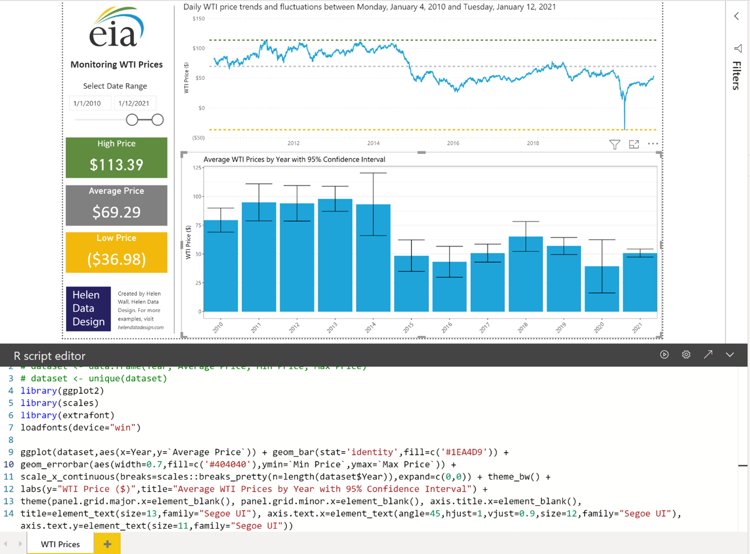
Notice how analyzing the visual output of this chart in tandem with the line chart and summarized WTI price trends gives valuable insight about the trends in WTI price on a daily basis, as well as how these prices fluctuate between years and even within individual years. You can see how adjusting the date range in the slicer on the left side of the page lets you analyze the WTI price trends over a narrower date range and changes some of the sizing proportions in the R visual for this narrower data range. This sample project also only represents a small part of the capabilities of R within Power BI! You can explore many more options for leveraging R visuals directly within Power BI, as well as Python and D3.